It’s always a good sign when a designer’s work can be recognized without his name on it. You know the look, the style and it just clicks into place. There are a few designers in the playing card industry that can accomplish that, and Lorenzo Gaggiotti is now one of them. Lorenzo and his recently created Stockholm 17 brand have become solid, recognizable names and images in the playing card community. So yes, hard work and attention to detail doesn’t go unnoticed for too long.
About the time Stockholm 17 was being born, Lorenzo worked on a project for Card Launcher, the deck was simply called No. 17 and was to be used for promotions and marketing for the crowd funding site. Only 530 of these “Promotional” decks were produced. The deck is very much a Lorenzo deck, but I do remember seeing it for the 1st time and feeling like it was a bit incomplete, not a terrible thing, Lorenzo’s sketch work is amazing on its own, but it was missing the refined touches I was used to seeing with Lorenzo’s earlier work. Needless to say, when Lorenzo announced that he would be releasing a second version of No.17, with a “Revised” look, many, myself included, we’re pretty excited.
So 3 base version of the No.17 deck have immerged… to date. They all bring something a bit different to the brand, each with its own feature so to speak. We have the Version 1, and 2, Version 2 consisting of a Branded and Unbranded tuck design. Let’s start with theV1.
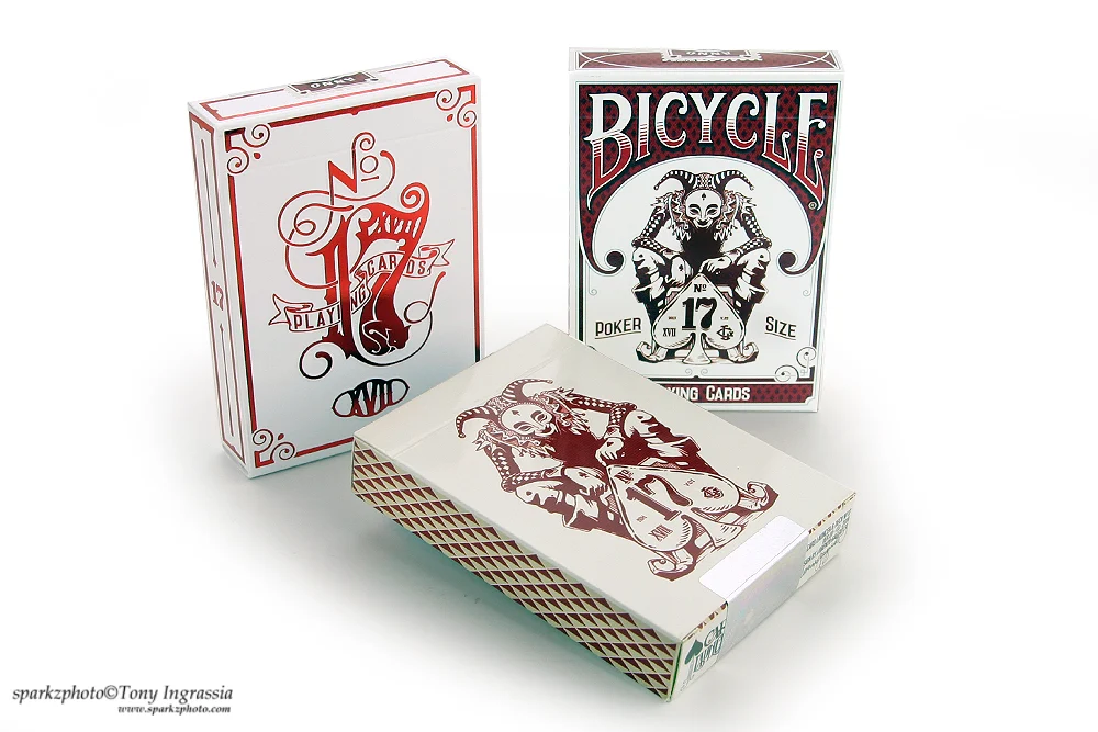
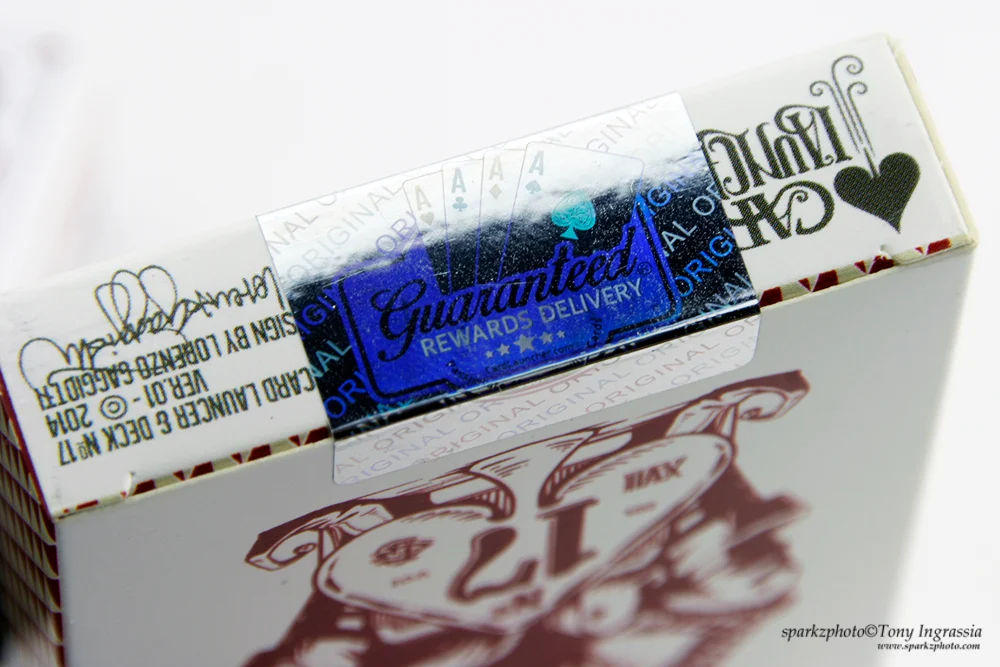
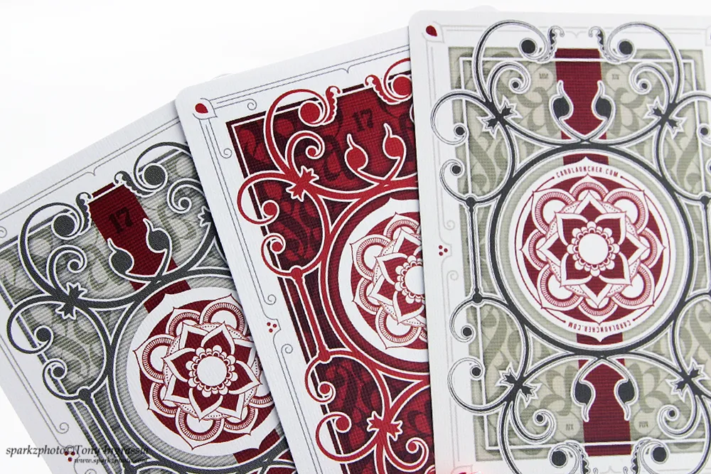
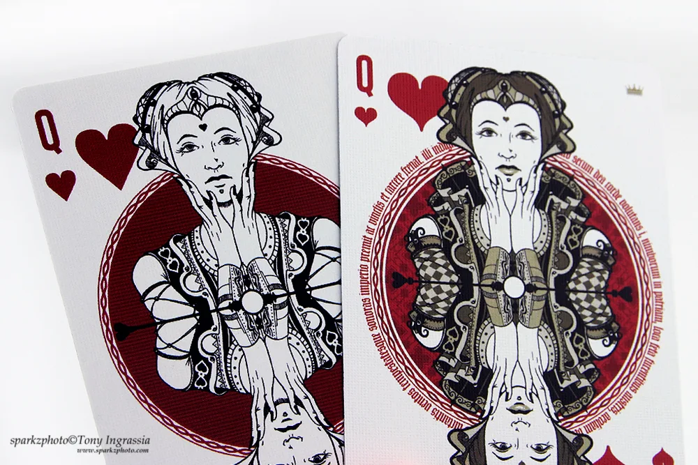
The No.17 v1 was produced by MPC on their Linen Finish. The back design is beautifully ornate and shows Lorenzo’s style and detail very well, the face cards feature smaller pips that are centered and brought in on the card frame. The court design is easily recognized as Lorenzo’s work, each personality is well designed and thought out, they all go well together in look and concept. Here is where the v1 seems incomplete to me. The courts look more like a “Final Sketch” than finished product. Again, this is my opinion; it just didn’t seem to fit Lorenzo’s usual presentation. That being said, they still look great. The deck is in a glossy white tuck box with two holographic “Safety” seals, one at each end. I’m not going to go into this too much, but my simple comment to the seals is, overkill.
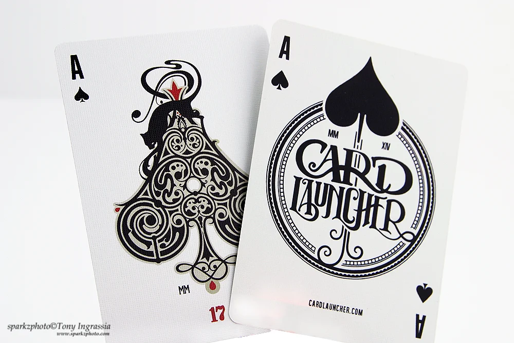
The back of the tuck reflects the card back and the front features a Jester sitting over a Spade which reads “No. 17”. The deck also features a custom Ace of Spades and Jokers, all three cards advertise Card Launcher on them, and you will also find another small ad on the back design at either end of the center “Flower” design. Keeping in mind the intention of the V1 deck I have to give it some props, as a promotion you can’t really go wrong with a talented designer and a limited print run…the designer carrying most of the appeal. Version 1’s aren’t impossible to find and will have a heavier price tag than a normal deck, but if you’re a collector and more so a fan of Lorenzo’s work, it’s a deck worth pursuing at the right price.
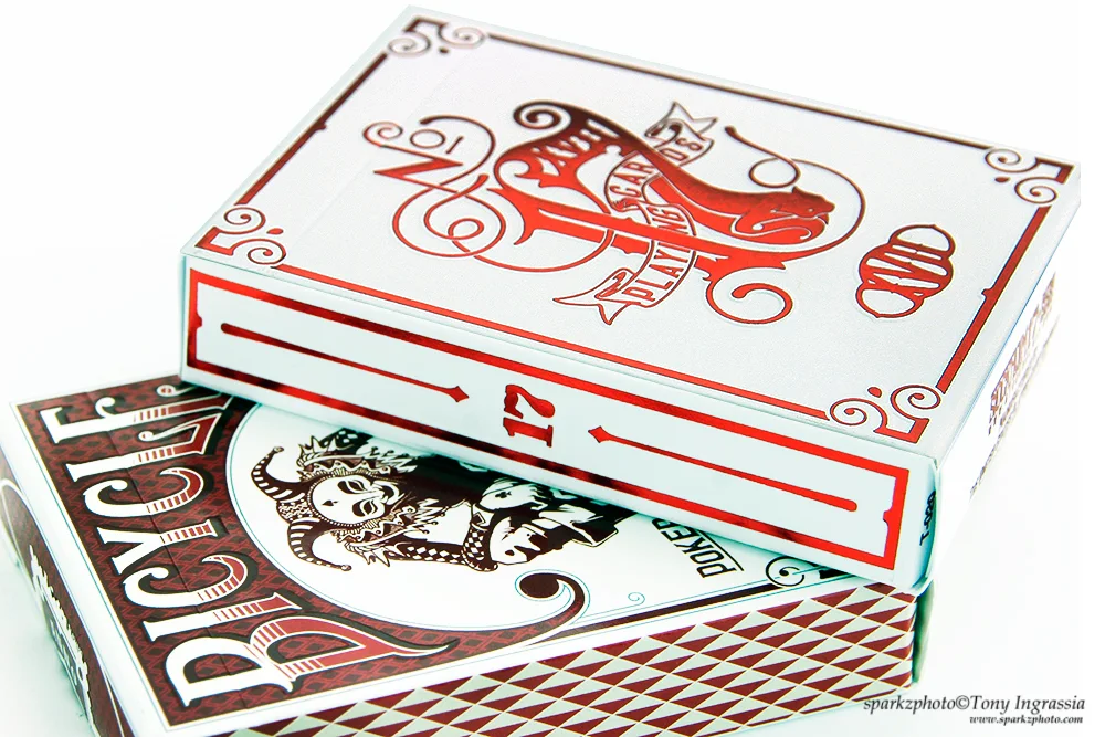
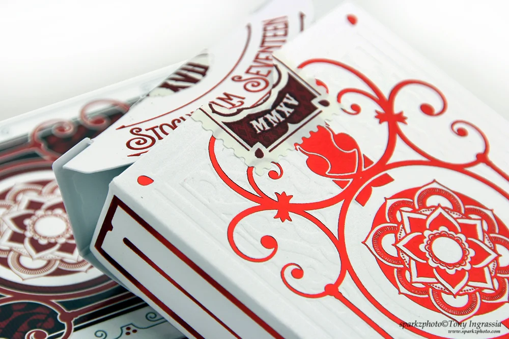
After waiting very impatiently, the No. 17’s version 2 came along. Offered in a Branded and Unbranded tuck, both decks drew heavy similarities to the V1. The Branded version has a very similar tuck to the v1, but offers a more “Complete” look. Bicycle branded with subtle embossing give the tuck a nice look and feel, the tuck also features a “Tax Stamp” style seal, the now familiar Jester on the front and a slightly redesigned back that carries heavier line work and a new color palette.
The face cards remain true to the V1 layout and design, while all 4 Aces received a major redesign, making them all stand out. The key Ace of Spades has a beautiful ornate look that matches up with other Aces very well and also includes an image of a black cat draped across the top of the Spade. The Jokers mirror the V1’s minus the ad copy and feature Lorenzo’s Jester once again. The court cards are amazing, from a “Sketch” to finished product, the wardrobe is more complete and detailed and the subtle color palette makes some of the detail stand out really well in comparison to the V1’s courts. The back design uses a red color palette, heavier lines on some of the elements, but a mirror of the V1 none the less.
The Unbranded V2 cards have the same faces and courts as the Branded version, but the back design returns to the color palette used on the V1’s. The tuck for the unbranded version is subtle, but striking. Featuring some nice embossing on a soft white tuck and vibrant Red foil accents make the beautifully detailed “No. 17” just pop off the front of the tuck case. The V2’s does also have a subtle addition to the back design in the form of a “17” at either end of the card back.
No.17 is a beautiful piece of work by Stockholm 17 and all three decks come together nicely as a set, the 1st offering some collectability and the latter offering what, in my opinion, a more complete vision of what the deck was supposed to originally look like. Lorenzo does amazing work, and if you’re a longtime fan or just seeing his decks for the 1st time, No. 17, in any of its incarnations, would make a nice addition to any collection.
Visit Stockholm 17 on their website and you can also follow them on Facebook so you can keep up to date on new projects and release dates.



 Kardify is the leading online destination for playing cards news, reviews, and cardistry culture. Enjoy the best editorial content daily.
No comments
Post a Comment