Responsive Ad Slot

Kickstarter: Bicycle Emperor Playing Cards


Last month we had Empire Playing Cards, this month we have Emperor. However, do not get the two projects confused as they are completely different in design and style. Massachusetts resident Joanne Lin designed Bicycle Empire Playing Cards and launched on Kickstarter today, July 31st.

Click here to visit Bicycle Emperor on Kickstarter.

The project comes with a low funding goal of $1K. Some might be thinking this is too small of a goal for a USPCC deck but Joanne assures us the decks are already in production. The low funding goal is to simply make sure everyone who pledges for a deck on Kickstarter, will get one. Low funding goals can sometimes be a cause for a concern but they aren't always. Just earlier this month, Paul Carpenter of Encarded set a low funding goal for the Bicycle Deco two deck project for exactly the same reasons as Joanne.

The project will fund for 29 days. This is also Joanne Lin's first Kickstarter project.

According to Bicycle Emperor's Kickstarter page, the deck pays homage to ancient Chinese legends and the original idea was actually inspired by her father's love of collecting cards.

Here is a look at Bicycle Emperor courtesy of the project's Kickstarter:


Card Radar: Bicycle Inspired Wooden Playing Card Case by Josh Coyer


Josh Coyer, a designer from Wiscosin Rapids, designed a custom playing card case that features laser engraving. The case, which was designed for two playing card decks, pays homage to the Bicycle playing card brand that everyone knows and loves. Josh added a laser engraved Bicycle with the words Special Edition Playing Cards engraved in two different fonts.

The finishing touches on this deck include the engraved 1885, which is the date Bicycle card began printing. With that, Bicycle's parent company, United States Playing Card Company was founded in 1867 under the name Russell, Morgan & Co. The company didn't start printing actual playing cards until 1981 with the first line being Congress No. 606 playing cards.

Apart from the history lesson that this case inspires, the playing card case features custom designed suits that are engraved into the bottom of the lid.

These were created for a school project and do not seem to be available for sale at this time.

Courtesy of Josh Coyer's Behance account here are photos of the case:


The Erdnase 216 Playing Cards


Produced for The Conjuring Arts Research Center (CARC) by USPCC, the Erdnase 216 deck purports to be as close a replication of the original 1902 Bee 216 deck as is possible. Based on a recently rediscovered original deck, these cards are unique in nearly every way compared to their modern counterparts. They are available in both tan and the green hue currently en vogue.

Here’s what CARC has to say about them:
Last fall Conjuring Arts started some new experimentation, taking our research in a completely new direction. We did three major test runs at great expense which allowed us to successfully create what we proudly call our Erdnase Finish. This new finish is the thinnest and smoothest card that can be produced at US Playing Card Company. When measured by caliper a 52 card deck is merely 14.5 mm. This combined with a smooth finish (just as all the cards were in Erdnase’s time) creates a deck that feels as close to the 1902 Bee as is possible to make today. The only real difference is that our new reproduction is a bit slipperier than it’s [sic] 1902 predecessor. Today the manufacturing process uses a plastic material in coating the paper and 100 or so years ago this was more of a varnish that can no longer be used for cards.


This review will focus on the tan deck. Much ado has been made about these cards, so let’s take a look and see what all the fuss is about.

The specs:
Name: Erdnase 216
Company: The Conjuring Arts Research Center
Release date: 5 March 2013
Stock: Proprietary
Finish: Proprietary “Erdnase Finish”
Colors: Green, Tan
Face: Standard
Size: Poker

From the get-go, these cards have an almost “holy” aura about them. Nearly every card enthusiast has read, or at least knows of, SW Erdnase’s 1902 manual “Expert at the Card Table”. This legendary tome is widely considered the gold standard for instruction of card manipulation, and the mystery surrounding its provenance grows greater by the year. This review will avoid any speculation of this aspect, as there are more pages devoted to the mystery than there are in the book itself. What we can say without question, however, is that the author demonstrated his sleights using a Bee deck, as seen in illustrations throughout the book. Card printing technology has changed dramatically in the more than 100 years since publication of the book, so finally getting one’s hands on a deck like the one Erdnase used is very exciting indeed.

The first thing one notices when approaching the wrapped deck is that there is no stamp seal. This isn't necessarily odd in a small-run deck, but if CARC was trying to be as faithful to the original as possible, then they missed a step here. The pictures of their original deck clearly show a stamp seal, so this omission is confusing at the very least. Aside from that, there’s nothing particularly special about the tuck case itself. Yes, it reproduces the original box, which is quaint, but there’s not much else to say about it. The bottom flap legend describes the creation and inspiration behind the deck.


The back design is, of course, a reproduction of the original deck. CARC believes this to be the back alluded to in the illustrations from “Expert at the Card Table”, and I guess I’ll have to side with them. There aren't any other decks that seem to match the illustrations, and some artistic license can be forgiven in not attempting to draw these things dozens of times. From directly above, they appear to be a distorted wood grain design. The distortion comes courtesy of the horizontal lines that run the entire length of the card. 

When viewed from an oblique angle, the distortion dissipates and the wood grain pattern becomes very clear.


One thing that may be of interest to magicians is that the back design is not a two-way pattern. At a glance, they may seem to be mirrored, but close inspection reveals differences at the ends. In a modern deck, this would be a point of concern, but in 1900 card magic wasn't quite the industry it is today, so Bee can be forgiven for not being concerned with this detail. 


The Ace of Spades is another question mark in this deck. The picture of the original on CARC’s website shows an older style Ace of Spades (for example, see the “92” designation wrapped around the stem of the spade), but the reproduction is almost identical to Bee’s current design. The main difference between this deck and the modern Bee AoS is the word “Bee” itself – an angled, serif font in the Erdnase deck, and a stylized, sans-serif font in the current production. Again, this is a minor quibble, but if they were striving to recreate the look of the original deck as closely as possible, why make such an obvious omission?

[post_ad]  

The other thing about the Ace of Spades that bothers me is that the font and pips used in the corners is in the modern style (as it seems to be in the photos of the original deck) but every other card uses an older, “typewriter” style font (including the remaining Aces). I rather like this older font, as it seems like it could have come from an old, worn down printing press that had lost some crispness over the years. The font is shorter and thinner than on modern cards, and the pips throughout the deck have a more rounded appearance than we are used to. Again, this is a very pleasant stylization and further serves the worn-out look of the print. 


The court cards match other early 20th century decks, with more ornate faces, and again we see the rounder pips and shorter, thinner fonts. The jokers are the standard black-and-white Bee jokers from current decks (which may or may not be reproductions of the original, but no pictures exist on CARC’s website for comparison).

Now that we finished discussing the overall design elements, let's get into what makes this deck so unique: the finish and stock. I promise you, you've never used a card like this before. They are thinner than current cards (per CARC, the entire deck measures just 14.5 mm thick). This makes passes, changes, and other card manipulations feel odd at first, but it’s quickly overcome, as it doesn't feel drastically different from what one is used to.

The finish, on the other hand, is otherworldly. Everyone who has touched a playing card in the last 75 years is used to the air cushion, cambric, or some other textured finish. CARC, along with USPCC, spent a long time trying to emulate the finish from pre-1910 decks, and they've come up with something unlike anything I've ever seen. Without delving too much into the history of the printing process, let me say that current cards use a plastic coating (with a textured surface), whereas before 1910, there was no texture, and until the latter quarter of the 20th century, the “slip” feel was provided primarily by a “varnishing” process. One may associate the newer finishes with slipperiness, but I can say beyond the shadow of a doubt that the Erdnase finish, which is not textured, is slipperier than anything else I’ve ever used.

[post_ad]

I've saved this detail until the end of the review, but it’s absolutely the first thing one notices when handling this deck. There is no comparison that comes to mind – baseball cards are too thick, CCG cards (such as with Magic: The Gathering) have no finish. The closest analogue to the feel of these cards would be a stack of glossy photos. They slip and slide all over the place, making the holding of fans very difficult (without the modern textured finish, there’s so little surface area that the cards have almost nothing to grip on). Don’t get me wrong – they fan beautifully, but without an iron grip, that fan starts to fall apart quickly.

The finish and stock even affect the feel of the sides of the deck. Try to overhand shuffle a new deck of Bicycles or Bees, and you’ll feel the comparatively “rough” edges, almost like fine sandpaper. With the Erdnase 216 deck, there is no such feeling.

One final mention – whether it’s because of the stock, or the finish, or a combination of the two, these are some incredibly durable cards. I’ve been using them for about a month now, and they have not lost shape one bit. They hold their form and snap back to straightness after countless riffles, faros, passes, and other abuse.

Notes on the Erdnase 216 deck:

  • While numbers have not been released, CARC says there were a “very limited” number of these decks printed.

  • The identity of SW Erdnase has never been revealed, and even the illustrator of “Expert at the Card Table”, who spent time with Erdnase in order to create the drawings, could not recall his name or anything other than a very basic physical description.

  • Despite being thinner, the deck is heavier than modern cards. This is likely due to the weight lost in texturing a finish. (In the picture below, the modern Bees are on the left and the Erdnase 216 are on the left.)

Final Assessment:
Erdnase 216 is a challenging deck to review. There is no comparable deck in production today. While they serve as a great talking point, they aren’t cards one is likely to use in everyday card manipulation or magic. That being said, they may be a great deck for those looking to improve their skills, as the handling is much more difficult to get a grip on (no pun intended) than modern decks. I like this deck, I play with it all the time, but I can’t say that I’d use it outside of the house or even show it to anyone who wasn’t interested in cardistry or Erdnase.

Score: 7.5/10

Review: 7 Questions With How To Disturb Reality's Jarek 1:20 On Playing Cards


Jarek 1:20 is a leading Youtube star for magic and cardistry related videos. With over 100,000 subscribers on his Youtube channel, How to Disturb Reality, Jarek is seen as a great resource for learning and introducing magic all across the world. In his videos, Jarek is seen using many different playing card decks that range from custom decks to standard Bicycle Rider Backs.

TuckCase.com got in touch with Jarek to ask him a few questions about playing cards in order to help designers as well as budding magicians in understanding an experienced and popular magician's point of view on what makes a great card deck for performance and design.

Tuck Case: Do you have a particular playing card stock and finish preference?
Jarek 1:20: The standard air-cushion finish from the Bicycle Decks is what I prefer. I've seen some rare decks that have "Performance Coating" on the side of the box. Those ones feel great, but for me to just be performing magic, I'd rather just use a deck that most people are comfortable seeing, so they believe there's nothing special or weird about it.

Editors note: Performance Coating is actually the finish Ellusionist uses on some of their card decks. Performance coating is embossed, which is unlike a smooth finish or the other type of finish offered by USPCC. For those curious, Air-Cushion finish is actually embossed as well. Although a few year old, here is the story of Performance coating and Ellusionist's work with USPCC.

Tuck Case: Do you prefer bordered or borderless back designs? Is one more conducive for card tricks?
Jarek 1:20: Borderless back designs can be cool, but for performing magic, the borders help a lot visually and as convincers, such as moves like a double lift.. When you fan half a deck of cards with one hand, for example, the large spread is often much more appealing to the eyes with the border versus borderless, because they're designed to look cool in a fan. Again, it's a stylistic preference.

Tuck Case: Are two-way back designs essential when doing card tricks?
Jarek 1:20: "Double-backers" as they call them, can be a beautiful little tool in card magic. I can only think of a small handful of effects that can utilize the two-way back design, but it essentially allows you to do magic tricks where you can "end clean." I wouldn't say they're essential or necessary, but they will definitely convince your audience that you're doing everything in the fairest manor possible.

Tuck Case: Do you have a favorite playing card deck?
Jarek 1:20: My favorite deck would have to be the Artifice Tundra Deck. What won me over was the face (court) cards. They're borderless face cards. Lee McKenzie really put work into this design. The pips are thin but bold. It just looks like a deck that would gravitate towards anyone. The only reason I collect decks of cards is so I can give them out to my fans, because I know they like them more than I do. So when the Artifice Tundra Deck was voted for, and got sent to my house, I opened it up and now it's become a deck I'll actually take out with me and perform with. The Sultan Republic Deck is beautiful too. Each individual face of all 52 cards is unique.

Tuck Case: Some playing card decks are released today with big elaborate designs, when does the design just become too much? Has there ever been a time when the design got in the way of a trick? 

Jarek 1:20: I think the Arcane design is way too busy. The face designs are cool with the crippled smokey kind of look, but again, it's like, "What should I be looking at here, there are probably a lot of little Easter eggs on this design." You can get lost in some back designs. Some decks also give off a kaleidoscope kind of look, such as the Arch Angels deck, which I'm not a fan of. The design has never got in the way of an effect, but if I felt it was going to, I would just use a different deck.

Editor's Note: Interestingly enough, Arcane is also a Lee Mckenzie and Ellusionist creation, which is the same team that created Jarek's favorite deck.

Tuck Case: Do you have a favorite type of trick deck?
Jarek 1:20: The Invisible Deck is the best trick deck in the world, regardless of the actual design. If you were to own ONE magic trick, The Invisible Deck is the one you want. I swear by it.

Click here for a video of Jarek explaining The Invisible Deck.

Tuck Case: Just like Youtube has been big for your career, a lot of deck designers have been using Kickstarter as a platform to launch their own deck projects and designs. Do you have any advice for playing card designers trying to build their own online crowds?
Jarek 1:20: I'd say it's a lot harder for playing card designers, because you need to be an expert in this field, a master artist. Human interaction is just like this too––when you take a look at someone, how long does it take for your brain to say it's attractive or unattractive? About 1.5 seconds, same goes with art. So I would say, make sure you have a kickass and beautiful design and hopefully the power of word of mouth will do your work for you. Also remember, YouTube and Kickstarter are big websites––but the internet as a whole is much bigger. Start using third party websites to try to help promote what you're doing.

Follow Jarek 1:20 on his youtube channel, How To Disturb Reality!

Review: Lawrence Sullivan and CARC's Legends Playing Cards

The Legends No. 852 playing cards are the result of a collaboration between Honk Kong Magician, Lawrence Sullivan, and Conjuring Arts Research Center.  The Legends No. 852 playing cards, which come in three colors - red, blue and green, were printed by a playing card factory in Taipei, Taiwan. The factory is mainly known for producing playing card decks for casinos in the Far East.  The design was commissioned out to designer Mark Stutzman, who has done with with David Blaine and most recently the Whispering Imps Playing Card project on Kickstarter. For UK and Europe fans the decks can be purchased from JP Playing Cards.  

Legends Playing Cards

With Legends Playing Cards, Conjuring Arts Research Center (CARC) and magician Lawrence Sullivan did what a lot or the majority of playing card companies/designers are afraid to do - they did not print their playing card project Legends No. 852 with United States Playing Card Company. In the industry, Bicycle is considered the standard and anything that doesn't have USPCC's signature on it, are considered by some to be sub-par or are at least put through some heavy skepticism. Some collectors, magicians and/or enthusiasts won't even give a non-USPCC deck a chance. This is what happens when a company has deep historical roots and a very long tradition making decks for some of the best magicians around. Kudos to the USPCC for becoming the giant that they are but TuckCase.com is here to see and prove if the Legends really have something to offer....

The specs:

Name: Legends No. 852 Playing Cards
Company: Conjuring Arts Research Center/Lawrence Sullivan
Release Date: Early 2013
Stock: Overseas Factory/Unknown 
Finish: Embossed
Colors: Red, Blue, Green - Standard court colors
Face: Standard
Size: Poker

On to the review...

Most folks will wonder how the Legends differ from USPCC stock, whether it be Bicycle or the thicker Bee stock. Because of that we will start the review describing the handling and feeling of the cards. The Legends No. 852 playing card stock is slightly thinner than standard Bicycle playing cards. However, the difference is within .5 to 1 card thickness difference. Although the cards are embossed similar to the air-cushion finish that USPCC cards have, the finish is somewhat glossier. Given the glossiness, one would think they are slippier than standard Bicycle cards but that just is not the case. There is almost a "magical" grip to these cards that fan and separate incredibly smooth when you want them to but stay together when you want them to. The edges are also smoother than USPCC cards.

When you first open the tuck case and pull out these cards you quickly notice that these cards have a varnish-like scent to them. After handling these cards for some time the scent does not go away but thankfully the scent does not transfer over to your hands.

The cards only come 54 in a box. They do not come with an ad card or an extra gaff card.

On to the design...

The overall design is not a showy or over the top design but rather it has a classic look and feel with some hidden details that make this deck more than your average playing card deck. The design is done in the same vein as standard Bicycle Rider Backs. Looking at the Legends one would not think the deck looks like a gimmick by any means like some other custom decks give. Despite all that, the Legends feature a design with enormous depth, detail and substance. At a quick glance the deck looks simple and not much different from a Rider back as each deck in the Legends series features one prominent back color - red, blue or green.

The front of the tuck case (as seen above) also includes "Legends" in standard placement with a crest-like symbol donning the majority of the front.  At closer inspection you will see the intricate detail added to these cards and tuck case. You can tell right away where the name of this deck comes from as the back design (both on tuck case and on actual card backs) includes fire-breathing dragons, fierce tigers and other beast-like creatures as well as a lot of fire that swirls in and out of the two-way design.

DSC_0415

The bottom of the tuck case includes a three of hearts reveal:

Legends Playing Cards

Speaking of reveals and as mentioned earlier, the deck design features some hidden details in the design. Coming with a QR Code equipped with a secret link in the flap of the tuck, the link unveils 8 riddles to be solved. These 8 riddles reveal elements that can be used for certain routines. The following riddles include:

  • One way to amaze is found on the tip of a wing

  • Riffle to stoke the flames of fire

  • In the heart of a blind man, the eight is king

  • Dragons reveal smoke and rubies

  • Pearl is to dragon as Koi is to waterfall

  • Hearts are found split in the embers

  • What language do computers understand?

  • An Lámh Fhoisteanach Abú

For the sake of this review, TuckCase.com will not directly go into pointing out each riddle but we will touch on some of the design elements they are calling out (It is up to the deck handler to put them together). These riddles certainly add to the "Legends" name and create somewhat of a legend or story out of the deck itself.

Legends Playing Cards

The Ace Of Spades continues the theme that the tuck case and back design set in motion by featuring a dragon prominently displayed within a spiked spade shape. The dragon's smokey breath exits the spade forming the deck's name "Legends" across the top. Unlike if the name of the deck was created with a separate banner or disconnected type, the use of the dragon's smoke to create the name of the deck is exceptionally creative as it ties the entire Ace together.

Legends Playing Cards Ace Of Spades

The Jokers feature an actual dragon simmering smoke. There is a city in the background, which is likely Hong Kong. The reason it is Hong Kong is because that is where deck creator Lawrence Sullivan resides. The 852 written in stone at the dragon's feet is actually the area code for Hong Kong. There is a man at the feet of the dragon which symbolizes somewhat of a "no fear" attitude.

Legends Playing Cards

One of the Jokers features a 2 of Spades reveal, which is quite difficult to read unless you really look close. Using it in a routine even may be difficult to point out to a spectator. There is also another interesting reveal that is the word "Ruby" designed right into the smoke of the dragon's breath. This element is also difficult to point out.

DSC_0424

The court cards are standard Anglo American in design and color but have custom faces and elements built in. The addition of the custom faces further differentiates this deck from standard Bicycle cards. Anything more custom would change the traditional feel of the deck.

Legends Playing Cards

DSC_0428

It is important to note that the indices are thick on top and thin on bottom, which creates an interesting but subtle one-way feel design to the cards.

Notice a few of the cards reversed to see the varying thicknesses....

Legends Playing Cards

Other than the one-way design, the number cards are standard.

Notes on Legends No. 852 Playing cards:

  • The No. 852 comes from the area code for Hong Kong, which is where Lawrence Sullivan is based.

  • The actual names of the deck colors are Porcelain Blue, Firecracker Red,  Jade Metallic Green.

  • The cards have a varnish-like scent to them that is much different than USPCC paper-like scent.

  • Very subtle one-way court and number cards.

  • The riddles that reveal different hidden design elements creates a depth to these cards that other cards do not have.

Final Assessment: Despite there being a giant in the industry, some people (Conjuring Arts and Lawrence Sullivan) feel there could be better. With Legends, they set out to find a better product and some may agree they found it. While claiming these cards are better or superior than a USPCC product can be considered fighting words, there is no doubt the Legends offer some stiff competition minus the slightly obnoxious varnish-like scent. Call it a David and Goliath story or some other tale of triumph over the giant, the Legends put up a fight and are here to stay providing magicians and card handler's an exciting alternative to the industries leading brand. It will be interesting to see new card decks produced out of the Taiwan factory that made these cards.

Final Score: 9.8/10

Editors Note: The Legends No. 852 were sent to TuckCase.com from JP Playing Cards in the UK. JP Playing Cards is a leading retailer of custom and standard playing cards in the UK.  

News: Bicycle Calaveras Creator Launches DeadOnPaper.com


This week on July 22, Chris Ovdiyenko's Bicycle Calaveras Playing Card project successfully finished funding on Kickstarter. The Bicycle Calaveras playing card project, which we first profiled when the project reached it's goal of $15,000 in mid-June, is one of the most successful playing card projects of the summer.  The project finished the funding period with a total of $61,217, over 4X the original goal. In an e-mail to TuckCase.com, Chris mentioned how incredibly thankful he is for all the backers who supported Calaveras. He said "It's been nothing short of life-changing for me and I feel a deep debt to the community. [The backers have] been amazing!"

After the project funded, Chris along with his wife Adria launched the website DeadOnPaper.com, which in his word is "to give folks that may have missed the Calaveras project a chance to join in, and not miss out because of the relatively short funding period on Kickstarter."  Chris further explained the big picture for DeadOnPaper.com, "I'm hoping that Dead On Paper will be the eventual home for new card projects, but I think it's going to take a while to build an audience there to sustain it independent of Kickstarter. So I see myself using Kickstarter for a bunch of projects to come, and Dead On Paper as a place to move the projects post-funding."  While Kickstarter will be the platform, the website will be the portal and brand presence for all projects, news and any information. The website is currently taking pre-orders for additional Calaveras merchandise.

The name "Dead On Paper" is a reference from the popular book Catch-22 by author, Joseph Heller. The name comes from a character in the book named Doc Deneeka, who is assumed dead after a plane crash he was not on, essentially making him "dead on paper." Chris and Adria thought it was a great tie in with the first project - Calaveras images printed on paper.

What's next for Chris and Dead On Paper you ask? 

While Chris is working tirelessly to get the Bicycle Calaveras to backers, he has plans for more. In fact, Chris is planning to launch the follow-up to Bicycle Calaveras or part II, which is a limited edition Bicycle Calaveras deck called "Midnight Calaveras."  While the details of this deck are still being worked out, Chris explained the idea, "This deck would use metallic inks (copper and silver for red and black suits respectively) on black cards? I think it would be stunning. The cards will use the same art as the first Calaveras project, but will be adapted to being reversed. I would also have a new card back design for this deck."   There may also be a few surprises added to the tuck case to really make this deck premium.

Chris went on to explain that the deck would have a short funding period and will hopefully launch in late August or early September. However, Chris remains dedicated to the first project and wants to focus on making sure that gets into production and will ship on time before he makes any moves on a second project too soon.

Keep posted for more information on Chris and Adria, Calaveras and DeadOnPaper.com!

Check out DeadOnPaper.com!

Follow Dead On Paper on Facebook!

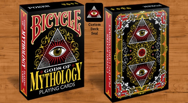
Kickstarter: Bicycle Gods of Mythology Designer Marci Brinker Discusses First Deck Project


Last week on July 17, designer Marci Brinker launched her first ever Kickstarter playing card project - Bicycle Gods of Mythology and it is a powerhouse of mythology and design! The Bicycle Gods of Mythology deck features many different mythological gods and goddesses that have been used in stories for thousands of years.  Unlike most deck projects, Marci was extremely ambitious and designed every single card of this 56 set before the project was launched. She also had the design approved by the United States Playing Card Company, which means if funded the design is good to go to the presses.

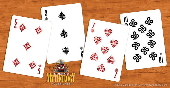
The artwork is 100% custom and was extensively researched to stay true to not only the characters but it also stays true to the playing cards she grew up loving by keeping the color palette and traditional design elements of standard playing cards in tact.  With this project, Marci sought to recreate mythological gods out of the style of traditional Anglo-American court card and she pulled it off flawlessly.


The project will be accepting funds until August 16. If funded, the decks will be set to ship in December 2013.

Tuckcase.com was able to get in touch with Marci to ask her about her design process and career along with the idea behind Bicycle Gods of Mythology. Read further to learn more about this incredible project directly from Marci....

Tuck Case: Can you tell us a little bit about your design background?
Marci Brinker: I've been drawing for as long as I can remember and I was always working on paintings or other art projects when I was in school. I studied graphic design in college, but ended up getting my degree in technical theater/scenic design instead. It still involved a lot of design and illustration because I had to do sketches and final renderings of the sets, along with scenic painting. I worked in a professional theater for a couple of seasons, and the opportunity came up there to move into the marketing department where they did all of the promotional materials for the theater. This was the late 1980s, and I had never used a computer before! It was early in the desktop publishing era, so I had to just dive in and give myself a crash course in it. They took a chance on letting me move into that position, provided I could get up to speed on the Mac, so I came in every day for about 2 weeks during the theater's summer hiatus and learned to use my first Mac. After that, I moved to Florida and designed t-shirts for many years and I learned how to use Illustrator and Photoshop then. Later, I worked in theme park design, did package design and marketing materials for an educational toy company, marketing for an engineering company, and now I do package design and product development in the craft industry. It's been a circuitous path!


Tuck Case: How did you come up with the idea of Gods of Mythology?
Marci Brinker: A few years ago, I was feeling burnt out from a corporate design job that I didn't like, and I was even thinking about changing careers. I realized that even if I did that, I would probably still be drawing and designing in my free time, but making art for myself because I wanted to do it. I wasn't doing that at all then because it was the last thing I wanted to think about when I got home after doing it all day, but it's different when you're doing it just for yourself because you have the freedom to do whatever you want. I ended up changing jobs, but not careers, and I started drawing more in my sketchbook and carrying it around with me more. I also kept a running list of ideas for art projects or miscellaneous ideas I had so that I wouldn't forget about them while I was working on other things. It's tough to stare at an empty page and have no idea what to fill it with, so keeping a list gave me lots of places to start each time I had a new empty page. One of the things on the list was "design a deck of playing cards" because I could remember looking at court cards as a kid and thinking I'd like to be good enough someday to be able to design something so detailed and intricate. It's also a unique design challenge to come up with that many different card designs which each have to stand on their own, but work together to give the whole deck a cohesive look, not to mention having each of the suits also hold together as a family.

I was working on a different art project, which was to do some illustrations depicting scenes from Neil Gaiman's novel "American Gods." It's one of my all-time favorite books - it has mystery, it's dark and sometimes tragic, but also funny at times, and it has some of the best characters and most memorable scenes I've ever read. The story involves gods and other beings from ancient and diverse mythologies living among people in the modern world. Out of curiosity, I looked up some of the myths about the characters in the book, and it suddenly occurred to me that mythology would be a great subject for a deck of cards. The deck doesn't have much to do with the novel, really, but that's where the seed of the idea came from. I still plan to pursue those paintings, but I jumped right into designing the deck after the idea came to me.

Mythology has always been interesting to me because so many cultures have used mythology as way to look at, or to explain, the world. There was a documentary series on PBS called "The Power of Myth" and it was Joseph Campbell and Bill Moyers talking about mythology, storytelling, and the hero's journey. Campbell tied in modern storytelling with mythology and used "Star Wars" as an example of the classic hero's journey, and he showed how mythology is around us all the time.


Tuck Case: This deck has a lot of history behind it, what kind of research went into designing this deck?
Marci Brinker: I spent quite a bit of time early on just looking into the mythology and writing down lists of which gods and which mythologies might work best. I think I initially considered just doing Greek gods, but then I thought it could be a lot more interesting to choose 4 major fairly well-known mythologies so that each could represent a different suit.

It seemed like a no-brainer to use Greek and Roman mythology because a lot of people are familiar with them. Norse mythology was a given in this case because the character I wanted to do first and foremost was Odin. I read a lot about his mythology when I was reading "American Gods" and he seemed really interesting. Egyptian mythology seemed like another that people know to some degree, and I've always liked the symbols associated with it (like the scarab and the ankh). So after I knew which mythologies I wanted to do, I started making lists of which gods would fit in. The Kings were the easiest to pick, because a lot of myths have some sort of hierarchy among the gods already established. I broke away from it a little on the Romans because I thought Zeus and Jupiter were too similar and Neptune allowed for more interesting details (like the trident and the the fish and seahorses). There were many different possibilities for the Queens and the Jacks, so I had lists of them and did research to figure out which ones would be the most interesting to do.

After I finally nailed down which gods to use, I gathered some imagery to help with physical characteristics. I decided early on that I wanted to do the art in the same graphic style that you would recognize from standard playing cards, and I also decided to keep the color palette pretty close to that, with just a few additional colors where I needed them. I knew I could choose to do any art style or color palette, but I wanted to pay homage to the decks of cards I had always remembered and admired from the past.

Tuck Case: This deck is extremely detailed and even showed up on some forums months ago. Now that it is launched and every card is designed, how long did this entire process take?
Marci Brinker: It took quite a few months. Since I work full-time, I often work on art projects in the evening, and of course regular life responsibilities sometimes intrude on that time too. I started doing the research for it around September of last year, and I did some rough sketches then. I had finished the courts and the original backs and posted them on Behance, DeviantArt and on my website in December. I wasn't sure if anyone would be that interested in them, but I like posting my projects just as I like looking to see what projects other people are doing. I didn't really have a plan for getting them printed and hadn't thought about it that much.

Over the next few months, I started getting some comments and emails from people wanting to know if they could buy them or suggesting a Kickstarter project or HOPC submission. I started to think that maybe I should look into it. I decided to go back in and design the jokers, the pips, and the tuck box. I also redesigned the back of the cards so that I would have a complete design finally. That way, if I could find a way to have them printed, they would be ready to go. That was in March of this year, and between doing some cleanup work and some revisions on all of them, along with the new designs, it was probably late May or early June before they were all done.

Sketch of Loki (Joker) courtesy of Marci:


Tuck Case: You posted on The Discourse forum how you submitted the deck to HOPC, Ellusionist and Theory 11; did you ever hear from them regarding the submission?
Marci Brinker: I did submit the designs to all of them, but didn't hear back from them. I'm sure they get lots of submissions, and they all seem to need about a month of review time - if you haven't heard from them after a month, you probably won't hear anything. I worked on finishing the deck while I was in a little bit of a holding pattern, waiting to see if each one would respond. I also used the time to start researching the Kickstarter process as it became more and more clear that I probably would need to go in that direction. I think it was probably just not the right fit artistically for any of them, or maybe not the right timing, but it was worth a try. Kickstarter initially sounded like more than I wanted to take on, but I did a ton of research and I've been watching a lot of playing card projects. I finally decided that I should just give it a shot. So far, it's been a good experience and I really hope the project will be successfully funded. It has been a lot of work, but it would be very rewarding to have it printed.

Tuck Case: Is this your first attempt at designing a playing card deck?
Marci Brinker: It is my first attempt, and it has been a great learning experience and an incredible design challenge. I'm not sure that I'll start on another one soon, but I continue to add ideas for other decks to my list of possible art projects, so you may be seeing more deck designs from me in the future. I think the next one will go a little easier since I've done one already and have a little better idea of how to approach it, but there will always be unique challenges to designing one, regardless of the subject or concept.

Tuck Case: Do you have any favorite playing card decks? Do you collect yourself?
Marci Brinker: I can't really claim to be a collector, but as I've been watching projects on Kickstarter and seeing more and more of the great designs people are doing, I have started backing a few and I think I'll continue to do that. There are so many great designs at places like Theory11 and Ellusionist too. It's hard to single out a favorite because there are so many great ones and knowing how much work goes into them only increases my appreciation. Most recently, I was blown away by Lee McKenzie's Empire deck and also by Jackson Robinson's Federal 52 decks on Kickstarter - the intricacy and craftsmanship on those decks are amazing and inspiring.

Click here to check out Bicycle Gods of Mythology on Kickstarter.

News: Big Blind Media Sets Limited Edition Karnival Gold Release Date

As Big Blind Media releases two of the hottest playing card decks of the summer today 7/19 - The Discoverie Deck and Karnival Elite, they are also gearing up for yet another summer 2013 release. This next release is a color variation of their highly successful Karnival original series. Karnival Gold Playing Cards will be released on August 16, 2013 in very limited amounts of only 4,000 decks. These cards will be printed on the same Bicycle stock and finish as the originals and do not feature any additional changes other than the gold color change.

The original Karnival playing cards were done in all white and black and were released 5 years ago in 2008. The original Karnival playing cards have been sold out for quite some time with no plans for a return.


News: Bicycle Lefty Deck Now Available at House of Playing Cards

From House Of Playing Cards (6/17/2013): 

The Bicycle Lefty Deck is the world's first and only reverse-index Bicycle deck. Officially licensed and printed by the US Playing Card Company, the Lefty Deck is a terrific utility item for any magician.


This deck can be used for unique new forces, peeks, spreads, fans, color changes, and reveals. Lefties will appreciate the ability to perform standard peeks and fans, while righties can take advantage of reverse spreads and fans. All magicians can mix the Lefty Deck with a normal Bicycle deck for interesting forces, reveals, and color changes.

The Lefty Deck offers the classic Rider Back design and tuck case. Each of the faces has been reversed, with the indexes being moved to the upper-right and lower-left corners of the cards. The Lefty Deck is available in both RED and BLUE backs, printed on top-quality Bicycle stock with premium Magic finish for smooth handling and lasting durability.


All Lefty Deck purchases include a free video download starring Kevin Reylek, offering several fun ideas and magic tricks that can be accomplished with this deck.

Click here to see Bicycle Lefty Playing Cards on HOPC.

www.houseofplayingcards.com

Kickstarter: Winter Deck Planned For Early August Launch
First brought to the attention of the playing card industry in March of 2013 on The Discourse Forum, the Winter Deck has been announced by project creators that it will be launching on Kickstarter.com in early August. The coming launch was officially announced on the Winter Deck's brand new Facebook page as well as on The Discourse Forum today 7/16. The deck was designed from December 2013 to February 2013. If funded the playing card deck will be printed by the United States Playing Card Company.

The deck, which is designed by artist Alex Nick, has a theme that revolves around the beauty and darkness of northern winter and centers in on the main character - Her Majesty, Ice Queen. As posted on the deck's Facebook page, here is the complete story behind the deck's theme:
Winter is cold, dark and dangerous in the places where we live. But there is a strange beauty in this danger. Beauty of a hunting predator, deadly but amazing. From the North and from cold and windy Russia, comes the Winter Deck.

Winter Deck is a custom [and] highly-creative deck of playing cards designed by our team. Inspired by freezing tribal images of northern winter, this artwork is called to show you all of its mystic and dangerous beauty.

Every royal card here is a character. Fully detailed, they are not faceless "Clubs King"s or "Hearts Queen"s, they have their own face, thoughts, feelings and history. Their own mind. The inner sense of the characters is described in their totem animals so you can look at their souls unleashed!

But there is one more person in our story. She, who reigns everything when its her time. The one, who can kill or mercy with an only motion. Her Majesty, Ice Queen. Winter. As the main character, she appears on every image of the deck. She touches our heroes, holds them, leads and punishes. Rules them. 

It is not known at this time whether or not the Winter deck will feature the Bicycle name. However, we have been given a look at the pre-launch card design, which show the court cards featuring two different faces, courtesy of the project's Facebook page (Please note these may not be the final designs):


Follow the Winter Deck on Facebook for news and updates of the launch and card design.

Daniel Madison and Ellusionist Tease Madison Scarlet Rounders


Update 6/17: The Madison Scarlet Rounders were released as a free gift with the purchase of Madison's latest instructional video Mechanic

Released by Daniel Madison on his Instagram account late this afternoon, the Madison Scarlet Rounders are confirmed and are coming soon to Ellusionist. The Scarlet Rounders also made an appearance in a series of videos by Ellusionist featuring Daniel that have been playing up a new release that end with the single word "SOON". In typical Ellusionist style, the full release has been a mystery as it has been unclear whether it will be a tutorial, magic production or an actual deck. At this point it could be all three. However, there is a countdown on Ellusionist.com counting down to Wednesday, July 17 at 4PM EST when all will be made available or the time when the mystery will be made clear if these videos only pertain to the deck or if they are for much more.

This comes only a few weeks after Daniel Madison and Ellusionist released the marked deck Madison Dealers.


Here is the image Ellusionist released along with a video where Daniel is using the Scarlet Rounders:


This deck was first teased on Revelations 9 video back in March when the project was being produced.

[post_ad]

Kickstarter: Half Moon Playing Cards Teams Up With US Partner; Set To Launch Bicycle Venexiana


Last month on June 1st, Half Moon Playing Cards launched their Bicycle Venexiana Playing Card project on and along with the new crowd funding site, Jumpstartcity.com. However, shortly after launch, Half Moon called it quits on Jumpstartcity.com claiming the site's system was stifling the project's success.

Because Half Moon is a Greece-based playing card company and is not based in the US or UK, it makes it very difficult for them to launch using the most prominent crowd funding platform, Kickstarter.com. After about a month of figuring out how they would do so, Half Moon announced today on their Facebook page that they would be launching on Kickstarter on July 16 at 10:00am EST.

In order to make this possible on Kickstarter, Half Moon has partnered with a US-based partner who happens to be a good friend of Half Moon's owner and designer and located in Atlanta, GA. Half Moon is still deciding whether the decks will ship from Greece or Atlanta if the project is funded. However, a lot of the extra rewards and add-ons will ship from Greece. This will mean that some backers will receive two packages if the decks are eventually shipped from The States.

Bicycle Venexiana is based on Venetian culture and features an illustrated plague doctor on the tuck case. Since Jumpstartcity.com, Half Moon has changed one design element going from an aged look on the cards to a cleaner soft yellowish background color tone. Half Moon mentioned to TuckCase.com that the aged look did not translate well to the printed version of the cards.


Kickstarter: Bicycle Iron Kings Playing Cards Project Launches


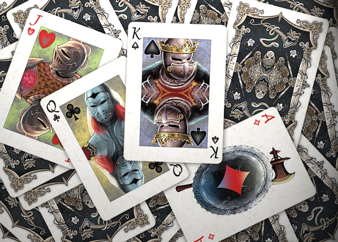
From Xtu Productions comes a new playing card project called Bicycle Iron Kings Playing Cards. The theme of this new project revolves around the time when Kings and other royalty fought for the countries that they ruled. The project's Kickstarter states the following regarding the idea behind the deck:
"Iron Kings' were inspired by medieval tales through centuries, from the times when battles were fought with swords, axes, halberds, crossbows...and armor suit, helmet and shield were necessary equipment for warriors."  

The deck features fully custom colorful illustrations of  fierce warrior kings and queens. The deck has a fantasy type element as the back design and the add-on art cards feature dragon illustrations as seen here:


The project has a goal of $8,800 and will cease taking backer funds in 29 days on August 11, 2013. If funded the project is set to ship in November 2013 - just in time for the holiday season!

Bicycle Iron Kings is designed by artist Johnny Whaam of Xtu Productions. Xtu Productions is the same group that ran the previously cancelled Kickstarter project, Emotions Playing Cards. Emotions Playing Cards were picked up by CollectablePlayingCards.com where it is currently taking pre-orders for a Q3/Q4 2013 release.

Here are images of the deck courtesy of the Bicycle Iron Kings Kickstarter page:


Designers: Joshua M Smith of Altruism Playing Cards


Getting hired for a playing card design gig by one of the more successful playing card companies these days is no easy task. Great designers and their ideas are shelved all the time in this industry. We previously heard about how designer Lee McKenzie's first go at Ellusionist was even shelved. It is the nature of any industry that prides itself on only releasing the BEST designs and companies have no problem turning down or shelving great designers. These companies have excellence in their eyes and do not compromise.

Enter Joshua M. Smith, a tough but humble designer with even tougher skills and designs. Joshua is the man behind the design studio, Hydro74. Although Hydro74 is one man studio, Joshua has worked his way from small design jobs to design gigs for some heavy hitting clients all while giving the finger to anyone trying to stomp his style or hold him back.  Joshua knows first hand what it is like working with one of these playing card companies as he has been through the design process with one of the best in the biz, The Blue Crown. He was eventually picked up for a gig that went on to be one of The Blue Crown's most successful projects - Altruism Playing Cards including the very limited, Altruism Snow Owl deck. Currently, the Altruism Snow Owl deck is on Ebay for double the original asking price.


TuckCase spoke with Joshua recently about his work with The Blue Crown and his design career. Read further to get an inside look at the design studio that has accomplished so much yet is just getting started.

Tuck Case: Can you talk a little bit about your design background?
Joshua M. Smith: I’m a college drop out. I never wanted to be a designer. It was just one of those things that came forth out of spite towards my advisers in college. I went to college for elementary education since I wanted the good ol’ suit and tie sort of job and wasn't smart enough to be a lawyer or a doctor. You have got to love redneck DNA. When I found out I was ‘too punk’ for the student teaching part of the degree (I wasn't, I was just dirt poor and shopped at goodwill before the hipsters took it over), I decided to do liberal arts until I decided what the next choice was going to be. I could of stuck with it and changed, but it was the principle of a Christian college being judgmental without consulting me first that I just had to give the middle finger to.

Long story short - I took easy classes in art, drawing and painting just to keep the GPA up. I then discovered a class called visual communications. The professor was learning Adobe Photoshop at the same time the class was so I really  wasn't learning anything revolutionary. However, after posting some stuff online I started to get a gig here and there. Getting $500 to draw shitty anime characters back in 1997-1998 was kind of a big deal. I ended up dropping out shortly after that when my main adviser suggested I take drawing and painting classes instead of focusing on graphic design. I was perplexed because I knew that those classes wouldn't help me land a job or pay the overpriced cost of this school. In the end, I quit and forced myself to learn on my own. I remember doing shirts for $25 to $50 just to be able to get food. I was also working a full time job at Best Buy.

I stuck with it. Several years and several jobs later (from designer, production artist, art director to creative director), I called it quits on that hustle and started my thing full time. I hate the word freelance since it seems lesser than, so technically, I started up my own company Hydro74. The company is just me but I created an LLC (Limited Liability Company) and pushed forward. I've always freelanced but when I went independent more opportunities came forth with working with Hasbro, Lucas Films, Burton Snowboards, Mattel, Nike, Adidas, The Blue Crown and so on and so forth. Not bad for a college drop out.

Tuck Case: How did you team up with The Blue Crown?
Joshua M. Smith: Alex over at The Blue Crown is a great guy. He hit me up a while back when I went on this rampage so to speak of trying to develop playing card backs. Theory 11 contacted me earlier, which eventually went no where. However, it was fun to work with them so getting an email from Alex was exciting since my mindset was already involved in that style. We went back and forth a few times trying to figure out what to develop and we eventually landed on the owl concept. I wish I invested more time into the actual cards rather than the backs, box and a few other tidbits. However,  something is planned soon with The Blue Crown.


Tuck Case: Why didn't the Theory 11 project work out?
Joshua M. Smith: Not sure, they have pretty high standards and this was the first time trying to figure out a deck. I don’t think I nailed what they were looking for. And if I did, I have no clue what or if anything is getting used. They are a great company and always producing amazingly inspiring pieces so hopefully, I’ll get the offer to re-do and create something epic.

Tuck Case: Altruism is an incredible design and highly sought after in the playing card industry, how did this project develop? 
Joshua M. Smith: That I didn't know. I am glad it got a great response in the field. The concept took a bit to figure out. First, we talked about mystical, masonic and secret society hints. However, since I love drawing owls I mocked up a raw concept and Alex really dug it. There is so much symbolism with an Owl but I always used it as a basis of selflessness. Even though the owl is a predator and an individual, as it goes forth with it’s life there is a selflessness or "Altruism" expressed because the needs become habitual and it’s actions are natural and not about proving anything.

We still threw in hints of different symbolism in the deck, but one thing I enjoyed most with working with The Blue Crown is the fact that they allowed me to make this deck mine. This was my first time doing this project so I’m excited to see what we can do next.

Images of Altruism courtesy of TheBlueCrown.com:


Tuck Case: You posted some playing card back designs on Behance that weren't used, can you talk a little bit about some of the designs that didn't get used? Any plans to use them in the future?
Joshua M. Smith: Those designs came from me just exploring some ideas. I guess it can be considered bait in a way to get The Blue Crown to say "lets do this."  Actually, I love working with symmetry and ornate objects so designing playing cards is a great practice. A few of those designs turned into or will turn into silk screen prints.

Tuck Case: In your first response after being asked to do this interview with us you mention playing cards is an area you are looking to get into more, have you ever considered Kickstarter.com or any other avenues to release your own deck?
Joshua M. Smith: I have actually. One thing that is planned is a portfolio deck. I just wish I was good at marketing.


A lot of illustrations will change on that design, but the goal was to create something I can give to clients that is unique and different but is still all me. It will be something that defines what I’m into but is something that they can use even if they choose not to hire me. It can serve as more of a constant reminder that I am wanting to work with them. Also, it is great for friends and fans of my work. Ultimately, it will show something different than the norm.


My goal with the kickstarter project (if it ever happens) is to create two decks. A design that is just over the top, but also a portfolio deck or a design that shows my work and range as an artist. I also want to make gold coins, silk screen prints and stickers as bribes or add-ons for the backer list. It is just a matter of finding someone to help me put together a video, the right connections with USPCC and moving forward.

Tuck Case: Do you have any favorite playing card decks?
Joshua M. Smith: Yes I do. It is a deck that I got as a kid from my step dad. It’s a set of naked girls. You have got to love that 80’s hair and adult ‘fro'.

Tuck Case: You mention on your website being ripped off or having your work traced by lazy designers, is this something you run into a lot? What kind of advice can you give artists looking to protect their own work from being ripped off?
Joshua M. Smith: Sadly, there isn't much you can do. I’m not a fan of legal since it’s never been about protecting people but protecting people who have money. I come from the old school concept that design has ethics. It is not a religious idea or spiritual standard, but a common core of respect and knowing what you can do and what you shouldn't do. We are all inspired and emulate, but it is the people who directly steal a piece for their own selfish gain. Those people should have their hands broken with a hammer. Well, maybe not that directly, but the lack of ethics in what we do only makes things worse.

My advice is just get a good fan base that believes in you and has no problem calling people out when something is truly stolen. IF it is a higher company then you can take legal action, but good luck with that. Sadly, there isn't much we can do except bitch. It is really a sad state for designers who want to protect themselves.

Tuck Case: What kind of music do you listen to when you design? Any favorite bands?
Joshua M. Smith: My music tastes are all over the place. I tend to always resort to stuff I grew up with. Siouxsie and the Banshees, Dead Kennedys, Front242, Dead Can Dance... I am also into electro crap and classical music if I am in the mood... Most of the time it is just whatever playlist I’m listening too at the time.

Tuck Case: A question I ask all designers, what advice can you give someone looking to design their own custom deck of cards?
Joshua M. Smith: Just do it, do it again, then keep doing it again and again. The more you discover in techniques, the better off you get. Post it online and people will find you. If you have a solid idea, contact them. Eventually, the right opportunities will arrive.

Personally, I wish there was a good site or blog that showed nothing but designs and the designers who did the designs. There is so much history, symbolism, beauty and insight in seeing what people have done before that could inspire something more glorious years to come. The past has built the road, but now it is up to us to honor and respect that road and make it better.

Check out Joshua's design studio -  Hydro74 

Review: Encarded's Aurum Sovereign and Aurum White Gold

Encarded is a staple in the playing card community. It didn't take them long to get there thanks to releases like Aurum. Aurum was launched on Kickstarter in October of 2012 for early supporters and then released to the masses (5,000) shortly after. The deck comes in a few editions with the flagship deck being the purple "Sovereign" edition (4,500 released) and a special "White Gold" edition  also being released in very limited quantities (500). Both decks will be reviewed here on TuckCase.com in this post. There was also a very, very limited release of 90 Aurum Laser Cut edition decks.

To get started here is what Encarded.com has to say about Aurum:
Aurum is designed to be intricate, elegant and fit for the Venetian royalty that inspired it. Every card is intricately designed and features multiple metallic inks and was also carefully crafted to be "purposefully imperfect." The court figures are all based on the familiar Bicycle court but were painstakingly redrawn to have many subtle imperfections and asymmetric features. 

Aurum Playing Cards


The specs:

Name: Aurum Sovereign and Aurum White Gold
Company: Encarded
Release Date: October/November 2012
Stock: Bee Casino Stock
Finish: Magic Finish
Colors: Deep purples, Gold
Face: Standard
Size: Poker

Before we go in depth, most are probably wondering what makes Aurum Sovereign different from the Aurum White Gold playing cards. The only difference in these two decks is with the tuck cases or card boxes. Sovereign features the purple tuck and White Gold features the pearlescent white tuck. As stated previously, Aurum Sovereign was released with 4,500 decks and the Aurum White Gold edition only released 500. The actual playing cards are not different.

On to the review...

The strongest element that both Aurum decks have over every other deck released in the playing card industry are their tuck cases. Aurum's tuck case features gold metallic inks, embossing, custom colors, pearlescent finish (White Gold edition) and custom diecut on the back.

Both tuck case designs features an intricate gold swirling centerpiece design reminiscent of the design/patterns on a Venetian mask.  This centerpiece design wraps around the front to the right side of the tuck case, which forces you to examine the entire case. You are eventually greeted with the unique diecut element on the back revealing the inside of the deck and the actual playing card.   While a lot of today's modern decks feature metallic inks and embossing, Aurum is taken an extra step further by adding the custom diecut element.

Aurum Playing Cards

Although an incredible design style, the diecut feature does leave the actual cards more exposed to the elements so be mindful of that. If you put this deck in your pocket make sure the edges of the diecut do not get caught on anything before you take it out. You may want to use a card clip if you are going to take these over a friend's house for a weekend poker game.

The White Gold Edition features the white pearlescent finish as seen here:

Aurum White Gold Playing Cards

Once you can get yourself away from admiring the tuck case, you will open the tuck case to a deck of 56 cards. The standard 52, two jokers and 2 gaff cards. The back design is a white bordered, purple back with the Venetian swirl design in the center creating the two way design. There is a continuous line that swirls in the background of the cards. This is more of a secondary but up-close design feature found while examining the cards beyond a glance. The background is then bordered by a gold line with an inside shadow. The line work combined with the border creates a depth to the cards that would not be there if it was just a solid purple background to white border.

Notice in the photo below you can see the swirls within the back design of the card:

Aurum Playing cards

The Ace of Spades features a spade in the form of what looks like a Venetian fan. The spade shape is in black with the more intricate design elements of the fan in gold. The spade pops out as the primary design element, while the gold creates the depth and ties the entire design in with the Venetian theme. A downside to the Ace of Spades is that the company's name is located on the card in an illegible small font in gold ink. Since the Ace of Spades also features the continuous line work in the background, it fights with the name. Ultimately, the name ends up getting lost.

Aurum Playing Cards

The court cards are an interesting and exciting bunch. Although the court cards are in the Anglo-American style as your standard cards are, they are completely redrawn and recolored. If you look closely on each court card you will notice that there are minor differences in the faces, hands and dress. All of these differences make these court cards somewhat flawed but it is not a bad thing by any means. According to Paul this subtle design element was intentional. The differences just add to the amount of detail Paul puts into these cards. To the untrained eye, one will not notice a thing but if you are really paying attention to the detail you will be pleasantly surprised by this differences Paul decided to add.

With that, since this deck is inspired by Venetian royalty it would have been exciting to see some of the Venetian masks incorporated in with the court cards. Imagine a King of Spades designed to look like a Medico della peste or Plague doctor!

Aurum Playing Cards

It should be noted that the court cards have somewhat of a wax-like or foggy look to them when compared to other standard court cards. It could be the line work + the matte like appearance due to the finish/stock + the color combos + the grayish background. At any rate, this is not a bad thing but it does not add to the design. It just exists on the cards. With that, the cards are not wax-like by touch or handling.

The number cards were given all new custom pips as seen in the image below:

Aurum Playing Cards

The borders on the pips utilize the same type of line work found on the background on each and every card. This takes the pips from being somewhat standard recolored pips to pips with depth and character. These pips may even make you want to hold onto a 2-7 off suit starting hand in Texas Hold 'Em.  Actually, it may be exaggerated to say these cards will mess up your poker game (that is on you) but it proves the point that these cards are something to be admired. Just make sure you do it when you don't have money on the line.

Here is a close up image of the continuous line work found on the background of each and every card:

Aurum Playing Cards

The Jokers feature two different colored Venetian Jokers that you may find at the Carnival of Venice. This is the biggest tie in to the theme of the deck given that not only do you see the line work but you will also see the elaborate masks that have been famous since the Renaissance.  A very nice touch and a great deck to use if you plan to use the Jokers.

Aurum Playing Cards

The cards handle much like a standard Bee Deck of playing cards. These cards are great for playing poker and various card games as they stood the test of time after many shuffles, dealing and handling. They seemed a bit stiff at first but after a few passes at handling they become more comfortable but they never lost form.

Notes on Encarded's Aurum Playing Cards:

  • Aurum is the latin term for gold. 

  • The Carnival of Venice was actually banned in the late 1700's by the King of Austria. [source]

  •  This is Paul Carpenter's second deck with Encarded. The first deck was the Tendril deck, inspired by the rain forests of Costa Rica.

Final Assessment: Encarded's Aurum is hands down a beautifully crafted deck with subtle elements for the designer type or for anyone that appreciates great design and detail. In other words, this deck holds more than what the average eye can point out. It is simple, yet detailed and elaborate. It is historical, yet in style. Designers should get this deck for inspiration, poker players should bring this out to spice a game up and collectors will want this deck for not only it's limited releases but for it's total beauty. Encarded is hot right now and they are only getting hotter.  Aurum is the deck to have and without it, your collection is incomplete.

Final Score: 9.7

Don't forget use code: ENC7Y52 at Encarded.com for 10% off. Aurum is currently in stock.

Encarded
© all rights reserved
Kardify 2013