Responsive Ad Slot

Kickstarter: System 6 Magic Set to Launch First Deck Project


System 6 Magic, a New York based magic company, is gearing up to launch their first deck project on Kickstarter in the next couple of days. In an Instagram comment on a recently teased image, System 6 noted that the latest the deck would launch would be on Monday or Labor Day.

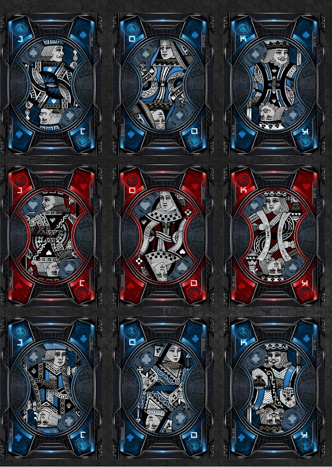
Small parts of the upcoming deck have been teased on their Instagram account and other social media for the past few months but just this past week followers have finally been given a glimpse of full card and tuck case designs. The deck, which currently has no formally released name, features a lot of deep detail and symbols that are reminiscent of the detail and line work found on currency. From a far the detailed design works together creating a "circuit board" effect.

The tuck case does not feature Bicycle branding but the deck will be printed by The United States Playing Card Company.

System 6 Magic is an up and coming magic company that was founded by New York based magicians Michael “Six” Muldoon and Devonte Rosero.

Here are some of the teased images courtesy of System 6's Instagram account:


Designers: Artist Taylor Eshelman Discusses Upcoming Bicycle Tinker Deck


Coming soon to Kickstarter, the Tinker Deck is the creation of artist Taylor Eshelman aka Tesh of Utah. Tesh's Tinker Deck is a Steampunk deck of playing cards that is gear heavy with metal texture and great depth and contrast. Tesh has been blogging about the deck process on his blog Tish Tosh Tesh for most of the year where it has caught the attention of playing card enthusiasts. Although the artwork is still waiting approval from USPCC and could be subject to change based on their requirements, Tesh hopes to launch the project in mid to late September of this year.

This is Tesh's third project on Kickstarter. The first two projects were dice projects. Unsuccessfully funding the first dice project, Tesh came back swinging with a second dice project that funded 2,546% over the original asking goal that just finished up it's funding period on August 25. In fact, the Steampunk deck project is actually an extension of the dice project, which goes by the same name as the deck - Tinker Dice. With a successful project already funded, Tesh is busy working on the dice project as he waits for final word from USPCC.

We were able to catch up with Tesh to discuss his upcoming deck project and the inspiration behind it all. Read further to get the inside scoop....

Tuck Case: On your previous Kickstarter project page you mention you are a technical artist and animator in the video game industry, can you talk more on your design career?
Tesh: My BFA is in computer animation, and I've always been interested in games and game design. I work as a technical artist, dabbling in design a bit, but on my own, I design games and do game-related art. As a youth, I wanted to design video games, but purely as a practical matter, these days the design I do on my own in my spare time is for card and board games. I have several full game ideas, but it seemed prudent to get my foot in the door by offering artistic variations of existing games, hence the dice designs and playing card designs, then work in my own designs once I have some more people to bounce ideas off of. Even before that, I was offering custom art, some game-related, via Zazzle, just as a way to make a little money on the side once the creative urge hit.

Tuck Case: Can you give us some background on the Tinker Deck project?
Tesh: I started working on the Tinker Deck back in January of 2013 and first posted about it on my blog.
I'd designed some dice previously, the Gearpunk Dice on Shapeways, and it seemed a natural extension of that sort of "gaming art" ethos to dive into making art for a deck of standard playing cards. I've long been fascinated with machinery and history, so when I ran into the Steampunk world, it seemed like a good outlet for some of the art projects I do in my spare time.

The Tinker Deck grew out of those trends, aided and abetted by a trip to a local mining and semi-ghost town that had some excellent old machinery to examine. It's been through three major revisions and plenty of little fixes since then, and there's always more that I could do, but at some point it just needs to be released into the wild.


Tuck Case: What stock and finish will the Tinker deck feature?
Tesh: The Tinker Deck will be a standard Bicycle deck, with normal Bicycle stock and the "air cushion" finish we see on most decks Bicycle offers. At least, that's the goal of the Kickstarter campaign. If it fails to reach the financing goals, we'll just offer the deck via a Print on Demand service, which would mean different stock and finish. We considered foreign printers who claim to be comparable to Bicycle stock and finish for a better price to make the Kickstarter goal more viable and offer better prices to customers, but ultimately decided to go with Bicycle.

Tuck Case: Is this your first venture into card design?
Taylor Eshelman: This is my first playing card design project, though I've done card designs for a variety of projects that haven't yet seen the light of day. These were other card games, from a TCG to a simpler, single deck game. Playing cards, or at least, playing card collectors, have a different set of design and product elements they like to see, as opposed to a casual family gamer or a TCG player, which is why I made the major revisions between deck iterations and why we're going to offer it via Bicycle instead of other printers.

An older version of the deck is available now at TheGameCrafter.com, but it has seen some great upgrades since then, and if we can make the Kickstarter a success, the Bicycle cards themselves will also be an upgrade, and all for a cheaper price per deck in the end.

It's been a bit of a learning curve, but I've read compelling arguments that collectors are at least one major axis for success via Kickstarter, which is important for leveraging the economy of scale to get good prices. Collectors seem to strongly prefer Bicycle and things like symmetrical card backs and indices near the edges, so I've been happy to take the time to learn what people are looking for and tweak where it makes sense to do so.

Tuck Case: You previously ran a successful Kickstarter for the metal dice, will the dice be offered as an add-on or stretch goal with the Tinker Deck?
Tesh: Yes, the Tinker Metal Dice will be featured in the Tinker Deck campaign. We're going to offer a limited number of a variety of types as add-ons. We're not sure about stretch goals at the moment. We have several ideas, primary among them an alternate deck with "rusted" faces and backs, but it's undecided at this point whether that would be the first (big) stretch goal, or if we'll go with smaller ones and do the Rusty Tinker Deck as another campaign afterwards. It will depend heavily on backer and community feedback.
If we do make Tinker Metal Dice into stretch goals for the Tinker Deck, it will be to get together another "print run" of the dice, but again, which dice out of the mix we wind up doing will depend heavily on the community as well.


Incidentally, we'll also be offering backers the option of "taking over history" and supplanting the portraits of historical figures with their own faces and even costumes as premium pledge tiers. This will naturally introduce another round of Bicycle approval, but we're hoping that it's worth the fun factor.

The Rust Back Design:


Review: Bicycle Expert Back (2010 Heritage Series)

Released in 2010 by USPCC Bicycle, the Bicycle Expert Back pays homage to one of the first ever back designs ever created by the company in 1895, also called the Expert back. The design is extremely similar and often times confused with another back design called the Old Fan back. According to jimknapp.com, "USPCC itself misidentified" the two on another release the same year. The Old Fan back was also re-issued in 2010 on another "tribute" type deck called the 125 Years Anniversary Edition deck.

Bicycle Expert Back

The Specs:

Name: Bicycle Expert Back (2010 Heritage Series)
Company: USPCC/Bicycle
Release Date: 2010
Stock: Standard Bicycle Stock
Finish: Air Cushion Finish
Colors: Distressed/Red Back
Face: Standard
Size: Poker

The tuck case features a vintage or early USPCC issued Ace of Spades with the "Statue of Freedom" design on the front of the tuck. The entire tuck case has a distressed overlay with rustic coloring. This creates an old or worn look as if it were an actual Expert back deck from the late 1800's. From a far this can be taken as such but on close inspection this is clearly identified as artificial and an intentional design element. The distressing looks like a brown tie-dye or marbling up close. Some may even say it looks like coffee spilled on the deck. The distressed tuck case gives the deck a very distinguished look from other standard Bicycle decks. If it were a simple red on white, or off white even, design the vintage or heritage aspect might end up being lost.

On breaking the seal, we are met with 56 cards in total, which includes the standard 52, 2 Jokers and 2 ad cards. The entire deck comes with the same distressed look found on the tuck case. This was predictable. The look is consistently one-way on the backs of the cards (seen below), meaning the distressed patterns that overlay the original two-way back design only go in one direction. This makes the complete back design one-way even though the original Expert back was a two-way design. This is disappointing but it makes sense why USPCC did this as true aging never mirrors itself.

Here you can see the new Expert back with the distressed overlay:

DSC_0537

Seen here we can compare the original 1895 Expert back design with the new and "distressed" Expert back:

Photo courtesy of www.jimknapp.com

The Ace Of Spades continues the theme of bringing back the old design as it features the "Statue of Freedom" design found on earlier decks. It is refreshing to see USPCC keep the vintage theme going beyond the back design. Indices are smaller on the Expert back decks when compared to standard Bicycle decks. Reading these cards can be difficult for some that are used to the larger indices or those with bad eyes. Add the smaller indices plus the weathered and faded distressing together and it can cause even more reading difficulty. One thing to note that is different on the face and number cards is that the distressed element is different on each card. This is a tremendous bonus and shows that the design is not limited by lazy design.

DSC_0540

Moving on to the court cards, we are greeted with standard Anglo-American royals with more of the older characteristics found on earlier cards. Once again we see USPCC carry over the old school theme. One disappointment with some of these cards is that the distressing is sometimes too much. It would have been acceptable to tone down the number of "coffee stains" or dirt on these cards as it overtakes some card designs to the point of distraction.

DSC_0542

Number cards come with smaller indices but the center pips are fatter and boxier than what you get in a Bicycle Standard deck. These fonts and design styles are reminiscent of design capabilities in the late 1800's. The distressing is carried throughout as well.

The Jokers feature black lined playing card kings on bikes with the 808 milestone. A warranty is included on one of the Jokers.

These decks come with standard Bicycle and the embossed air-cushion finish printed in Kentucky. The stock and finishing process has since been updated since 1895....obviously! ;) Handling these cards is very similar to what you expect from a Bicycle Standard. With that said, you may feel as though two standard decks feel different and you would not be incorrect. Bicycle has a range of acceptable paper thickness per stock that they use, which are currently the Bicycle stock and the Bee stock. It is possible that two decks labeled as standard Bicycle stock have slightly different thicknesses. This thickness may not be noticeable to the eye but it is measurable and some with a good touch can tell but overall it is minor.

To show you the Old Fan Back design similarities noted in the beginning of the review, here is the 125 Years Anniversary Back:

DSC_0545

Along with the original Old Fan back:

Courtesy of www.jimknapp.com

Can you spot the differences?

Notes on the Bicycle Expert Back Playing Cards: 

  • These cards were not a one time production. In Fact, Bicycle still produces these decks and sells them on their website.

  • The deck used for this review is dated 2012.

  • Theory 11 sells a Heritage Series set that included 4 non-distressed decks that do not include the Expert Back.

  • Ellusionist sells a Vintage Series 1800 deck that comes with a distressed look.

Final Assessment: USPCC Bicycle does a good job keeping this deck with the vintage theme. It practically screams old, worn and vintage. From the early design elements of the Ace Of Spades and court cards to the original back design that gives this deck purpose, the Expert deck is great for anyone looking to dive deeper into the history of this 100+ year old company. The deck has a few downsides in mainly over distressing or "coffee spilling" that make it too much to take sometimes. The design shouldn't get in the way of practicality. It is definitely something a magician probably won't use too much but it can be a fun deck to break out on a Saturday night game night....As long the distressing isn't too annoying. If it gets to be a lot, switch this deck out with a Theory 11 Heritage deck and shelf this one for the collection.

Score: 8.5/10  

Kickstarter: Inspired By Silent Film A Trip to the Moon, The Méliés Playing Card Project Launches

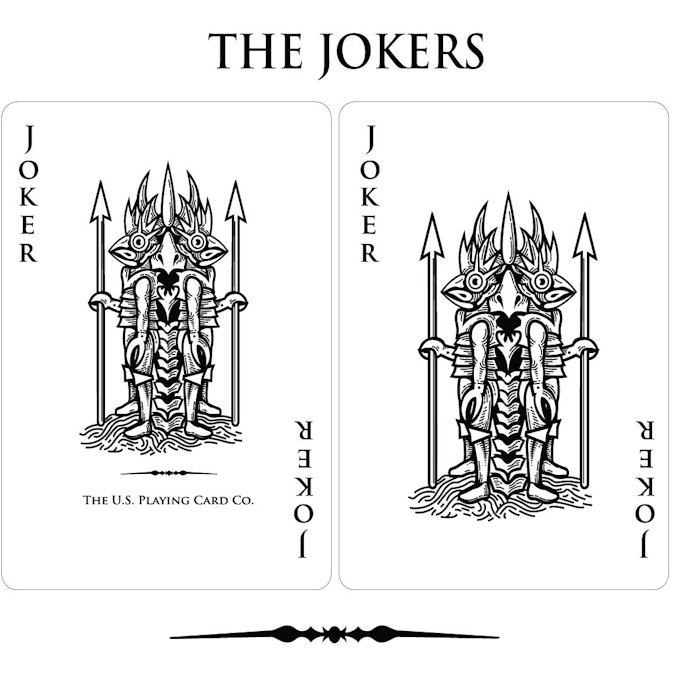
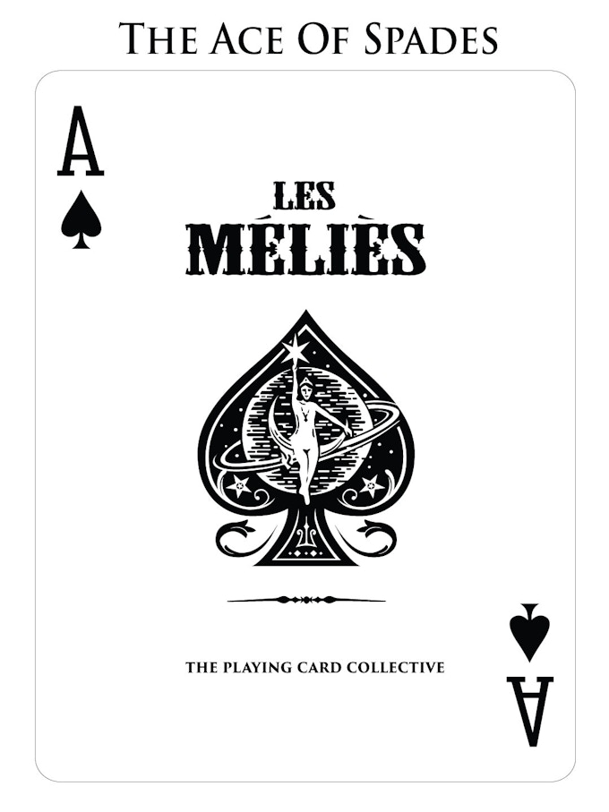
Brought to us by LA magician Derek McKee, the Méliés Playing Card project launched this afternoon on 8/26. The project is completely inspired by the 1902 French silent film, A Trip To The Moon, and even takes the name of it's director, George Méliés. The deck features countless design elements taken from the film including the most iconic "rocket in the moon's eye" design, which is featured as the centerpiece of the two-way and bordered back design.
According to Wikipedia, in the film A Trip To The Moon the plot...
...follows a group of astronomers who travel to the moon in a cannon-propelled spaceship, explore the moon's surface, escape from an underground group of Selenites (lunar inhabitants), and return in a splashdown to Earth with a captive Selenite in tow.

The Méliés Playing Cards were designed by Derek as well as Logan Max, who have both been friends since their early school years. The design took almost all Summer to complete and is nearly finished with only a few details to take care of on the tuck case. Derek plans to utilize the United States Playing Card Company for production. The deck will feature an air cushion finish.

Along with the deck, the project includes many add-ons including posters, t-shirts and even Jamie Grant's Anything is Possible bottles. The project will last another 28 days when it ceases funding on September 26. The goal is set at $11,500. This is Derek's first Kickstarter project.

Click here to visit the project on Kickstarter.

Here are images of the Méliés Playing Card design courtesy of the project's Kickstarter page:


Sticky: Your Contributions


Inspired by the good old days of decknique and thecuso, we would like to build an online community for cardists to discover, learn, share ideas, perform and connect with other cardists around the world.
Obviously we are just starting out and would really appreciate any contributions made to kickstart us. :) We hope we can be an outlet for your creativity and contribute to the elegant art of cardistry.

So, use the Submit button on the menu bar if you have something interesting to share or just want to show-off your awesome flourishes.

We hope to grow this community and eventually be one of the best cardistry community on the www.

Let's spread the word and have fun! ^_^

Kickstarter: The Imperial Deck


The Imperial Deck designed by the House of Playing Cards, is inspired by the beautiful Imperial Eggs created by the House of Fabergé from the late 1800's to early 1900's. Currently only available on Kickstarter, the project has been successfully funded - reaching the funding goal of $10k with more than 20 days remaining. The deck's unique eggs were modelled and rendered beautifully in a 3D software package and each of the four suits focuses on a different style and color palette.


For example, the diamond eggs all have a Nature/Fantasy/Elfish vibe, while the clubs are inspired by Greek mosaics, colors and geometric shapes. The Russian Double-Headed Eagle is the focal point for the hearts and red back eggs, and they also draw inspiration from ancient Rome. Lastly, the spades and black back eggs all have a Baroque/Gothic look and feel.


For the court cards, the designer created a theme to differentiate the hierarchy of Cards- the Jacks are the "Warrior" eggs within each suit. The Queens are simple, elegant and use light colors. The Kings are the most decorative and ornate of the court eggs and contains a "Crown" at the top.

The deck will be printed by the United States Playing Card Company. Along with the deck, a 20-Page Collectors Art Book will be available for pledges above $33 - a perfect companion for the deck! Each Book will be hand-signed by the designer, Randy Butterfield.

The first deck is due out to the backers by December 2013.

News: The Blue Crown Announces New Playing Card Release- Nautical Playing Cards

Yesterday The Blue Crown teased us with images of an upcoming deck release but left no details. Today the details came with more information on the deck itself including a release date.

Announced today in an event created by The Blue Crown's Alex Pandrea, the new deck is called The Nautical Deck. Designed by artist Edo Huang, The Nautical Deck boasts a heavy sea and ship-inspired theme and will be available in a red and blue back design with nautical design elements such as boat rope, life preservers and other "nautical" type elements. The deck will also be released in a limited edition white back design, which will come with a limited edition tuck case and new Ace of Spades.

If you need more than the design to reel you in, The Nautical Deck is not a USPCC playing card deck. Being printed in Shanghai, China the new deck will be printed on thin playing card stock with an embossed finish. According to The Blue Crown, "the more they are used, the better the cards perform." This is the first time The Blue Crown has used a non-USPCC printer.

It is not clear whether or not what other card decks use this same stock and printer as the Nautical deck. Although just this summer Conjuring Arts Research Center had their new entity's first release Expert Playing Card Co. Global Titans printed in Shanghai as well. Both releases show a search for new products and quality to provide to customers and fans.

The Nautical Deck is set to be released this upcoming Thursday August 29th at 8pm on The Blue Crown's website.

Here is a peak at The Nautical Deck courtesy of The Blue Crown.


News: Conjuring Arts Research Center/Expert Playing Card Co. Release New Concept for Tuck Case Protection


Often times when traveling with a playing card deck, the tuck case, which is made of a light cardboard box, often times becomes bent, ripped and abused after countless times of taking cards out and putting them away. In fact, simply putting a tuck case in your pocket will more than likely damage the edges and corners of the case. With a damaged and aged tuck case, there are more possibilities and ways you can damage and take your cards out of use before their time.

Help has arrived in a cheaper alternative to a common card clip....

Announced by Conjuring Arts Research Center, the newly formed Expert Playing Card Company has introduced a new way to protect playing card decks with a new concept they call the Pack Jacket. The Pack Jacket is an inexpensive alternative to protecting playing card tuck cases, which ultimately gives added protection to the treasured cards within. Created out of heavy and sturdy card stock, the Pack Jacket is a "wallet" for the tuck case with added and reinforced protection complete with an elastic strap to keep your tuck case locked in place until you want it.

The Pack Jacket comes foil stamped with Expert Playing Card branding with  five different foil stamped colors, which includes black, silver, gold, red and blue. The primary color of the Pack Jacket is black matte.  Pricing starts at $4.99 a pop but bulk discounts are available.


This is the Expert Playing Card Company's second product release this summer since they launched.  The first release was their first playing card release called Global Titans.  With both releases, the playing card industry is starting to get a taste for what is in store from this innovative company who pledges no allegiance to any one printing company.

Editorial: So You Want To Design Some Art Cards?

This editorial or opinion post was basically brought on by our latest deck review, Stranger & Stranger's The Ultimate Deck. 

As of the past couple of days I have been thinking about the concept of an art deck, which is a specific playing card deck style that I feel can use some readjusting. If you aren't familiar, an art deck is traditionally a deck of cards with a heavy, heavy focus on the art of the cards. It goes beyond a standard custom deck and usually each card in the deck features different art. Since I have been a collector, I think the "art deck" is my least favorite type of deck for one main reason: the playing card aspect is almost always an after thought.

As a lover of playing card design, I have always been fond of the rules associated with card design; including but not limited to the following aspects of a deck: two-way design, suicide king and other specific royal cards, indices and pip placement/identification, Ace Of Spades, hierarchy (when a royal court card is designed to look weaker than a 7 of clubs).  A lot of art decks are notorious for slaughtering those rules. The Ultimate Deck doesn't give a hoot about indices or card identification. Sure they put the indices in the right spots but looking at some of the cards I wonder how they even fit in with the design? Stranger & Stranger mainly focused on creating beautiful artwork and it is clear when fanning through the deck that there are cards that are unrecognizable. At the end of the day, if you just want to create beautiful artwork, just release 52 art prints. Why even try to use the playing card format if the deck is going to include cards that are extremely hard to use in play?  I think it is because people think "playing cards are cool, why not combine awesome artwork and playing cards? Light bulb moment."  What they don't get is that they aren't cool if you can't read them or use them. Collectors who do not open their decks may disagree.

With all that said, playing card design rules can be broken but I feel it must be done tastefully, smart or have some historical reasoning behind the rule break. I think it is safe to say that the majority of active playing card enthusiasts feel the same whether they want to believe it or not. A lot of art decks just do away with designing art that leaves room for certain aspects of a playing card that should be kept in tact. They keep everything that isn't essential to a deck of cards and throw away everything they know to be true because "their art is killer." What they end up killing is the concept of a playing card. If you do away with every rule in the book except one, that one rule should be that when all is said and done, you end up with a playable deck....even if it is just going to be in a collector's collection unopened.

Art decks could be some of the coolest decks in all of creation if they were just playable. They are called 'playing cards' for a reason right?


Kevin Reylek Talks Kickstarter and House of Playing Cards

HOPClogo


A couple of days before Randy Butterfield launched his latest project, Imperial, last week on 8/13 he posted a letter regarding the way it would be released. Earlier this Summer it was announced that House Of Playing Cards (HOPC), part of The Blue Crown Network, would take on the full release but in Randy's letter we were made aware that both Randy and HOPC changed directions and Imperial would launch on Kickstarter. This would be the company's first attempt at a Kickstarter project. It was something that came as a surprise as well as a blessing given some of the scams that took place on Kickstarter in the past year. The letter also left some very important questions about the state of HOPC and where they were headed, which you can read here in our response to Randy's letter. After all, the majority of fans felt HOPC was a Kickstarter alternative and vice versa. As mentioned, it was surprising to see them join Kickstarter train but overall, it was a positive response.

When Imperial eventually launched on the 13th, funding  took a steady pace. In less than a week the project reached the funding goal of $10,000. It was no surprise. However, the questions about HOPC still lingered.... until now!  This week we spoke with HOPC and The Blue Crown's Director of Production, Kevin Reylek, about Kickstarter, HOPC and how everything fits together. Read further as Kevin lifts the veil on their world at HOPC, The Blue Crown and you will ultimately learn their thoughts on one of the biggest marketing tools in playing card history - Kickstarter....

Tuck Case: With Randy Butterfield's Imperial Deck being launched on Kickstarter, is this something we will see more often going forward with House Of Playing Card (HOPC) releases?
Kevin Reylek: Additional Kickstarter campaigns from HOPC are certainly not out of the question. Doing the Imperial project with Randy is obviously a sort of testing ground for us.  Depending on how it goes (and whether or not we find [out if] it's easier or more complicated than a more standard release format) will determine if we continue to use Kickstarter in the future.

hopcksmn


Tuck Case: What are your thoughts on how Kickstarter has changed the playing card scene?
Kevin Reylek: Kickstarter has undoubtedly changed the playing card market. It's allowed anyone with strong design skills to offer their art to the community for very minimal risk. Also, it lets the market decide. If a design is weak and nobody wants it, the campaign will not be successful. If the design is great and everyone loves it, it will be a smash. It also helps to eliminate some guesswork. Instead of a creator just blindly running 2.5k, 5k, or 10k decks, they can see how much demand exists and print accordingly.

So for the most part, I'd say that Kickstarter is a good thing.  Naturally, there are some drawbacks. For example, those who are good designers, but lack the business skills to see the project through to the end, or don't have the time/facilities to ship large quantities in a timely manner.  But for a well-organized and motivated individual, it's a great platform.

Tuck Case: Out of the decks that you see launch on Kickstarter, do a lot of them come to you for funding first?
Kevin Reylek: Some decks come to us first, some don't. I would say that a majority of the decks that are on Kickstarter do not come to us first.

Tuck Case: Why do you think some designers opt to try Kickstarter instead of trying to go through House Of Playing Cards for a release?
Kevin Reylek: It could be because the creators have not heard of us, or they simply like the Kickstarter environment. If a creator wants to do a really limited and specialized release with a lot of community feedback, Kickstarter is a good place for that. Others have their own brand/market strategies that they want to pursue.

Tuck Case: Some designers have made mention that they do not get approved or picked for release through House Of Playing Cards, what is the approval process like at HOPC?
Kevin Reylek: We would love to say "Yes" to a lot more projects at HOPC.  At the end of the day, we are one small company, and we can only produce so many designs per year. We get a TON of submissions coming in daily. We have to say "No" to several designs simply because of volume issues. I think if you were to send all of our submissions and divide them amongst us, Dan & Dave, Ellusionist, Theory 11, and Conjuring Arts, we still could not produce them all.

Luckily, we are not the only game in town. People have many different options to produce their decks. Naturally, we love for people to submit their designs to us, and highly encourage it. But if we can't accept a deck for one reason or another, we hope that people will still find a way to share it with others.

Tuck Case: What advice can you give designers looking to submit their designs/ideas to you?
Kevin Reylek: For those who are wondering what to submit, I'd say that they should keep an eye on our site and see what kinds of things we've already been producing. Designs like Americana, Mechanic, Curator, and Ornate. All wildly different, but all equally awesome. We're looking for designs that will make us (and others) say "Wow." We're also looking for something new. A design may be well-executed on a technical level, but just be too similar in theme/design to something else that has already been produced. Generally, we're not looking to re-do what's already been done, we want to break new ground.

Tuck Case: When a deck is submitted and approved by HOPC, who ends up owning the artwork or is this a case by case basis?
Kevin Reylek: Artwork ownership is mixed on the site. If we approach an artist and commission them to design a deck for us (like we did with the Crown deck, Vaudeville deck, and a few others) then we usually retain those rights. For submitted decks that come to us fully-formed, we usually leave the ownership with the creator, and HOPC is simply granted the printing rights for decks. This allows the artist to also produce other related items on the side; like posters, t-shirts, etc....

tbclogo


Tuck Case: Recently, you released the Summer NOC through The Blue Crown Summer Club and then the mass release through House of Playing Cards. How do decide whether to release a deck through House of Playing Cards or The Blue Crown or through both?
Kevin Reylek: Deciding which site a particular deck is featured on depends on several factors. One big factor is who we think a deck will appeal to - magicians or collectors. Obviously there's some overlap there but generally, we find that collectors are into the more fancy, 100% custom designs like Randy's ORNATE series. Magicians tend to be looking for something a little more standard that they can use for all of their effects. A good example there would be the White Aladdins. The special stack and other features that we put into the Aladdins are GREAT for magicians. But a collector could probably care less what order the cards are in.  What other decks we have in the pipeline and where we think they'll fit best are also factors in deciding which decks go on which site - or if they're featured on both.

Ornate deck released through HOPC in 2012. 

ornate


White Aladdins released through The Blue Crown in the Summer of 2013.

whitealaddins


Kevin continues....
Ultimately, we created HOPC as a solution to allow artists to be artists. Some artists want to wear multiple hats and create the deck, plan the marketing, do the shipping, etc. But there are many more who do not want to do that. They want to share their art with the world, but the thought of having to do all of the other "Stuff" can be daunting. We want to raise the bar and push the envelope with playing cards. We originally put ourselves out there to artists as an alternative to Kickstarter, but over the past year and a half, we've realized that Kickstarter does not need to be excluded. We can still provide excellent design and marketing feedback, shipping services, etc, while still offering the community involvement and broad audience that Kickstarter provides.

When I first created the Lefty deck about 4 years ago, I did not have a social funding option, and the minimum print run at USPCC was five thousand decks. I had to fund that run out of my own pocket, and ship all of the decks myself. If an option like HOPC had existed then, I would've jumped at the chance.  I can speak from experience in saying that I do not want to personally ship thousands of decks by myself ever again!

Editor's note: The Lefty Deck was just re-released on HOPC in mid-July.  

Bicycle Lefty Deck


It is interesting to highlight a key point that Kevin brought up - HOPC gets a ton of submissions (answered in question 5) but only a small amount end up on Kickstarter (answered in question 3). Since HOPC does not put out decks on a weekly basis, the new question is - Where are those decks that were not released? The only people that can answer that question would be the designers and people that submitted those designs in the first place. It is a shame that there are means for people to release decks by using Kickstarter but they are not being brought to that market. Kickstarter is extremely "crowded" and it is amazing that it could get even more crowded if these designers moved forward. Some designers move forward but it seems that the majority don't. What does everyone think about that? Does this open doors for new opportunities? 

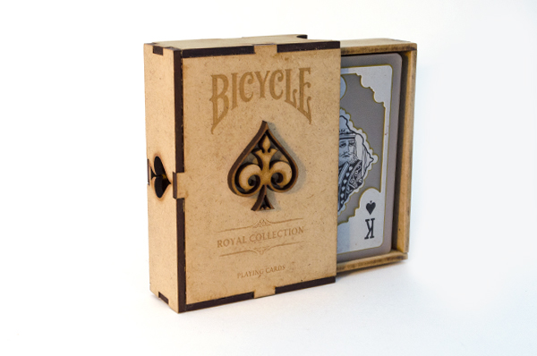
Designers: Bicycle Royal Collection Wooden Tuck Case By Sema Hernández


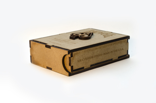
Artist Sema Hernández of Queretaro, Mexico created a wooden tuck case complete with an engraved Bicycle logo and wood cut spade centerpiece. The tuck case, which looks to be built with particle board, is assembled with a tongue and groove style assembly and features a drawer-like compartment for where the cards are placed for protection.

Although the project is titled "Bicycle Royal Collection," Hernández created this tuck case as part of a school project for a special edition packaging assignment. This piece was not commissioned by Bicycle/USPCC and there is no special "Royal Collection" set for releases (that we know of).

Sema Hernández posted this on his Behance.net account in mid-August 2013. Here are more pictures of the wooden tuck case courtesy of Sema's Behance account:


Here is Sema Hernández's  website and professional portfolio - http://semillero.co/

Review: Bicycle White Allure Playing Cards

bicycle white allure playing cards

Bicycle White Allure Playing Cards come from the New Jersey design outfit TPX Designs, which is run by Noel Quiles of Millville, NJ. TPX Designs launched their Kickstarter project on April 26, 2013 for the White Allure playing cards and successfully funded the project on May 25th with 449 backers totaling $17,685. The Bicycle White Allure playing card project is TPX Designs' third playing card deck created through a Kickstarter project. The first project was the Bicycle Genesis and the second was the Allure deck. Bicycle White Allure is an extension of the original Allure project.

It should be noted that TPX Designs is currently running a Kickstarter project for their fourth playing card project called Bicycle King of Kings.


The Specs:  

Name:  Bicycle White Allure
Company:  TPX Designs
Release Date: End July 2013 (Decks started shipping)
Stock: Standard Bicycle
Finish: Magic Finish
Colors: White, Gold, Red, Black
Face: Standard
Size: Poker

According to the deck's Kickstarter page, Bicycle White Allure was brought to market due to demand for a white version of the original Allure playing cards, which was an all black deck.

On to the review....

As seen above the tuck case features a classy white and gold design. It is clear from the start that this deck was originally intended for a darker version as the white version loses key details that made the original Allure pop. The White Allure tuck feels rather bright and lacks contrast to bring out detail that was originally very prevalent on the original. Metallic gold inks or embossing would have possibly done the trick.  While the White Allure strictly uses one light color for the embellishments on a white background, the original Allure deck contrasted with multiple bright colored embellishments on a black background that gave the overall design depth. At inspection of only the tuck case, there is certainly more to be desired in this follow-up release, which seems to be typical of re-colored releases.

The deck features 56 custom playing cards - 52 standard, 2 jokers and 2 gaff cards. With the back design, which is also featured on the tuck, we are met with the same bright, almost washed-out look that the tuck case features. In certain parts the design elements are lost in the background, where they originally popped in the first Allure deck. With that said, the back design is a two-way design with heavenly embellishments. Two harps are featured as the main focal point with many abstract geometric shapes intertwining around a cross in the direct center. The back design is bordered with more abstract shapes similar to those found in a doily or decorative lace.  The design contains many tiny details that takes a close eye to fully appreciate.

bicycle white allure playing cards

The court cards are an improvement as they feature bolder colors, which provides much needed contrast. The royals are positioned in the middle inside somewhat of a frame with a gold to white gradient background. The royals are then recolored and skinned providing the boldest elements on the deck. This is quite the change from the back and tuck case designs. TPX Designs did a good job tying in the overall theme by adding an outside border in the same style that is found on the back design. This border fills out the cards nicely by adding resolve or closure to the design.

bicycle white allure playing cards

The Ace Of Spades features a blacked out Ace with no ornate design or intricate detail within. The style here is refreshing and modest. A  bold but lightly colored abstract floral pattern adds contrast in the back. There is also a very light and subtle floral pattern even farther back in the design that is very unnoticeable unless inspecting these cards very closely. In fact, the camera does not even pick this up. This feature is actually on every card in the deck.  Although this is more noticeable on the original Allure cards, this design element is a very nice subtle and hidden element that finally brings out some depth in the cards. This is one element where we do not want to see it contrast with the background or else the cards would look too busy. Moving on, a stylized "Allure Playing Cards" is written across the bottom of the Ace, which fills out the Ace Of Spades as the arch of the deck. The rest of the Aces are similar to the Ace of Spades without the name of the deck written across the bottom.

bicycle white allure playing cards

The number cards are custom. They feature the same border as the court and aces feature as well as the subtle floral pattern deep in the cards. Although these elements provide consistency throughout the deck, a negative to the number cards are the way the indices and pips were designed with a highlight or glowing border that creates a blurred effect on the white background. They are bold enough that they are not illegible but it is slightly unflattering.

bicycle white allure playing cards

The Jokers are interesting with a leaping angel of sorts that is silhouetted on both cards. Each joker is red and black, which is a nice way to keep things different between the jokers that are often times left the same. The angels keep the theme of "Allure" alive. The Jokers use the classic  intertwined "US" indices. This is a very nice tie in with the standard Bicycle decks. A lot of times custom decks do away with any sort of tie in with the traditional Bicycle deck but it is nice to see Allure keep it.

bicycle white allure playing cards

As mentioned in the beginning of this review, the deck comes with two gaff cards. While one gaff card is a double back that is often times standard with custom decks, Allure also comes with a gaff card that features a blurred out Queen of Spades. This gaff card is extremely impressive as it can be used in a lot of different magic routines. This is the first time we have seen a blurred out card used for the gaff and it is certainly exciting.

bicycle white allure playing cards

White Allure playing cards handle similar to the standard Bicycle playing cards as they feature bicycle stock and a magic finish. They spring nice and work well right out of the box. They will obviously need some breaking in as all decks do but there are no disappointments in the handling or feel department. These cards work and work well.

Notes on White Allure Playing Cards:

  •  With the release of White Allure,  a Limited Edition Gold edition was also released at only 1000 available.

  • While 4000 of the original Allure were printed, only 2500 of the White Allure were printed.

  • The original Allure produced 1000 gilded edged decks that were dropped from the White Allure.

  • All of TPX designs tend to have a religious theme.

  • These can be found at site sponsor PlayingCardz.net for European customers.

Final Assessment:  Overall this deck may fall short for some looking for contrast but it is perfect for those looking for a bright and heavenly design. This contrast issue on the backs could have very well been the intention of TPX, which in that case would make it a non-issue.  Aside from the contrast choice, TPX designs gets points for knowing how to create elegant and classy looking cards with exciting design elements that you don't normally find on other cards. Given the unique gaff card, this deck is perfect for magicians. After all, what is the point of creating a unique gaff card like that if it isn't going to be used?

Final score: 7.9/10

News: USPCC/Bicycle Releases Two New Decks - Bicycle Pluma and Bicycle Table Top

In the beginning of this month, we released news of Bicycle adding four new decks to their product offering.  The new playing cards ranged from a "skull" redux to the summer inspired Peacock deck. Fortunately for playing card collectors and enthusiasts, Bicycle was not done releasing new products. Just this week, Bicycle added two new decks to their arsenal in a huge August release push. The new decks include Bicycle Pluma and Bicycle Table Talk. Both of these decks were teased throughout various online forums but have not been officially released through Bicycle until now.

Bicycle Pluma is a redux from a historical design that the company dug up from the archives. According to BicycleCards.com, Bicycle Pluma '"features a blend of tribal and avian imagery."  Unfortunately, we were unable to source the historical design this was modeled after.


Bicycle Table Talk playing cards are reminiscent of an online tag cloud.  The words used on Table Talk are all the words associated with card games and playing cards - dealer, rummy, poker, raise, fold etc... Bicycle Table Talk comes in two colors - warm red and cool blue.


Photos courtesy of Bicyclecards.com. 

News: Card Experiment Announces Upcoming Release Called Utopia Playing Cards

From the creators of Bicycle Asura and the Babel deck, comes a new project called Utopia Playing Cards. The announcement was made rather quietly on Card Experiment's website and social media in the form of a banner featuring the words "Utopia Playing Cards - coming soon." The banner can be seen here courtesy of the company's website:


Although there are currently no details regarding production, release date or scope of the project; Card Experiment uses the United States Playing Card Company stock and finish for all releases. This will be Card Experiment's fourth major release. The previous releases include Bicycle Asura Metallic Blue, Bicycle Asura Metallic Red and the Babel deck.

Card Experiment is a Hong Kong based custom playing card company that does not release projects through Kickstarter.

Check out Card Experiment on Facebook.

Kickstarter: Elite Playing Cards Launches Bicycle Evolution Playing Cards


With four successful playing cards under their belt, Elite Playing Cards might be the most consistent custom playing card company out there. Not to mention efficient as they are popping these projects out at rapid speed. In fact, three projects were launched this summer alone. The first being Bicycle Majestic, which has already shipped to backers and the second being Bicycle Platinum, which finished funding less than a month ago. The third project and tonight's topic of discussion, is called Bicycle Evolution Playing Cards and launched on the evening of 8/12.

Although Elite's current deck designs range from the traditional Majestic deck to the luxurious Ritual playing cards, they switch gears in the third project by taking us on a futuristic ride.  Bicycle Evolution is an all black design that features carbon fiber and laser sharp blues and reds, which make the whole deck pop in all the right places. Despite being a futuristic design, Elite has managed to fit in the traditional Anglo-American court card designs fit within cutting edge borders that are reminiscent of escape pods on a deep space aircraft.

The project already has close to $5K in backer funds in only a few hours of being launched. Scheduled to take funds until September 11th, if funded the project will ship in December 2013.

Here are images of Bicycle Evolution courtesy of the project's Kickstarter page:


Click here to check out Bicycle Evolution Playing Cards on Kickstarter.

News: Ellusionist Confirms Release of Republic No. 02 Playing Cards


When Ellusionist said there would be no more Sultan Republic playing cards printed again, it was one part bummer for those that missed their chance and another part awesome for those that got their hands on such a limited deck. Although a redesign or reissue of the Sultan Republic was predicted, it was never confirmed a fact by Ellusionist. That was the case until now.... Announced through the Ellusionist Facebook page during the early hours of August 10th, "a complete redesign of the Republic Playing Card series" called Republic No. 02 will be released on August 14th on Ellusionist.com.

In typical Ellusionist style, the first announcement of this deck release was teased on Facebook and other Ellusionist social media in the early evening of August 9th with a special promo photo.

The second announcement confirming the release came complete with a teaser video and special landing page on Ellusionist.com that can be found here!

Although there are no actual images of the cards available just yet, the teaser photo certainly alludes to a white/lighter deck. However, this can all be smoke and mirrors in order to keep fans on their toes until the actual release!

A review of the original Sultan Republic on TuckCase.com was posted in late May.


Revealed: Playing Card Designer Randy Butterfield Issues Letter Regarding Imperial Deck Release


In a letter posted on The Discourse (AetherCards.com) playing card forum this evening, playing card designer Randy Butterfield issued a public statement to all playing card fans and supporters regarding his upcoming Imperial Deck release. TuckCase.com is publishing the following letter that was posted that details recent changes with the project, which was intended to be released solely through The House Of Playing Cards (HOPC) as it was exclusively released in a story on TuckCase.com early in June. Read further to understand the changes to the project directly from the project's creator as well as TuckCase.com's response to the changes....
Hello Everyone,

In a few days the Imperial Deck will be launched as a Kickstarter project with myself and HOPC! I figured some people on the forums might have some questions/concerns with HOPC being involved in a Kickstarter campaign, so I wrote this up in advance to explain our reasoning.

The decision to take the Imperial Deck to Kickstarter was mostly due to the rapidly changing marketplace for custom Playing Cards. Other factors included a behind-the-scenes change I cannot elaborate on further and the idea that a unique and artistic design like the Imperial could do very well on Kickstarter. When the original Ornates were released last August, Kickstarter Decks were popping up at a much slower rate than they are now - just one year later. 2013 has seen an explosion in Kickstarter success stories in the Playing Card world.  I think it has altered the way ALL of the Card and Magic companies handle new Deck releases. Kickstarter Decks that do well have a HUGE advantage with the 30+ days of funding, that is essentially a long Pre-Order period!

I will admit that a small factor for my part in the decision is ego. I've watched closely this past year as beautiful Decks have done extremely well on Kickstarter. It has enabled designers like Encarded, Uusi, Jackson, 4PM and others to assemble a large fan-base and receive critical recognition. Watching the success of the great Kickstarter Decks is almost like sitting the bench, just waiting to get into the game and give it your best shot!

It's my opinion that the success of Kickstarter Decks has made it hard for companies like HOPC to entice some of the talented designers. Designers who choose to take the roll of the Kickstarter dice instead. We're trying out a unique way to release the Imperial Deck by having a Kickstarter Exclusive Black Bicycle version that won't be available after the KS project is over (and won't be offered to resellers at reduced prices - in order to keep the exclusivity viable). The Red "Base" version will be available in the Kickstarter project and will be added to the HOPC catalog after the Pledge Rewards are all mailed out (with a price point of $9.95 + Shipping).

If the Imperial campaign is successful, the Co-HOPC Kickstarter project mold could be a great way for designers to release their dream Deck with the best of both worlds: The unlimited potential and exposure of a Kickstarter project + the stability of partnering with HOPC to handle the shipping and production roles, and later adding the Deck's "Base" design to the HOPC catalog.

The current landscape of Kickstarter Deck fulfillment is either hit-or-miss. HOPC's involvement in the Imperial campaign makes it a sure thing that the Pledge Rewards will go out to Backers as soon as they're ready. Just look at some of the failed or late KS projects and tell me having an established distributor like HOPC doesn't provide an extra peace-of-mind!

During the campaign we plan on having some fun with voting by Backers, similar to what other campaigns have offered. We will also have a couple other cool items available besides the Red and Black Decks, some meaty Stretch Goal items are planned out and we will have some Early Bird reward levels.

Here's a few images from the KS presentation, including a look at the the Black Bicycle Imperial Deck!  


Thank You, Randy Butterfield

TuckCase.com Response:

This came as a surprise at first but given the parties involved and the success they have seen with other releases, it is actually quite refreshing and validates the idea of crowd funding as a source for a buying (err, funding) playing card releases. With that said, change is hard but I'd say going with Kickstarter was a good move regardless of what happened behind the scenes. I am confident the deck will get funded and Randy and HOPC will deliver on their word.

However, Randy's letter paints an interesting picture that makes us wonder what is in store for the future of HOPC and how they will release playing cards from now on. Heck, it makes me wonder about playing card releases industry wide given the bump Kickstarter has received this year. The playing card industry is filled with many creative minds and a lot of possibilities but we are definitely learning that the "crowd" is powerful. This year alone we have seen over 1 Million dollars go to Kickstarter playing card projects! In fact, we have seen one single project earn over a half a million dollars in funding. We have also seen the dark side of Kickstarter as certain projects turned out to be nothing but scams and rip-offs.  Randy is right when he said that "The current landscape of Kickstarter Deck fulfillment is either hit-or-miss." There needs to be more accountability.

Despite the negatives, the crowd funding model is proven. If there is one company that is definitely in the "publishing house" of playing cards it would be HOPC. That is the main reason they formed the entity. If Randy's Imperial deck proves a success, will HOPC strictly release through Kickstarter/crowd funding going forward? Will HOPC eventually change their site model? That would definitely be interesting but right now only time will tell. Who knows maybe we will see all the big companies pulling for the crowds on Kickstarter.... or even launching their own crowd funding platforms creating a better and more reputable source for custom playing cards. Whatever comes of this, the whole idea of crowd funding becoming the norm for buying cards isn't a far cry. As Randy said to me in an exchange we had "Hell, even Spike Lee is on Kickstarter now!!"

The times are exciting!

- Scott

Kickstarter: Former Marvel And D.C. Comics Artist German Garcia Puts Talent On Display With ZOM-B-GIRLS Playing Cards

Editor's Note: I originally intended to publish an interview with Justin from ZOM-B-GIRLS but the interview was posted earlier than intended on The Discourse Playing Card Forum. Check it out here. Since it was published, I wanted to switch gears a bit and focus on the art behind the cards.

sample cardsLast week on August 1st, Justin Hussain launched his first Kickstarter campaign called ZOM-B-GIRLS Playing Cards. Zombies have certainly made their way on to playing cards in recent years. In fact, USPCC/Bicycle has already released two zombie decks within the last year. However, Justin and the rest of Team Zombie have decided to do something different. Justin's zombie playing cards marries the trendy new zombie theme with the pin-up theme of the past that was popular on playing card decks in the 1950's through the 1970's.

The project combines a little bit of the old with a lot of the new as the entire deck is 100% drawn and illustrated in a comic book style of art by multiple artists. Team Zombie's creator and project lead, Justin Hussain discussed with us that it wasn't an easy process finding the best talent for his project. Justin went through a grueling 40 interviews in a process that goes back 6 months before settling in with the best artists for this project including renowned comic book artist, German Garcia.

Hailing from Spain, German Garcia is a highly talented illustrator, who can count working for both Marvel Comics and DC Comics among his career highlights. While an excellent penciller in his own right, German is lending his talents as the principal colorist of the project.

Here are some images of German's comic book art courtesy of Marvel and D.C. Comics:


Team Zombie shared with TuckCase.com multiple process sketches and color photos that have been worked on by German as well as the project's other artists, Robert Elsmore who works as an illustrator and Illias Dante who works as a second colorist.

talking heads vectorized art

survivors first concept drawings

card backs from sketch to finished

icecream girl from sketches to finished

zombieking from sketches to finished


The decks are not going to be printed by USPCC but the UK based project will be using high quality German Black Core playing card stock with an embossed linen finish. The stock is associated with a mainland Chinese company called Shenzhen Wangjing Printing Co., Ltd., which mainly prints playing cards for Asian casinos and promotional use.

Going with an overseas printing company is not new to the custom playing card industry, just recently Conjuring Arts Research Center launched The Expert Playing Card Company who printed their first release, Global Titans, overseas in Shanghai.

ZOM-B-GIRLS Playing Cards project will be in funding for another 27 days when it ceases on September, 5th.
© all rights reserved
Kardify 2013