Responsive Ad Slot

Review: Plugged Nickel Playing Cards Prototype


Review by Joey Heininger of theflush.com.au

I’m an Aussie, we have some of the best beef in the world and it is all sans Mad Cow. I love me some steak, and that’s the point I’m trying to make. When I got my hands on this deck I immediately felt like I was at one of those rustic steak houses, you know the ones, with the dimly lit booths and the licence plates on the wall and some race car driver no one has ever heard of has donated his race suit that now proudly hangs over the bar?

Plugged Nickel, is that deck, that deck that doesn’t take itself seriously, that deck you would use if you were having a steak and poker night with the boys.


This is just the prototype so not all is as it will be in the final print, but it gives us a good indication of what is in store. What is in store?

The art is simple while being detailed enough to get the ambience across to its audience. One may mistake himself to be on the edge of a Texan highway sifting through road kill with all the skulls of dead animals and barbed wire that adorn the deck. The number cards have custom pips, perhaps a bit too small for my bad eyesight, that all sit over a custom background.


The art is subjective, some are gonna love it, some are gonna hate it, check out the pictures for yourself, bearing in mind the colour is not quite right due to the prototype printing method. We aren’t looking at a masterpiece here, but it has a quaint charm and will in fact really appeal to the right audience.

[Update] After writing the review, the chosen printer has been changed from Liberty to the USPCC. This will greatly change this deck for the better.

What we were really asked to look at was the chosen printer, Liberty Playing Cards of Texas USA and their stock and handling. Is Liberty Playing Cards going to knock USPCC off its smug high horse? No; there is a reason Bicycles are the most recognised playing card in the world, but that isn’t to say we don’t have a fine deck of cards here.


The stock is thick and rugged and feels like it could last a thousand hands of poker, but alas it just isn’t great for card handling. Truly skilled hands will not have any trouble manipulating this deck to do his bidding but straight out of the box I was a fumbling mess, and as I have to pass this deck along I couldn’t truly break it in. They have a texture similar to the USPCC Air Cushion, but clump slightly. I see them clumping badly after a little use, especially, if like me you live in a humid climate.

But! I don’t really see this deck being overly appealing to the magic / XCM market. This deck would however really suit the good ol’ boys drinkin’ Bourbon and shootin’ the bull over a game or two of Poker and to a lesser extent, Go Fish, and for this I think Liberty really do offer something better than a great deal of those cheaper card producers do.


If the USPCC was a ten year old port barrel whiskey, the MPC would be cheap supermarket beer… that would make Liberty a Bourbon you have to mix with a coke to drink.

If you see this deck for sale and you know you have a poker game coming up, go ahead, grab it, your buddies will enjoy the difference from the run of the mill French courts, but if you are looking for the next deck to wow you audience in a dazzling display of XCM dexterity, grab a deck of Aristocrats instead.

Plugged Nickel printed by Liberty Playing Cards gets five and a half out of ten race car jump suits.

This review is written by Joey Heininger for kardify. No part of this review can be reproduced without written permission from the author. You can check out Joey's Australian based online playing card store at theFlush.com.au Use discount code KARDIFY to save 10% for orders above $50. 

Also big thanks to Eli Retschlag for providing the photos for this review. Check out Eli's review of the deck below and for more reviews and cardistry videos checkout Eli's youtube channel.


Deckstarter: 7 Questions with Aaron Draplin of Draplin Design Co: Thick Lines Edition


Earlier this month Deckstarter was launched at HOW Design Live Conference in Boston. During the conference the Buck twins handed out show bags containing the launch edition playing cards of Deckstarter to each attendee. One of the eye-catching deck is the Draplin Design Co. "Thick Lines Edition", designed by Aaron Draplin himself.

Aaron Draplin is a spirited, straight-talking designer, creating iconic designs which are both exceptionally clean and timeless. He has built an impressive roster of clients, including the Obama Administration, Nike, Adobe, Lego, Burton Snowboards, Wired magazine and Incase. You can checkout his work at draplin.com

We had a chance to talk to Aaron about his design background, his work, designing the Thick Lines deck and his advice to aspiring designers and artists.


Could you introduce yourself to our readers? What is your design background?
My name is Aaron James Draplin and I’m 40 year old. I make logos, icons, catalogs, DDC merch, wild posters and a little memo book company called Field Notes. I’m from Michigan and as soon as I could, moved West in 1993 to be a snowboarder. Got out here, lived like an animal for five winters riding all over the west, then got a design degree in Minneapolis. Did a couple years in Southern California working for Snowboarder magazine, finally getting rescued back to Portland in 2002. Did a couple years with CINCO here in Portland, and went out on my own in 2004. Haven’t looked back since!


You have a design studio, run a blog (since 1998) and also your own line of products. How do you find the time…
I make the time. Just that simple. This stuff means something a lot me, and I take my output very seriously. All the bellyaching and what not I hear about people “not having enough time” to do what they want, well, I’ve just never indulged in that sh!t. If I want something, I fight hard to make it happen for myself. Might be small, might be wobbly, but it’s still mine. No boss or pressure system is going to tell me “No.” Who needs those turds? I’m trying to invent my own f       life, and so far, so good! Fingers crossed that I make it to 41!

... and what are some of the most memorable work you have done?
Records! Vinyl is the best. I’ve had the honor of making records for bands I love over the years. The one that rises to the top is the first record I did for Richmond Fontaine. They are a local Portland band, and damn, I’ve loved them for going on 19 years! And then you get to work on their record? It’s mind-blowing. You fret EVERY detail, cuz damn, all those little pieces matter. I’m just so proud to be able to help out on something I love so much, you know? Recently I got to do the Old 97’s record “Most Messed Up.” Super fun. I’ve been listening to those guys since the mid-90’s, too! Got to meet Rhett and roll up my sleeves for them. Other favorites: Danava, Megafaun, All Tiny Creatures, Casey Neill, Chuck Prophet, Man…Or Astro Man and Dawes!

The Draplin Design Co. Playing Card Set: Thick Lines Edition will be your first playing card deck. How did you and D&D end up collaborating together for Deckstarter?
I got a call from Andrew at The Dieline offering a chance to make a set! Took me about five seconds to make up my mind. My own damn card set? How could anyone say no? I've been a fan of The Dieline for some time, so the chance to collaborate instantly sounded great. We inked a deal and I got down to work.  


Can you describe the DDC Playing Cards: Thick Lines and why you’re passionate about it?
I’ve just seen so many incredibly intricate sets out there, and man, I love that stuff too, but, I wanted to make something that felt oddly “off.” Like, big, thick lines that just feel good in your hands. The idea that there’s a table full of players, and those big, colorful thick lines are sort of lighting up the place? That was the start. We can always use more color. And of course, being the nerd I am, I had to make my own set of icons, and that turned into diving into the face cards! You make one, all fired up, and quickly realize, Sh!t, there are 15 more! Ha!  

What was your most brilliant breakthrough when designing the deck?
Damn, that make me sound so official or something? Honestly, it was a slow burn. Just this fun buzz of knowing the sum of the parts were better than any one card or element. I just wanted people to hold them and get little surprises? Like with the JOKER card? Just wanted me to go, Oh damn, that’s cool! Little reactions. Cards are cool. I love playing old-fashioned solitaire and stuff. They just feel good in your hands. There’s an earthy, human quality to them. In an iPhone/IPod world, more and more sh!t is some little digital flick or whatever. These make you savor that simple quality of having something pleasant in your hands.  


What are your favourite playing card decks? 
That “Animal Kingdom” set by Hatch is incredible. Love the hand-drawn quality. The Monarch sets are beautiful! Every detail is considered. I appreciate how they own each little detail. Seeing those for the first time really blew my mind. They really respected the tradition of the “ornate” card design. A new, respectful take on it. And now that I think about it, I really blasted that to sh!t with my my set. Ha!  

Thank you so much for indulging my questions. Do you have any other words of wisdom for other aspiring artists and designers?
Of course! I’ve always got words for the youngsters coming up! Here’s a little list.
01. Keep the sh!t fun. Work is work, but play is play. Design should be fun! Meld the two!
02. Never ever ever ever stretch type. Don’t do it.
03. Pay those taxes! Uncle Sam won’t budge on that sh!t.
04. Be an inventor. We forget this one. Dare to dream, and then act!
05. Call your Mom and Dad each day.
06. Things to stay away from: Clip art, texting while driving and Guy Fieri.

Awesome! Thank you for your time Aaron!


The Draplin Design Co. Thick Lines Edition is available on Deckstarter for $25. For a higher pledge, you will get a limited edition How Design Live Edition of this deck in a custom MagicPak. Think Lines will ship as soon as funding goal is reached.

Kickstarter: 7 Questions with Soleil Zumbrunn of Glitch Playing Cards


Glitch playing cards is a unique set of playing card deck that combines radicalism and classic design that we all are familiar with. Skillfully crafted by Swiss designer Soleil Zumbrunn, these cards are visually direct and intense due to it's opposing colors... giving it a sense of distortion. It might not be everyone's cup of tea but this exceptional deck has been meticulously put together.

We caught up with Soleil for a quick chat about her design background, the inspiration & design process behind Glitch and Kickstarter.

Can you tell us about yourself and what is your design background?
I'm from Switzerland and now live in San Francisco. I studied at School of Design Kolding, in Denmark, under the Communication Design department, focusing mainly on interaction design, methodologies and processes. The majority of my work has been video / video installations and print work. You can check out my work on my website.


This will be your first Kickstarter project. Why Kickstarter?
I love how Kickstarter works. It is a great platform for finding like-minded folks. After telling my brother that I'd like to get the cards produced he mentioned that there are other card creators using Kickstarter to get it going. So now I am trying my luck as well.  

What is your inspiration behind Glitch Playing Cards? How did you come up with the idea?
I've always been interested in distortion of reality. I started exploring it with my first glitch project a couple of years ago, where I used datamoshing to censor a person. I felt it gave the viewers a very visual barrier that something was out of the norm - something wasn't quite right. I liked how people reacted to it and since then I've worked on several projects where the surrealistic effects break emotional norms and patterns.

A common object, like playing cards are the perfect medium to bringing that concept into the analog world.  


How much time did you spend working on the deck? Also, can you briefly go through the evolution for one of your unique card designs?
I've been interested in and working with glitch art and anti-aestethetics for years. I feel like I've been working on the deck for months. It took a long time to get every card right, as I wanted the deck to be playable, while making every card unique and interesting in its own way.

The first step was slicing and dicing up old decks I had laying around. I like to work with my hands to get a project going, to really get into that flow of play.

There are some process images (example below) on Kickstarter that illustrate the whole procedure. Once I decided on the right style for a card I brought it in to Adobe Illustrator to refine the design and finish it up.  


From the project page, what are a few of your favorite reward levels and why?
I tried something new for the early bird rewards. A "pay as you wish" level that gave backers complete control over what they thought was a fair price. It was a very interesting experiment and I was positively surprised how almost every single backer pledged considerately!

I'm really excited about the uncut sheet and I think it's become one of the more popular rewards!  

Playing card projects on Kickstarter has grown exponentially over the past few years? What are your thoughts? 
I think it's fantastic that playing cards are doing so well on kickstarter - it's great for us designers that we can reach out to collectors directly without going through a traditional card distributor. A niche concept like glitch would be very to hard to pitch to a printer directly :)


Finally, what are your favourite playing card decks?
Actually my favorite playing card deck is the standard Bicycle rider back, because it’s a design classic. I also really love the decks by Uusi - especially the Pagan deck with its beautiful craftsmanship.

Thank you for your time Soliel and all the best! If you like what you’ve read here and want to support the Glitch Playing Cards, you can find it on Kickstarter here


Glitch Playing Cards will be printed USPCC. Pledge starts from $15 and there are multiple add-ons available such as t-shirts and the popular uncut sheets.

Deckstarter: 7 Questions with Dan Buck


At the end October 2013, a collaboration between Dan and Dave and Alejandro Portela was announced on Art of Play's Facebook page and this has generated quite a buzz around the community... both positive and negative. Deckstarter has been promoted on various social media outlet as a funding platform for custom designed playing cards. After months of speculations and radio silence, Deckstarter was finally launched in Boston at the HOW Design Live Conference.

We managed to catch-up with Dan Buck to talk about Deckstarter, how it came about, how it works and the future of Deckstarter.


There are many speculations around the community about Deckstarter. Can you tell us a little about Deckstarter?
We came up with the idea of DeckStarter after talking to many people that tried to "self-publish" their own deck of cards without knowing what they were getting into. If you ask anyone that tried, they will probably tell you the nightmare that it is to print, promote and ship out the cards. Most of them dedicate months to see little to no return on all the work they put into it.

How did you guys come up with the idea?
We wanted to offer a more accessible way for artists to turn their artwork into a deck of playing cards, specially to artists outside of magic, cardistry, and card collecting. We wanted to make it hands-off for them. Just send us your graphics and we will handle the rest.


That is a very good concept. So, how does Deckstarter work?
Deckstarter is a crowd-funding platform for playing cards. We hand pick the best projects that get sent to us and if we think they are a good fit, we feature them on the website. People make pledges on the decks of cards they like and if the funding goal is met, production begins. What really makes Deckstarter unique is the behind the scenes. For the deck lover it's pretty much the same but for the artist it is a much more simple process.

Why would a designer pick Deckstarter over the more established Kickstarter?
Deckstarter takes care of pretty much everything. From the moment that we receive the initial sketches or the finished artwork from the artist, we take over production, marketing and distribution of the cards. Designers can save hundreds of hours, and headaches, by letting us print, fulfill and promote their decks for them.


What are your future plans for Deckstarter? How far ahead in the future do you guys plan?
Our plan is to reach a broader market, we want the best designers that never heard of the custom playing cards phenomenon to put out their own through us. We think this way we will raise the bar and offer the best playing cards out there.

What advice would you give to aspiring designers who want to create their own custom deck?
We want designers to translate their own style into a deck of cards, something that when you see it you can instantly say "this was made by this artist". If you have a personal style and you think it's amazing, we want to see it. Just send us a draft with a note of what you want to do and we'll get back to you with our thoughts.


Finally, what are your favourite playing card decks? 
The ones on DS right now. Go pledge!

Thanks for the good insights Dan and all the best for the launch of Deckstarter! Can't wait to see more interesting decks.


Deckstarter will be launching on 28th May 2014 (Wed) at 10am PST. Join Deckstarter's Facebook Event of the launch here and to keep up-to-date on Deckstarter's latest release, visit Deckstarter.com. Also, to see more exclusives and interviews, please follow us Facebook.

Kickstarter: 7 Questions with Lorenzo Gaggiotti of Heretic Playing Cards


Lorenzo Gaggiotti is at it again! After the successful and highly acclaimed Requiem Playing Cards, Lorenzo just released what look like another hit on Kickstarter, Heretic Playing Cards. This masterfully crafted deck is a heresy in many ways. It´s based on alchemy and the hermetic world. Salt (for the Jacks), Sulfur (for the Queens) and Mercury (for the Kings) are the three basic ingredients of the alchemist. There is a whole list of heresies listed on the project page.

Heretic was designed before Requiem Playing Cards, however it remained with a company which ended up not printing it. Lorenzo famously took Heretic back, tweaked, improved on the artwork & design and finally launching it on Kickstarter.

Between his busy schedule, we were able to catch-up with Lorenzo for a quick Q&A on the Heretic Playing Cards,  Expert Playing Card Company, design and evolution of Heretic and some advice and thoughts from his previous project.


Can you describe the Heretic deck and why you’re passionate about it?
Heretic is based on Alchemy, sacred geometry and hermetism. These 3 themes have a big aura of mystery and they are interconnected. Since alchemy is the closest thing to magic, I wanted to bound these themes with the world of playing cards. Heretic is also my very first deck. It was designed even before Requiem.

I started working on it in September 2012 and the first name was “Der Alchemist”. In 2013, I managed to find a producer and we decided that it was better to find other name than Alchemist or Alchemy, since there was already a lot of decks with the same name. I had a list of names and Oracle was the choice. Then it passed one year and nothing happened, it was a constant postponing the release to a date that sounded as “never”. Meanwhile Chris Ovdiyenko released his beautiful Oracle deck and I started to work on Requiem.

After Requiem I cancelled the contract with this company and I took it back, renamed it, improved it and what you see today is the result of many months of work, redesign, tweaks, changes and improvements. I'm passionate about it because I love the theme and the symbols, the style and because it is “my first son” that took 2 years to get out.


Heretic will be printed by the Expert Playing Card Company (EPCC). How did you come to this decision to use EPCC and were there any challenges when you approached them?
I was quite unhappy with USPCC during and after Requiem because they charge a lot, they are inflexible, slow in responding and they do not do any kind of discount. Just asking money on things that should be granted, as the printing proofs.

The biggest problem with USPCC is that they do not print the quantity you ask. There is always a +10% overproduction and they ask the money for it. That´s not fair at all. Let´s have a realistic scenario (and it´s important to understand this): After the campaign I count 3250 decks. I want 200 for myself (total 3450). At USPCC I have to order 3500. But they say that there might be a -+10% of production. Worst case scenario: 3150 or 3850. If I order 3500 and they produce 3150 I don't have enough for the backers. If I order 4000 the worst case scenario is 3600. It fits. BUT, if they produce 4400 I have to pay all of them. Even the +400 in excess. It happens in 90% of the cases that they produce this damn +10% (or more), but I could not take the risk. Result: 4400 decks produced, 1000 in excess.

EPCC is flexible, dynamic, responsive and the quality of the print, registration and feature is high. I have here Zenith and Exquisite. I do want Heretic being made with that quality. Ok, cardists might disagree, but Heretic is not specifically designed for cardistry. EPCC produces at better prices the requested quantity without insane overproduction.

How much time did you spend working on the deck? Also, can you briefly go through the evolution for one of your unique card designs?
It took me almost 4 months of my spare time to make the first version. Then I worked another month with redesign, changes, tweaks and improvements. The Kickstarter campaign takes another month of work and design. Total 6 months of my spare time (read evenings and weekends).

About the Ace of Spades, well, that´s “the card” in every deck. I did an geometrical structure around it, as I also did for the other aces. But for the ace of spades it was more complex and intricate. There you see all the alchemy symbols and geometric shapes resembling the sacred geometry, sigils, “magic” hermetic cryptic drawings.


From the project page, what are a few of your favourite reward levels and why?
I had this idea of “dynamic pledges”. I don't know if it´s original or not, but I think it´s a good solution for the stretch goals. For example: you pledge for an uncut sheet, and if the Noctis is unlocked you automatically will get 2 uncut sheets: one lux and one noctis. Without adding money.

What are a few key elements and principles you incorporated into your project that you think future Kickstarter creators could benefit from knowing?
I like to do simple things. Simple things are not easy to do. Simplicity is not easy to achieve. As you can see this project has very simple and few pledges. I did the mistake on Requiem of having a long list of possibilities. It complicates the management of the backers and the pledges. 1,2,3,4 decks, uncut sheet(s), one early brick, bricks. (ok, and 3 numbered prototypes that flew away at the speed of light). Another thing is my reluctance to add-ons. I prefer to give something for free as gratitude as I did for Requiem. I want to focus 100% on the decks and their features. The problem for me with add-ons is the long-distance management. Since I'm located in Stockholm, it´s very hard to produce coins or dice, get samples, communicate and work from here.

What are your three favorite Ace of Spades?
Ah! that´s not fair. I like almost all of them. The Ace of Spades is the Ace of Spades. It´s hard to say and I have many in my list...3 of them I really like are from: Venexiana, Whispering Imps and Archangels.


;) Had to make it hard for you! Finally, do you have any other words of wisdom for aspiring artists and designers?
Quality over quantity, focus, study, analyse, observe, have care for details, be consistent and patient. It´s hard to design a deck of playing cards, and it takes time. It´s hard to stay in that area where your deck is perceived as custom card deck, instead of tarots, merchandise licensed decks, cards for kids or copy-paste color-swap jobs. It´s a challenge to keep a classic feeling and apply a modern/different look.

Looks like another hit Lorenzo! Thanks for your time and honest insights. All the best!

 Heretic Playing Cards will be available in two editions: Lux and Noctis (if Stretch Goal is reached). Both decks are completely unique and 100% customised. These beautifully crafted decks will be printed by EPCC at the highest quality stock with 'Master Finish'. Pledge starts from $11. With the exception of uncut sheers, no other add-ons are available for this project.

If you like our interviews, please remember to Like Us on our Facebook page.

Deck View: Bohemia Limited Edition Playing Cards


Baroque. Grandeur. Contemporary.

Bohemia is Uusi's second out of the eventual six deck series. The artwork of this eye-catching deck was inspired by the unlikely pairing of 17th-century Baroque style with contemporary, urban street art. Each have a flair for drama, tension and grandeur that when mixed together create one lush, combustible style!

Every single card, right down to the pips and indices is individually hand-painted in varying shades of luminous blue for the dark suits of Spades and Clubs and lushly romantic red for the light suits of Hearts and Diamonds. Bohemia is printed by the USPCC on Bicycle playing card stock with an Air Cushion (linen) finish.

[post_ad]

Revealed: Heretic Playing Cards


Okay, this is not exactly a 'first look' of Heretic Playing Cards but a before and after look of the deck. Masterfully crafted by Lorenzo Gaggiotti, designer of the breathtaking Requiem Playing Cards, Heretic has generated quite a following around the community after hints and teaser images on social media and popular playing card forums.

Interestingly, Heretic was designed before Requiem Playing Cards. It remained with a company which ended up not printing it. Lorenzo took Heretic back, tweaked and improved on the artwork & design. After five months of hard work, it will be released on Kickstarter.

Thanks to Lorenzo, we are able to have a look at the original Heretic deck (top) and the improved version (bottom), which will be released on Kickstarter.


The original name for the deck was "Der Alchemist" and then it became "Oracle" before a deck with a similar name was released on Kickstarter. After taking the deck back, Lorenzo renamed it "Heretic". From the given names, one would have guessed the deck is based on alchemy and the hermetic world. Noticeably, Salt (for the Jacks), Sulfur (for the Queens) and Mercury (for the Kings) are the three basic ingredients of the alchemist. To quote Lorenzo,

The mysteries of alchemy, hermetic world, symbols, sacred geometry and numbers fits with playing cards (e.g. 52 cards as the 52 weeks of the year).

Find out more about Heretic Playing Cards Here. Also, to see more exclusives and interviews, please follow us Facebook.

Deck View: Bicycle Pluma Deck


Tribal. AvianHistoric.

The Pluma Deck features a fusion of tribal and avian imagery, and is an updated version of a historic plate in the Bicycle archives. The deck is available in blue and orange colors, which play off each other in an allusion to earth and sky.

Printed by the USPCC, this deck features original artwork on the tuck, card back and the Ace of Spades.

Find more amazing decks at JP Games. Use the code KARDIFY10 during check-out to get 10% off for orders over £50.

Kickstarter: 7 Questions with John Powell of Occults Playing Cards


Following the success of Double Black Playing Cards, Gambler’s Warehouse released their second custom playing card deck- Occults, on Kickstarter. Featuring the original artwork of John Powell, this mysterious deck is the result of extremely high demand for a coloured version of their previous release. Occults Playing Cards features 56 playing cards with custom Faces, Courts, Jokers and Tuck.

We caught up with John to talk about his design background, the inspiration behind the Occults deck, the design evolution of the deck and Kickstarter.

Could you introduce Gambler's Warehouse (GW) to our readers? What is your design background?
GW: We have been involved with the playing card industry for over twenty years. We recently expanded to be able to handle 300+ orders daily and have opened a new retail store-front based in Dallas/Fort Worth Texas. We are excited to finally be creating custom decks and have several designers that we are working with to bring the community fresh ideas and unique, quality playing cards. We want to give John Powell the opportunity to speak on behalf of his own design and his experience in working with us. So without further ado, Herrrrre's Johnny! ;)

John: I've been a graphic designer for 18 years now. I've worked primarily in licensing and merchandising with companies like Warner Brothers, Nickelodeon, Metro Goldwyn Mayer, Sony Signatures, Cartoon Network and a bunch more making products licensed for movies. I then kind of fell into product design after playing professional paintball for a few years. I've been lucky enough to get to work with Gambler's Warehouse on my first card deck and we already have more planned.

Can you describe the Occults deck and why you’re passionate about it?
The Occults deck is my very first deck. I grew up in a very strict Mormon house in Utah. We weren't allowed to have playing cards in the house. The very idea of something associated with gambling and devious behavior was pretty taboo so of course I absolutely loved them. Plus some of the first cards I ever got my hands on had naked ladies on them so they were twice as amazing and I'd fallen in love with playing cards ever since (and b00bs).


Occults was kind of my effort to show some of that love back and being not allowed all those years growing up to be anywhere around them. I was always fascinated with the courts and felt like each one of them had these faces that were just holding secrets. I have always been equally fascinated by secret societies, (mormonism is one already) sacred geometry and the marks and symbols associated with them that have this immense history or story behind them that tell it all with just simple shape or mark. I wanted to have as many stories packed into my Occults courts as I had imagined there were when I was a kid. For example in the Occults courts the queen of clubs is in love with the jack of hearts hence the heart on her chest and she's about to poison herself because he's just beheaded her brother (who is also in the courts but I'll let you decide who).

I just had all of these kinds of stories going on as I was constructing each one. There are dozens more of these little secrets hidden away and I don't want to give them away as I think the stories other people may come up with are even better than the ones I'd imagined. I basically wanted a deck that brought some of that mystery and taboo to everyone that I got sneaking away with other neighborhood kids to play cards on camping trips.

This will be the second Kickstarter project for Gambler's Wareshouse. Why Kickstarter?
Kickstarter is pretty instrumental to what I feel like GW's is trying to do with their custom decks give everyone what they want in a deck. I think they listen to all the feedback and adjust the decks art rewards whatever according to the feedback. I think its a win/win situation for backers and GWs gets to focus on producing the highest quality products that ultimately are what the backers are wanting.

How much time did you spend working on the deck? Also, can you briefly go through the evolution for one of your unique card designs (maybe the evolution of the back design)?
Each court essentially took about three days to complete. Typically I'd take a day to roughly sketch out and plan the story for each card basically build and research my secrets for it. Then a day for drawing a half of the court drawn well enough I could then scan it to the computer.Then a day or two for building them in vector in the computer. Then coloring. I built the courts in 2012 so its been over two years now since I was able to finish the Box, the back and the rest of the deck. They all seemed to fall together really easily once the courts were completed and I'd had so long to see them and run them over in my mind as to what I wanted them all to look like.

So its been such a long process I'm not entirely sure of the answer as to how long I worked on it. There was a period of over a year where the project sat and I wasn't really sure if it was going to be produced at all. I'm obviously thrilled that there has been such a great response to it and people seem to be as excited about it as I am.

What are a few key elements and principles you incorporated into your project that you think future Kickstarter creators could benefit from knowing?
Again I think its vital to listen to your backers. GW has listened and I think people really respond to that and see hey these guys care about our input our ideas and we get a better product because of it. I think its important to set realistic goals and set great stretch goals that make it worthwhile to maybe back a project for a little bit more to get a better reward.


Playing card projects on Kickstarter has grown exponentially over the past few years? What are your thoughts?
I think the capitalist market is the greatest thing of all times! I think that collectors deciding whether or not they want to buy something before it gets made is an awesome opportunity. As well as for creators who wouldn't otherwise have the money to do it. Collectors get better cards and rewards. Artists produce better quality work. Everyone comes out ahead in my opinion. I've heard about other people developing their own Kickstarter like platform where they wouldn't have to pay the fees and such and I think that's an even better idea.

Finally, what are your three favorite playing cards?
Jaqk by Cellars, Federal 52 by Jackson Robinson, Empire by Lee Mckenzie are my personal faves!

Thank you for your time John and congratulations on hitting the funding goal! 


Occults Playing Cards will be printed by the USPCC and is available in two separate editions: Limited Edition (Unbranded) and Standard Edition (Branded). Pledge starts from $13 and there are multiple add-ons available such as Card Clips, Poker Chips, T-Shirts and Collector Coin. There are also multiple rewards that will be unlocked once the project hits its set stretch goals.


Analytics: Kickstarter April 2014


With the increased interest in crowd-funded playing card projects particularly on Kickstarter, we are publishing a monthly tracking report as part of our popular Analytics series. The goal is to give an analytical insight into the month-on-month performance of projects and how these numbers are tracking cumulatively year-to-date.

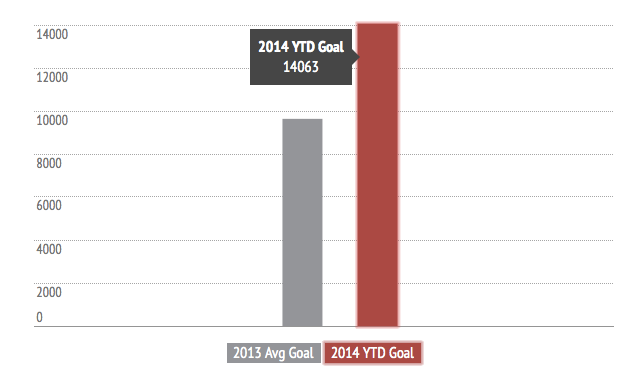
The number of funded projects in April remained stable at 25% as playing card backers remained caution ahead of a few high profile non-Kickstarter launches: the Hive deck, Kings Wild Tally-Ho, LUXX, and Whispering Imps v2. Having said that, the year-to-date (YTD) numbers continue to surpass 2013 numbers. The chart below describes how 2014 is tracking against the numbers from 2013 as benchmark.


Playing Card Projects 


The number of unsuccessful projects fell to 13% in April. This is offset by the percentage increase of cancelled projects, 21% (up 10% from last month). This increase is partly due to the launch of several playing cards with copyrighted materials, which was subsequently cancelled.

Here is what the month looked like in numbers:


Majority of the projects launched in April were launched mid to end of the month.


Here's a look at how projects performed over the month. The % of successful projects this month remained similar to that of last month.


Funding


A total of $791k was raised by all projects in April, relatively on par with last month.


With no surprise, Kings Wild's The Independence ($117k) was the most funded this month.

Here is a look at the top 5 most funded playing cards:


The top 5 successful playing cards projects for the month contributed 53% to the overall funding of successful projects!

The average YTD funding goal of successful project is $14.1k. We maintained that the average funding goal stabilize around the $15k mark.


Backers 


Approximately 19.7k backers were recorded across all projects in April. The average pledge per backer decreased to $44 this month.

The following is a month-on-month comparison for 2014 with the 2013 curve used as benchmark.


Top 5 funded Projects by backer numbers below:


Launched Projects 


Here are the top 10 most funded projects launched in April:


The Atelier is the surprise winner this month with it's minimalist deck. Historically, minimalist deck never seem to do well on Kickstarter.  The project had a good start on day 1, but the project took off on day 5 when major news networks made the connection between the creator and his former employer, Apple.

Kardify's very own Aquila Playing Cards ($23k) had a good start and was funded in just over 7 days and are now pushing for the stretch goals. Thank you for all your support!

As expected, the momentum have stabilize this month and we expect the numbers to be remain constant next month before things pick up during summer.


Data provider:

Deck View: Bicycle White Ghost Playing Cards


Classic. EerieWhite.

Designed by Ellusionist, the Bicycle Ghost Deck has a thick high grade stock, a smooth finish and an amazing design. With five solid months of design work, this unique deck of cards emanates beauty and energy.

Available at JP Playing Cards. Use the code KARDIFY10 during check-out to get 10% off for orders over £50.


Review: Empire Playing Cards


A big milestone in my career was the day I stepped from out of the shadows of my boss and did it myself… It was a complete cock-up.

Then there are guys like Lee McKenzie. Lee, once an artist for that company that gets way more hate than it deserves for regurgitating decks in different colours that we still buy because we secretly like them and want them for our ever expanding collection. Lee has recently left that company to build his own; Kings and Crooks.

The first deck for Lee on his own turf was Empire. Blisteringly successful, his project shone with the force of a thousand suns to burn a hole in enough pockets to make Brad tremble a little. It was this deck that saw Lee with Success on Kickstarter and release a deck for magicians and collectors now hard to get your hands on.

Why is Empire so hard to get a hold of these days? Those that had them for sale have sold them, those that bought them have kept them, and I dropped a deck in to the pool, so there’s one less deck to be had.


Empire will likely remain the most sought after Kickstarter deck for us. Even though we can no longer get them, I am constantly bombarded with requests to restock them, however Empire was a limited release and there is just no more to be had. We live in hope for an unlimited release in the future.

Does it work? 


I was, as my wife put it “Embarrassing yourself again Joseph” by practicing in public with this deck, a complete stranger walks up to me and says “that’s a fine deck of cards you have there” and then just walked away, I didn’t even get a chance to tell him where to buy it from. Sure I was taken aback, but I think it is a testament as to how well the deck works.

This deck has a bag of tricks too, the six of heats reveal and the subtle one way feature. Empire is functional and collectable.

The art


Lee McKenzie… ‘Nuff said.

What I don’t like


That I don’t have anymore.

What I do like


What I like is this deck is completely customised, and completely functional. Unlike other highly popular, fully customised decks, this one serves its owner well in the usability category. I also like that they handle just as good as about every other high quality deck ever printed by the USPCC.


Empire! Uhh, what is it good for? Absolutely anything

Want to play poker? Go ahead. Are you a magician? A deck doesn’t come any better. Need a bookmark? Lee has you covered with a box full of them that will make your fellow book club members jealous. Good for XCM and flourishing and also highly collectable, this deck gets my highest rating ever… three thumbs up.


This review is written by Joey Heininger for kardify. No part of this review can be reproduced without written permission from the author. You can check out Joey's Australian based online playing card store at theFlush.com.au Use discount code KARDIFY to save 10% for orders above $50.

News: Bicycle Monster Montage Playing Cards Remastered

Bicycle Monster Montage Playing Cards debuted on Kickstarter in February 2014 but the project was taken down before it could reach funding. Over the past couple of months, the project was completely overhauled and given a brand new look and feel. Carlos Bercini reworked the entire color palette and new rewards have been added. The project originally launched with a poster and t-shirt add-on but with this upcoming launch, dice and a coin have been added as previous backers requested.

The project will launch at 12pm Est on Saturday May 10.

Here is a look at the new colors and rewards:


© all rights reserved
Kardify 2013