Responsive Ad Slot

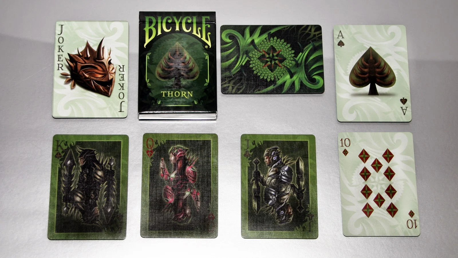
Deck View: Bicycle Thorn


Unique, Vibrant Earth Tones


Produced by the Collectable Playing Card's the Thorn deck was inspired by fantasy stories of the jungle. Like the most stories of the inhabitants of the deep forest, the court card illustrates the keepers of the lush, green world deeply hidden from humans. The Guardians are adorned with heavy armor and swords. Like thorns, they guard the sacred forest from the human hand. Printed by the USPCC on Air-Cushion Finish

Find these and other great decks at Collectable Playing Cards. Use the code KARDIFY during check-out to get 10% off your entire order.

1-ON-1 UnCommon Beat


In late 2012 the designing duo of Scott and Sara Perry, better known in the card community as UnCommon Beat, released their first project via Kickstarter to great support and backing. The deck was Urban Punk, a Graffiti Street Art Inspired Deck that lent itself to the rebellious undertones and punk subcultures.

” We viewed both the physical cards and traditional designs as a “washed out” concrete wall where the bits of stencil-style graffiti imagery are the energizing and vibrant pop”


About a year later the duo once again took to Kickstarter and the release of their second deck, The Black Book of Cards, a beautiful typographic deck that was a complete change of direction from their first project. The unique design concept and intricate detail, along with the “Book” theme that carried through the debossed leather like texture of the tuck and onto each individual card in the deck struck a chord with collectors and enthusiasts alike. Built on a simple statement…

“We all have a card within the playing card deck assigned to us based on the day we were born”

The project funded in approximately 12 hours of launching and kept a steady momentum reaching over 3000 backers.


Currently working on their new project, Manifesto, Scott and Sara were nice enough to find some time to collaborate on this piece and give us all a little insight into UnCommon Beat.

Tell us a bit about how you ended up at this point, with your careers as well as UnCommon Beat:
“After being in the corporate grind for 7+ years in Chicago directly after college, (Scott worked his way up through the ranks at a Software Development Company and I was in the Advertising/Media world working with some of the largest Consumer Package Good Companies in the US), we knew we wanted something different from life and so we made a hard decision to pack up and start out on something new.  We were both excelling in our fields but knew there was so much more we wanted to do that our lives at the time would not allow.  It was not an easy decision, and at times felt like we were stepping off into an enormous unknown abyss.  The short version of the story is that this journey took us across the world and back again, to places like Singapore, Netherlands, England, Vietnam, Cambodia, Hong Kong, Thailand and Mexico.
We’ve experienced a lot during that time, met a lot of amazing people, and it has brought us to where we are today…two dedicated individuals with a combined background in Computer Information Science – Software Development, Graphic Design/Arts, Marketing, Product Management and a whole lot of gumption. setting out to create an entrepreneurial experience for our supporters that brings to life new and unique ideas to the market.  Now a days, you will most likely find us with our heads down focusing on what’s next, chatting with our Kickstarter backers, and drinking lots of coffee.”


With the design background you both have, what attracted you to playing cards as a medium?

“Our love of playing cards started with our love of card games.  Eventually this led to seeing playing cards as an artistic medium and collecting.  But it’s not just the amazing designs on playing cards that we find fascinating but the time, attention, and quality of the playing cards themselves.  Not many canvases out there involve a team of nineteen plus people to produce, extremely expensive machinery, proprietary methods/materials, and have such a rich history.  When getting a deck of cards, you get the whole package (beautifully design cards and a well-crafted medium) and we feel that is extremely unique.  Playing cards are a fantastic way to express an artistic idea through an affordable, tangible, and usable medium - something complicated and dynamic yet so compact that it all fits in the palm of your hand. 

That in itself we think is just brilliant.”


The Black Book of Cards is such a unique deck, how much time went into the design concept and creation?
Roughly a year went into the design and concept.  When we started working on the Black Book of Cards, we decided we really wanted to push the envelope with both the design and the concept of the deck which meant doing something we had never seen done before at a scale we had never seen it done.  While coming up with the design idea and refining the concept for the Black Book, we decided there would be two different deck series stemming from the BBoC.  One deck series would focus on the design idea that we created for Black Book and the other one would focus on the concept of the Black Book of Cards – the concept that we all have a card in the deck (mine’s the three of diamonds and Sara’s is the two of diamonds) and that every card in the deck should be completely unique, collectible, and a piece of art in its own right.  (This is where the launch of the next deck in the collection comes in…the Black Book Manifesto coming to Kickstarter this July)
When it comes to the design of the Black Book of Cards, we spent months creating and building the different elements…which includes our signature expansion of the pip designs to our approach to achieve perspective and form.  All of these choices were made to achieve a design concept that would both be signature to the Black Book and allow for flexibility in designing future decks using these same design concepts in different ways [i.e., a black book version using pattern, one using symbols, etc.].
All this and the fact that every single card was completely unique, translated to loads of testing, working/re-working and refinement to 54 different designs.  We ran hundreds of test sheets to make sure that every card was something we would be proud to have as “our” card. 

The Black Book of Cards was quite a different direction than your 1st deck, Urban Punk, why a typographic deck for your second outing?
Urban Punk was originally created to accompany a game we had developed where the concept was about changing the rules and doing things your own way.  Looking back now, we can see how Urban Punk truly reflected a lot of what we felt in our lives at the time…the breaking out from the norm, striving to do something different, and celebrating the differences in those around us.  
The Black Book carries on some of the same undertones.  One idea we were hoping to promote through the Black Book was the idea of taking a moment to see and celebrate the characteristics of those around us.  We even tried to continue this via our website through the “Email a Friend their Card” feature.
As for why we chose typography for the Black Book, it was because of two main reasons (outside of our love for typography of course).  The first reason, as we mentioned earlier, was to do something completely new, something that would both challenge our skills AND push the limits on what had been achieved on playing cards. 
The second reason we chose a typographic deck was that it was the ideal way to introduce the concept that everyone has a card, every card is unique, and each card could be meaningful in different ways. 

Do you have a "Creative Process" you go through when coming up with a new concept?
The process typically starts with verbally brainstorming an idea and talking through every aspect of that concept.  This would be followed up by rough sketches, a collage-type draft board to see if the concept has visual appeal.  If we feel like there’s teeth in the concept, we feel passionate about it, and it fits into our current work load, we then move to pursue it. 
Once we decide on the concept, from there, the actual design process can take on different forms depending on the project. In the spirit of our upcoming Black Book Manifesto Kickstarter, we thought it would be fun to share a development piece of the Queen of Hearts.  When tackling the court cards, we envision it almost like it’s a block of clay where we mold the design - continuously refining, adjusting, and shaping to form each face.


One interesting fact about the Manifesto deck is that all of the face cards are based on the Arrco standard court card faces.

Outside of card design, do you have any other design projects that you are involved in currently or would like to explore in the future?
We have a host of other design projects we’re currently pursuing but there is one that we’re particularly excited about which, even though it does have a big card design aspect, reaches far beyond.
As we stated earlier, we have plans for a series of decks which will be based on the concept behind the BBoC. 
Since the Black Book Collection is about treating each card as its own piece of artwork based on the notion that we all hold a card within the deck, we wanted to expand on this concept by teaming up with different talent artist to create the art for each and every card.  (A concept that I’m really excited about as I find myself checking every deck I buy for the two of diamonds to see if it’s something I want to put on my wall.) 
This series will not only provide a nice addition to card collections but reaches far beyond into the tangible space.  Imagine walking into an art gallery and seeing 54 paintings from different artist all with cohesive elements representing different cards in the deck.  It’s a way we can help take this medium we have all come to love so much and re-introduce it to others in a new way. 
The feedback we have heard from different artist has been so positive that we could not wait to get backers involvement to help make this series one of a kind.

This is where the Black Book Manifesto comes in.  The Black Book Manifesto deck, which will be launching on Kickstarter July 9th at Noon EST, will be the foundation for this Artist deck series to follow.  How?  To see more about the Manifesto deck and what’s to come…check out the feature page we developed to explain further:  The Black Book Collection: Manifesto


Any final thoughts or comments?
We realize that you’re typically the interviewer but we would like to take a second to ask you a question…a little lazy Susan interview action if you will :). This is completely off the wall and completely goofy but that’s how we roll….
If you had to describe your personality as a tuckbox, what would your tuck box be like?  Covered in bling foil, minimalistic, etc…

Well, usually at this point I’m thanking people for collaborating on the piece, but I wouldn’t want to be rude to Scott and Sara and just brush off their question. So, how would I describe my personality as a tuck box, hmmmm, well I would be a dark rich matte brown or other earth tone, with a bold design and intricate line work that would be embossed and gold foiled……..ya, that’s it.  Oh who am I kidding, look up the Bicycle Brosmind deck……..I’m a little goofy and always looking at the lighter side of life

Anyway………I really want to thank both Scott and Sara for taking the time out of their busy schedules to share a little of their background and future plans. The Black Book of Cards is one of my favorites, I love the concept and the tuck on its own is just beautiful, but more so, it was my very first Kickstarter deck, so it holds a special place in my collection, and Scott and Sara were one of the first designers I reached out to, just to make conversation about the product and they’ve been nothing but pleasant and fun to deal with over the last year. That being said, I’m very excited about Manifesto and I encourage everyone to visit the web site for more insight into the project.


You can find out more about Manifesto and all of UnCommon Beats projects, past and present by visiting their web sites UnCommon Beat , The Black Book of Cards ,  as well as follow them on Facebook to keep up to date on all the newest happenings.


This exclusive 1-on-1 is written by Anthony Ingrassia for kardify. No part of this article can be reproduced without written permission from the author. You can check out Anthony's awesome collection at sparkzcollector or follow him on Facebook-SparkzCollector

Deck View: Thick Lines Playing Cards


Bright. Loud. Dynamic

No... we are not talking about Aaron Draplin but his Thick Lines Playing Cards. Launched earlier last month by Deckstarter at HOW Design Live Conference in Boston, this eye-catching deck was one of the successful launch decks on Deckstarter.

Borderless and soulful, allows for beautiful card fans and ribbon spreads, making every card blend into an indefinite number of different patterns. Also, the courts and pips have been completely revamped incorporating Draplin's obsession with Thick Lines while staying true to the classic design of modern playing cards.


Find amazing decks at JP Games. Use the code KARDIFY10 during check-out to get 10% off for orders over £50.

Trending: #cardsintime - Adding Cards to Cultural Classics


Ok.. I have to share this with you... it is pretty awesome! The genius that is @musclor_superpike started this whole movement of adding cards to cultural classics on popular photo sharing social network, Instagram. The image above, Salvador Dalí's the persistence of Memory 1931, added by @andyneophytou

Leonardo da Vinci's Mona Lisa.


Vincent Van Gogh's A Pair of Shoes 1886. Added by @benoitpervier


Rembrandt's The Anatomy Lesson of Dr. Nicolaes Tulp 1632. Added by @tomashlavaty


To see more, search for #cardsintime on instagram.


Review: Tendril Playing Cards


This review is written by Joey Heininger for kardify. No part of this review can be reproduced without written permission from the author. You can check out Joey's Australian based online playing card store at theFlush.com.au Use discount code KARDIFY to save 10% for orders above $50.

The Man ‘O War or the Bluebottle as it is known here in Australia is a rite of passage. You are not considered a man until you have had to untangle the stinging mess of fire wire from your junk. The more courageous (read sadistic) of us would gather them up and use them as a depraved projectile in a game where there was no clear winner, except perhaps the Fish and Chip shop that sold us the vinegar to cure ourselves. Fast forward a few years and imagine my surprise to receive a deck of cards that immediately transports me back to those days of tweenage delight and the beach I grew up on.

Tendril by Paul Carpenter is one of those rare decks, for me at least that engaged an emotional response, after a quick wince and a twinge in my giggle berries after being forcefully reminded of days gone by, I sat down to have a better look. An interesting deck to say the least!

Tendril, a deck that is oddly polished enough to ensure Paul was to be forevermore taken seriously by the playing card collecting community as a designer, but somehow manages to remind you of those kindergarten days of creating butterfly art and relief paintings.


Paul introduced into the mainstream card design some really innovative and functional elements with Tendril. The back design that appears to be organic and random while remaining mirrored, the boarders on the face of the cards and lastly a box… most cards come in a box, but this one was designed specifically for the Tendril playing cards and manages to complement the deck.

How do they handle?


They handle well, as well as can be expected of any deck printed by the USPCC. There was very little clumping after good use and they spring as expected. I dropped one, but that could probably be blamed on me being a terrible shuffler.


The art


I’ll let the photos do most of the talking here, but I have to say photos just don’t do the deck justice. My personal opinion; they’re beautiful, to others they’re odd. It was the deck the cemented Encarded into playing card stardom so surely they must be alright. If nothing else, the courts are fully customised, and I know that is important to some people.

What I don’t like


The colour, it’s weird, but also somewhat hypnotic in XCM displays.


What I do like


In this case it has to be the boarders. I’m a magician so blending cards into each other is an important feature. This deck provides the shock value of black faces with a boarder to ensure upside down cards get lost in the pack.

What are they good for?


Playing poker and such. No seriously this deck is hands down one of the more versatile fully customised decks out there. Very usable in magic, XCM and for game play, I know they’re good for collecting too, as they are getting a little hard to get your hands on these days and a good chunk of them has found their way into the hands of collectors. Mike, Jackson, Victor… you know who you are, I have my eye on you.


I really should summarise this deck. It is strangely beautiful. There isn’t a deck out there like it and anyone that has tried to emulate it has failed miserably, and rightly so, this deck could have only been pulled off by the master himself; Paul. The colours are hypnotic, but not to my tastes, and the art is both organic in design by functional by nature, and somewhat cool.

7 Questions with Justin Froyd of the Coat of Arms Playing Cards


We have been following the Coat of Arms Playing Cards for quite awhile. From the design & development pages of playing card forums to the popular crowd-funding platform Kickstarter, this unique deck of playing cards has been diligently put together by Justin Froyd of JammPakdCards.

We are delighted to have Justin here on Kardify to tell us more about Coat of Arms Playing Cards.

Can you tell us about yourself and what is your design background? 
I have been playing card games and poker since I was eight years old. Growing up my family and I would play poker with pocket change. I met Gonzo, my card designer, more than 10 years ago. Gonzo has over 15 years of ad agency, design studio and in-house design experience. He has also done illustrations for national ad campaigns, publications, trade show graphics and comic books including work for Todd McFarlane. Gonzo helped my design poker T-Shirts and create the Coat of Arms Deck. I give Gonzo my rough sketches along with my vision and he works his magic.

This is your first playing card project on Kickstarter. Why Kickstrter? 
Yes, this is my first Kickstarter playing card project. Back in 2008 I read Inc. Magazine and I was intrigued by an article about a beta site called Kickstarter. I have read the article many times over the years. I knew one day I wanted to put some of my ideas on Kickstarter. Now my dream is coming true.


What is your inspiration behind Coat of Arms Playing Cards? How did you come up with the idea? 
The inspiration behind the Coat of Arms Deck was my parents Family Crest on our wall in my childhood home. I thought it would be unique and interesting to have different images inspired by medieval coat or arms in a deck of cards.

How much time did you spend working on the deck and can you briefly go through the design evolution of one of your unique card design? 
The whole process has taken over a year. One of my favorite designs is the back of the card. I thought it would be cool to have the back design with a lion and a shield in its mouth. I started with a rough sketch that had a lion head with a shield in its mouth wearing a crown. I also had medieval mantel around the edges of the card. Gonzo and I talked about my vision of the lion and Gonzo came up with the idea with making the mantel apart of the lions hair. I am really happy with the final image for the back of the card.


We initially noticed the Coat of Arms deck in the forums. What do you think of the playing card community in terms of the feedback and support that you’ve been getting so far? 
The forums have been great. People have been supportive and have given some great feedback. I really appreciate all of the support I have received from everyone in the forums.

What are your thoughts about the continuous strong growth of playing card projects on Kickstarter? 
Wow, the growth has been great! The competition is getting better which helps to create better decks of cards. There has been great playing card projects.


Finally, what are your favorite playing card decks? 
My favorite decks are, Tendril, Ornate, Kem Arrow plastic cards, Federal 52 part 1 and 2, Clipped Wings and Delicious. The quality of these cards are great. I am impressed with their work.

Thanks Justin! Congrats on the launch and all the best!

The Coat of Arms Playing Cards is available in the Standard Coat of Arms deck and Limited Edition (LE) Dark Ages Deck. The LE deck is limited to 2,500 and features gold and red metallic inks, embossed tuck box with gold foil and metallic ink. Also included, is a special seal printed by Bicycle which states "Limited Edition 2,500". Pledge starts from $12.


Kickstarter: 7 Questions with Spaaaade&Co of Hundred Years' War Playing Cards


The Hundred Years' War Playing Cards is inspired by one of the longest war in history- a series of conflicts waged from 1337 to 1453, pitted the rulers of the Kingdom of England against the House of Valois for control of the French throne. Deeply inspired by the dramatic scale of the war, the team at Spaaaade&Co has decided to make a deck based on the historic events- every single element of the card designs have been carefully researched and verified.

The deck themselves have been delicately crafted. The Aces are designed using symbols and medieval motifs that represent each dynasty involved in the war and the Courts feature the major historic figures of the war, accentuated with detailed modern classic features.

We had a quick chat with Spaaaade&Co on their design background, the Hundred Years’ War Playing Cards and Kickstarter.

Can you tell us about yourself and what is your design background? 
Spaaaade&Co. is a small design studio consists of 6 people. Among us, Jeanne, Jack and I are interested in play culture. We’ve been enthusiastic about card games and various kinds of table games. It was natural for us to name our group as ‘Spaaaade’ when we started our company 3 years ago despite that we didn't have any plan to design playing cards at all.

We mostly do web design works for clients but we always had a desire to do self-initiated work. One day, our member Jeanne started cardistry and it was a real eye-opener. We began to collect decks in earnest and found out awesome projects on Kickstarter. Those campaigns encouraged us to dive in.

Hanuku, who collaborated with us, is a freelance illustrator. We fell in love with his amazing book and asked him to join our project. Luckily, he accepted with pleasure. 


Hundred Years’ War Playing Cards is your first Kickstarter Project. Why Kickstarter? Kickstarter is obviously a cool place to share ideas with and get feedback from a large community of backers. For small studios like us, it opens up so many possibilities. We didn’t have to give it a second thought because there weren’t services like Deckstarter or Cardlauncher yet when we came up with an idea of this project. 

Can you describe the Hundred Years’ War Playing Cards and why you’re passionate about it?
The deck is about a series of conflicts between England and France. We wanted to create a playing card deck, both beautiful and rich in content at the same time. Also, Joan of Arc has been one of our favorite characters. Her tough and dramatic life has been a popular material in cultural history. I’ve always dreamed about of making an art inspired by Joan of Arc and she was an obvious heroine of Hundred Years' War so naturally we picked it up as a theme.

How much time did you spend working on the deck? 
We began thinking about the project last December so we spent almost 6 months. The first part of the process was tracking down as much of the historic sources as I could. That was a number of weeks as it required to look at stories behind a century. And then we started with court cards. The main goal in making the courts was to describe the medieval costumes in detail so this took months. 


What was your most brilliant breakthroughs when designing the deck? 
Well, that's a tough question. We just had so much fun making the deck. We wanted to make something shiny and dignified in style—embossing, quality of the stock, metallic. This project was particularly enjoyable for us since we rarely do printed works, make something you can actually hold in your hands. 

What are your thoughts about the continuous strong growth of playing card projects on Kickstarter? 
I think it’s awesome. It just makes people more creative and gives the creator a job. Moreover, it is also amazing for collectors. The more the playing card community grows on crowdfunding platforms, the more diverse collectible cards can be. It’s a win-win all the way around. 


Finally, what are your favorite playing card decks? 
There are way too many decks that I admire, but if I was to pick some, I would obviously get a thrill out of holding decks like Artisans, Monarchs and Misc. Sherlock Holmes Series by Kings Wild Project and Pagan by USSI are also fantastic; the details and artistry in these decks are amazing.

Thank you for your time! Very elegant deck! :)


The Hundred Years’ War Playing Cards will be available in two editions: Gold and Silver Edition. These elegant deck will be printed by the USPCC. There is also a Collector's Box reward tier, which comes with the Gold and Silver edition deck along with a box, engraved with the SPAAAADE&Co. logo on top with black foiling. Excellent for both collection and as a gift!.

If you like our interviews, please remember to Like Us on our Facebook page.

Analytics: Kickstarter May 2014


With the increased interest in crowd-funded playing card projects particularly on Kickstarter, we are publishing a monthly tracking report as part of our popular Analytics series. The goal is to give an analytical insight into the month-on-month performance of projects and how these numbers are tracking cumulatively year-to-date.

May was an interesting month. The launch of Deckstarter and the impending launch of a few high profile decks did not slow the momentum of the popular crowd-funding platform- the number of funded projects in May have increased. The year-to-date (YTD) numbers continue to surpass 2013 numbers. The chart below describes how 2014 is tracking against the numbers from 2013 as benchmark.


Playing Card Projects 


The number of unsuccessful projects remains at 13% in May while % of successful projects ended higher (34%).

Here is what the month looked like in numbers:


Projects launched in May were equally distributed across the month.


Here's a look at how projects performed over the month. The % of successful projects this month ended higher than April. This is predominantly due to the lower funding goal of more than half of the successfully funded projects this month. See YTD funding goal in the next section.


Funding


A total of $721k was raised by all projects in May, basically on par with last month.


The Atelier playing cards ($66k) was the most funded this month. The project had an average start but it took off when major news networks made the connection between the creator, Robert Padbury and his former employer, Apple.

Here is a look at the top 5 most funded playing cards:


The top 5 successful playing cards projects for the month contributed 50% to the overall funding of successful projects!

The average YTD funding goal of successful project had dropped to $11.2k. 52% of the successful projects in May have a funding goal of less or equal to $10k, puling the YTD average down.


Backers 


This month, approximately 19.3k backers were recorded across all projects. The average pledge per backer for successful projects continue to decrease. This month it stands at $41.3.

Line chart below is a month-on-month comparison for 2014 with the 2013 curve used as benchmark.


Top 5 funded Projects by backer numbers below:


Launched Projects 


Here are the top 10 most funded projects launched in May:


The Muertos- Day of the Dead playing cards is the surprise winner this month after going viral on 9gag. From where it stands, it is on track to join the elite $100k club.

From the numbers this month, it looks like the momentum is picking up as we draw closer to summer. However, this could be dampened by the news of a new playing cards crowd-funding platform launching in late July/early August. This should have a slight effect on June and July numbers as backers remain cautions.


Data provider:

Kickstarter: 7 Questions with Will Pitney and Jason Mannon of the Frontier Deck


The Frontier Deck is a Bicycle branded playing card deck inspired by wildlife illustrations of the late 19th century. This beautifully illustrated deck is designed by the Frontier Guys, Will Pitney and Jason Mannon, who both loved the outdoors when they were growing up- camping, hunting, fishing, digging holes and just romping around. So when someone suggested they make an outdoor-themed deck of cards, they just couldn't resist.

The deck will be printed by the USPCC and will feature the era-appropriate Bicycle logo from the original 1895 Expert Back deck. An era where camera exposures were still very slow, hand-drawn illustrations were the only way to capture the true vitality of the wild.

Last week, we managed to have a quick chat with Will and Jason about their design backgrounds, the inspiration and the design evolution of the Frontier deck and their thoughts on Kickstarter.

Hey guys, thanks for your time. Can you tell us about yourself and what is your design background?
Will: Born and raised Texan, I could always be found romping around in the woods, diggin' holes and what-not. For as long as I can remember, I've been drawing and making art. This led me to getting a degree in Illustration at John Brown University and have been lucky enough to earn a living by making art.

Jason: I've been an entrepreneur with smaller scale projects since I can remember - its always a bug of mine. Now that I have my CPA license I feel I could branch out and do something a little bigger. This is my largest personal project to date.


The Frontier deck is your first Kickstarter Project. Why Kickstarter? 
Jason: To me, Kickstarter was a no brainier – yes, there are other sites but Kickstarter had the best reputation within the card community. As well as with the general public - trying to convince others in the hunting, wildlife, or outdoor community has been difficult enough. It would've been impossible with lesser known crowd funding sites.

Will: I'd been a fan of kickstarter for a while. So, when the time came for a crowdfunding platform, I felt more comfortable sticking to what I knew. Also, I saw how nice and supportive the card community was.

What is your inspiration behind the Frontier deck? How did you come up with the idea?
Will: One day, Jason showed me some really great decks on Kickstarter and asked if I had ever seen any that were hunting themed. After a bit of research, nether of us were able to find a playing card deck like it. So, after much debate, I decided to make my own. In the fist few weeks, I decided on the vintage theme and to change the theme from 'hunting' to 'outdoors'. Doing so, we expanded the scope of the deck to encompass a larger variety of amazing wildlife. Also, in the beginning, there was only supposed to be one deck. However, after finishing The Frontier Deck, I couldn't stand leaving out so many great animals. Thus, the Predator Edition was born.

Jason: As an outdoor lover I looked for a deck that had high design - needless to say the options were limited. That's when I approached will with the idea, kind of halfheartedly. Needless to say he took it farther than my expectations. I love this deck - I cant wait to get it in the hands of our backers.


I agree, it is a beautiful deck. How much time did you spend working on the deck? 
Will: One full year! The Frontier Deck stands as the longest personal project I have ever undertaken.

Jason: My time will come...handling fulfillment my time will come.

Can you briefly go through the design evolution of one of your unique card design?
Will: The Ace of Spade was one of the last cards made. Mainly to save the best for last and have all the experience from drawing the other cards under my belt. So, when the time came, it was simply a matter of combining all the other elements from the deck into one cohesive card. With an emphasis on continuity, the iconic Bison was drawn, set on dots, framed in plants and set in the shape of the spade.


What are your thoughts about the continuous strong growth of playing card projects on Kickstarter?
Jason: I love it - I think its really great. Its doing nothing but pushing the level of design further.

Will: While there are some valid complaints about flooding of sub-quality decks, I think its great. Playing cards are a canvas to the designers for them to tell us of a time, place or thing they are really passionate about. All the while, be a tool for fun and games. The more growth we see, the more people can share their stories.

Finally, what are your favorite playing card decks?
Jason: I think the deck that started it all off for us was the Federal 52 deck - I was so impressed by it and was my first experience into the card community. Currently I love the Muertos and the Memento decks. Those are just the ones off the top of my head, like in the previous question there are so many good ones.

Will: Monarchs by Theory11 – Very classy. Much quality. Wow.
Whispering Imps by Chris Chelko – A perfect marriage of nouveau design and history.
Bruce Lee Playing Cards by Dan & Dave – I've always been a fan of this martial arts legend and its simple design is very fitting.
Spider-Man Playing Cards by Marvel – This was the first deck of cards I ever bought with my own money and is still fun to shuffle every now and again.

Awesome! Thanks again for your time guys and all the best! 


The Frontier deck is available in two editions: the Frontier deck (Blue) and the Predetor Edition (Red). Pledge starts from $10 and there are multiple add-ons available such as Uncut Sheet and Poster Prints. There are also multiple rewards that will be unlocked once the project hits its set stretch goals.


Deck View: Killer Clowns Playing Cards


Freaky. Dark. Crazy.

Killer Clowns is a fully custom deck of playing cards, released by the awesome guys at Collectable Playing Cards. This set of cards is the freakiest deck on the market. Each card is bursting with color and detail... but be sure not to stare too long or you may see them move!

Killer Clowns features 12 custom court cards of the most dysfunctional clowns ever seen before dark and is printed by the USPCC on Bicycle playing card stock with an Air Cushion finish.

Available at Collectable Playing Cards. Use the code KARDIFY during check-out to get 10% off for orders. This Deck View is contribute by Anthony Ingrassia.

For your chance to win this deck, check out Anthony's post on Sparkz Facebook page to learn how (embedded below).


Designers: Paul Roman Matinez on 11 Things All Failed Kickstarter Projects Do Wrong


This month on our Designers series, we are delighted to have a guest post from Paul Roman Martinez, artist, illustrator, and designer. Paul's run four successful kickstarter campaigns in the comics and tabletop games categories, including the The Flight Deck Playing Card series. This really insightful article was first published on Paul's personal blog and has generated a lot of positive comments and was republished on a few other sites. This article is republished here on Kardify with Paul's permission.

I’ve done research into hundreds of campaigns, following them from start to finish, trying to analyze what works and what doesn’t so I can implement those strategies into my own projects. Here are a few of most common mistakes I see people make that hopefully you can avoid. I’ve seen amazing projects fail because they missed a few of the simple things listed here. While no one can guarantee success, I can promise a better chance of reaching your funding goal if you fix these issues in your next project!

1) Poor Thumbnail 

It may seem like a small detail, but the thumbnail image is the key to the project. It is the first visual representation of your work. Imagine it this way: Food companies put millions of dollars into developing their packaging so that their boxes stand out on a shelf amongst dozens of other boxes. Just like someone pushing a cart through an aisle of groceries, people are scrolling through crowded pages full of projects waiting for something to catch their eye.

Here’s What You Do: 
Go to kickstarter and browse the section you want to be listed in. Take a screenshot of the projects when they’re all listed on a page together and pick one to photoshop your project thumbnail over. You will use this photoshop image to design your perfect project thumbnail. Adjust the color and layout so that the most distracted browser can easily spot it amongst all the other thumbnails. A good project thumbnail is interesting but also tells people at a glance what they are backing.


2) Poor Project Title and Subtitle 

If you managed to get a browser’s attention with your thumbnail, the next thing they’re going to look at is your Title and Subtitle. This is the only text they can see through the browsing page and will contain the most important keywords for the search function. What is your project? What themes does it contain? You have to ask yourself what things your potential backers are looking for. I’ve seen—even experienced—project creators mess this up. I saw a project creator who had made about 8 different projects, many of which went over $100,000 and one over $500,000, decide to go with a simplified title. It was only a couple words and didn’t really explain what the project was. I think he was hoping to tempt people to click the link by being mysterious; I guess he figured after grossing close to a million dollars total on his projects, he could start taking some risks. Well, the project did not show up in any of the standard searches his previous backers would be making. I went to the forums exclusively for fans of the type of product he makes, (I’m being cryptic here about their product, can you tell?) and no one was talking about him. It was like a secret campaign no one knew about and it received a tiny fraction of his previous project’s funding.

Here’s What You Do: 
Go to kickstarter and find someone making something like yours. Get specific. Are you making a space themed comic book? Search “space comic book.” Are you making an Old West themed tabletop game? Search “Old West” in the tabletop games section. Do this a lot for a lot of different keywords. If you do it enough, you will start seeing some repeats at the top. Those are the people who, no matter what search terms you used for “space comic book” or “Old West tabletop game,” have figured out a way to show up. That’s what you need. And do this while the project is running as well. Don’t be afraid to change what’s not working. If you’re producing an Old West game that features horses prominently, for example, and halfway through you realize you’re getting a lot of equestrian fans because of your fully painted horse cards, then throw some keywords in for them. Mention horses in the subtitle! You do not want a single Old West fan to miss your project because you forgot an important key word in your subtitle or main title.


3) Unclear Description of the Product and the Goal 

This one should be easy. You know exactly what you need the money for, so your backers should know too, right? Well I see people screw this one up more times than I can count, especially in the comic book section!!! I know you want to tell us what your book is about. I know it has a great story arc involving a Sci-Fi post-apocalyptic future with robots that transform into steampunk zombies to fight off the coming of Chtuhlu (that’s my next project; don’t steal it). But you need to put at the top of your project in clear letters in less than two sentences what you are actually making. Is it a comic? How many pages? What dimensions? Color or B+W? These things should be there at the very top. Is it a tabletop game? How many players? How long does the game take to play? What ages? What does it come with?

Here’s What You Do: 
Come up with a new elevator pitch for your project. I know you’ve spent months honing the perfect two sentences to describe the plot of your book or your game, but now you need the perfect two sentences to describe what you are doing with all your awesome backers’ money! And then, hit return twice and start writing your plot summary.


4) No Prior Fan Outreach 

If a tree falls in the forest and no one is around to hear it, does it make a sound? If a project launches on kickstarter and you have no fans and maybe 150 facebook friends, does anyone notice? People are always asking me how to get more backers to see their projects—how to get more pledges. Well the real work to reach backers can start over a year before you launch. The best way is to build up your social networking presence. You start posting development pictures early. If you don’t have development pictures, start a pintrest with pictures of projects similar to yours. Whatever you do, just start it early. If you set up a facebook page two weeks before your project launches and hope your project will go viral because you want it to, then you’re out of luck.

Here’s What You Do: 
Start connecting on every social media network you can and start early! Learn how the different networks work. Getting traction with a post on Reddit is totally different than getting traction on Facebook or Pintrest. But most of them start with a great image. Take the best image you can and start pimping that around. If it doesn’t take off in one section, wait a few days and try again with a different set of keywords or a different way of phrasing your heading. Look at what topics are trending in the Reddit sections for your type of project. How did they do it? The social networks change so often that there is not a single one I would recommend over the others. I can tell you right now, though, that you can get just as much attention with some great keywords and well placed pictures as you can with paid ads.


5) Not Explaining Why You are Qualified to Produce this Project

Maybe the art looks great; maybe the game looks great; maybe it all looks awesome. I’ve seen a lot of projects like that. Then I look at everything that is going into them and the amount of money they are looking for and I think, there’s no way this one person can pull this off. Depending on the scope of the project, you might need help. People are giving you money for a product that doesn’t exist yet. Now that Kickstarter has gone mainstream, there are tons and tons of people on there who think they can make money quickly with a project and then they’re in business. It takes a lot of skill to produce a good book, and it takes a lot of different types of skills to produce a great tabletop game. I tell people that self publishing my own tabletop game felt like sending five books to the printers at once. Every piece has to be prepared differently. Each part has a separate template and set of die lines and a different set of materials for you to sample and decide on. And all of this has to be done on a deadline.

Here’s What You Do:
Do your homework and then TELL people you’ve done your homework. Tell them about the hours you spent on forums getting feedback on your design. Tell them on your page about different printing techniques you’re researching. And also, make a mockup. Get into photoshop and manipulate an image to look like the cover of your book or game. Yes, maybe the game or book isn’t done yet, but you need to be able to get your backers to picture it. And if you can’t picture it, how will they?


6) Not Enough Art on the Page 

Both comic books and tabletop games are very visual mediums. Yes, they contain a lot of writing and gameplay, but what sells these mediums first? The visuals. Unless I’m looking at a project to review it, I usually don’t watch the videos for the projects I back. That’s right–I just skim the page. If I like it, I’ll back it. I’m sure a lot of people use Kickstarter this way. I’ve seen projects that have awesome videos but their pages aren’t filled in. That just doesn’t hook me. Did you know there are tons of people on Kickstarter who have backed a hundred projects or more? These power backers are on there every day, commenting on projects and reading updates. The video is a small two-to-five minute portion of the project experience. When pages aren’t there, or closeup of card artwork isn’t present, the whole project looks suspicious.

Here’s What You Do: 
Put some pages up. Sounds easy enough, right? But you’d be surprised. Put up some images with character bios if your comic is new; they don’t have to be long. Create some headers for sections of your pages in photoshop. Create some visual breaks in the product page. For tabletop games, you’re going to need multiple videos. One for gameplay, one for artwork, and maybe one for unboxing if you have a good demo. They don’t have to be long or super awesome, they just have to exist.


7) Not Enough Interaction with Backers 

Yes, I’m sure there have been successful six-figure projects that only did three updates and made two or three comments on their project pages, but these are not the norm. When I look at a great product and try to figure out why it didn’t get funded I immediately look at the comments and the updates. In the comments section, people can voice their frustration about a project, ask questions, or just say good luck. And the updates section is a great way to keep backers up to date and let them know you are working your ass off to create an awesome project.

Here’s What You Do: 
Make the first comment. Go ahead and do it. A lot of people are nervous and don’t want to be the first one to comment. Do it for them. Respond to every single comment. Do it; why not? Of course, if you get a super backer commenting a lot, you can always wait and respond to a couple at a time. But respond! Let these people know you are there if they need to ask or say something. And post an update every two to four days. There is no excuse for running a thirty day plus project and only having 3 updates. Is your project so boring you can’t think of a single new thing to say about it?

8) Not Treating the Kickstarter like an Event

This sort of goes along with comments and updates. What is a kickstarter campaign? For some it is a new and strange thing, like going to senior prom stag. You don’t know why you’re there, and you’re not going to talk to anyone. For others it’s become a routine part of business, and they have it down to an exact and very boring science. I’ve launched four projects for three very different products with three very unique fan bases. I’ve had the luxury of learning a whole new world with almost every campaign. If you want your kickstarter to be an event, then you need to make it an event.

Here’s What You Do:
You bring the party. Find reasons to create updates and find reasons for people to read them. Yes it is great to thank people, but who wants to read twenty updates filled with you being thankful and humbled by the support. Offer them new information. Show them pictures of you doing game testing. Show them pencils for pages in progress. Update them on manufacturing details, like receiving samples. If you can, save some surprise rewards to unleash during the project, especially during the dog days in the middle. Go to kicktraq.com and look up some succesful projects. Every one of them has a slump in the middle where they may even lose money. But good projects find a way to get new backers during those days. I have looked at projects with a spike in the middle. And everytime I see a spike, I can trace it back to the day it happened, look at their updates, and sure enough, it’s because they announced some super cool new feature about their projects. And no, I’m not just talking stretch goals.

9) Confusing Pledge Levels 

Some projects by nature will end up with a lot of different pledge levels. My playing card project almost doubled in pledge levels when I introduced some new limited edition decks. It can’t always be helped. But I have seen projects where I can’t even tell what pledge level the physical book comes in! If I have to spend more than three minutes reading the same three pledge levels in my price level over and over again to figure out which one comes with what, then I’m going to just move on to the next project.

Here’s What You Do: 
Write all of your pledge levels out on a document. Make sure you’re using the same nomenclature for rewards across the board. That means if you have a 1 Screenprinted T-shirt reward offered, don’t call it a t-shirt further down the page because you got tired of capitalizing the “T.” If you write the rewards the same way every time, it will make it easier for your backers to see what new items are popping up in later reward levels. If you can, make a graphic for all the reward items and show reward tiers visually. Not every project will have the space for this, but if you do, visual representations of levels can go a long way.


10) Missing or Poor Video 

There is no excuse to have a project with no video. Almost everyone has a phone with a camera on it, so when I see a project with no video, it just looks lazy to me. Or it looks like they’re not very serious about the project. The video is a great place to get on the screen and talk a little about what you’re trying to accomplish. If you have no video, then you just missed an opportunity to humanize your project and put a face to all the hard work people are seeing.

Here’s What You Do: 
Make a video, or get someone to make it for you. It doesn’t have to be long. At it’s simplest, it can be you sitting in a chair in your office describing what your goal is. From there, the sky is the limit. You can overlay artwork from your book or show yourself drawing a page. Time lapse drawing videos are always popular. If you have a tabletop game, you need to show gameplay. You just have to—there’s no avoiding it!

11) Confusing or Incomplete Shipping 

Did you know a kickstarter can raise all the money they need and still be a complete failure? We’ve all seen plenty of projects that ran out of money and couldn’t afford to ship the products to their backers who helped pay for it. Don’t be that person. If you don’t raise the funding you need, you can always re-launch a project and try again after you make some tweaks. But if you fail to deliver, or worse yet, deliver to stores and not your backers, then you may never get to run another crowd funding campaign again.

Here’s What You Do:
Get a scale. They’re cheap! Go do it. Package up some stuff that is the size of the product you’re making. Go on google maps and look up the address of a Starbucks at the farthest point in the country you are in and estimate shipping. Then, find a Starbucks in France or Australia (two of the most expensive countries for me to ship to from the United States) and estimate shipping to those addresses. Also look up Canada. If you live in South Florida or Southern California like me, then shipping to Canada can be just as expensive as shipping to Great Britain. And make sure whatever surcharge you place on shipping you explain to your backers. If you’ve done your homework and priced everything out properly,m then you shouldn’t have much to explain. You can just say, I checked the prices, and that’s how much it costs!

So there you have it—11 ways to keep your crowdfunding campaign from failing. I guarantee that if you follow these steps, you will have an interesting campaign that will at least entertain some backers along the way. Whether or not you will make a profit, well, I can’t guarantee that!


This exclusive guest post is originally written by Paul Roman Martinez on his personal blog and republished on Kardify with Paul's permission. No part of this article can be reproduced without written permission from the author.

Deckstarter: 7 Questions with Chris Biron of Flesh & Bones Playing Cards


Flesh & Bones is a delightful deck that features detailed, hand-drawn illustrations based on mythical creatures and ancient gods. Created by Dual Originals which comprises of Marylou & Chris, a London based duo who's passionate about the weird and wonderful and wanted to express their take on it through this deck.

The tuck and back designs are clean and precise, consisting of illusional line patterns and geometric shapes. This contrasting design methodology gives the deck a very unique overall look & feel and is sure to catch a few eyes.

Just before the launch of Flesh & Bones on Deckstarter, we managed to have a quick chat with Chris Biron about Dual Originals, getting on Deckstarter, and of course the inspiration behind Flesh & Bones.

Can you tell us about Dual Originals and what is your design background?
Dual Originals consists of myself (Chris Biron) and my partner in crime, Marylou Faure. We're both hands on people and love to create unique products with a personal touch. Marylou is an illustrator who works with some really great clients bringing a whole range of weird and wonderful ideas to life through her artwork. On the other hand, I’m a digital designer and spend my days crafting websites, products and branding for forward thinking people. We both have a real passion for art and design and have brought our skills together to create our new identity, Dual Originals.


Flesh & Bones will be your first playing card deck. Why Deckstarter and what made you decide to take the plunge?
Our debut deck of cards actually kind of happened by chance. We like to keep our creative juices flowing and are always working on side projects outside of the office. We wanted to work on something that we had never done before which triggered us to explore a new medium, playing cards. At that time, Deckstarter didn’t exist and we didn’t have the cash to fund the deck by ourselves. We explored the idea of using Kickstarter to get the financial backing but we have absolutely no experience in handling orders, packaging them and distributing them all over the world if we were successfully funded.


We had basically given up on the idea that our cards would ever be professionally printed and were ready to drop the project all together. Then, out of the blue, I was contacted by an awesome dude, amazing magician and now a good friend, Chris Ramsay. He had seen our deck design on Instagram, fallen in love with it and wanted to help us make the deck a reality! He then put us through to his friends, the Buck twins who had a great new idea up their sleeve. Dan and Dave wanted to partner up and have our cards debut on their amazing new platform, Deckstarter, which we were obviously thrilled about and dived straight in.

What is your inspiration behind Flesh & Bones? How did you come up with the idea?
Marylou and I collect a lot of art and are always looking everywhere for inspiration. We’re both fascinated by mythology, especially the creatures involved in the stories and thought that it would make an awesome idea to illustrate them onto a deck of cards. I’m sure a lot of people won’t realise this, but each suit in the deck is actually based on a different theme. This theme then determines which creatures are illustrated on the court cards. For example, the diamonds theme is water and the court cards contain imagery of a Kraken, a Mermaid and a Hydra. There’s a lot more to this deck than what first meets the eye and you need to study them to find all the little details that we put in.


From the teaser pictures, I really like the clean tuck and unique court designs! What role did you play in the art direction?
The great thing about our partnership as Dual Originals is that our artistic skills go hand in hand. Marylou dreamt up and illustrated the amazingly detailed creatures on the court cards while I created the custom pips, card layouts, back and tuck box designs. We have our separate strengths and weaknesses and therefore collaborate on everything we do and always critique and challenge each others work in order to create the best designs that we possible can.

How much time was spend working on the deck? Can you briefly go through the design evolution for one of your unique card design?
A long time! As it was a personal project, there was no pressure to hit a deadline. We wanted the deck to be the best that it could, so didn’t try to rush anything. We actually started it over a year ago now and have been fine tuning it ever since. As for the process, Marylou would start by illustrating the design by hand with a pen and paper. This would often take a while as she would need to think what the character should look like and bring them to life straight from her imagination. Usually after a few attempts (she’s quite self critical) she would be happy with it and would then proceed to take a photo of the illustration to import onto the computer. She would then trace her original drawing in photoshop using a graphic tablet and pen to keep the artwork feeling organic even though it is digitalised. Once that was complete it would be handed over to me to create the layout for the card. I would then process the artwork and add the pips and any extra details needed to complete the card.


Do you have anything you’d like to share with aspiring artists and designers who would like to get their playing card designs on Deckstarter?
Make your deck stand out. Find an idea that you love and put all your skills into making it as great as you can and just never give up. We have really had our highs and lows with this project to the point where we were about to let it go. Never do that. Continuously improve yourself and your designs by practising and never be afraid to take inspiration from others, it’s a great way to get the best out of your own work; everything’s a remix.

What are your favourite playing card decks?
It would have to be the Misc Goods Co 1st edition. The attention to detail on them is just insane and it’s actually the deck that gave us the idea to create one ourselves.

Thanks Chris and all the best! If you like what you’ve read here and want to support Flesh & Bones you can find it on Deckstarter here


Flesh & Bones will be printed by USPCC and pledge starts from $12. There are multiple add-ons available such as t-shirts, and uncut sheets (extremely limited!).

If you like our interviews, please remember to Like Us on our Facebook page.

© all rights reserved
Kardify 2013