Collections: Ornate Obsidian Edition by Midnight Cards / HOPC
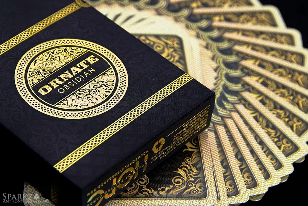
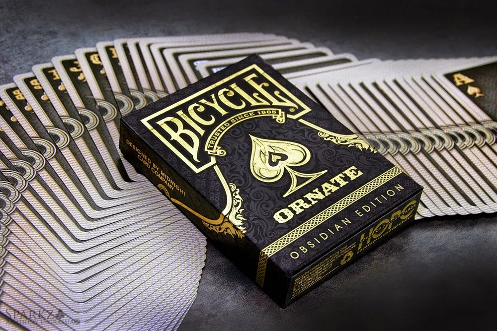
As part of the Ornate White Edition campaign by HOPC on Kickstarter, the Ornate Obsidian Edition, in my opinion, was the stand out of the project. Designed by Randy Butterfield of Midnight Cards, the Obsidian deck is just stunning in it's presentation and detail. The tuck has a beautiful embossing covering the entire tuck, the detail in its negative space is inspiring, it's very subtle at first, but as the light hits the tuck in different angles, the details just come alive. Gold foiling compliment the already eye catching design on the outside of the tuck as well as a completely gold foiled interior tuck treatment. The Obsidian deck was also available in both a Branded (pictured) as well as Un-Branded version via the campaign.
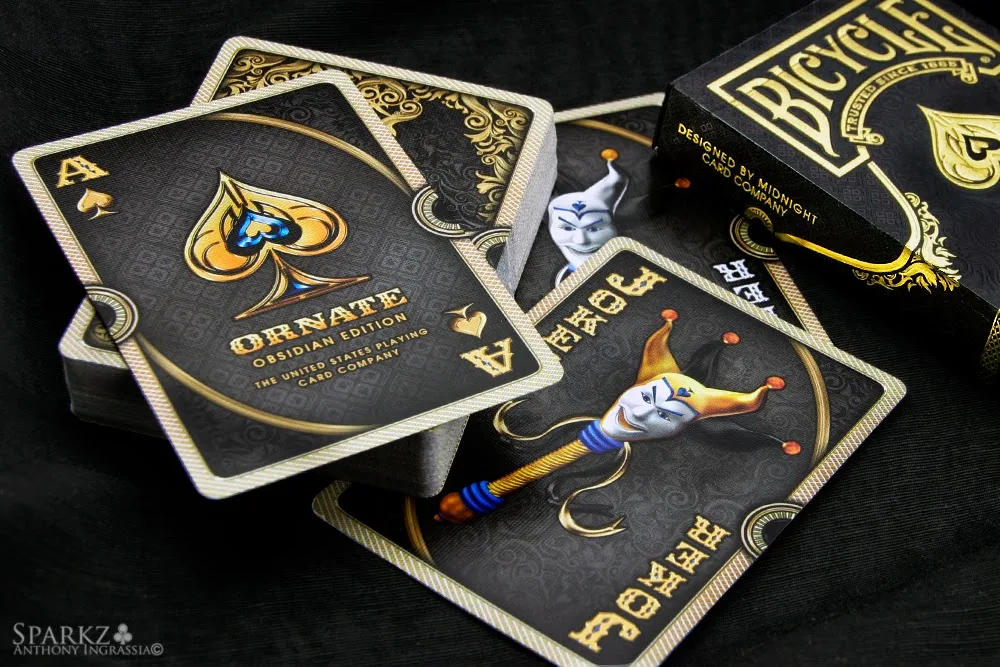
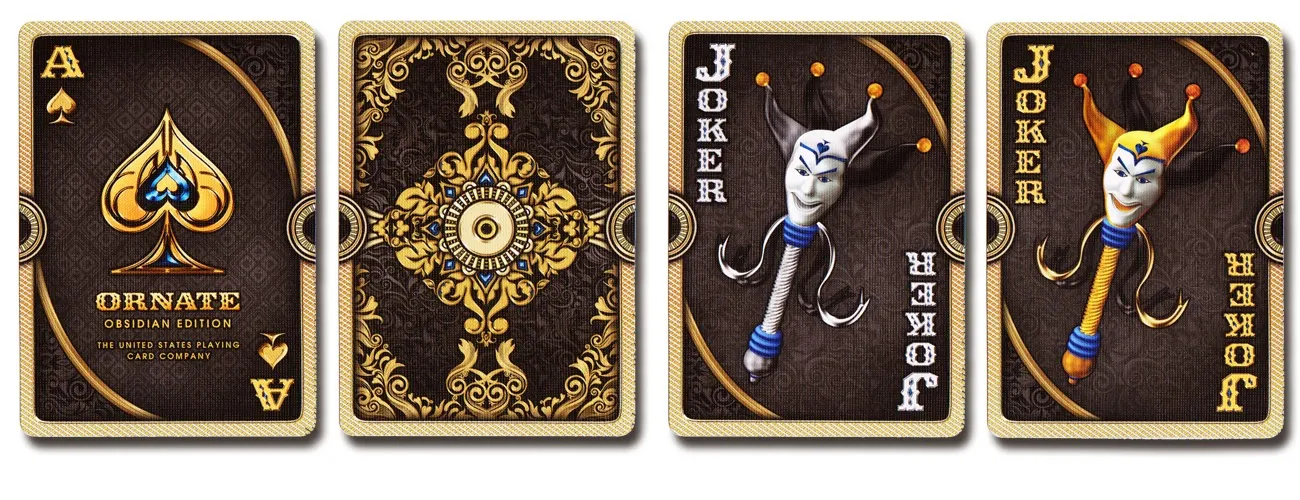
Inspired by Baroque designs the Ornate deck has bold vibrant imagery, the deck is completely custom including it's Ace of Spades and unique Jokers. The court cards are easily identified, but with a very new look and treatment to the standard style. The back design continues the Baroque theme in beautiful earth tones and once again amazing detail in the negative space of the design. Obsidian is all about visual impact and attention to detail which it pulls off just amazingly and will appeal to collectors for that reason. That being said, magicians, cardists and aficionado's of all sorts should enjoy the elegance and functionality of this deck. Without a doubt on the "Must Have" list.
The Collection segment is produced by Anthony Ingrassia of Kardify. No part of this article, images or video can be reproduced without written permission from the author and Kardify.com. To see more of Anthony's (Sparkz) collection please visit sparkzcollector.com
0
0
Subscribe to:
Post Comments (Atom)
disqus, kardify-admin


 Kardify is the leading online destination for playing cards news, reviews, and cardistry culture. Enjoy the best editorial content daily.


No comments
Post a Comment