Responsive Ad Slot

Deck View: Aurum White Gold Playing Cards


Luxurious. Royalty. Intricate.

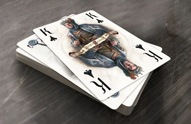
Aurum is designed to be intricate, elegant and fit for the Venetian royalty that inspired it. Every card is intricately designed and features multiple metallic inks and was also carefully crafted to be "purposefully imperfect." The court figures are all based on the familiar Bicycle court but were painstakingly redrawn to have many subtle imperfections and asymmetric features.

The luxurious pearlescent paper of the tuck shimmers both white and gold depending on the light and features incredibly intricate gold foiling, metallic inks, embossing and custom diecut on the back. Also, each deck comes with an individually custom numbered holographic seal. Only 500 of these decks are publicly available.

For more cool playing cards, check out JP Games.


Kickstarter: 7 Questions with Vadim Smolenskiy of the Lumberjacks Second Edition Playing Cards


The Lumberjacks are back and fully redesigned for the new Edition! Designed by Vadim Smolenskiy,  the deck pays homage to the original while making enough changes to keep the deck fun and fresh.

Changes such as the suit pips feature fluorescent blues and reds in place of the traditional black and red colors. Each suit features 3 redesigned court cards portraying and older king, beautiful queen and a younger jack. The 12 court cards have a fine woodgrain border and their respective suits in the right hand corner.

Meanwhile, the back design pays homage to the original. Both the original and 2nd edition have trees, axes, leaves in the corners, and a caption. For the 2nd Edition, the leaves have been revamped, the rope replaced with a woodgrain border, the axes are incorporated into the tree and a new caption is added. Also, the Ace of Spades on the front follows in the foot steps of the "Standard Bicycle" deck and many other decks that feature it on the front.

Just before the launch of the new Lumberjacks, we had a chance to talk to Vadim about his design background, the Lumberjacks deck and his design process.
Can you tell us about yourself and what is your design background?
Sure, but it’s going to be a short story! I’m a visual designer who lives and works in Baltimore. I went to school at the Art Institute of York where I got a degree in digital art. I’ve worked in agencies, corporate, freelance and finally decided to venture out on my own.

Can you describe the Lumberjacks Playing Cards and why you’re passionate about it?
So this is the 2nd edition of the Lumberjacks. It’s an all black deck with fluorescent blues and reds in place of the traditional black and red suits. Fully redesigned tuck, aces, court cards, 2 diptych jokers and a custom number seal. This deck has come a long way from concept, I’ve put a lot of time and effort into it (I think about a year or so) and seeing how it developed and evolved is really cool.

With your creative process, talk to us a bit about going from the first draft to the final version of Lumberjacks v2. How did you get to this finished product?
I almost always start on paper. At this point, it easy to scrap something, turn the page and start something new or carry the same idea, but add a twist to it.

That’s what I did with the 2nd edition. After the first sketches were done, I posted them to UnitedCardists and the Playing Card Forum to get feedback. This is a very important step for me because it gets the design in front of more than just my eyes. Others are able to spot things that I might not be able to at the time because I’m so close to the project.

After some well received feedback, I took the sketches into Illustrator and began to vector the art. Here, I quickly learned that what I drew wasn’t going to reflect well. The proportions were off and the art would be too small on the card, so I had to go back to the drawing board.


I took the template I was working with, blew it up 200%, printed and now I had guide that told me where the middle was and how far out I can go. Now I could draw something and know it would reflect without major issues. So once again, I sketched all of the court cards (face cards) and again, posted them online. After receiving more positive feedback, I once again took the art back into Illustrator and began vectoring it. Every time I had a card that was about 90% complete, I would posted online for feedback. This process continued over and over for all the court cards, aces, tuck box, and jokers. I kept the pip cards relatively standard in both decks because I wanted the functionality to be there. You can actually play with both decks.

Through this process and the feedback from both forums, I redesigned the hair on all cards, modified proportions, added new elements and basically end up with what I have now.

From here, I needed to see what they would actually look like. So I ordered some prototypes and let me tell you, it’s one thing to see the cards on screen, but to be able to hold and play with a physical copy (no matter the quality) before they actually print is simply awesome. The contrast of the fluorescent reds and blues against the black is really cool. Everyone I sent the prototype to really liked what they got.

That’s kinda my process. I feel it’s helpful, it gets more than just me involved and I’ll be improving it as I work on future decks.

What was your most brilliant breakthrough when designing the deck?
I think it’s the hair. If you dig back through the forum posts, you’ll see the hair isn’t what it started out to be. There was a lot of criticism regarding how it looked (bananas, snakes, etc!). Thanks to that feedback I was able to modify the hair to what it is now and I think it worked out for the better.

From the project page, what are a few of your favorite reward levels and why? 
The “Decks and Sheets” is probably my favorite. You get one 1st edition deck and uncut sheet and one 2nd edition deck and uncut sheet. It’s just an awesome combo because the 1st edition was all white and the 2nd edition is all black, so you get this yin/yang going on. Not to mention, it’s really cool to have both side by side and see the difference / similarity between the two decks. There’s only 5 of these available so that one is going to fast!

With so many playing card projects competing for funding, why should potential backers choose your deck?
It’s hard to say because it really comes down to personal preference, but I’ve been told it’s a really cool looking deck. So if we’re just going off of that, it’s the cool factor of an all black deck with super high contrasting colors. Digging a little deeper, this deck wasn’t thrown together overnight, I have a ton of thought and hours into it. Campaign wise, I really stripped it down to only cards and uncut sheets to make sure everyone gets their rewards as fast as possible. Cool, quality, and speed!

Finally, what are your favorite playing card decks? 
Man, I think I can fill an entire page with answers, but to throw out a few I would say the Monarchs by Theory11, MailChimp by Theory11, Sawdust by Emmanuel Jose, Robocycle by Bicycle, and The Federal 52 by Jackson Robinson (in no particular order).

Awesome! Thank you for your time Vadim! 


The Lumberjacks Second Edition is available on Kickstarter for $15. For a higher pledge, you will get the original edition of Lumberjacks as an add-on.

First Look: Branle Playing Cards by NoirArts


[Update] Branle Playing Cards are now available on Kickstarter.

A beautifully crafted deck with custom pips, Ace, backs and face cards by NoirArts. As the name would suggest, Branle Playing Cards are inspired by Branle, a 12th-century French chain dance adopted by European aristocrats, especially in France and in England. The gorgeous deck portrays history and culture of the 16th - 17th centuries.


Each suit represents a different European country: the peaks - Britain, hearts - France, clubs - Spain and diamonds - Eastern Europe.


Only 1000 decks will be printed and limited to Kickstarter backers only. Each deck will have numbered custom seal. Upgrades such as interior tuck printing and embossing are available as stretched goals.

[Update] Branle Playing Cards are now available on Kickstarter.


Kickstarter: Back to the Asylum Playing Cards


It's been a long journey for Serbian artist Milan Colovic leading up to the launch of Back to the Asylum Playing Cards. The original Asylum Playing Cards by Altius Management were never delivered and Milan was never paid for his services. In what is the first consumer protection lawsuit involving crowdfunding, Washington State Attorney General filed a suit against Ed Nash of Altius Management. You can read more about this on Max Playing Card's comprehensive write-up on The Dark Side of Kickstarter.

Almost three years later, Milan has the opportunity to turn things around and make the Asylum deck a reality. He collaborated with Roman Kotiv of Noir Arts to bring Back to the Asylum Playing Cards onto Kickstarter. With less than four days remaining, the project is well above it's funding goal of $5k!


We asked Milan why he is still passionate about the Back to the Asylum deck,

It's hard to explain why I'm so passionate about Asylum. That's what Asylum is all about - passion. For me Asylum is not just deck of cards. Story about Asylum turned into a real saga. Into obsession with plot, twists, turnarounds - on cards and in real life, after all good and bad things Asylum came through. Asylum art screams: "Passion!", from every corner of every card. Playing cards are great medium to present the art to the world. But if you use it as a medium, you must use it wisely and treat it carefully, with full respect of traditionalism. 


As for the inspiration behind the designs. Milan continued,

I found a lot of inspiration for Asylum in some of the anthological movies and retro/cult cinematographic creations and characters, from golden era of horrors. In its way it is my tribute to the masters of the silver screen such as Vincent Price, Kathy Bates, Sir Anthony Hopkins, etc. Every character is hand drawn carefully and with care, through bunch of sketches until it wasn't embodied in all its glory.   

I spent so much time with characters of Asylum, that some of them almost become alive. They even "acting" differently in different editions of Asylum. If they were images on paper in first edition of Asylum, in second one (Back to the Asylum) they've got own life. We created a story. Movie plot, actually. Some of them arise against medical staff of Asylum, some developed different personality, we had to invite medical staff reinforcement for the second deck... It's a deck with a good reason for existence, and great firm story behind it.


Pledge starts from $11. Also, if you backed the original Asylum project, take advantage the exclusive Limited Insanity bundle. The Asylum Inmate deck produced for that tier will be strictly limited to the original backers.

Deck View: Sentinels Playing Cards


Clean. Deception. Mythology.

Elegant and refined design. The first mainstream deck in magic that is composed 100% of original art - the faces, the backs, the box. And yes - even the court cards. Every single design element has a meaning behind it. The deck represents magic, the industry of deception, and the allied arts.

Designed by Hatch, an industry leading design firm in San Francisco, California that produces illustrations for Coca-Cola, Pepsi, Starbucks, and Target, the illustrations for the deck were refined after hundreds of pages of research on the history of magic, hermeticism, secret societies, and mythology.

The tuck is printed on imported paper 40% thicker than normal tuck cases - and has metallic accents on SIX sides. The art is embossed in 20 locations and coated with a matte varnish to enhance durability. Printed by United States Playing Card Company on an improved 909 Premium Finish.

Check out more cool playing cards from JP Games.

Kickstarter: Royal Pulp Playing Cards by Gambler's Warehouse


Two dynamic deck of playing cards brought to you by Gambler's Warehouse. Designed by Brad Foster and Blackout Brother, the Royal Pulp Playing Cards features brightly colored illustrations and gorgeous typography.


The deck is accentuated by deep mineral blues and vintage blood-tones saturate a marble-cream-parchment backdrop.

Each card within the Royal Pulp deck are custom, from the Aces, Jokers, to the backs and the comical courts.


Pledge starts from $14 and will be printed by either EPCC or USPCC based on the project's success.


7 Questions with Ember Waves of the UnTied States “Capitalists” Playing Cards


The UnTied States "Capitalists" Playing Cards is conceived by first time Kickstarter and graphic designer Ember Waves. This unique set of playing cards is bold, intricate and mesmerising in a complex way - this deck may not be to everyone's liking.

The deck is custom designed and signifies the United States cutting the ties of injustice and bigotry that has made up such a large part of its history. The entire point of the UnTied States brand is to be a symbol of acceptance and inclusion of all people no matter what their background may be.

We caught up with Ember Waves to chat about his creative background, Kickstarter and the inspiration and design process behind the Capitalists deck.

Can you tell us about yourself and what is your design background?
My name is Nate, I have been doing graphic design for over 15 years and I am the musician/producer that created Ember Waves. I love architecture and intricate designs and since I was scribbling drawings on the backs of my binders in middle school I have been obsessed with complex ideas.


From running a YouTube channel for aspiring card magicians to starting your own Kickstarter project, when did you first start thinking about using Kickstarter? What made you decide to take the plunge?
Well the YouTube channel started as just an idea to get people to see my card designs, as most of the videos feature my card designs. I had thought about Kickstarter for quite some time maybe 3 years or so to do something from my music (Ember Waves). Then after seeing lots of designs come out that were absolutely phenomenal, I decided why not come out with an Ember Waves design. That quickly turned into more and more ideas and now I have about 15 custom designs that will coming from the UnTied States brand in the future.

Can you describe the Untied States “Capitalists” Playing Cards and why you’re passionate about it?
Well I try not to go to far in the the political scope of things, being that people are extremely divided on that topic. But in a nutshell, the whole point of this line of card, the UnTied States, is to bring more awareness of the terrible bigotry and injustice that has been involved in America history. The play on words is really to symbolize this current movement in America, and how many people are trying to cut the ties of bigotry and injustice. I imagine a country that is fair and just, not divided and cruel to some. The entire point of the UnTied States brand is to be a symbol of acceptance and inclusion of All people no matter what their background may be.


How much time did you spend working on the deck and can you briefly go through the design evolution of one of your unique card design?
Well it's hard to put a raw number on it, I would estimate over 200 hours. But in reality it may have been double that, I love old currency and saw a lot of interesting and intricate patterns that I thought would make up a great idea for a playing card. I spent a lot of time just breaking down the artwork that makes up the certificates that are now no longer in circulation. I found a lot of things that could represent freedom or at least Should represent freedom and liberty and that's where it all started. As hours, weeks, months went by all the small intricate pattern ideas I made began to come together. Then came the daunting task of putting them all together to make a playing card. I had a lot of fun putting it together, but as my wife can attest, it took a Long time!

What was your most brilliant breakthrough when designing the deck?
Well that's a hard thing to put into words! Firstly I would not consider myself brilliant, I am a humble guy and as you might have seen I do not like to show my face or draw attention to myself as a person. This is all about an idea, so I would say the most brilliant idea would be the overall message of what these cards mean. Its not your standard deck of cards, and that was the whole point. I wanted to do something that would make people think and also could be something that they could spent hours looking at all the details.

With so many playing card projects competing for funding, why should potential backers choose your deck?
Well I personally haven't seen many decks out there that are similar. I think that collectors would really enjoy using this deck for poker and even for magic as the pips are easy to read. But above all my brand is going to be using extremely intricate patterns and designs and I think this will show to the average collector or cardist. I really enjoy the whole movement that cardistry has become, Dan & Dave have done a lot to bring playing cards to the place where they are now. I want anyone to own these to be proud they are a part of their collection. Ideally, I would like to see that bigotry and injustice are ideas that bring this country down. Inclusion of all people and acceptance of those that are different than you is something that could change the world. Not saying that these cards would do that, as I chuckle to myself, but the idea is there and hopefully people will see that.


Finally, what are your favourite playing card decks?
Wow, so hard to choose. I do have to say Theory11 and CardExpirement have some absolutely amazing designs to choose from. Jackson Robinson obviously is phenomenal. Just a short list to keep it simple I would say my top 10 are: Federal 52, Arcane, Density, Legacy, Monarchs, Artisans, The Black Book of Cards, Babel, Anicca, and Dream.

Thanks for your time Nate! If you like what you’ve read here and want to support the UnTied States “Capitalists” Playing Cards, you can find it on Kickstarter here


Pledge starts from $13 and the deck will be printed by the Expert Playing Card Co.

News: The World's Oldest Full Deck of Playing Cards


This article was originally published on Business Insider Australia on January 27, 2015.

In 1983, The Metropolitan Museum of Art bought a 52-card deck of South Netherlandish playing cards. The cards dated from the 15th century and were in incredible condition — but they were almost lost to history.

An Amsterdam antiques dealer was sold the pack back in the ’70s for $2.8k. They were said to be a “unique” pack of tarot cards from the “16th century,” according to the Paris auction house that sold them. But the dealer who bought the deck was sceptical, according to a The Day article published in 1983. He thought they might be even older.
The hairstyles and clothing worn by the royal figures on the cards helped date the deck.
After five years of research, he was able to successfully date the cards to between 1465 and 1480 thanks to the style of the paintings, watermarks on the pasteboard, as well as the costumes and hairdos worn by the Burgundian court figures on the cards. The shoes, hairstyles, and clothing worn by the kings and queens were going out of style by 1480. The watermarks were also common in Southern Flanders and the Netherlands from 1466 to 1479, according to The Day.
The suits were based on hunting symbols. These are hound tethers.
These are hound tethers. The dates were confirmed by the Central Laboratory for Objects of Art and Science in Amsterdam which dated the paints used to the 15th Century.

All of this digging and research paid off. In 1983, the Met bought the pack for $US143,000.
Game nooses were another hunting-inspired deck suit.
It is now accepted that this is the oldest known full deck of playing cards in the world. The cards themselves are also very interesting. Instead of the suits we know today, the four card categories are based on hunting gear, including hunting horns, dog collars, hound tethers, and game nooses.
Another suit were dog collars.
This was not uncommon given that many countries had their own suit symbols. Playing cards were introduced to Europe through the Mameluke Empire in Egypt after originating in China. The Mameluke suits were goblets, gold coins, swords, and polo sticks. Italy and Spain transformed them into batons/staves, swords, cups, and coins. German card makers had acorns, leaves, hearts, and bells. The French were the ones to simplify the shapes and make them the clover, “pike-heads” (a type of weapon), hearts, and paving tiles.

The English used the simplified French shapes, but called the pike-heads “spades” and the paving tiles “diamonds.”
The final suit were hunting horns.
Mass-producing and printing playing cards had still not become the norm, so these cards were drawn free-hand with pen and ink with gold and silver later applied. Because they are in such good condition, it’s assumed the cards were rarely touched.

You can currently view the cards at The Met’s Cloisters museum in New York City.
The cards were drawn free-hand with ink. Gold and silver were later applied by hand.

This article was originally published on Business Insider Australia on January 27, 2015.

Deck View: Draconian Lightning Edition Playing Cards


Dragon. Legendary. Illusion.

Inspired by a time of legendary dragons, this mythical deck features beautiful dragon scales, gorgeous colours and borderless back design. Draconian is available in 2 different edition, the Lightning (blue) and Spitfire (red) decks.

Designed by Randy Butterfield and beautifully printed by the Legends Playing Card Co., the backs feature a borderless optical illusion design formed from Dragon Scales. The Faces incorporate a clean design that keeps them very functional and provides the highest level of playability.

The tuck is printed on a premium soft-touch smooth paper stock and features Blue & Orange foil, metallic Gold and pantone Black Inks. They are also intricately embossed in key selective areas.

In stock and available from JP Games.

Top 12: Playing Card Decks to Expand Your Collection


The custom playing cards market has boomed over the past year, investment in crowd-funded decks has surged and new playing card designs and concepts are pushing the boundaries of the simple constraints of one tuck x four suits x thirteen cards.

No doubt, there are an incredible number of amazing decks out there and each deck is unique in its own way! So, how do you expand your collection? How do you know which decks to use for your stylish cardistry video? How do you impress your poker buddies at the weekly meet-up?

In the second of our popular "Top 12" series, we’ve collated 12 of our favorite custom decks to help you continue in this adventure. The playing cards featured below are a little harder to find but still reasonably affordable. As this series progresses, we will cover decks that are slightly harder to find and a little more expensive. Check out the first part here!

Enjoy the selection below. Difficulty scale from easy (1) to difficult (5). If you have one that we haven't discovered. Do feel free to share.


12. The Dawn of Flight 


The Dawn of Flight Playing Cards is a fully custom deck inspired by the Golden Age of Aviation in the Art Deco era. Designed by Paul Roman Martinez these classy decks serve as an homage to aviation from the earliest days to the 1930s—a time defined by travel, art deco style and the spirit of adventure. Available in blue (Airplane) and in red (Airship), both printed by the USPCC.

Difficulty: 1
Price: $14.90


11. Rebels 


Designed by StudioNumberONE and produced by Theory11, Rebels are a premium decks of cards inspired by modern street art. Mysterious and intricate, Rebels feature a custom-designed box, back design, Ace of Spades, and Joker. The backs proudly detail the United States Capitol Building, a timeless symbol of the nation's united spirit of independence.

Difficulty: 1
Price: $29.95


10. Legends v1


Simply amazing cards! Illustrated by Mark Stutzman, the intricate "Dragon" back design is just incredibly detailed and eye catching. The somewhat standard faces help keep the look of the deck familiar for working professional. The handling of the deck is were most will be impressed, they are just very smooth and easy to work with. Just beautifully designed and full of amazing secrets to discover.

Difficulty: 3
Price: $20.00


9.  RUN Heat Edition


Produced by Murphy's Magic, the RUN Heat Edition captures detail, stunning looks and an attitude. Beautiful presentation with the outer shell case and just as impressive Crimson and Chrome tuck box makes RUN a unique concept. The deck is fully custom from every aspect in and out. Familiar yet different court cards tie the custom Jokers, Ace of Spades and stylized pips together. The decks also include a Gaff that can be used for various effects for your magic routine.

Difficulty: 1
Price: $14.95


8. The Ultimate Deck


The Ultimate Deck is a one-of-a-kind, luxury deck of playing cards showcasing stunning works of art on every card. Produced in collaboration with award-winning design firm, Stranger & Stranger. Every single card is represented with a unique story, incorporating classical art, as well as works from todays leading illustrators. The Ultimate Deck features 54 unique works of art, and an elaborate back design. Packaged in a gorgeous tuck-case of extraordinary detail featuring embossed elements and foil accents.

Difficulty: 1
Price: $24.95


7. The Hive


The Limited Edition Hive Playing Card is designed and illustrated by Brendan Hong and independently produced by Kings Wild Project. Inspired by classic playing card art, this fully customized 54 card deck that comes with its own unique court cards to customized back design to Bee inspired Ace of spades. The deck comes in matching set of blue and red back design.

Difficulty: 3
Price: $49.95


6. Ornate Obsidian


The Limited Obsidian Edition decks are part of the very successful White Ornate series. Meticulously designed by Randy Butterfield, these beautiful decks exudes elegance which will elevate the impact of any magic or flourish routine, or add a high roller feel to your poker table. The tuck is truly mesmerising, crafted from a deep matte black vellum paper. The design has been carefully stamped in Black and Gold foil, giving the box a shimmer and shine. The inside of the tuck is coated in a solid wall of gold foil.

Difficulty: 2
Price: $34.95


5. Special Edition Whispering Imps 


The Whispering Imps are an original deck of playing cards illustrated by Mark Stutzman and inspired by American magician Harry Kellar's 'Whispering Imps' poster from 1894. Created by Chris Chelko, the "Special Edition" is a very limited edition deck of Whispering Imps. It features a brand new tuck box crafted from premium Starfire Red Vellum Paper embossed with Red Foil. The intricate card back design of the Whispering Imps is embossed with red foil on the back of the tuck box. Finally, the star pattern from the back design is printed with black ink on the inside of the box. 

Difficulty: 2
Price: $69.95


4. Bohemia


Bohemia is Uusi's second out of the eventual six deck series. The artwork of this eye-catching deck was inspired by the unlikely pairing of 17th-century Baroque style with contemporary, urban street art. Each have a flair for drama, tension and grandeur that when mixed together create one lush, combustible style! Every single card, right down to the pips and indices is individually hand-painted in varying shades of luminous blue for the dark suits of Spades and Clubs and lushly romantic red for the light suits of Hearts and Diamonds.

Difficulty: 1
Price: $20.00


3. Branded Black Reserve Note


The Bicycle branded Reserve Note deck is the fifth deck released in the Federal 52 series. Inspired by US Reserve Notes of the early 1900s, the Reserve Note deck a completely new courts set from the Federal 52 series. The stunning embossing along with a hint of bright red foil just sets this deck apart, as well as Jackson Robinson's signature style for this series and the fully foiled tuck interior makes this an amazing center piece to any collection.

Difficulty: 2
Price: $69.95


2. Seasons: Verana and Inverno


The Verana & Inverno are a set of playing cards that visually captures the changing seasons. Beautifully crafted by Alex Chin, this unique set stands out from other deck sets. These cards embrace two different illustrated artworks while still maintaining a consistency for the set. The back designs incorporate intricate flourishing enough to entrance any spectator. This summer and winter collection display class with beautifully complimenting silver and gold foiling and embossing across the set.

Difficulty: 1
Price: $29.95


1. Tendril Ascendant


Tendril Ascendant is a worthy successors to the highly sought-after original Tendril playing cards. Its design incorporates all the refinements that Encarded have learned over the years and mixes those with the organic symmetry first seen in the original Tendril. The colors are bold, the borders are intense, the faces are dark and the level of detail has been increased. The tuck is printed on a soft-touch matte black paper with incredible metallic green details and subtle gloss black foil tendrils. Special edition shown on image.

Difficulty: 1
Price: $10.00


The selection expressed in this top12 are solely those of the author.

Kickstarter: 7 Questions with Egor Zoidberg of the Strange Head Society Playing Cards

[Update] Unfortunately Gambler's have had to make an executive decision to cancel this project due to lack of funding thus far.  The Strange Head Society deck will be printed in-house by GW at Liberty and will have it available for sale in the near future.

Have you heard of the Strange Head Society? A place where the intrigue of classical science-fiction blazes the boilers of the grim steampunk world. While all manner of science and theory are discussed at Strange Head convocations, no gathering would be complete without a high-stakes game of cards. Commemorating this deep tradition, cardist and Strange Head senior-fellow Egor Zoidberg (Egor Klyuchnyk) brings us Strange Head Playing Cards.

This intriguing, fully custom deck portrays its royalty not as human figureheads, but as ideas central to the Strange Head Society: cosmology, mortality, and tentacles- perfect for fans of contemporary steampunk comics and anime, or of “proto-steam” literature by authors such as Wells, Lovecraft, and Poe.

Thanks to the folks at Gambler's Warehouse (GW), we had a sit down with Egor to discuss the idea behind the Strange Head Society Playing Cards, collaborating with GW, and Kickstarter.

Can you tell us about yourself and what is your design background?
My name is Egor, I'm designer from Ukraine. I studied at the Kiev Institute of Design for 5 years. Now I work as a freelancer. The first deck I created was a Demon deck which didn`t have much success but it gave me great experience. Also I draw posters and other stuff.


What is your inspiration behind the Strange Head Society Playing Cards? How did you come up with the idea?
First of all, it is Mike Mignola's art. Especially "Screw-on head" comics. When I first saw this comics, I decided to do something just as cool as it. My dog - pug named Joric - became an inspiration for the Joker card.

Talk to us a bit about going from the first draft to the final version. How did you get to this finished product?
Well, I didn't have much trouble with the ideas for this deck. I made a few sketches and began drawing immediately. The idea was so fascinating that I drew the project in two weeks.


How did you end up collaborating with Gambler's Warehouse?
Kickstarter`s policy doesn`t allow to launch a project directly from Ukraine, so I tried to look for some ways to share my deck with the world. I posted information on some forums and then a word of mouth led me to the Gembler's Warehouse, who launched my Strange Head Society`s deck on Kickstarter.

With all the projects competing for funding, why should potential backers choose your deck?
My deck is full of mystery, great idea, hard work and all new artwork, so it is all absolutely exclusive. You will be absolutely satisfied with this purchase.

What are your thoughts about the continuous strong growth of playing card projects on Kickstarter?
In my mind, it is because card projects gain a lot of success among other projects launched on Kickstarter. In addition to that, card games are popular throughout the world and it is fun to have your own unique deck to share it with your friends.

Finally, what are your favourite playing card decks? 
To my deepest regret, the idea of original playing cards in Ukraine is not popular. Probably this is one of the reasons I decided to create my own decks. I follow the projects on Kickstarter and I really love the artwork of Federal 52.

Thanks for your time, Egor and all the best! At the time of writing, the project is only 21% funded with 16 days to go. To support the Strange Head Society Playing Cards, head to Kickstarter.


Pledge starts from $11 and the deck will be printed by the Expert Playing Card Co. on their famous Master finish. There are multiple add-ons available such as uncut sheets, poker chips, post card and art print.

Deck View: Pressers Playing Cards


Vintage. Sixties. Custom.

From the wizards at Ellusionist, Pressers Playing Cards are a beautifully designed deck inspired from the 60's advertising era. In fact, Ellusionist has gone as far as to say that the deck is "one of Don and Roger Sterling's favorite sets of playing cards" and "is the talk of Sterling Cooper". For those unaware, Sterling Cooper is the fictional advertising agency from the popular AMC show Mad Men.

This deck is wrapped in a beautiful vintage design, printed on soft luxe paper with a raised emboss, courts and face cards are fully customized. Also, Pressers features a unique "used" look & feel and printed by the United States Playing Card Company. Available at JP Games.


Indiegogo: 7 Questions with Kenneth Aidan Foo of Isometric playing Cards


Isometric Playing Cards are a deck of playing cards designed with cardists and magicians in mind. Created by Kenneth Aidan Foo, mastermind behind the popular card flourish, Ripple, this aesthetically pleasing deck is sure to grab attention in a quick glance.

Exuding style, this deck subtly pays tribute to one of the great classics, the Tally Ho Circle backs. The design is centered around a hexagon with triangles blading out along the short ends. The striking blues, combines with the stark geometric design and two-toned greys accentuate spinning flourishes, fans, cuts and displays.

We were able to catch-up with Kenneth for a quick chat on the Isometric deck, the design process and cardistry.

You are an amazing cardist! Can you tell us about yourself and how long have you been doing cardistry?
That’s so nice of you to say! Well, first off, my name is Kenneth, I’m a Singaporean born and raised, studying in Perth, Australia. I've been doing cardistry for about 7 years now!


When did you first start thinking about using Indiegogo for the project? What made you decide to take the plunge?
Well, I had initially planned to use Kickstarter, however, after setting up an account and beginning to formulate a marketing plan, I realised that Kickstarter did not support Singapore citizens so I had to make the move to Indiegogo. It is super unfortunate that people don’t see Indiegogo in the same light as Kickstarter. Indiegogo has been a pretty satisfactory platform for me so far!

What is your inspiration behind the Isometric Playing Cards? How did you come up with the idea?
I had wanted to make my own deck of cards for a very long time. A lot of the early versions consisted of triangles and hexagons. I gave up on designing the deck for a couple of months and focused on a bunch of other projects. Eventually I decided that my deck would pay tribute to the Tally Ho circle backs and slowly everything fell into place.

Some people see a major similarity with the Isometric Playing Cards to the Virtuoso deck. I can definitely see the similarity, but I felt that my design offered a different sort of take on the concept of geometric backs.

Walk us through the process you took to design this unique deck. How did you get to this finished product and what was your most brilliant breakthrough when designing the deck?
That’s a tough one to explain. I’ve had this long standing fascination with hexagons and wanted to find a way to incorporate them into something I did. Eventually, like I said earlier, I decided that I would use one of my all-time favourite decks – Tally Ho Circle Backs, as a starting point and everything fell into place.


The hexagon sat nicely in the centre and the “blades” of the design mirrored the lines along the top of the circle backs. The most brilliant breakthrough was the colour scheme. I was trying to find something that looked different enough, and was experimenting with a wide range of hues and colours to fill the 10 triangles in the deck. It is much harder than it looks. After a few nights of experimenting, I finally came to the current colour scheme and just loved the heck out of it.

With all the projects competing for funding, why should potential backers choose your deck? Well, I've found that a lot of the current decks vying for funding are either super intricately designed decks that are going for the “custom everything” look, or the super minimal, almost lazy, design. The Isometric Playing Cards offer a really cool, simple custom back design that catches the eye, but at the same time doesn't feel too lazy, or go too overboard.

At the same time, they are going at a really affordable price for backers! I don’t want my deck to sit on someone’s shelf as a “super rare limited collector’s edition”. I want to see people use them!

What do you think of about the growing trend of cardists having their own brand?
It is really great to see people willing to take risks and developing their own brands. Not just with cards, but with merchandise and marketing as well! One piece of advice that I can give for cardists developing their brand though, is to take your time to find out what you are trying to achieve. I often see very new cardists struggle with trying to make themselves popular by putting out video after video and picture after picture. Work on your material first, then find out how your material can work for you.


Finally, what are your favourite playing card decks?
I gotta go with the classics. Blue Seal Tally Ho Circle Backs and original Studs. I would stab someone to get my hands on more of those cards.

Thank you for your time, Kenneth and all the best! If you like what you've read here and want to support Isometric Playing Cards, you can find it on Indiegogo Here! 

Pledge starts from USD$12 and will be printed by Legends Playing Card Co on their Emerald stock and finish.

© all rights reserved
Kardify 2013