Responsive Ad Slot

Kickstarter: 7 Questions with David Goldklang of Duel Playing Cards


Produced by Vanda Playing Cards, DUEL is a fun & playful deck of playing cards inspired by Harlequin patterns. Designed by London-based graphic designer Joelle Wall, each individual cards is a work of art by itself and features 56 gorgeously custom illustrated face cards, Ace, Jokers and Tuck.

With its soft subtle pastel shaded colours, each card exudes fun and charm, while maintaining the traditional function of a playing card deck. This deck is produced by Vanda Playing Cards (VPC).

We managed to catch-up with Joelle and David Goldklang, founder of Vanda Playing Cards to chat about VPC, the inspiration behind DUEL Playing Cards, the design evolution of the deck, the future of Vanda Artist Series and lessons from Kickstarter.

For those of us who don’t know, tell us a little about yourself and Vanda Playing Cards?
David: Three years ago I discovered Kickstarter and noticed that designers were able to raise money to produce printed versions of their work - posters, books, and even playing cards. I was completely drawn in to the idea and decided to craft my own version of a deck of cards. I launched a Kickstarter for the original Vanda decks, it became funded, and I was hooked. Since then I've launched several other card deck campaigns and been able to print tangible manifestations of the countless hours I've devoted to my craft.


Can you describe the DUEL Playing Cards and why you’re passionate about it?
David: I love the clean simplicity and thoughtfulness that went into the design of this deck. There are so many cards being created these days that cram in more and more details and they all start to look similar to me. One of my primary goals with Vanda products is to create items that are original and distinctive – they don't look like any other decks out there and they don't even look similar to each other. Every design so far has been a different illustrative style and I've pushed myself to learn unfamiliar techniques with every project. Duel fits in with this trend perfectly and that's why I've chosen to launch it as the first deck in the Vanda Artists Series.

DUEL is the first deck of the Vanda Artist Series. How did you end up collaborating with Joelle Wall on DUEL and what can we expect in the future from this series?
David: I discovered Joelle and the Duel deck when browsing through artist portfolios online one day. I'd been looking for artists to collaborate with to expand the Vanda brand. Joelle had already designed the Duel deck and I thought the design looked amazing. I contacted her to ask if she had produced the deck before and when she said no, I offered to produce it as a Vanda deck.

Walk us through the process you took to design DUEL. How did you approach this project and get to this finished product?
Joelle: I play a lot of card games, mostly with a standard red pack of bicycle cards. They have always been my favourite deck and I carry them with me wherever I go. Designing my own deck of cards has always been a dream of mine and when I started developing concepts for the deck, I referred back to the bicycle cards for the symmetry in the face cards and how the suits are laid out on each card. Although I loved the intricacy of a bicycle deck of cards, for my design I wanted to keep things as simple as possible.


I started by designing the 4 suits. I selected the basic red and blue, with two lighter shades to accompany the main colours. Once I started designing the face cards I realised I needed a few more colours to contrast the primary colours, so I selected dark brown and black. The idea for the pattern on the back of the cards came from a harlequin–inspired printed dress that I picked up in a Market in Amsterdam. I really liked all the geometric combinations used throughout the design. This became a big inspiration for the face cards and the box design.

I called the deck duel because in its truest meaning, a duel refers to the arranged combat between two individuals with matched weapons in accordance with agreed-upon rules. My playing cards intend to encapsulate the essence of the word in a playful manner.

What was your most brilliant breakthrough when designing the deck?
Joelle: The most difficult part of designing the deck was the face cards. Getting the face card designs to be symmetrical but still have enough balance was proving to be difficult with the 4 colours that I selected. I think my biggest breakthrough was when I started adding the striped patterns throughout the other solid shapes. This was the contrast that was needed to get the face cards working, and it also transitioned nicely when I added the crowns.

This will be your fourth playing card project on Kickstarter. What are a few key elements and principles you incorporated into your project that you think future Kickstarter creators could benefit from knowing?
David: I'm trying to find ways to keep my backers engaged and excited about the project. I think this is one of the most important aspects to running a campaign. I've seen many projects that just sit with very little activity and they probably don't reach their full potential as a result. I've managed to build one of the largest Instagram followings in the card community with over 20,000 followers, so I'm trying to engage users through that medium as much as possible. I'm even running an Instagram contest and giving away 36 free decks to 3 lucky backers.

The single most important thing I've learned from running previous projects is that communication is vital. I've made mistakes in the past on this front but as a result I found that it's essential that you update regularly and respond to backers as much as possible. This creates a sense of trust as well as community.


Finally, what are your favourite playing card decks?
David: Aside from all of the Vanda decks (of course), I'm a big fan of Randy Butterfield's work. I have a very small card collection and it mostly consists of his creations. I feel he puts a ridiculous amount of thought and attention into every tiny detail and the result is a cohesive package. The LUXX deck he designed is dripping with details, but every element is there for a reason and seems to make sense.

Thank you both for your time and all the best! If you like what you’ve read here and want to support DUEL Playing Cards, you can find it on Kickstarter here


Pledge starts from $13 and will be printed by the USPCC on their famous Bicycle stock with Magic Finish. There are also multiple rewards that are waiting to be unlocked once the project hits its stretch goals, most notable is the blue edition at $20,000.


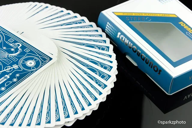
#kardtalk: What are Soundboards Playing Cards?


Social networks such as Twitter and Instagram provides a platform for breaking news and instant reactions. Card aficionados are often opinionated and rarely pass up an opportunity to show off their card skills when new releases hits the timeline. Social networks are fast-moving and there are good amount of posts that don't get the recognition they deserve.
To change that, we've rounded up some of the best Tweets and Instagram posts from the past week on the latest releases. Thsi time we have with @patch.var's #soundboardsplayingcards. Scroll through, enjoy the images and give a follow to anyone you think deserves it.


A year in development


Love every detail

A photo posted by Shin Lim (@shinlimmagic) on


A photo posted by aidan (@aidancards) on


Waiting to Arrive


Nostalgic


Cardistry confirmed!

A video posted by Patrick Varnavas (@patch.var) on


A video posted by Patrick Varnavas (@patch.var) on

Crowdfunding this Week: 9/27


Welcome to Crowdfunding this Week, where we select some of the best playing card projects on the various crowdfunding platforms this week. Four projects for you to check out this week:

NIPPONIA Playing Cards

Relaunched. Custom illustrated playing cards inspired by medieval Japan and printed by NoirArts Playing Card Company.

Kickstarter project by: Kieran Alexander
Current Status: 31% Funded
Pledge Amount: $14 for single deck
Ends: October 17th, 2015


EMINENCE Playing Cards [First Look]

Two beautiful decks of playing cards that feature full embossing, 54 custom cards and metallic inks. Available in gold or platinum.

Kickstarter project by:Vadim Smolenskiy
Current Status: 52% Funded
Pledge Amount: $15 for single deck
Ends: October 23rd, 2015


DUEL Playing Cards

A fun & playful Harlequin-inspired playing cards are designed by London-based graphic designer & illustrator Joelle Wall. Printed by the USPCC.

Kickstarter project by: David Goldklang
Current Status: 51% Funded
Pledge Amount: $13 for single deck
Ends: October 18th, 2015


GRINDERS Playing Cards [First Look]

Premium Playing Cards encased in luxurious packaging of Copper and Silver Foils by Midnight Card.

Kickstarter project by: Randy Butterfield
Current Status: 54% Funded
Pledge Amount: $14 for single deck
Ends: November 2nd, 2015

Deck View: Antler Limited Edition Playing Cards


Outdoors. Majestic. Buck.

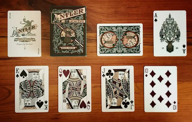
Designed by Tom Lane, Antler Playing Cards is Dan and Dave's first playing card deck following the very successful Smoke & Mirror series. Inspired by the wild forests, rolling hills, and snow-capped mountains of Northern California, the Antler Playing Cards showcase the majestic beauty of the great outdoors.

This Limited Edition features two fully colored back-designs: Hunter Green and Deep Maroon. Everything was hand illustrated in the style of early 20th century playing cards. The Ace of Spades features a noble Buck with herbaceous ornamentation crowning his dignified antlers, and each Joker offers the Antler name.

Also, each Limited Edition deck is hand-wrapped in parchment paper before boxing and is sealed within by a perforated stamp for easy opening. Printed by the USPCC.

Available now from JP Games.

News: International Cardistry Open Season 2 Champion Named


After months of competition, the International Cardistry Open (ICO) Final has come and gone. A dramatic 3-minute cardistry video determined who would emerge victorious as the champion of the second season.

The 5 finalists — Alvin Herp, Amsyar Fikri, Matthew Beaudouin, Phuoc Tran and Sam Wheeler — seemed evenly matched coming into the Final after displaying strong season performances, but it was Matthew Beaudoin who was the most consistent throughout the season with Alvin Herp coming in as runner-up. Matthew wowed the judges with his cardistry skills and his amazing continuous shot video! There was no denying that Matt had put a lot of thought, planning, hard work and thereby claiming his place as the Season 2 ICO Champion.


Joey Heininger, ICO co-organizer, theflush said,
Congratulations to the finalists and to everyone else that entered, a very big thank you! Ivan and I are extremely overwhelmed by the sheer volume of people that joined us this year, without all of you there is no doubt the ICO could not continue, every single one, from the earliest Novice to the seasoned Veteran and even the spectators, you are what make the ICO what we are, 
Kardify would like to thank the generous sponsors who have helped make this year’s tournament possible. Please tell these companies that you appreciate their involvement in the ICO:
+ Expert Playing Card Co.
+ JP Playing Cards
+ Metropol Cards
+ Cardvolution
+ Kairos Playing Cards
+ Choice Playing Cards
+ theflush.com.au
+ New Deck Order
+ Kardify

Also, it is time to recognise the hard work, time, and dedication put in by those that have organised and judged the ICO this year.
+ Jaspas
+ Lance T. Miller
+ Rama Dimasatria
+ Claudia Seow

To keep up to date with the #ICO, follow us on Facebook. For more performance video from the season, including both the novice and veteran, check out the website here.

First Look: GRINDERS Playing Cards by Midnight Card Co


[Update] GRINDERS Playing Cards are now LIVE on Kickstarter!

Randy Butterfield (Midnight Card Co) unveiled his next Kickstarter playing card project. Last week, he shared an image (above) on Facebook and it features the Grinders Tuck Box with the description, matte Black stock with Copper AND Silver Foils.

According to Randy,
The design of the Grinders Deck is meant to embody the workhorse mentality of a professional Grinder, but also contains elements of grandeur and opulence.

As mentioned above, the Grinders' tuck will utilize a thick Black matte stock. HOWEVER, no inks will be printed on the Tuck. The design elements will be stamped in Copper AND Silver Foil.


As expected, the deck is fully custom! The Back design contain subtle references to the games of Poker and Roulette. At the same time, the Face Cards are designed with the intention for maximum playability and the Courts are from a more classical design than most modern Courts with additional elegant details and handpainted elements to make them unique on their own.


Grinders will be printed by Legends Playing Card Co on their popular Classic Finish stock. Grinders will be available on Kickstarter 25th September. Pledge starts from $14 for a single deck and there are Early Bird tiers avaiable. Don't miss out!

[Update] GRINDERS Playing Cards are now LIVE on Kickstarter!

Collections: Independence by Kings Wild Project


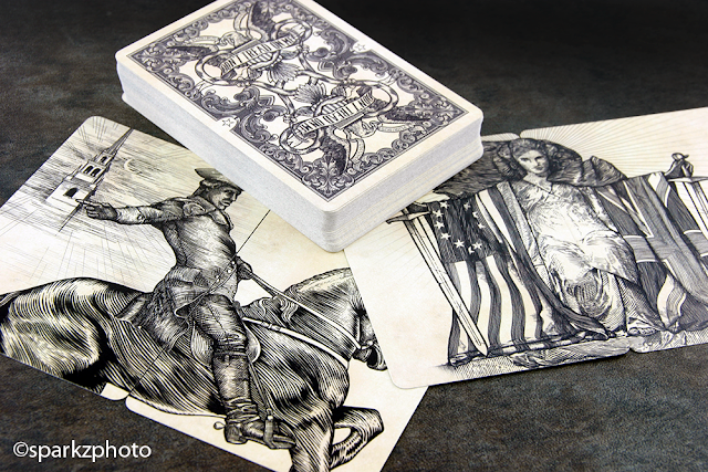
Historical decks are nothing new to playing cards, they've been presented in many different ways and covered a huge array of events. In the early boom of completely custom playing cards, Jackson Robinson and Kings Wild Projects released The Independence.

Inspired by the American Revolution, the series consists of two decks representing both the Continentals and British. The Blue version in the set represents the Continentals, while the Red represents the Crown.


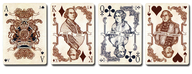
Both decks feature Jackson's signature style and include multiple diptych panels that are striking all on their own. The courts feature famous historical features such as Thomas Jefferson and King George III. The court design is also enhanced by some beautiful line work in the corner framing that carries down the side of the card. 

The face cards have nicely designed pips with another KWP feature, the watermark design in the background. The slightly "weathered" color and look of the cards really works well with the concept and design. The tuck cases reflect elements found on the back design as well as silver foil accents and embossing on a soft matte base. Independence was released in two variations, the Standard Edition and the Limited Edition.


The Limited Edition decks feature a more detailed back designs as well as a more elaborate design for the Ace of Spades. The packaging was also upgraded with custom fold over tuck cases, wrapped in vintage style vellum and to tie it all together a nice "Belly Band" signed by Jackson Robinson. 

Independence is not only a beautiful set of playing cards, it's a wonderful conversation piece. The historical concept behind it with its detailed courts cards and two card panels is sure to draw attention. I'm a big fan of Jackson's style, it's been copied and redone quite a bit since the release of Independence, but as they say, imitation is the sincerest form of flattery. Independence also had a hand crafted four deck presentation case available which make the set a beautiful center piece . 


As playing cards go, The Independence Series holds more to it than just a custom designed set of playing cards, the work and design reflects the history behind the concept really well. If your a history buff and like playing cards, this is a no brainer............even if you don't like playing cards and your a history buff, you should take the time to check out The Independence. 

The Collection segment is produced by Anthony Ingrassia of Kardify. No part of this article, images or video can be reproduced without written permission from the author and Kardify.com. To see more of Anthony's (Sparkz) collection and work please visit his Facebookpage or follow him on Instagram 

First Look: EMINENCE Playing Cards by Vadim Smolenskiy


[Update] EMINENCE Playing Cards are now LIVE on Kickstarter!

EMINENCE Playing Cards have been designed from the ground up with backers in mind. Great efforts were put into developing the deck from a user's point of view and ensuring that the deck is functional and usable for everyday use. According to the designer, Vadim Smolenskiy,
For a while now I wanted to make a fully custom deck that someone not only wanted for their collection but also to play with.
That became Vadim's goal; a legible, easy to play with deck that’s fully custom, has all the bells and whistles, but at the same time, can be proudly opened at the table and played with without having to look twice at the indices to figure out what’s what.


EMINENCE will feature gold foil on white stock, the main colour being Gold to fit the ‘Royalty’ theme. When asked what inspired EMINENCE Vadim said,
 I own a few Russian Empire stamps and one day, I was admiring them and that inspired the back design. Somehow the double-headed eagle seemed very fitting for this deck and the royalty theme that I was establishing. I carried it over to the Ace of Spades, which made it’s way to the front of the tuck. not only could be collected, but easily played with. application from a user’s point of view and ensuring that users spend their time using the software, and not continuously learning how to use it. 
Every inch of this deck has been researched and custom-illustrated from scratch with great attention to detail.  The cards, while fully custom, have a very traditional look and feel to them. Each court card features an updated King, Queen and Jack with new weapons and flowers, but retains many of the original patterns.
I started drawing out and vectoring the royalty one by one. Researched each one to see it’s history and how it came to be what it is today. With that in mind, I made changes and added new details to each card (most of the Jacks and Kings have new weapons while others have been updated).
The tuck will use white stock that will feature gold foil, embossing, and interior printing. So EMINENCE will be offered in two versions the “Gold Edition” and a “Platinum Edition” that will feature silver foil, embossing and interior printing.


EMINENCE Playing Cards will be printed by Legends Playing Card Co. on their Diamond Finish card stock and scheduled to launch on Kickstarter September 23rd. Pledge starts from $13.

[Update] EMINENCE Playing Cards are now LIVE on Kickstarter!

First Look: LUXX Palme Playing Cards by JP Playing Cards


Continuing the series of luxury playing cards, Palme is the second design in JP Playing Cards' stunning LUXX series. Designed by Rick Davidson, creator of the beautiful Origins Cards, Palme is a deck inspired by the beautiful Paisley pattern, which has roots and heritage across the globe.

A photo posted by JP Playing Cards (@jpplayingcards) on

The Palme backs features full-bleed, borderless design, giving this deck a unique look and style which is carried through the deck and onto the tuck. The eye-catching tuck box features a wrap-around design and embossing complete with matte foiled LUXX logo. We asked Paul Middleton what was the inspiration behind Palme and how did he end up working with Rick,
Paisley was a design I’ve always enjoyed and I believed it would inspire a beautiful deck. There was only one choice for the designer really, I've got a pretty good relationship with Rick and he stood out as the perfect person to move the series on. I’m glad he said yes because he’s more with the theme and concept than I thought possible. We’re incredibly excited to see the reception that this deck when it’s our there with our customers!

With the design, what does this mean for the future of LUXX? Paul continued,
We’d always intended for LUXX to be a series of decks, but it wasn’t clear early on exactly how that would be achieved. I wanted to create a brand which was synonymous with luxury, whilst being decks which people actively use. Randy’s beautiful work on the original first and shadow editions meant that I wanted to ensure that the next design in the series was suitably different at the same time as carrying those brand characteristics.

A Limited Edition of 2000 of each colour printed on Elite Finish by the Legends Playing Card Company, a similar finish to Classic which has increased durability and a slightly different texture.

Palme will be available for pre-order beginning on Friday, October 2nd. To find out more about LUXX Palme Playing Cards or to pre-order, visit JP Playing Cards.

Card Gear: Magic Life


To continue our series in discovering new inventory and accessories,  we have the everyday gears of @lost_angelus featured this month. @lost_angelus is a well-respected and very popular magician on Instagram. His amazing magic videos and visually impressive images have inspired the magic community on the social network and at the same time help start the #MondayNightJams movement across the globe. Talented, friendly, and knowledgeable magician! Definitely, one to follow if you are on Intagram. @lost_angelus' gears:

+ Steel Watch by Fossil
+ 128GB USB3.0 Thumb Drive by Centron
+ F-402 Pen by Zebra Alex
+ Cadet Knife by Victorinox Kensington
+ Wallet by P.M. Goods Co.
Black Artisan Deck (06-15) by Theory11
+ iPhone6 with Kevlar Case

What’s yours? If you would like your card gears to be featured on Kardify, contact us.


Card Gear is our monthly feature dedicated to discovering new inventory, setup and accessories used everyday by card designers, cardists, magicians and collectors. The concept originated from the popular social media site, Instagram: #passthepockets. Whenever one of these hashtags come up on the social news feed, there's always something new to discover, no matter who that person is.


Crowdfunding this Week: 9/20


Welcome to the first series of Crowdfunding this Week, where we select some of the best playing card projects on the various crowdfunding platforms this week. Summer is finally winding down and Kickstarter has been busy with a few projects launched last week. Check out some of these projects:

TUXEDO Playing Cards 

Fun and stylish deck of playing cards. A classic deck with the face cards wearing Tuxes.

Kickstarter project by: Natalia Silva
Current Status: 47% Funded
Pledge Amount: $13 for single deck
Ends: October 20th, 2015


¡ VIVA MEXICO ! Playing Cards

A fun and vibrant deck of playing cards created to celebrate Mexico. Designed by Adrian Valenzuela, printed by Legends Playing Card Co.

Kickstarter project by: Jay Losa
Current Status: 41% Funded
Pledge Amount: $8 for single deck
Ends: October 16th, 2015


NOUVEAU Playing Cards

Discover the original heroes and heroines inspired by 16c French decks with NOUVEAU, official 2016 United Cardists Annual deck

Kickstarter project by: United Cardists
Current Status: 84% Funded
Pledge Amount: $13 for single deck
Ends: October 20th, 2015

Deck View: ONIDA Playing Cards


Minimal. Elegant. Linear.

Designed by Nick Vlow and produced by Legends Playing Card Co., ONIDA is an elegant deck designed with flourishers in mind. The linear pattern adds dimension to rotational moves and enhances displays, yet does not overwhelm the eye with too much color or blocky artwork.

The deck features a beautiful matte uncoated paper tuck box, with UV accents, and a minimal back design that cardists will definitely love. ONIDA was printed in Taiwan, with Legends' snappy and durable Diamond Finish card stock.

Available now from JP Games.

Kickstarter: 7 Questions with Karin Yan of NOUVEAU Playing Cards


[Update] NOUVEAU Playing Cards are now LIVE on Kickstarter!

NOUVEAU playing cards are inspired by the historical and mythological heroes and heroines traditionally featured in the French playing cards in the 16th century. Designed by Karin Yan of Bonafide Playing Cards in Barcelona for United Cardists annual 2016 deck, the art style and design are a tribute to the philosophical and artistic trend Art nouveau, promoted and popularized in France.

Fully custom and beautifully crafted, the NOUVEAU courts feature historical and mythological characters such as biblical King David, Greek goddess Pallas Athena, Roman leader Julius Caesar, legendary Knight Sir Lancelot and many more! The suits themselves represent different Social Orders. For example, Spade represent nobility, Hearts the clergy, Diamonds the merchants and Clubs the commoners and the peasantry.

Just prior to the launch of the project, we had a quick chat with Karin about being a designer, the story of the NOUVEAU deck and how it came to be the UC 2016 deck and her thoughts on the support from the playing card community.

Can you tell us what do you love most about being a designer? And where do you get your drawing inspiration from?
I love the fact there are no bounds for imagination and it’s rewarding to bring your ideas to life. The creativity and versatility, which are part of anything related to designing, awakens a constant constructive criticism and self-improvement desire, which I greatly enjoy.

Well, inspiration is kind of different depending on how you approach it and it can come from literally anything; if you really want the perfect or right result, inspiration is not something you can force, it comes on its own once you have a general picture of what you want. As I see it and in this case, you don’t decide to create a custom deck and then break your head trying to come up with several ideas for designs. When you check out other playing cards, you realise that there’s still so much room for different and unique designs.

As for me, I love classic drawings and designs so decks such as Hundred Years' War, Venexiana and Federal 52 inspired me to create something classic. The idea of custom playing cards with a classic style led us to the original cards and after polishing it, we came up with NOUVEAU Playing Cards.


Tell us about the story of how this NOUVEAU came to be United Cardists 2016 deck? 
Ever since we started with the idea of our own custom playing cards, Mike has been very supportive of the story behind the design and the design itself. He liked our work and the concept so, after we failed to fund our own campaign, he suggested we work together on an improved NOUVEAU as the United Cardists 2016 deck.

How do you approach this project? Specifically, what led you to Art Nouveau styling for the deck and why? 
We had many ideas from the start and one of them was to bring back the historical and mythological heroes and heroines that inspired the French playing cards back in the 16Th century, which developed into the playing cards as we know them today. Taking that into account, we chose to stay in France and choose a French art style for our cards. It wasn’t easy as France was always known as a place of artistic reference, but after some thought we settled on Art Nouveau (promoted and popularised in Paris in the late 19th century). Another reason was that on our first funding attempt, the idea was to print a Bicycle branded deck and Art nouveau was contemporary to the birth of the brand.

I noticed the the colour palette for the deck have been updated. What are some of the design updates you’ve done to the deck to incorporate the UC theme? 
There are several and noticeable changes including the back, tuck and backgrounds on the court cards and Aces. Taking into account all the feedback and suggestions, I tried to change our deck’s look to something simpler as well as sophisticated within the limits of Art nouveau. Something that could be considered minor details such as the thickness of the lines, the finish or colouring helped me reach that goal and come up with a bolder design.


I know you put a lot of time and effort into your work, how much time has gone into the deck? 
A year has passed since we came up with the idea till I finished the UC2016 redesigned deck last month. I must say that even if there’s a lot of time and work behind this deck, I’m glad I managed to keep most of the design I first came up with, leaving the Aces and courts almost intact since day 1.

Are there any surprises planned for the release of the deck? 
We’re still deciding on our campaign’s details but we’re planning on two more decks that will be unlocked if we reach their stretch goals; One unlimited, closer to our original design (check out our previous campaign) and another extra limited Reserva Privada deck with an elegant and luxury finish both on the cards and tuck. We’re thinking about some items as well but nothing is decided yet. We’ll be updating with more news closer to the launching date.

Finally, what do you think of the support and feedback you have been getting from the playing card community thus far? 
We’re really grateful for all the feedback and support we’ve been getting along the way. NOUVEAU wouldn’t be the same without their help so it’s safe to say that if we manage to produce this deck, it will be thanks to their selfless support and constructive criticism.

We want to thank Karin and the team from United Cardists for their time and insight into NOUVEAU. Make sure to mark your calendars for the Kickstarter launch on September 19th, 12pm.


The NOUVEAU Playing Cards will be printed by EPCC on their Master Finish card stock. Pledge starts from $13 and there will be EARLY BIRD pledge tiers available. There are multiple add-ons available such as uncut sheet, art print and dealer coin. Also, there are multiple rewards that will be unlocked once the project hit their set stretched goals, most notable is the NOUVEAU Bourgogne deck at $15k.

[Update] NOUVEAU Playing Cards are now LIVE on Kickstarter!

Don't miss out!

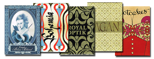
Collections: Classic by Uusi Studios


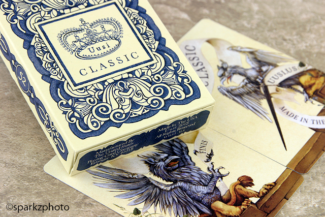
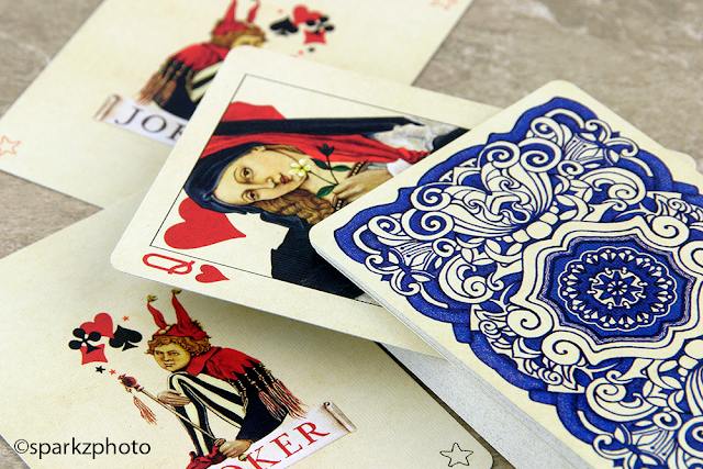
Six decks ago, starting with the still sought after Blue Blood, Uusi embarked on their new project. It was a series that was to consist of 6 different decks, each with its own style, look and concept. That series came to a close with Classic. Appropriately named, Classis is exactly that, a throwback to the vintage look and feel of old renaissance artistry, the hand painted courts and hand drawn back design all show the true artistic talent that Uusi brings to all of their projects.


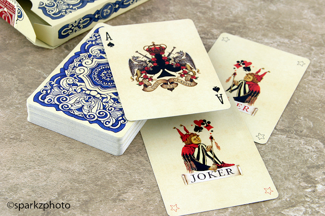
The tuck has a soft feel and subtle embossing to it, and the off white color helps the bold design work stand out, while still having a “Vintage” look to it. As with all of Uusi’s decks, Classic was also printed at USPC, the antique hue of the base color of the cards works really well with the Classic theme and the almost iconic large full pips feel perfect in this renaissance package.


The court cards are the stand out element of the deck in my opinion, a very strong Classic design, again pulling from the renaissance period, bold character and the perfect palette make each court look like a painting you would find hanging in a museum. The Ace of Spades has a nice regal look to it and the Jokers are playfully innocent and continue to tie the theme together exceptionally well.


Available in Blue and Red, Classic also features another Uusi staple, the two panels (Card) Diptych, adorned with mythical creatures and a banner that stretches across both cards that reads “no. VI” (No. 6) on one side. Classic is everything I would have expected from Uusi, it continues to showcase Linnea and Peters talent and commitment to producing something different than each previous deck. Classic is a bit bittersweet, closing the chapter on Uusi’s series, but they haven’t disappeared completely from the playing card world, which is good news for us.


If your new to collecting, take a moment to look up not only Classic, but all six decks in the Uusi series, you would be hard pressed to find such a divers series anywhere else.  The only real hard piece to find is the original Blue Blood, but you can enjoy the look and feel of that deck with the Redux version. The others in the series are not impossible to find, but might set you back a little. Well worth adding to your “Wish List”, and they definitely earn the title of “Must Have” in just about any collection. Enjoy the “Vintage” look of Classic, and venture into the back library as well, you won’t be disappointed.


The Collection segment is produced by Anthony Ingrassia of Kardify. No part of this article, images or video can be reproduced without written permission from the author and Kardify.com. To see more of Anthony's (Sparkz) collection and work please visit his Facebookpage or follow him on Instagram 

First Look: Viva Mexico Playing Cards‏


[Update] Viva Mexico is now LIVE on Kickstarter!

Coming soon! Viva Mexico‏ is a vibrant deck of playing cards conceptualized by Jay Losa and designed by Adrian Valenzuela who also run the incredible design company avdesignco. With Viva Mexico Playing Cards, their goal is to celebrate Mexico’s rich culture and heritage in a unique and lively way.


When asked about the inspiration behind the deck, Jay said,
I lived in Mexico for most of my childhood and the thing that stuck with me most about the Mexican people was their love for life and their country. It was such a beautiful experience. It is because of this that I decided to create a lively and unique deck of playing cards that would celebrate my culture, my heritage, and my people. 
[Update] Viva Mexico is now LIVE on Kickstarter!

The deck is set to launch on September 16 to coincide with the Mexican Independence Day.


Card Radar: Ginza UNO Playing Cards


This is not the usual playing card deck. No courts, no jokers or no aces. Based on the popular colour and number matching card game, Ginza UNO playing cards was designed for special guests of Ginza project restaurants network.


This elegant deck of cards is design by Igor Hrupin, a graphic designer based in Moscow, Russian Federation. The deck consists of four suit colors (red, green, purple, and yellow), each color having two of each rank except zero. The ranks in each color are zero to nine, "Skip", "Draw Two" and "Reverse".


In addition, the deck contains four each of "Wild" and "Wild Draw Four" cards. These cards also serve as a marketing tool as it features addresses of Ginza Project restaurants all over the world on the cards.


More Igor Hrupin's work on Behance.

© all rights reserved
Kardify 2013