Responsive Ad Slot

Deck View: Density Playing Cards


Patterns. Shapes. Stylish.

Designed by artist Roni Lagin, Density Playing Cards are a limited fully custom-designed deck where suit symbols are manipulated into intersecting shapes and patterns. The deck features intricate line-work, fine details and a unique approach to face cards.

Printed by the United States Playing Card Co on their famous Bicycle grade stock, Density contains 52 fully custom playing cards, two custom joker and a stylish custom tuck. Density Playing Card will excite magicians, poker players and any playing card enthusiast.

For more cool playing cards, check out JP Games.


Collections: Union by Theory 11


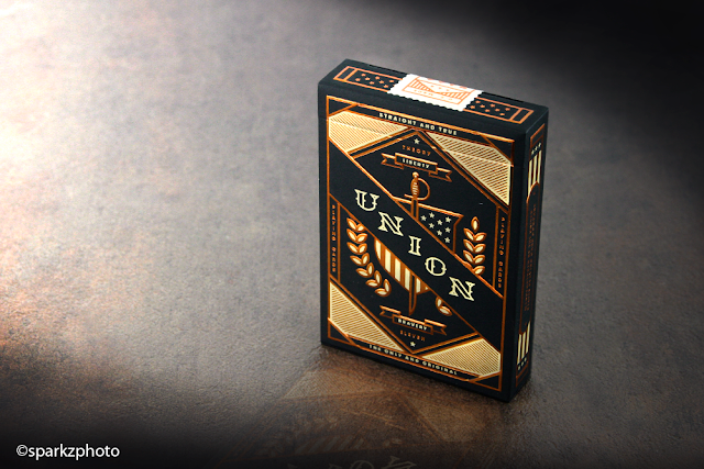
Union from Theory 11 continues the winning formula that the company seems to have adapted over the last year. While not all the decks may appeal to you, there is no denying Theory 11 has a nice selection of functional eye candy for everyone as of late.

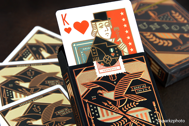
As a theme Union oozes American in every way, the design features elements and icons all harking to a patriotic time and place. Presented on a heavy stock tuck with a beautiful Bronze foiling and embossing give the deck a really nice impression at first glance. Designed by Jay Fletcher, Union does a wonderful job of bringing a very historic feel to the concept.


The deck itself handles as you would expect from Theory 11, made in the USA using FSC-certified paper, vegetable-based inks, and starch-based laminates. The color palette of the deck is a nice vibrant, yet a bit muted scheme, but it lends itself well to the concept and period it's representing. The spot cards Red suites have been replaced by a nice calming orange throughout the deck, while the dark suits retain their classic black coloring.


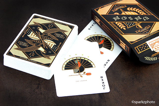
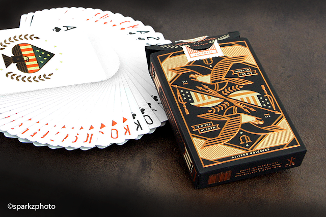
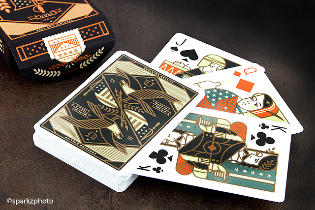
The court cards look fantastic in the color scheme of the deck along with a very theme appropriate design, very Americana, yet keeping the classic concept of court cards intact. Each unique court card does a nice job of depicting characters fitting the time period as well as bringing the design together with the wardrobe and elements you would normally see on a mirrored court card. The Ace of Spades features a Eagle with outstretched wings and the top of the spade being composed of the Ole' Stars and Stripes. The deck also features two Jokers featuring a Turkey design that just keeps the "Home made Apple Pie" feel constant in this presentation.


The back design is perfectly fitting for this deck, a two way back featuring an eagle in flight along with very familiar patriotic symbolism. Very iconic line work and framing bring the design together really well and the muted Gold tone just lends to the look and feel of the concept. Overall Union is a fun, well conceived deck with beautiful element and line work. The Americana feel is just amazing and I can see this deck being a great gift for any History buffs in your life. It's no mystery I'm a big fan of Theory 11, but with the wide variety and the perfect use of the "Bling" factor on there decks, not to mention, an affordable price tag, it's hard to go wrong with Union or any other Theory 11 deck now a days. Head on over to Theory 11 and pick up a few and while your there, check out the Ironside Edition :)

The Collection segment is produced by Anthony Ingrassia of Kardify. No part of this article, images or video can be reproduced without written permission from the author and Kardify.com. 

Deck View: Branle Playing Cards


Culture. Historical. Europe.

From NoirArts, Branle Playing Cards are a beautifully crafted deck with custom pips, Ace, backs and face cards. As the name would suggest, the deck is inspired by Branle, a 12th-century French chain dance adopted by European aristocrats, especially in France and in England.

The gorgeous deck portrays history and culture of the 16th - 17th centuries. Each royals have been beautifully illustrated and each suit represents a different European country: the peaks - Britain, hearts - France, clubs - Spain and diamonds - Eastern Europe. Also, Branle features a premium card stock tuck with printed tuck interior.

Each deck will have numbered custom seal. Printed by NoirArts Playing Card Co, Branle features NPCC's Casino Classic Black Core Card stock with Linen Finish a soft stock which handles reasonable well but requires a short break-in period. Only 700 decks were be printed.

Available from NoirArts. For more cool playing cards, check out JP Games.

Collections: Black Lions by David Blaine


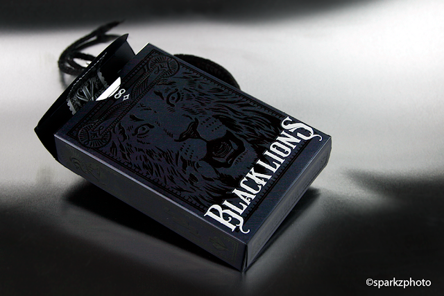
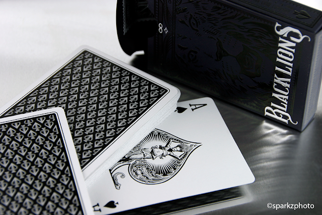
David Blaine is an amazing illusionist and performer. Over the years he's also delivered some of the most beautifully classic looking playing cards with the amazing design work of Mark Stutzman. The most recent David Blaine Series is the Black Lions and like most Blaine decks, they don't disappoint.

The Black Lions seem to be more of a continuation in the long line of David Blaine Playing cards. Each offering a classic, familiar look and a solid product. The Black Lions will appeal to just about everyone in the Playing Card Aficionado funnel, from magicians looking for a nice working deck, to collectors who love the look and design elements of the deck.


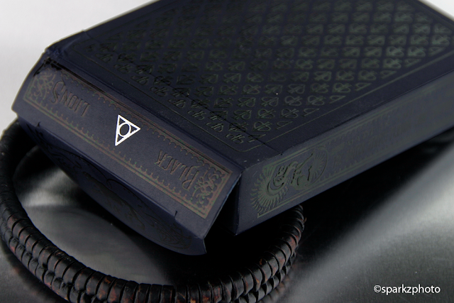
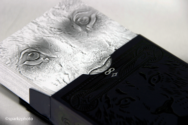
The Black Lions feature design work by the brilliant Mark Stutzman who always has a beautiful way of presenting subtle ideas in an eye catching way. The soft black tuck with Black "Foil" accent elements work so well with the subtle beauty and fines of the Lion face as well as the "DB" repeating pattern on the front of the tuck....yes, the front of the tuck. Small silver foil details enhance not only the decks name on the tuck, but also some of the small "Symbols" you'll find here and there that represent a few things depending on your beliefs. Ranging from the Holy Trinity to the symbol of the All Seeing Eye, these little details help give the deck the mysterious overtone that David Blaine brings to his craft and performances....the decks are always full of little secrets.


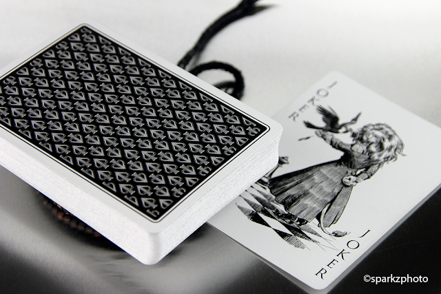
You'll also find two intriguing Jokers featuring a Lion Faced woman handling what appears to be a crow, one of which does incorporate a reveal. There are two additional cards in the deck. One is, at first glance, an abstract and confusing design...this is one of the "puzzles" in the deck you'll need to figure out on your own. The other is an uncanny effect of metamorphosis that will turn David Blaine into a Lion and vice-versa. The rest of the pack, as in most of David Blaine's decks feature friends and family making up the faces of the court cards as well as David holding his usual position as the King of Spades and the spot cards are pretty much your usual Blaine standards.


Black Lions also features one of my favorite Ace of Spades designs that first appeared on the Split Spade Lions. An image of a woman disguising the face of a lion framed in the shape of a Spade, its still a cool design and till this day I still come across people who say "What Lion". The card backs feature the repeating "DB" symbol which is both intricate and classic in its appearance. I've always enjoyed David Blaine's decks, each has its own unique look and design, Mark Stutzman's work never disappoints and when you get passed all the intricacies of the deck your left with a solid, well handling pack of cards suitable for everything you could possible want to use them for. One thing I've grown to expect on a regular basis from DB is a quality product at an affordable price....the eye candy is just the cherry on top.


The Collection segment is produced by Anthony Ingrassia of Kardify. No part of this article, images or video can be reproduced without written permission from the author and Kardify.com. 

Card Gear: A Man Well Traveled


Card Gear is our monthly feature dedicated to discovering new inventory, setup and accessories used everyday by card designers, cardists, magicians and collectors. The concept originated from the popular social media site, Instagram: #passthepockets. Whenever one of these hashtags come up on the social news feed, there's always something new to discover, no matter who that person is.

This month, we have the EDC of Paul Ruccio, the designer behind Jetsetter Playing Cards. When he is not designing cards, Paul is busy working as a retail management consultant where he travels typically around the US with a tiny international travel (Canada) helping retailers with various initiatives/project at their HQs. Paul loves to travel by plane which is why there's much passion behind Jetsetter Playing Cards. His next deck will be the Altitude Blue Jetsetter Playing Cards, coming soon on Kickstarter.

Paul’s gear:
+ ESQ Beacon Watch
+ iPhone 6s
+ Apple Headphones
+ American Airlines - Gold
+ Hyatt Gold Passport - Diamond
+ Leather R.E. Hand Crafted Clip
+ Jetsetter Playing Cards
+ "Remove Before Flight" Keychain
+ Passport


What’s yours? If you would like your card gears to be featured on Kardify, contact us.

[post_ad]

Kickstarter: Oni Playing Cards by David Boyd


Created by David Boyd, Oni Playing Cards are inspired by the tales of legendary warrior Minamoto no Yorimitsu and his four guardian kings found in the Otogizoshi and Noh theater. The deck features twisted demons, ogres, and tricksters of Japanese mythology.
I was inspired to create Oni after visiting the Shofuso Tea House in Fairmount Park. While reading up on the Jizo statue there, I stumbled across the legends of the Oni. I was instantly hooked. After absorbing everything i could get my hands on, doing a deck of cards centered around these powerful mythical beings seemed like a no-brainer.


The courts are hand-illustrated and carries an accompanying story, heavily inspired by Otogizoshi and the tale of the legendary warrior Minamoto no Yorimitsu. The typical French suits have been altered with unique, Japanese-theme pips.

Oni will be printed on linen USPCC stock and are available now on Kickstarter from $15.

Deck View: Revelation Playing Cards


Skeletons. Gothic. Cathedral.

Originally funded on Deckstarter, Revelation is a unique deck of playing cards inspired by medieval cathedrals and their gothic style. Designed by Blake Brenneman and Michael Messer, this meticulously hand-illustrated deck features gothic details, symbolic carvings and stained glass ornamentations from the stunning Nidaros cathedral in Norway.

Revelation is fully custom, from the tuck box, jokers, Ace of Spades to the eye-catching backs, which features artwork inspired by the beautiful stained glass of the cathedral. Also, the illustrated skeleton courts pay homage to the silent skeletons of Norwegian royalty still resting in Nidaros’ catacombs.

A strangely beautiful, simple and visually stunning theme. Printed by the Expert Playing Card Co and available from artofplay and for more cool playing cards, check out JP Games.


Kickstarter: Crazy 8's Playing Cards by Kings Wild Project


Kings Wild Project is back this year on Kickstarter with Crazy 8’s Playing Cards, which is shown in its full glory here.


Inspired by chalkboard art the Crazy 8's are a fresh new look on the traditional playing card deck. According to Jackson Robinson,
I have always loved chalk board art and I wanted to incorporate that interest into this deck of cards. I also wanted to incorporate quirky elements from some of my favorite illustrated childhood books that I now read to my daughters. Mix up all of those ideas and you have the Crazy 8's!

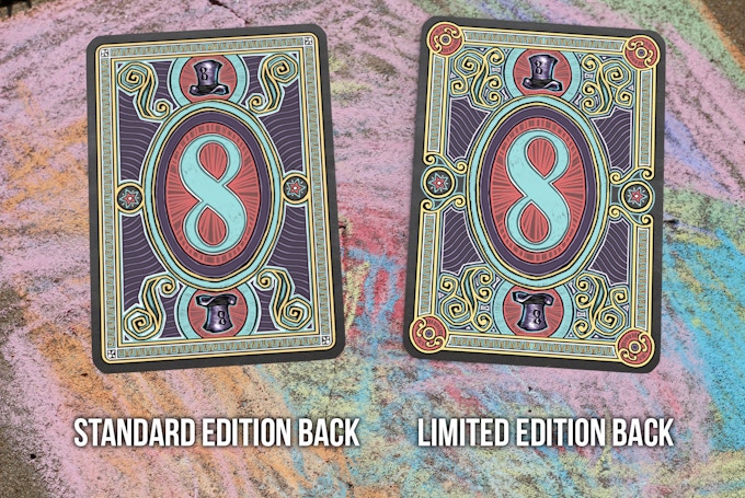
Crazy 8’s are available in two editions: Standard and Limited Edition. Both decks are completely unique and fully custom.


The Limited Edition (limited to 888) features numbered seal, embossed tuck and full color interior tuck printing.


These quirky decks will be printed by the Expert Playing Card Co at the highest quality stock with 'Classic Finish'. Already funded, pledge starts from $12 on Kickstarter.

Don't miss out!


First Look: Hessler's Enhanced Playing Cards by Matt Hessler


There’s always been that discussion of what makes a good “working deck” as opposed to a deck that, while functional in all its bling and design, isn’t really what someone would sit down at a poker table with or be readily used by a magician or card manipulator in their routines. Matt Hessler decided to dig deep into the Bicycle tradition and develop something very functional, familiar and unique.

The Hessler Playing cards utilize a classic Bicycle design with improved paper and enhanced full color faces.  We had a chance to chat with Matt about himself and this project.

Can you tell us a little about yourself?
I’m a nonstandard IT Professional who plays card games instead of video games. I work for a company in Portland Oregon, but work out of my home closer to Seattle, in Olympia Washington.  I enjoy most of the Pacific Northwest stereotypes like hiking, craft beers, and locally roasted coffee. I'm also somewhat of a history buff so I’ve always been drawn the history that playing cards have. I would say that I’m a casual collector who enjoys playing with the cards more than collecting them.

In a time where crowd funding is so prevalent, what factors made you decide to self-fund this project?
That’s a great question. I definitely considered doing a Kickstarter campaign for this deck.  I have certainly helped fund a few campaigns and I would consider crowd funding in the future. The main reason that I chose to self fund this project is because it was a more casual approach. I was able to work at my own pace and get the project done right without having to set a timeline or a funding time window.  I’ve heard a lot of horror stories about campaigns that don’t fund on time, or get a lot of backlash because unrealistic promises couldn’t be followed through with.  I also didn’t want to worry about the logistics of shipping decks all over the world. This deck may be slightly more expensive than some crowd funded decks, but no one has to wait for the product or wonder if it will ever be available. If you like the deck you can simply buy one get it in the mail in just a few days.

Decks with completely custom eye popping artwork have a huge market and following, why did you opt for a more standard fully custom “Working Class” deck?
There are some beautiful decks out there with unbelievable custom artwork, but most of those can never be used in serious games for a number or reasons.  For example the artwork often makes the different cards hard to differentiate from each other, or the dark card edges easily scratch and become marked. Often times I think people buy a new deck and they’re impressed by the custom ace or really amazing custom backs, but shortly after opening them they just put them on the shelf with the other cards and never look at them again. I didn’t want to create a deck like that. I wanted to make a deck that stands out in quality and playability.


What was your goal for the Hessler Enhanced Playing cards?
My goal was to make these cards of a good enough quality for magicians and people who handle cards every day to practice with, and also beneficial for the people who play card games regularly. I tried to give this deck the most visually playable design possible while also keeping the traditional Bicycle standards that everyone loves. I wanted this deck to look as if the design could have been introduced a hundred years ago, while also making it a cutting edge deck. I would like to think these are cards that people will want to go back to time and time again to actually use.  I hope that they’re unique enough that people are excited to shown friends who aren't card collectors.

Can you tell us a bit about the playability, enhancements and quality of the deck?
The two games I personally play the most are Texas Hold’em and Hearts. Since there still seems to be some controversy surrounding four color Poker decks I decided to make my first deck lean toward the game of Hearts.  My personal go-to decks have always been decks made by the United States Playing Card Company. These guys have been making playing cards in the United States since 1867.  Specifically I prefer the classic “bee” decks with casino quality paper, and a design that has for the most part remained the same since the 1800’s. While I was working with the USPC on this project they informed me that they only have two different printing options, the standard “Bicycle Paper Card Stock/Air Cushion Finish”, and the more expensive “Bee Paper Card Stock/Air Cushion Finish”. They also verified what I had heard about all of the other various paper and finish names used on USPC decks. Excluding a few options from the past all of the names are just marketing for the same product. I was really happy when I found out I could print “Bicycle” cards on “Bee” paper. The UPSC doesn’t allow mixing brand names however, which is why this deck is labeled as “Superior Casino Grade Paper and Finish”. The second deck I’ve always really enjoyed using is the Bicycle Multi Colors (Fragment X) Deck which was a great deck, but had some serious flaws, for example the yellow ink was almost impossible to see in low light. In my opinion four color suits (or pips) speed up game play and work better for almost every game. Four-color decks are used with almost all online Poker websites and are the norm for most games in Europe. From what I understand the two color red and black decks only became the industry standard because of the lower cost of printing them centuries ago. Some long time playing card enthusiasts may remember when professional poker player and pioneer Mike Caro introduced a four color deck during the World Poker Finals in 1992. That campaign didn’t end up going very well, most people blame this on poor card printing quality and the fact that the gambling industry will always be slow to change, not to mention that superstitious players naturally blame losses an anything that’s different. It’s seems logical to me that four color decks will replace two color decks at some point in history, but maybe not for another 100 years.


Most common poker decks have a set of Jokers, I noticed they were missing from the Hessler’s, was there a reason behind that?
The reason I chose to omit the jokers is because I’ve never used them. The only games I know of that require Jokers are Euchre, and Canasta, both of which have special decks available from USPC made just for those games. There is also one random bonus card that simply features positive quotes.  I felt like this was a good opportunity to put some positive energy out there. We all know the world can be pretty negative these days. I also didn’t want to fill this deck with marketing info and web addresses that may not work in the future.

We want to thank Matt for sharing not only his time, but a few of his decks with us. I have to say, the decks feel really nice. From a handling standpoint, they’re exactly what you would expect from a Bee Casino grade deck from USPC. I spent some time handling the deck with some shuffles, dribbles, fans, etc… and the deck felt perfect, it was hard to put down.

In terms of a deck for playing Card Games, the deck is just as pleasing. The four color suit markers do make it really simple to ID a card quickly. The color palette used on the courts is pleasing and give the deck a Classic look and feel and the script on the sides, surprisingly, fits really well without being distracting.


The deck also features a four color version of the Maiden Backs and I have to say that little splash of color really works for me. You’ll also receive a few Bonus cards with your pack, the “Black Maria”, The “Omnibus Knave”, as well as instruction on playing the game of Hearts and a nice inspirational card from Matt. Overall I like the deck for what its design and quality were intended, the look and feel of the deck are just added bonuses. There are a few things that won’t appeal to everyone, more so out of the reluctance to change and something out of the “Norm”. Sometimes stepping out of that comfort zone is just what you need to appreciate something different. The Hessler Enhanced Playing Cards can give you that opportunity.

You can visit Matt’s Website to get more information on the Hessler Enhanced deck as well as any future projects coming along or follow him on Facebook.

The Hessler Enhanced deck will be available today on Amazon.com and for this weekend ONLY will be at an introductory price of $10.95! Sale starts Friday January 15th and ends Sunday January 17th so take advantage of the savings!


Collections: Arcana by Dead on Paper


When Dead on Paper announced Arcana I was instantly on board. Besides my interest in Poker decks, I've always had an interest in Tarot cards. Much like the custom decks we see today, Tarot offers some amazing artwork and the added mystery of Tarot itself has always intrigued me.

Arcana is a great concept by Chris Ovdiyenko, it is by most interpretation a poker deck. But the way the deck has been presented and the available expansion to complete the Tarot side of things was well conceived. Arcana is available in White and Black and you can add a Major Arcana Expansion deck to complete the Tarot set.

Arcana's tuck is striking and simple. Beautifully detailed imagery and symbolism adorn the matte tuck that also seems to have a bit of a "Perlized" shimmer when the light hits it just so. Subtle embossing on the front and back add to the look and feel of the deck, while the light blue foiled interior completes the package.


The deck itself is presented for the most part as a poker deck. All the suits are represented as well as face cards and courts. The one omission to the "Standard" composition of a poker deck is the lack of Jokers. With the deck printed by USPC, there could only be 56 cards at most, 52 plus Jokers and 2 additional cards if needed. Chris opted to remove the Jokers in order to balance out the Tarot side of the deck by adding 4 Major Arcana cards (which come into play with the expansion deck), The Tower, The Lovers, The Fool and the Death card. In order to make the other cards in the deck work with the Tarot functionality, the Tarot suits were included in the overall design of the deck, with Spades, Clubs, Hearts and Diamonds matching up with the Tarot Swords, Wands, Cups and Pentacles. At first glance you really don't notice the Tarot suites because they fall into the design of the cards so well, but upon closer inspection you'll find the Tarot suite "Indices" opposite the standard Poker suites indices.
The face cards, as well as the courts cards, have a slightly "Used" look to the base color of the cards, the numbers and pip design works very well with the design concept and the courts along with the 4 Major Arcana cards have a beautiful scratchboard look that just magnifies the detail in the art work. The artwork is 100% hand drawn and is just striking. The back design is simple but beautifully presented with great detail, depicting the Tree of Life, the design works really well with what Arcana is all about. The image is framed nicely with some line work as well as ornate corner details.


Tackling the task of combining a Poker deck and a Tarot deck is no small feat, but I think Chris pulled it off really well with Arcana. As a card collector the deck is just spectacular, as a Tarot fan its a great "Hybrid" so to speak. Whichever side appeals to you most, there is no denying the work and thought that went into this project, and the finished product speaks for itself.


Dead on Paper's projects continue to be among my favorites and Chris' artistic talent and willingness to explore outside the box make his projects that much more appealing. Card collectors should give Arcana a serious look and fans of Tarot decks will love the artwork and functionality of the deck as well. One note for those looking at Arcana as a Tarot deck, Arcana does not include the Page/Knave cards.

If your interested in staying up to date on Dead on Papers projects, you can follow them on Facebook. And if your interested in picking up Arcana and checking out some of Dead on Paper's other products, please visit there website.

Card Radar: It is Time to Check my Cards Playing Cards

Came across this intriguing deck on etsy while looking for playing cards to be featured on Card Radar. Designed by Jerzy Tchórzewski, this deck was first launched during the London Illustration Fair 2015 and was highly praised by both audience and judges.


Lots of thought has gone into these 54 cards and there is a different theme for each of the 4 suits, Fun, War, Money and Love.


Elements in the deck include yellow face cards, 12 uniquely crafted Royals and Aces and standard pip number cards. There are 20 different tuck designs and 5 different backs.


Also, there are many allusions to human characteristics and playful images along the way, for example, King with no crown, Queen who prefers lipstick over scepter, the King who weeps for Paris, the selfie Queen, swimming in the sea of fear & hope and many more. To find our more, head to Jestprints on Etsy.


Only 80 decks were made and each is signed and numbered. Only available from Jestprints.


Kickstarter: 7 Questions with Steve Minty about Anubis and Osiris Playing Cards


Artist Steve Minty brings us a new look to an old but rich era, the Anubis and Osiris Playing Cards draw their inspiration from ancient Egypt. The bold decks combine a striking design with classic elements from Egyptian culture.

For those of you who may not know Steve very well, he was traditionally educated in the illustration and design field. He's also done branding and design for major sport stars and celebrities but that was a stepping stone and a steady income at the time. His goal, like many artists and designers was to work for himself one day and so he took that leap of faith to pursue his dream. He's lived abroad and has had the opportunity to experience cultures that many don’t have the opportunity to and he's drawn on all of those experiences to cultivate his sensibilities.

The journey is long, full of bumps and pits but nonetheless it is a very fulfilling journey and I can’t wait to see where it continues to take me!

This is Steve's 3rd project and Anubis and Osiris are currently Live on Kickstarter, and I'm happy to also add the project has already fully funded. The project has some great stretch goals and surprises in store between now and it's closing day. As with any project, it involves a ton of work and dedication, and we're thrilled Steve was nice enough to take a bit of time out of his schedule to talk about his current project.


Did the experience with your previous projects give you a better vision of how to approach the Anubis & Osiris decks?
I believe that I learn best through challenges and failures. In my previous projects I faced some complications and speed bumps with printer issues, shipping and etc and have grown immensely from them. My Muertos campaign allowed me to learn how to handle a large volume of orders under immense pressure. My Olympia campaign taught me the value of having a backup system after my files were wiped due to a hard drive malfunction and the importance of packaging. There’s still a lot more for me to learn but I'm confident that I'm even more prepared this time around.


Do you have a routine when coming up with a design concept?
I’m not sure if I would call it a routine but I always approach a concept by being myself. I ask myself what I like, what catches my eye and I work from there. I’m peculiar in that if I don’t like what I am doing, I simply don’t do it. I trust my sensibilities enough to incorporate it into the concept and it seems to have worked so far.

What was the inspiration and motivation behind the concept of Anubis & Osiris?
I was immediately drawn to Egyptian design during social studies class when I was a young lad. Something about the decadent and bold nature of that culture held my awe. I knew there was a huge craze with the Egyptian Revival but I hardly see it anymore. The decadent ornateness fell away in favor of modern sleek lines and my motivation was to bring back some of that luxury and blend it with my design sensibilities.


With a project so cemented in a rich culture, did you do any kind of research for this project?
Absolutely. I believe in order to offer something of quality, preparation is needed and but more importantly, a comprehension of what I want to tap into. Doing that requires a large pool of data and knowledge so I've been to the library, read up using the Internet when convenient, visiting museums and other sources. That the research I have done allows for me to bring out the essence of the whole theme through my art. I’ve done it with all of my designs and I will continue to do so in the future.

Most designers get very excited about an idea, what excites you about the Anubis & Osiris Decks?
That’s a good question. I’m excited about whether or not people share my tastes but I suppose the thing that I am most excited about is that I want to prove that good design doesn’t have to be a lot of white space, gridded and entirely too clean. Establishing my presence doesn’t hurt either.


Was it challenging to maintain some of the “Standard” deck features with the design style of the Anubis & Osiris deck?
It is, but at the same time, it’s fun to have some design challenges. 
There are certain aspects to deck design that I feel are necessary in order to call it a set of “playing cards.” By incorporating these standard features, I get a better sense of accomplishment when I get a deck I am comfortable with releasing to the public. I could have easily disregarded these features but as a newcomer, one of my goals is to stay true to the medium of playing cards to the point of fully understanding the medium.


Could you tell us about the two variations available for this project?
Originally, the decks were two colorways of the same deck called the Scarab Deck. Unfortunately, I found out weeks before release that another Scarabs Deck was released on kickstarter and that sent me into a panic mode.I reached out to my supporters to help me find a new name for the decks and it was then that I decided that I would differentiate the decks more than just colors. I discarded the original back design and redesigned it so it would be different for both decks. Not just that, I differentiated the Ace of Spades and vastly improved the original jokers. This was done partly with my supporters in mind as I figured they would become bored with just a simple color swap. Perhaps one day I’ll release the originals from the Scarab decks, but in the meantime, please enjoy the Anubis and Osiris deck!


We want to thank Steve Minty for his time and insight into his current project. As mentioned, the project is currently funding on Kickstarter, so go check out some of the deck details and pledge for a deck or two. Pledge tiers start at $15.00. 


If you would like to keep up to date with Steve's projects you can follow him on Facebook, and visit his website if your interested in picking up his previous products, Muerots and Olympia.

News: David Blaine Teases New Black Lions Blue Edition Playing Cards


David Blaine has teased on social media the follow-up to last year’s popular Black Lions Playing Cards. The new Blue Edition will be available on 15 January at shop.davidblaine.com for $6 per deck for the first 24 hours.

A photo posted by David Blaine (@davidblaine) on

First Look: Pipmen by Elephant Playing Cards


Back in June 2015, Ben Jones and his team at Elephant Playing Cards (EPC) were busy working on their first successful campaign, Prism: Night Playing Cards. The deck pushed the boundaries of playing card technology and aesthetic by adding a world-first shiny UV gloss layer to the face of the cards.


EPC is back with their second Kickstarter project, this time with Pipmen Playing Cards. Printed by Legends Playing Card Co., Pipmen takes the creative impulse a step further in a Leremy-inspired playful work of art unlike anything you’ve seen before. We asked Ben about the concept behind the deck,
I wanted to create a fun, creative and playful design in a semi transformation style. It was really exciting putting the ideas onto paper, and then into finished designs - creating something like this is very enjoyable!

On the design, Ben Jones said,
Each design is unique, and each court card is reversible and tells a story. It can be hard to do the courts on transformational decks, as compared to the interesting number cards they can be bland. I have tried to overcome this by making them just as interesting as the rest of the deck. The Jokers are also unique and fun, and also different for each deck - 4 Jokers!

There will be two decks available, the Black deck (the standard version) as the initial deck and the second Red edition as a stretch goal. There are also multiple rewards that are waiting to be unlocked once the project hits its stretch goals such as embossing and interior tuck printing.

Scheduled launch date, January 12th on Kickstarter.


Deck View: Joker and the Thief Playing Cards


Intricate. Elegant. Beautiful.

The Joker and the Thief playing cards is an impressive deck! After years of reviewing playing cards, the talented guys from Joker and the Thief have decided to create their own deck of cards. The need for the Joker and the Thief playing cards came from years of observing and handling hundreds of custom decks.

James Milaras and Reuben Nutt believe that a certain balance needs to be achieved in order to create a great deck. The design invites attention while striking a balance between style and functionality.

The back design is not only intricately beautiful but aesthetically and sentimentally appealing. The themes and connotation from back design continue throughout, you may even start to see a story forming as you look through them. The Ace of Spades is unique, bold and iconic of this design. The court cards are all fully custom. The tuck is peppered with lavish touches, and adorned with eye-catching silver foil, on a matte finished paper. It is embossed on all sides and has a foil stamped interior.

Joker and the Thief Playing Cards was produced on Expert Playing Card Co’s Master Finish. Don't forget to check out the Joker and the Thief website! Also, for more cool playing cards, check out JP Games.


© all rights reserved
Kardify 2013