Responsive Ad Slot

Deck View: Viridian Playing Cards


Elegant. Intricate. Beautiful.

Designed by Ade Suryana, Viridian playing cards feature a custom vintage design, reimagined courts, a beautifully crafted tuck case and a stamp bearing an intricate custom design. A deck that is as beautiful as it is functional, Viridian is the first in Trikard’s (a collaboration between Kardify and Three of Clubs) new line of Signature playing cards - versatile for magic, card flourishing or even just a game of poker.

The beautiful typography is based on vintage typeface and inspired from old Billheads and ephemera. The tuck is also elegantly adorned with beautiful organic patterns which is especially striking. The court cards are stunning and each card has a different face and a different arcane-styled outfit which looks amazing with the theme color: green and deep red, giving a good balance of having a beautiful design while keeping the integrity of a standard deck of playing cards. Also, the pips on Viridian have been given an update with timeless custom suits and a bigger font for the lettering and numbers.

Printed by Legends Playing Card Co. on their popular Classic Finish card stock. Limited quantities available at kardifyprojects.storenvy.com. Also, check out jpgames.co.uk for more cool playing cards.


News: The Mint Collection Hits $80k, Teases Final Stretch Goal


The final stretch goal for the Mint Playing Cards by 52Kards has finally been revealed in an update titled "One Final Stretch Goal", a reference to the close of the Kickstarter campaign in the coming week.

In a Kickstarter update, founder Asad Chaudhry revealed the new Edition to the Mint Collection: The Raspberry Mint deck.

"The next edition we have planned is the Raspberry Mint deck, and we were originally going to release it next year sometime," Asad said. "However due to the massive success of this project, if we reach our next stretch goal then we can get the Raspberry Mints printed at the same time as the Black Mints!"

If funding makes it to $90k, the Raspberry Mint deck will be unlocked and will be available to backers as a $10 add-on. The new Edition will include all the same features as the Black Mint deck: marking system, gas cards, custom seal, embossed & foiled tuck exterior and interior foiled tuck design. No expenses have been spared!

You can guarantee yourself a copy of the Mint Collection, which is expected to ship in June 2016, by pledging at least $10. Head to the Kickstarter page to see all of the other pledge tiers and rewards. Funding comes to a close in less than 5 days, ending March 3.

Collections: Chancellor by Encarded Playing Cards


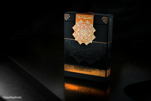
The second deck in the Encarded Signature Series, Chancellor, is the perfect follow up to the stunning series' launch deck Zenith. Chancellor took the bar that Zenith set and surpassed it with an elegant, strikingly original concept. Chancellor is just a beautiful piece of work top to bottom. The amazing tuck is only the "Cover" to this book and what lies within is just as impressive.

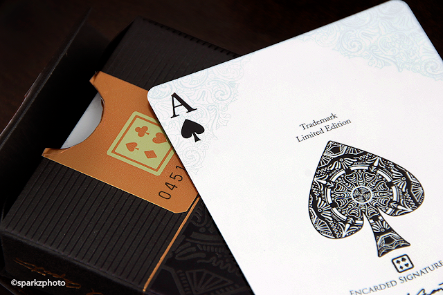
The tuck case for Chancellor is just stunning. A nice heavy stock fits the bill for this strong presentation. Featuring embossing, copper foil, black foil, and a seal like no other, one would think just by reading that list that this deck would be a bit much, bordering on gaudy. But the creative way all those elements come together on this deck is flawless. Chancellor's tuck also features a brilliant seal showcasing the "Main" image from the tuck case, accented by a faux Paul Carpenter Signature and the decks serial number and the Encarded logo on the back side.


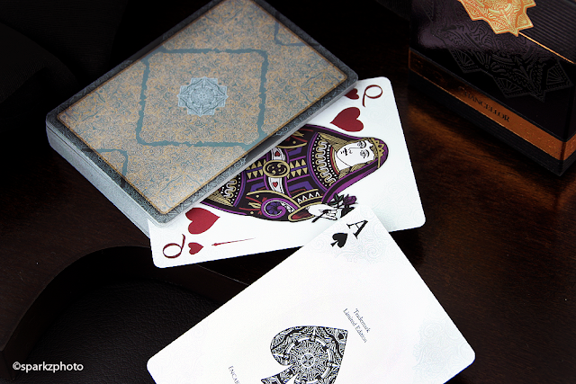
The cards themselves are just as stunning as the box that houses them. Again, Paul Carpenter shows his attention to the smallest of details in the subtle fashion that's been part of his projects for a while. The faces have a beautiful, but subdued pattern in each corner, just strong enough to be noticed yet not distracting. Printed on Expert Playing Card Co,'s Master Finish, the cards have a nice snap and spring to them and handled exceptionally well. The Ace of Spades has an intricate design that's pulled from the tucks main design element. The intricate line work is also shared in the full sized pips of the other Aces in the deck. The Jokers depict a portrayal of a "Chancellor" like character, one designed in black and the other in a dark red.


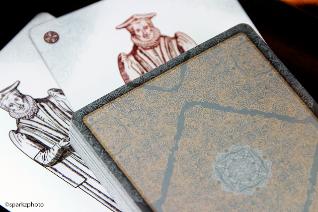
If the tuck case wasn't enough, the back design on Chancellors is just amazing. Featuring four metallic inks, the line detail is just inspiring. The back design also has a truly amazing "Shadow Border" that creates the illusion of depth and dimension that has to be seen to be appreciated. The Court cards utilize a standard mirror layout, but with great detail to the wardrobe as well as being presented in full color giving them a more worldly European look and feel.


As mentioned Chancellor was printed by The Expert Playing Card Co. on it's Master Finish, only 1000 decks were produced and once the sale went live, they didn't last very long. I find it hard to write about decks sometimes because I feel like I'm just rambling on about what a great deck it is.

There are those decks we add to our collections that are well designed, well thought out and deserve to be there. Then there are some decks that become cornerstones, I have no problem giving Chancellor that label in my collection. Paul Carpenters talent and hard work are just mind blowing and his constant move into elements and things that haven't been done before make him on my Favorite Designers. Chancellor's selling price in the aftermarket has already swelled a bit from its launch price, but I would put this one on your radar at a price that your budget will allow and don't think twice about pulling the trigger if the opportunity presents itself, you won't be sorry.

So for anything that I couldn't put into words, I'll invite you to take a really good look at the images and everything that Chancellor has to offer. Absolutely stellar work by Encarded and Paul Carpenter.


 The Collection segment is produced by Anthony Ingrassia of Kardify. No part of this article, images or video can be reproduced without written permission from the author and Kardify.com. 

First Look: White Tally-Ho by Penguin Magic


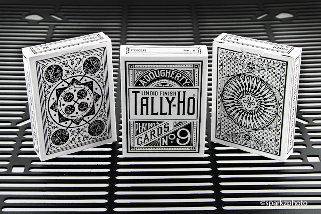
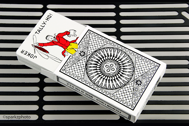
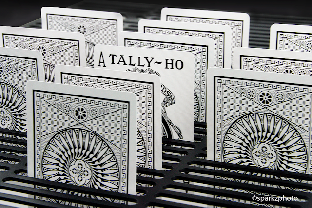
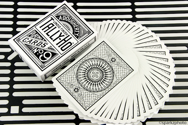
Penguin Magic continues its "Classic" deck releases with an all new White Tally-Ho deck. Available in both a Fan Back and Circle Back inverted Black and White back deisgn . The White Tally-Ho's feature standard Tally-Ho faces and Jokers for maximum use and interchangeability with Red or Blue Tall-Ho decks.

Printed on Bicycle stock with premium Magic Finish, the White Tally-Ho's handle just as you would expect. The deck also includes a double backer and blank face card.


The tuck on the new White Tally-Ho's really stands out and has a very custom design and feel. Crafted from a thick, high-grade, premium white paper stock accented with black foil, the White Tally-Ho's have no ink on the tuck what so ever, the entire design, and verbiage is in black foil. Definitely a deck best appreciated in hand.


The White Tally-Ho's are now available at Penguin Magic. Two editions available, the Circle Back and the Fan Back. Price starts from an affordable $8.95 and will certainly appeal to any magician, cardist, or aficionados arsenal.


Deck View: Fathom Playing Cards


Elements. Water. Blue.

Fathom Playing Cards are the first of Ellusionist's Elements playing card series called "Origins". Depicting Water, Wind, Earth & Fire. Based on an aquatic theme, Fathom Playing Cards are fully custom; from the beautifully illustrated Ace of Spades, unique Pips, to the bubble Royals and octopus Jokers.

Like other classic Ellusionist decks, Fathom handles extremely well and are perfect for any card enthusiasts and cardist. Available at JP Games


Collections: Wasteland by Kings Wild Project


Inspired by the game of the same name, Wasteland was a collaboration between inXile Entertainment and Kings Wild Project. A post apocalyptic, high energy game and a deck with the same attitude. The building blocks of this venture started a while back, when the two Kickstarter project creators, Jackson Robinson and Brian Fargo were two of the subjects featured in the Crowd Funding documentary Capital C. The documentary followed 3 projects, two which were Wastelands 2 and Federal 52. The rest, as they say, is history.

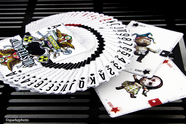
Jackson Robinson's talent and attention to detail shine through on Wasteland. The "Radioactive" edition is a fun and entertaining nod to the video game, bright colors, weathered looks and edge, along with an assortment of unique characters making up the court cards.


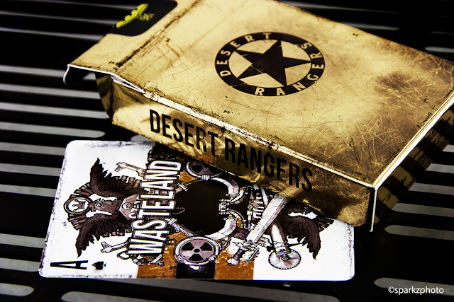
A beautifully appropriate Ace of Spades anchors the black and red band running through the face and court cards giving the deck a nice connection when fanned. The eerie yet entertaining Jokers fit right in with the inspiration of the deck and I can't help but love the "Big Baby" Joker sporting the Kings Wild Logo on his belly. The full color illustrations on the standard deck are gritty, detailed and perfectly at home in this deck. The Radioactive edition is full of color and punch, from the look to the design elements, the deck just screams the over the top look and feel of the video game. The full color matte tuck case wraps this package up perfectly and is sealed off with a gold foil seal tagged with a radioactive logo.


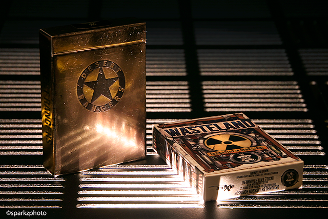
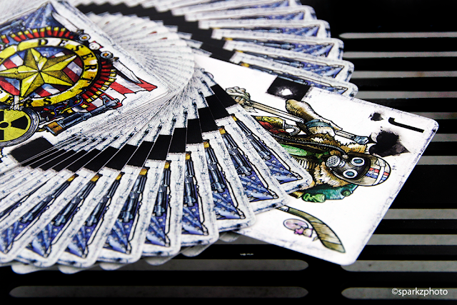
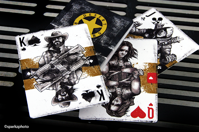
I have to be honest though, what really stands out on this project for me is the Kickstarter Exclusive Desert Rangers Edition. A lot of decks use "Bling" for the sake of Bling, but when that "Bling" is used in a perfect balance it's just remarkable. The Desert Rangers isn't just a tuck swap, and we'll get to the tuck in a minute. The decks do share the same illustrations, but the face cards and courts take on a monochrome look with gold metallic ink accenting the band on the faces and courts, while the back design takes on a entirely new look.


Let's start with the tuck. Constructed of a nice heavy stock, in an antique gold foil, with an amazing stressed and weathered  look that the renders did no justice to. The embossed Desert Rangers star on the front and the Wasteland band on the back shows that details do matter. It's all so subtle, but so perfectly used its hard to discount how well planned the look of this deck was. Sealing off the deck is the iconic Kings Wild Gas Mask Logo which has never looked more at home. 


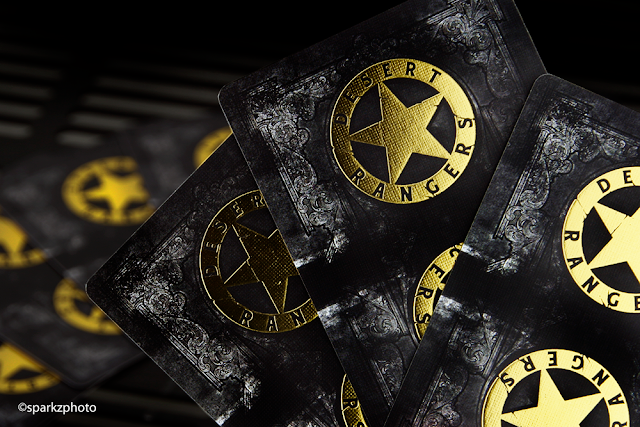
The back design is just amazing. The subtle details in the frame work on the weathered black backdrop are perfect. Top it off with two beautiful gold foil Desert Rangers "Badges" in a mirrored "Rider Back" layout and it's perfection. Printed by the Expert Playing Card Co., they continue to perfect their work with foil and it's application on playing cards. The Desert Rangers Edition was an awesome surprise when I opened it. Its difficult to convey in renders what the finished product will look like, and on the flip side, it's sometimes difficult to deliver the concept to the finished product...Desert Rangers surpassed my expectations.  
Both versions are great, but there is no hiding which deck stands out of the two. With Desert Rangers being a Kickstarter Exclusive, it may take a little looking around the secondary market for one, but this is one of those decks worth adding to your collection if the concept appeals to you. If your a gamer, the Radioactive edition should be a no brainer. As a collector, a deck like Desert Rangers delivers beautiful "Simplicity" in a pack that just has to be opened and appreciated. Collectors, don't pass this one by. 


The Collection segment is produced by Anthony Ingrassia of Kardify. No part of this article, images or video can be reproduced without written permission from the author and Kardify.com. 

Card Gear: Cardogenic


Card Gear is our monthly feature dedicated to discovering new inventory, setup and accessories used everyday by card designers, cardists, magicians and collectors. The concept originated from the popular social media site, Instagram: #passthepockets. Whenever one of these hashtags come up on the social news feed, there's always something new to discover, no matter who that person is.

On this month's Card Gear, we have the EDC of Tripp Sikes, founder and admin of Collecting Playing Cards Facebook group (CPC). Tripp works for a tour company in Savannah, Georgia and enjoys meeting people from all over the world during his workday. His love of playing cards started with games of Spades at family gatherings. Now an avid collector, Tripp started CPC to meet people from around the world who share the hobby.

Tripps’s gear:
+ USB Rechargeable Flashlight / Power Bank
+ Fisher Space Pen
+ Victorinox Swiss Army Cadet
+ Whiskey Wood Pill Caddy Keychain by Robert Wright
+ Coffee Titanium Wedding Ring
+ Samsung Galaxy Note 4
+ S. W. Erdnase Pencil
+ Expert At The Card Table Pocket Bible
+ Brass Card Clip by Illusion Works
+ CPC V2 Deck
+ Custom Leather Card Case by Mike Armstrong

What’s yours? If you would like your card gears to be featured on Kardify, contact us.

Kickstarter: Anubis & Osiris Signature Series


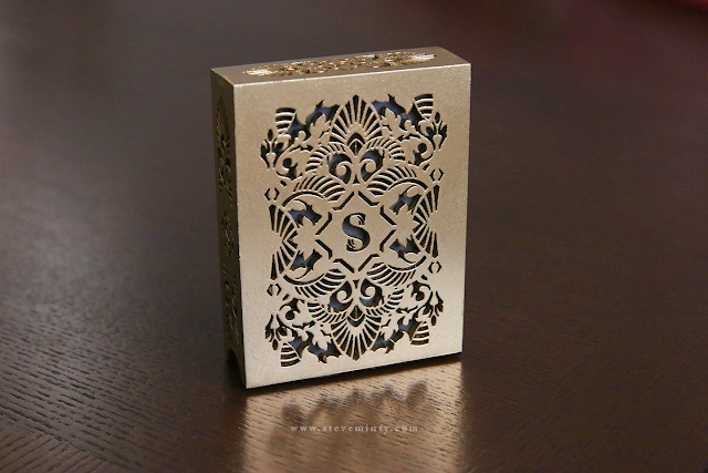
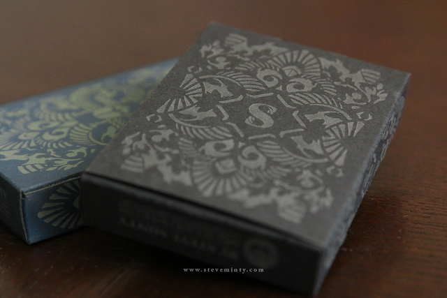
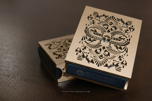
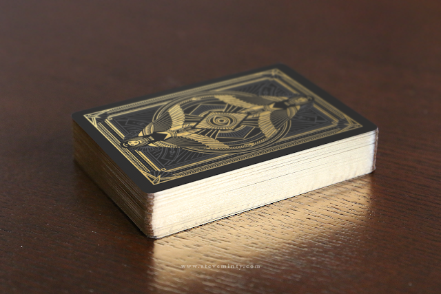
Right on the heels of the successful Anubis & Osiris campaign, Steve Minty brings us the Anubis & Osiris Signature Series. If your a fan of ultra-limited, uniquely designed decks you'll want to check these out.

Launching on Kickstarter on Wednesday February 17th at 5:00PM PST, the Anubis & Osiris Signature Series feature an entirely new tuck case design for each deck, gold gilding and a wooden slip case.


This campaign will run for ONLY 7 days and have a very limited run of ONLY 100 of each deck limited to one reward per backer. The 70 available sets will include matching serial numbers on a custom seal (Individual decks will also include numbered seals to reflect the overall print run). Gilding is being provided by a well-seasoned company with 70+ years of experience in the field, and of course the most prominent component is the beautifully intricate wooden slipcase that is included with each deck. The slipcase is presented in a gold finish and is an awesome compliment to these unique decks.


No add-on options will be available on this campaign and will be based on tier pledges ONLY

 Availability and Pricing

30 available spots for 1 Anubis Signature Deck for $100 including shipping.
30 available spots for 1 Osiris Signature Deck for $100 including shipping.
70 available spots for 1 SET of Signature Decks (1 Anubis + 1 Osiris) for $175 including shipping.


With this very limited run the Anubis & Osiris Signature Series is sure to move quickly. It's being offered on a first come first served basis, so if you're interested in picking up part of this beautiful set, mark your calendar, set your alarm and be ready to go when the campaign launches.

We would like to thank Steve for the images and information and wish him the best of luck on his new campaign. 

Deck VIew: Alice in Wonderland (Players Edition Gold) Playing Cards


Lavish. Gold. Typography.

Originally funded on Deckstarter, the Alice in Wonderland Playing Cards are designed by Turnstyle. This custom deck combines modern styling with lavish Art Nouveau and Art Deco ornamentation.

Unlike a traditional deck, the Alice in Wonderland courts features typographic royals with custom suit symbols as crowns. Fans of the classic fairy tale will be delighted to know that iconic quotes from the story are peppered throughout the deck.

Printed by the USPCC, this deck handles beautifully and perfect for any card enthusiasts and cardist. Available at JP Games.

First Look: Russian Folk Art (Special Edition) Playing Cards by Natalia Silva


[Update] The Russian Folk Art "Special Edition" Playing Cards are now LIVE on Kickstarter.

Last week, designer Natalia Silva teased her new deck, the Russian Folk Art "Special Edition" Playing Cards on social media. Like the first edition, the "Special Edition" are inspired by Russian Folklore and combines flowers, leaves, people, musical instruments and geometric shapes with stylized depictions of birds and animals, as well as mythological creatures. According to Natalia,
Russia has a very long, rich and visual cultural past, from its colorful folk costumes to its ornate religious symbols. I did a lot of research about traditional Russian designs, patterns and symbols and included all the new elements in my new deck.

Fully custom, the “Special Edition” features new artwork and the familiar colour scheme of White, Red and Green which represents the blossoming of the earth, and the blossoming of the creative spirit in Russian folk art.

On the design, Natalia said,
The Russian Folk Art "Special Edition" has a completely new artwork on each card, new tuck box and new back design. In my "Special Edition" I included more symbols, patterns and traditional designs that I could fit in my Russian Folk Art first edition.
[Update] The Russian Folk Art "Special Edition" Playing Cards are now LIVE on Kickstarter.

Printed by the famous USPCC, the Russian Folk Art "Special Edition" will be coming to Kickstarter on Friday, February 12th at 9PM EST.

Collections: Bicycle Pirate by Eric Duan


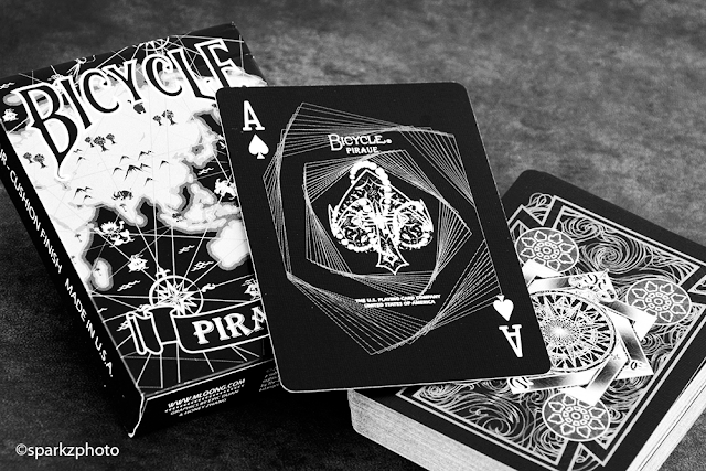
Collections has always been about more than just the latest and greatest. Every now and then we take a look back at some of the decks that got our attention before foil, embossing and ultra-limited print runs. Back in 2011 Eric Duan released the Bicycle Pirate deck, one of the early semi-custom offerings that I still like today.

Pirates was offered in two versions, Black and White. Each had its own distinct color scheme and Ace of Spades, while sharing the Joker and Back design. The back design feature some nice nautical elements and line work framed nicely and drawing your attention to the center “Compass” design. The back is one way do to the line work and the inclusion of directional markers around the compass, N, S, E and W. The spot cards on each deck are inversions of each other with one distinct difference. Each deck has a “Key” color it works with. The White deck uses a light blue and the black deck uses purple. This color is just a highlight on each deck. You’ll find pips using the particular decks key color, one colored pip on cards 2-7 and two colored pips on cards 8-10. The black deck makes a much bolder statement in its color choice and the purple along with the court colors; we’ll get to that shortly, just pop off each card beautifully.


Both decks Ace of Spades have a nice “Aquatic” design element to them, the White deck feeling more geared towards the ocean theme and color, while the Black AoS has a more geometric frame design. The Jokers are inverted between the two decks, but identical. The iconic image of a mermaid on a rock is depicted on both with a nice “Moonlight” effect reflecting on the ocean, simple and effective.

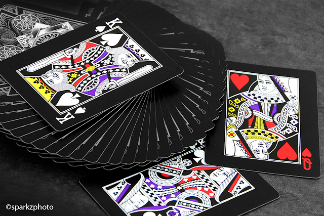
The court cards are where the decks seem to draw a harder separation. Both use a standard court design, but each one approaches their respective color palettes in its own way. The White deck takes a simpler approach, using the light blue from the pips and carrying them over to accent the monochrome color palette. Sashes and details pop in the light blue, but oddly, in my opinion, the indices remain true to a standard deck, remaining black and red respectively. The black decks adds a bit of a twist to the formula, while the white courts are complete mirror images, the black deck went with a mixture of custom and standard all in one. While the court design is mirrored, the color scheme is not. Half of each court uses what I would call standard court colors, reds, yellows, etc... While the other half incorporates the usage of the decks purple key color to accent sashed and details. The color difference is also split on an angle on some courts while horizontally on others. Meaning, a well-executed fan will show one or the other color scheme looking like two different decks.   Both decks are really nice, I do prefer the Black deck because the colors just jump off the cards.


Some other tid bits on the decks, each tuck is unique in its design. Both feature a map design on the front of the tuck and the back of the tuck reflects the cards back design. The maps used on each tuck differ in locations and markings. There is also a small error on both decks, the word “Pirate” is misspelled on both of the Ace of Spades, and for the longest time I thought it was actually a clever secret meaning that needed to be translated somehow, it just seemed too easy to pass off as an error. I think part of me still thinks there is more to it, but I’ve yet to confirm anything. Pirates were offered in a limited print run of 2500 decks of each color, still a small amount by any standards. It will take a little poking around to find the set, and will also cost a bit more than a normal deck to add them to your collection. Pirates were one of the early custom deck offerings that is well worth looking into.


The Collection segment is produced by Anthony Ingrassia of Kardify. No part of this article, images or video can be reproduced without written permission from the author and Kardify.com. 

Kickstarter: 7 Questions with Andy Wethington of the A-GLO Playing Cards


Designed by 421 Creations, A-GLO 2.1 is an eye-catching deck with a hypno-psychedelic theme that encompasses the designer’s vision of bringing a new youthful look to playing cards. Printed on ultra violet ink, things get crazy when the lights go out for this “glow in the dark” deck.
Presented in two colorways, A-GLO will be printed in a more dynamic indigo and black tuck and card back, or a black and blue with neon lime accent tuck and card back. Both decks will be printed by the USPCC on Bicycle card stock with Air Cushion finish and Ultra-Violet ink.The pips and backs of each card will still be visible once they’re in the dark.

We had a quick chat with Andy Wethington prior to the relaunch of A-GLO about 421 Creations, the inspiration behind A-GLO and design evolution of the deck.

For those of us who don’t know, tell us a little about yourself and 421 Creations?
Well, I’m Andy Wethington, a 28 year old Graphic Artist and Entrepreneur, I was born in L.A and raised in a small town in Kentucky. I spend most of my time in front of my computer and I have little to no social life. 421 Creations is a company I created as a way to bring my ideas to the world. My two closest friends, whom I grew up with (RK Carter & Craig Smith), are the other two members of the team and two of the most supportive individuals on the planet. They have had an immense contribution and I could not have done this without them.

Can you describe A-GLO Playing Cards and why you’re passionate about it?
A-Glo Playing Cards are essentially the cards that fill in all the gaps. With easy to identify court cards, unique but uniform pip arrangements, large font, a colorful attitude and Ultraviolet Ink these unique cards are great for so many situations that I thought there was a real need for them in the playing card market. From adult parties to kid’s games, from people with special interest (Cardistry and Magicians) to people with special needs (ADHD) these exciting and engaging playing cards are great for a plethora of different situations…. Just not a High Stakes Texas Hold’em game :)

Walk us through the process you took to design this very unique deck. How did you come out with the idea and how did you get to this finished product?
It started as a side project; a fun, colorful, easy to read playing card. It was as simple as that. I would work on it when I needed to take a break from other projects (like our original tabletop game that is a lot of fun… but is yet to have a solid name lol). A concept as unique as this was hard to explain, so I thought it was better to just go ahead and make a rough version and (why not) put it on Kickstarter to see what people thought. I found the lowest MPO that I could and my partner RK and I created the FIRST A-Glo Campaign.

The overall response was that the concept was really enjoyed but that the designs needed work. During the first few days of the release of the first A-Glo campaign, RK and I decided to not promote the campaign in any way so we could focus on refining the cards and making them as best as we could. We re-aligned our priorities to make A-Glo our primary focus and secured one of the best manufacturers in the world, the USPCC, and created the current A-Glo campaign/design. When we learned that the USPCC could print our cards with Ultra Violet Ink, we jumped on the opportunity!

What was your most brilliant breakthrough when designing the deck?
The Court Cards are very unique and they have been refined several times, each time was an interesting part of the creative process. The idea of having symbols instead of faces or people for the Court Cards made sense when the goal is a fun, colorful, easy to identify playing card. Our biggest breakthrough was probably when we got with the USPCC. Their expert printing capabilities and ability to print with Ultra Violet Ink was a great inspiration to us. We used that to fuel the reformation of every card and are very pleased with the way they came out.
From the project page, what are a few of your favorite reward levels and why?
The benefactor is my personal favorite. It not only offers the total package; 2 Red Decks, 2 Blue Decks and an Uncut Sheet, but it gives backers a chance to be personally mentioned and especially thanked in every deck and on every sheet. Another is the Double Decker. It offers the core essentials of what we are trying to create.

With so many playing card projects competing for funding, why should potential backers choose your deck?
Our Dedication. We have met so much adversity, but all great upheavals come from tribulation and wherever there was failure, there was inspiration. We are the little guys that Kickstarter was created for. The ones with an idea, a dream, and the determination to make it possible. Sure, we have made mistakes in our previous launches, but we have been upfront and honest with those mistakes and we have and will always continue to strive to correct every shortcoming our campaign has until we have proven ourselves to be a genuine, serious creator to the crowdfunding community.

Not to mention these Cards Freakin’ Rule!


Finally, what are your favorite playing cards?
Brand, Bicycle. Design, Anything that is unusual. Deck, The Cloisters Playing Cards- A pack of 15th-century hand-painted playing cards, believed to be oldest deck in existence, sold for $143,000 to the Metropolitan Museum of Art. They are one of the unique cards not on the market.

Artist, I'm gonna go with Dan and Dave. Thier art is always of the utmost quality and detail.
New stuff, I love those Pipmen Playing Cards that are being funded on Kickstarter. The creativity that the artist expressed in those cards is unparalleled.

Thank you for your time and all the best, Andy. If you like what you’ve read here and want to support these mesmerizing deck of playing cards, you can find it on Kickstarter here.

Card Radar: The Poop Deck Project - Illustrated Playing Cards


The Poop Deck Project is the culmination of 54 illustrated playing cards from as many international illustrators, masterminded and curated by Ammo. Ammo publishes small books and illustration filled magazines. When Inkygoodness.com told Ammo about their Beermat Character exhibition and asked them to share the gallery space, the team at Ammo jumped at the chance.
We decided it'd be fun to produce something a little different from our usual output whilst sticking to our print based roots. The outcome is an illustrated collection of playing cards and high quality art prints. Choosing a theme wasn't easy but eventually we settled on something with a maritime/nautical influence and decide to name it The Poop Deck Project.
Image from ammomagazine.co.uk

The Poop Deck Playing Cards are a maritime inspired collection of 54 illustrated playing cards. This beautifully illustrated deck features 4 unique suits including - Pirate Crew, Cursed Pirate Crew, Royal Navy Officers and Mythical Sea Creatures. Each suit has it's own colour scheme and icon making them just as easy to use.
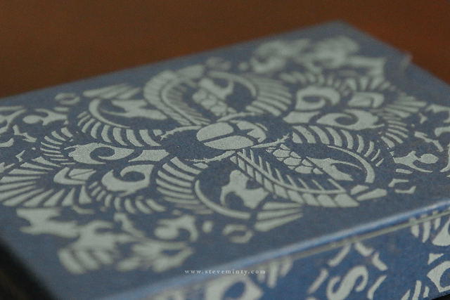
Image taken from sneakyraccoon.com

Also, each pack of cards is poker-sized, boxed and shrink-wrapped, with both face cards and tuck box finished with a matte overlay. The tuck artwork was created by the wonderful Brighton-based illustrator James Burlinson and features a treasure fight, a battle for the booty; staged upon the poop-deck itself between a hand-full of characters from the cards. According to James, their desperation is a sign of just how great that Poop Deck is.
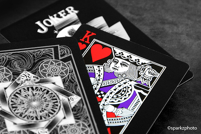
Image taken from burlisaurus.co.uk

The Poop Deck Project was exhibited for a week at London's Coningsby gallery as part of a joint exhibition with Inky Goodness.

Deck View: Bicycle Transducer (Aqua Edition) Playing Cards


Water. Limited. Stylish.

Designed by k3 Studio in Japan, the Bicycle Transducer Aqua is the first deck of the Transducer series. Well-known for his chromatic and 3d design artwork, k3 designed this deck as one of his artwork.

The deck features custom tuck and back, both printed with metallic ink. The face cards are standard Bicycle faces and include a red Ace of Spades gaff card.

Only 2000 were reportedly printed by the USPCC, this deck surprisingly does not handle as well as other standard Bicycle-branded decks. For more cool Playing Cards, check out JP Games

First Look: Victorian Room Playing Cards by The Blue Crown


The Blue Crown released a handful of teaser images of their latest deck, the Victorian Room. Designed by Edo Huang, this elegant deck is inspired by Victorian-era design and features custom aces, backs and jokers.


From the teaser, the tuck look stunning with striking red foil and a die-cut viewing window on the back. We asked Edo about the idea behind the deck,
A year ago, Alex Pandrea and myself decided to design a playing card design that inspired by Victorian-era. Something different from my previous designs. Something unique and never been done before. 

After months of hard work, many hours of sketching and going through numerous prototypes, Victorian Room Playing Cards will be available on Sunday, February 7 at thebluecrown.com. Printed by the Expert Playing Card Co.


Images courtesy of Edo Huang you can find him on instagram.com/edohuang. If you would like to keep up to date with the latest offering from The Blue Crown, and visit their site at www.thebluecrown.com

Collections: Carat Card Cases


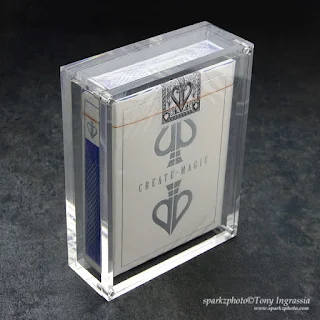
Something a little different this week in Collections, we spend so much of our time building our collections, but what do we do with all these wonderful decks once we have them? Do you store them in a box never to be seen again? I've been a collector a very long time and while displaying your passion can become difficult, especially if you have a larger collection, it's still nice to be able to showcase a few here and there.

I only have a few "Rules" when it comes to my collection, and one of them is to display as many as I can. If your like me, scouring and hunting those new additions, you should have those reminders around to show the fruits of your labor and the passion behind your collection.

Last year, Sherman Tsao came across an image of a single acrylic display case while scouring the internet for affordable playing card display cases and began to wonder if he could have them made for a reasonable price...

"I really only started out to make some boxes for myself  to use with my collection because everything that was on the market was quite expensive and with the number of decks that I wanted to display (and protect), it would have been financially unfeasible.  After deciding what I wanted, I found an acrylic manufacturer to make samples for me, which turned out great."

- Sherman

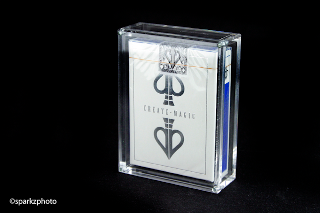
(Version 1 Pictured)


So as with anything, cost goes down with quantities, so after placing his initial order he began posting the cases in forums to see if anyone was interested in the case for their own collections. Well, let's say there was a lot of interest.

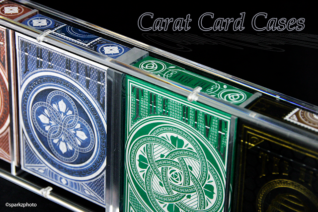
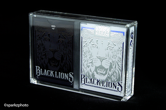
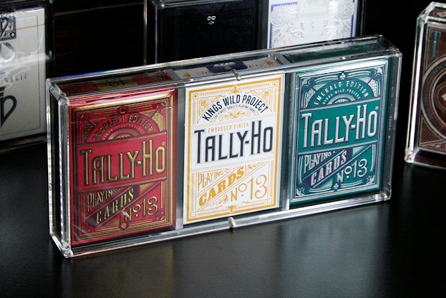
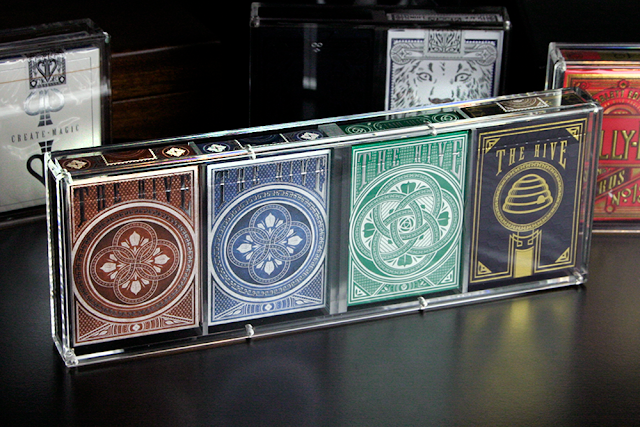
With the demand of the original Carat Card Case, Sherman has made some minor changes to the new cases for this year, along with expanding the product line. This year you'll find not only the single deck case, the Carat X1, but the addition of 2, 3 and 4 deck cases, the Carat X2, Carat X3 and Carat X4.

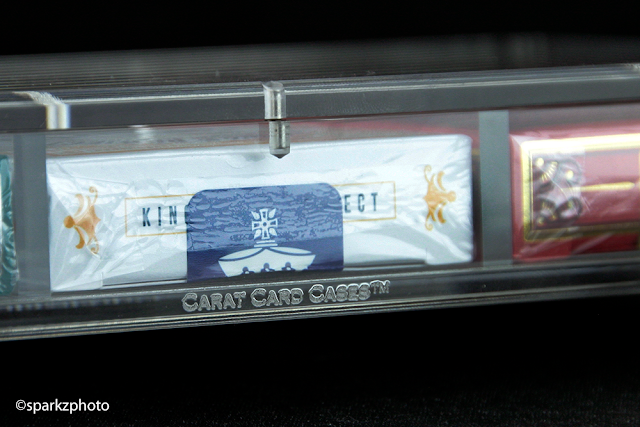
The changes made are subtle, but really do "finish" the cases wonderfully, the edges have been beveled moving away from the hard edge of the original and some nice branding has been added as well.


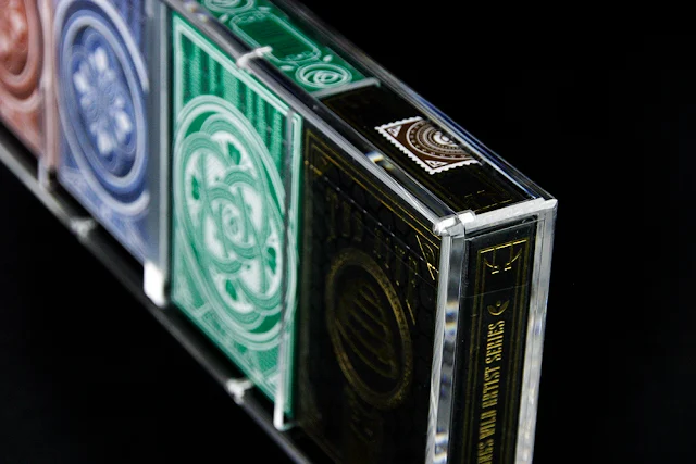
These cases are amazing, there is no two ways about it. If you're looking for an eye catching way to show your prized possession and protect them at the same time, look no further. The cases are constructed using 5mm Acrylic sheets and utilize Neodymium magnets, 10x stronger than your average magnet. The Carat X1 uses 4 magnets, one in each corner while the larger multi-deck Carat X4 has 8 for a better seal. Additionally, each case now comes with a set of 4 rubber "feet" that can be used as you see fit, preventing the ultra clear acrylic from resting directly on a surface. Multi deck cases also include a set of acrylic spacers to place in between decks. This not only centers the decks in the case, but also secures them in place with a nice snug fit.

Carat X1
Carat X2
The quality of the cases is second to none, the acrylic is super clear and the fit is perfect. While you may not want to house your entire collection in Carat cases, there is no doubt there are more than a few that would look stunning in one of them. I couldn't recommend these cases any higher, they present an affordable solution to a collectors problem, even non-collectors, magicians and enthusiasts should appreciate these cases, instead of tossing that signed deck by your favorite magician or cardist in a drawer or just on a shelf exposed to the elements, protect that personal memento and display it as it should be.

Carat X3
If you would like more details on the cases themselves please visit the Official Website. You'll find all the details on the construction and dimensions there. If your interested in picking up a few Carat cases, they are available through a few distributors at the moment, you can reach out to any of them for pricing on the cases as well as shipping information.


Carat X4
We want to thank Sherman for the opportunity to showcase these beautiful cases. Collections are meant to be seen and enjoyed, bring some of those special decks out of the drawers and brick boxes with a few Carat Card Cases and enjoy the talent and work that went into them. 

The Collection segment is produced by Anthony Ingrassia of Kardify. No part of this article, images or video can be reproduced without written permission from the author and Kardify.com.
© all rights reserved
Kardify 2013