Collections: Bicycle Pirate by Eric Duan
Collections has always been about more than just the latest and greatest. Every now and then we take a look back at some of the decks that got our attention before foil, embossing and ultra-limited print runs. Back in 2011 Eric Duan released the Bicycle Pirate deck, one of the early semi-custom offerings that I still like today.
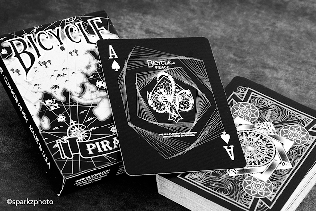
Pirates was offered in two versions, Black and White. Each had its own distinct color scheme and Ace of Spades, while sharing the Joker and Back design. The back design feature some nice nautical elements and line work framed nicely and drawing your attention to the center “Compass” design. The back is one way do to the line work and the inclusion of directional markers around the compass, N, S, E and W. The spot cards on each deck are inversions of each other with one distinct difference. Each deck has a “Key” color it works with. The White deck uses a light blue and the black deck uses purple. This color is just a highlight on each deck. You’ll find pips using the particular decks key color, one colored pip on cards 2-7 and two colored pips on cards 8-10. The black deck makes a much bolder statement in its color choice and the purple along with the court colors; we’ll get to that shortly, just pop off each card beautifully.
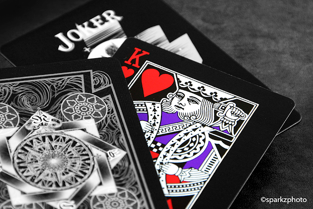
Both decks Ace of Spades have a nice “Aquatic” design element to them, the White deck feeling more geared towards the ocean theme and color, while the Black AoS has a more geometric frame design. The Jokers are inverted between the two decks, but identical. The iconic image of a mermaid on a rock is depicted on both with a nice “Moonlight” effect reflecting on the ocean, simple and effective.
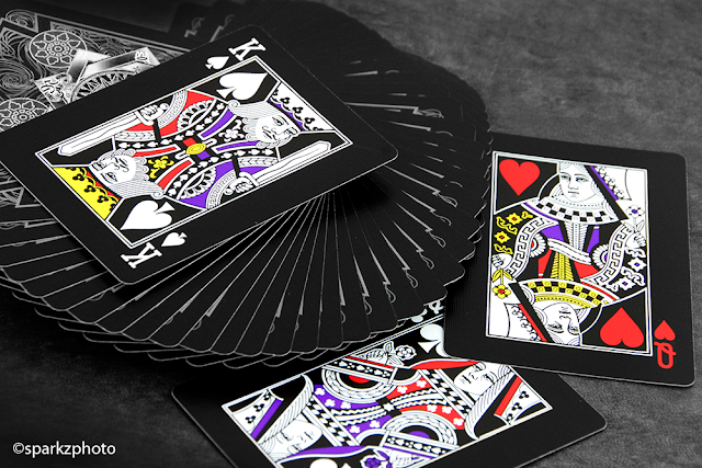
The court cards are where the decks seem to draw a harder separation. Both use a standard court design, but each one approaches their respective color palettes in its own way. The White deck takes a simpler approach, using the light blue from the pips and carrying them over to accent the monochrome color palette. Sashes and details pop in the light blue, but oddly, in my opinion, the indices remain true to a standard deck, remaining black and red respectively. The black decks adds a bit of a twist to the formula, while the white courts are complete mirror images, the black deck went with a mixture of custom and standard all in one. While the court design is mirrored, the color scheme is not. Half of each court uses what I would call standard court colors, reds, yellows, etc... While the other half incorporates the usage of the decks purple key color to accent sashed and details. The color difference is also split on an angle on some courts while horizontally on others. Meaning, a well-executed fan will show one or the other color scheme looking like two different decks. Both decks are really nice, I do prefer the Black deck because the colors just jump off the cards.
Some other tid bits on the decks, each tuck is unique in its design. Both feature a map design on the front of the tuck and the back of the tuck reflects the cards back design. The maps used on each tuck differ in locations and markings. There is also a small error on both decks, the word “Pirate” is misspelled on both of the Ace of Spades, and for the longest time I thought it was actually a clever secret meaning that needed to be translated somehow, it just seemed too easy to pass off as an error. I think part of me still thinks there is more to it, but I’ve yet to confirm anything. Pirates were offered in a limited print run of 2500 decks of each color, still a small amount by any standards. It will take a little poking around to find the set, and will also cost a bit more than a normal deck to add them to your collection. Pirates were one of the early custom deck offerings that is well worth looking into.
The Collection segment is produced by Anthony Ingrassia of Kardify. No part of this article, images or video can be reproduced without written permission from the author and Kardify.com.
0
1
Subscribe to:
Post Comments (Atom)
disqus, kardify-admin


 Kardify is the leading online destination for playing cards news, reviews, and cardistry culture. Enjoy the best editorial content daily.


No comments
Post a Comment