Responsive Ad Slot

Exclusive First Look: Hocus Pocus Playing Cards


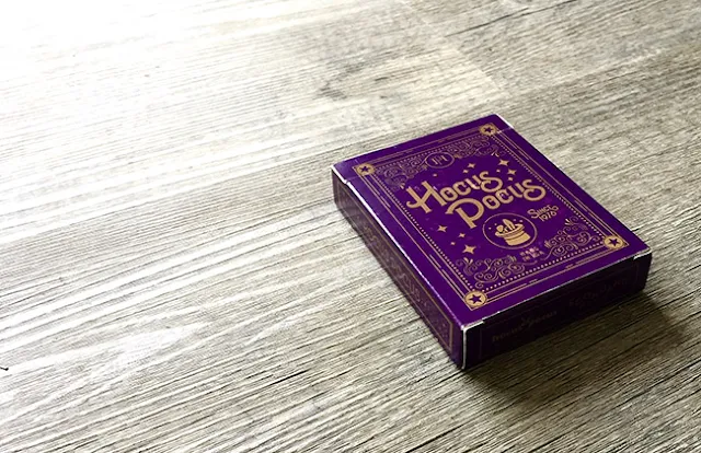
Hocus Pocus in collaboration with Edo Huang have announced the release of a new deck of playing cards featuring an eye-catching purple tuck box adorned with gold ink. Hocus Pocus Inc was founded 40 years ago by Paul Gross and for its 40th anniversary, Hocus Pocus wanted to expand their already extensive product offering. The company carries the very best of all new releases and exclusive effects from top magicians and magic companies from around the world.


The idea for the Hocus Pocus Playing Cards was conceptualised in the summer of 2015 when Max Gross, manager of Hocus Pocus Inc and his brother Cole started brainstorming for a deck design. When it came to a designer the brothers knew immediately that Edo was the man. With the idea, Edo took the deck to a whole new level, to say the least.
We wanted a deck that related to our company but wasn't a direct advertisement. Another factor while designing was making it represent a vintage magic feel. Edo took this idea and made it into a masterpiece. 

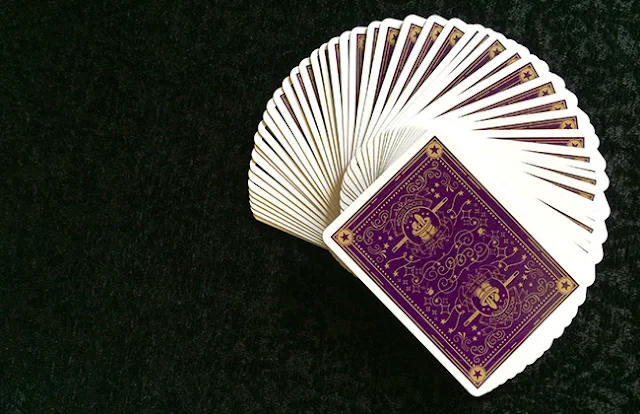
With details such as the initials of the two brothers, to fine details on the Jokers and hidden details on the card backs, you will feel a piece of the company in your hands!


This deck is for the magicians and collectors alike who want to perform and yet own a piece of memorabilia from this iconic company.

Printed by the USPCC, the Hocus Pocus Playing Cards will launch on Kickstarter in July 2016.


To find out more about the Hocus Pocus Playing Cards and anything Hocus Pocus, visit them at hocus-pocus.com or follow them on Instagram.

Deck View: The Virts Spring/Summer 2016 Virtuoso Playing Cards


Cardistry. Energetic. Bold.

Developed around the visual nature of Cardistry, the popular Virtuoso deck features an unique design architecture that The Virts call Adaptive Aesthetics. The innovative back design gives the appearance of swirling shapes, changing colours, and connecting patterns to visually enhance every card flourish performance.

This year, the Virtuoso deck spots a borderless edge-to-edge back design that not only magnifies each shape for maximum visibility, but also liberates the cards to seamlessly merge with one another to establish new forms.

The Spring/Summer 2016 (SS16) edition features a bold new energetic colorway, evoking the spirit of adventure. SS16 is crafted with the finest casino-grade materials and printed by the USPCC. Now available on JP Games.


7 Questions with Sarah Ferone of the Cocktail Hour Playing Cards


Created by Sarah Ferone, Cocktail Hour is a beautifully illustrated deck of playing cards that celebrate the craft of the cocktail – offering a playful and modern twist to the classic deck through custom art.

The artwork and style are visually pleasing, with the reimagined courts featuring unique characters crafting and enjoying a variety of drinks. The eye-catching back feature a balanced two-way design composed of hand drawn elements. For added charm, the number cards incorporate subtle hand-painted textures and pips that vary slightly in size. The deck is neatly packaged in a gorgeous tuck printed on matte paper with a solid color interior.

Prior to the launch of the project, we had a quick chat with Sarah about her design background, the inspiration & design process behind the Cocktail Hour deck and her thoughts on the support from the playing card community.


For those of us who don’t know, can you tell us about yourself and what is your design background?
I’m an illustrator and designer based in Philadelphia in the US. I studied painting and art history in college, but then I changed paths to a different creative track to work as a designer and art director. I had spent some years at an ad agency in Chicago, and then worked at a non-profit here in Philadelphia. It took me a while to find illustration as a career, but it finally feels like the perfect marriage of my fine art and design backgrounds. Now, much of my illustration work focuses on food and beverage subjects for a variety of clients for packaging to editorial commissions.

Can you describe Cocktail Hour Playing Cards and why you’re passionate about it?
My love of playing cards began in childhood during family rummy games and I have so many good memories from those times. I always thought it would be fun to design a deck of my own someday, and it really wasn’t until this past year where it finally felt possible.

These cards combine my interest in cocktail culture and love of cards to offer a modern twist to the standard deck. Using my illustration style to bring in a handmade element to the cards was important to me, too, so you’ll see a lot of bold brush and line work in the designs.


How much time did you spend working on the deck?
I started working on the deck in September of 2015 and finished putting the final touches on it in late April.

Talk to us a bit about going from the first draft to the final version. How did you get to this finished product?
For me, I thought the court cards would be the hardest to tackle, so that’s where I began. I wanted to challenge myself to create a two-way design that would be more complex than just reflecting it. It had been something that always daunted me when I studied playing card designs and knew that would have to be the first thing to overcome! Honestly, I feel like it’s working out a muscle in your brain, cause now I have a better understanding of how to approach designs like that.

But the thing that jump started this whole idea is finding some playing cards from the 18th century. There’s something really charming about how naively the figures are drawn and the bold use of pattern. A strong handmade feeling to the cards was present and my own project suddenly felt within reach.


The courts have definitely evolved over time and they’re much more refined than from the early sketches. My process starts pretty rough because I like to work fast and get the idea on paper, and then I’ll go back and pull out the parts that have potential. This may also be influenced by working in the editorial illustration world where deadlines are tight!

And as I approached the finish line in developing these cards, I had to be sure each part felt like it spoke with the same voice. I really thought the courts were going to be the most challenging part of this project, but creating a tuck box and back design that felt like my own was a huge struggle. I think I had been researching too many other playing card projects with beautiful and complex ornamental designs. It tripped me up for a while, but eventually I found my way back when I focused on elements that make this deck special – the handmade brush work and organic lines.

What was your most brilliant breakthrough when designing the deck?
Finally nailing the back design! It was a HUGE sense of relief to see all the pieces of this project fall into place.

We first noticed the Cocktail Hour Playing Cards on the forums. What do you think of the playing card community in terms of the feedback and support that you’ve been getting so far?
The forums have been so great to get feedback! I first connected with Don Boyer through playingcardforum.com and he has been such a tremendous help to understand the ins and outs of playing card design and the world of custom decks. And then reading through the development threads, it was impressive to see how honest some of the feedback was. I looked forward to sharing my project there and hearing what people had to say. Also, being such a newbie to this world, I knew there was good advice to be gained from the community.


Finally, what are your favourite playing cards?
Researching playing cards opened up a huge world of diverse designs out there for me. So many artists have contributed amazing art to this form over the years, it’s incredible. Some favorites include the weird and surreal deck by Salvador Dali, and another by A.M. Cassandre for Hermes that’s so great. I had already been looking at his poster designs as inspiration so I was delighted that he had also created a deck of his own.

Love the art style! Thank you for your time Sarah and all the best. If you like what you’ve read here and want to support Sarah, head on over to the Kickstarter page to back this project!


Cocktail Hour will be printed Legends Playing Card Co. Having raised 46 percent of its $9.8k goal in 10 days, with another 18 days left to go, a pledge of $14 sets you up with a deck. Also, there are multiple rewards that will be unlocked once the project hits their set stretched goals, most notably the copper foil on the tuck at $12k.


Exclusive First Look: Dedalo Playing Cards by Thirdway Industries Part III


In the third and final part of our exclusive first look at Thirdway Industries’ upcoming Dedalo series, we will look at the Dedalo Apeiron,the limited edition deck of the campaign. In the first part, we looked at Dedalo Alpha, the first deck of the campaign - and in the second part, the Dedalo Omega, which represents the future of the Dedalo storyline.
Not much information have been given at this time but Giovanni Meroni mentioned that the Dedalo Apeiron will be the "God" deck, with all the characters of the story… divinised.


Dedalo Apron will be printed by the Expert Playing Card Co. and will feature a stunning embossed tuck with Blue and Gold foil on black paper. The face cards will have a darker tone and will feature 2 metallic inks on black cards. Only 1000 decks will be produced.

The provisional launch date for the campaign will be 10 June 2016. To keep up to date with Dedalo and anything Thirdway Industries, visit thirdway.it or subscribe to Thirdway's newsletter.


News: Westminster Playing Cards from Penguin Magic


Launching today from Penguin Magic, Westminster Elite Playing Cards. Penguin has been doing a pretty nice job on their in house deck releases. Spotlighting some great designers and their fantastic work.

So the information we've been given from Penguin on their new deck:


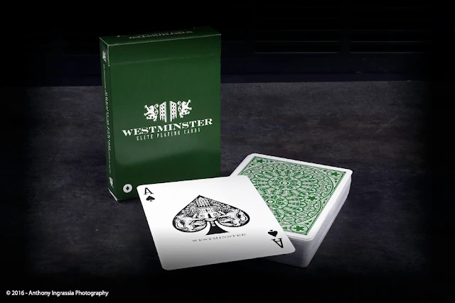
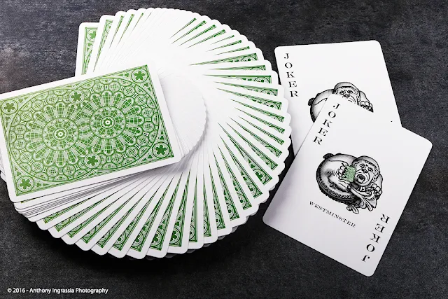
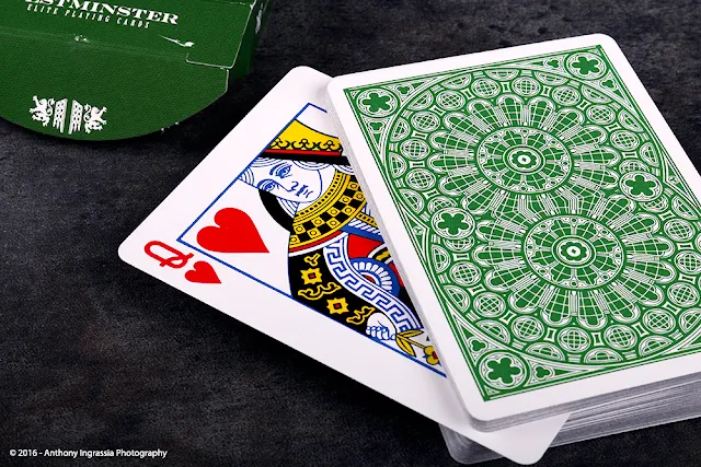
Westminster playing cards are the ultimate collaboration between England and the US.  Designed by Phill Smith (creator of Stegosaurus and the DMC Black/Gold Marked deck), the Westminster deck is inspired by the gothic architecture of Westminster Abbey and offers a timeless look combined with a premium feel.
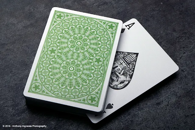
Printed by USPCC on high-end Bicycle stock with top-of-the-line finish, traditionally cut, and with metallic green ink on the back design, these cards are just as amazing to handle as they are to look at.  The deck features a custom Ace of Spades, custom gargoyle jokers with a built-in reveal effect, as well as a duplicate 2H and a versatile gaff card.
Classic enough for any poker table or magic routine, yet beautiful enough for cardistry with its intricate design and metallic backs, this is a deck that you will love to use!


 Westminster also features some nice details in quality, design and finish.
  • Limited 1st Edition
  • Custom Back Design in Green Metallic Ink
  • Custom Ace of Spades
  • Custom Gargoyle Jokers with Reveal Effect
  • High-Grade Bicycle Stock & Magic Finish, Printed by USPCC
  • Traditionally Cut for Easy Shuffling
  • Duplicate Card and Gaff Card Included


Westminster should appeal to a wide range of Playing Card aficionados. The intricate design coupled with the familiarity of a poker deck keeps it unique enough without distraction. At the time of publication we did not have an exact release time or price. Once we receive the information we'll be sure to update it here for our readers. I would suspect, in what's become a pattern at Penguin Magic, a nice discount on brick purchases for early buyers.

Keep up to date with information on Westminster, along with everything Penguin Magic on social media. Follow them on Facebook, Instagram and of course their main site at Penguin Magic.

We want to thank our friends at Penguin for the opportunity to bring our readers some info and images of their new products.

Card Gear: Travel Brainstorming


Card Gear is our monthly feature dedicated to discovering new inventory, setup and accessories used everyday by card designers, cardists, magicians and collectors. The concept originated from the popular social media site, Instagram: #passthepockets. Whenever one of these hashtags come up on the social news feed, there's always something new to discover, no matter who that person is.

This month we have the EDC of Randy Butterfield, founder of Midnight Cards and designer behind Imperial, ORNATE, Draconian, Bowl-A-Rama, Grinders, and more! Randy always brainstorm on new Deck ideas whenever he and his family travel up to Michigan, to visit his parents, who live out in the country.  According to Randy, the absence of computer, Internet and Netflix are great ways to alleviate normal distractions at night.

This is his travel gear he always takes up with him. Reference books vary, depending on the theme and style he want to go with (the Ancient Rome book in the photo is one of a handful or reference books he brought up the last trip).
Randy’s gear:
+ 8"w x 10"h Sketch Book
+ iPad Mini 4
+ EnerGel Liquid Gel Ink Pen
+ Copper Grinders Deck
+ KURZ Foil Selection Book
+ Tuck Box material samples from LPCC
+ Ancient Rome book by Roy Jackson
+ 10+ year old iPod Shuffle (Randy: still working perfectly!)

What’s yours? If you would like your card gears to be featured on Kardify, contact us.

[post_ad]

Kickstarter: The Sisterhood of Blood Playing Cards by 52Ravens


Currently funding on Kickstarter, the Sisterhood of Blood is a custom deck of playing cards by Kirk Slater of 52Ravens. The theme of this deck is based on London vampires from the Victorian era. As with 52Ravens’ previous project, The Coven, this deck also features an all-female cast of court cards. Each of them has a different story to tell, but together they become The Sisterhood of Blood.


Also, each of the vampires has names and backstories that help to bring these beautiful monsters alive. Alongside this, each of the groups follows a theme, the Jacks have just fed, the Queens revel in their malice and the Kings immortality is coming to a close.


The deck features fully custom courts, Aces, Jokers and tuck box with interior printing. The Sisterhood of Blood Playing Cards will be printed by Expert Playing Card Co. on their classic finish stock.


Having raised 75 percent of its £10,000 goal in 22 days, with another 8 days left to go, a pledge of £9 (~USD$10) sets you up with a deck of the Sisterhood of Blood Playing Cards.

Deck View: Piff the Magic Dragon Playing Cards


Piff. Magic. Dragon.

Illustrated by UK artist Claire Blackledge, this unique deck was created for Piff the Magic Dragon. If you don't already know, Piff (and Mr Piffles) is the standout star of Penn & Teller: Fool Us and recently, America’s Got Talent. With over 40 million YouTube hits to his name, Piff has performed to hundreds of thousands of people in famous venues such as Radio City Music Hall, Shakespeare’s Globe, the O2, London and Sydney Opera house. This unique deck features custom pips and indices, custom back, custom courts and redesigned tuck box, Die-Cut Harbin Table Playing Cards, and totally unique Gaff Cards for a special Piff magic trick.

The pips and indices have been redesigned to represent various aspects of Piff's life Spades are now represented by flames. The paws of Mr Piffles have replaced the clubs. Hearts are out, flowers are in, and diamonds are still the same, but fancier. Also, each of the 12 court cards have been completely redesigned to tell a story between the suits. Kings are represented by Piff, Queens have been upgraded to Princesses and Jacks are represented by none other than Mr. Piffles himself.

Also, each Piff deck is safely stored in a custom built and designed tuck case that is an exact replica of Piff's legendary Tacular. The deck comes with 2 uniquely engineered die-cut playing cards that fold out into a Harbin table! How awesome is that??

Piff the Magic Dragon Playing Cards are printed by the Expert Playing Card Co. Available now from the official Piff the Magic Dragon Shop! Also, for more cool playing cards, check out JP Games.

News: The Virts Released This Awesome Video of 'Liquid Paper'


Yesterday, The Virts released this awesome cardistry video- Liquid Paper, ahead of the official launch of the SS16 Virtuoso deck. This incredible video is inspired by films such as “Birdman”, to appear as a single continuous shot from start to end.

Along with the delicious mechanisations, glitched out moments and clockwork tickings of Koloto's chill-out music, the video also features audio samples from Bruce Lee’s iconic “Be like Water” interview. Liquid Paper is a thoroughly satisfying Cardistry video! We expect this video to go viral once mainstream media picks this up in the next couple of days.


News: Monarchs x Now You See Me 2 Special Edition Playing Cards Now Available from Theory11 for a Limited Time


Theory11 in collaboration with Now You See Me 2 have just released a Special Edition of Monarch Playing Cards featuring a deep black tuck box laced with silver foil.


Monarch Playing Cards are used throughout the film by the cast, and this special edition features the Now You See Me 2 title across the front in eye-catching silver foil.


Made using FSC-certified paper derived from sustainable forests, vegetable-based inks, and starch-based laminates, this special edition set of Monarch Playing Cards is available now for a LIMITED time for $9.95 at Theory11.com


Images from Theory11.com

Exclusive First Look: Dedalo Playing Cards by Thirdway Industries Part II

This is the second part of our first look at the upcoming Dedalo Playing Cards series from Giovanni Meroni's Thirdway Industries. In part one, we looked at Dedalo Alpha the first deck in the series. In this first look, we will focus on the Dedalo Omega, the second deck of the campaign.


Dedalo Omega will be available at launch and represents the "future" of the Dedalo storyline. According to Giovanni, everything in Dedalo Alpha is the past.


For example, the Jack of Clubs in Alpha was alive and wanted to fly high but in Omega, he is going to die after being overwhelmed by the Sun.


The deck will feature a striking red back and the eye-catching tuck will have yellow gold foil on white stardust paper.

Join us next week when we look at the final deck in the Dedalo series, the Dedalo Apeiron! The provisional launch date for the campaign will be 10 June 2016. Stay tuned!


To find out more about Dedalo and anything Thirdway Industries, visit them at thirdway.it or subscribe to Thirdway's newsletter.

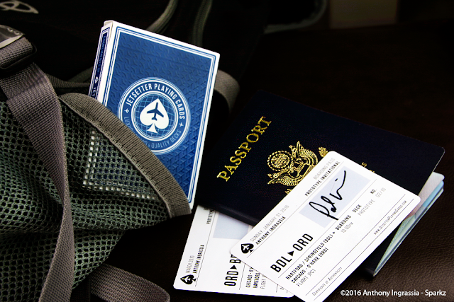
Contest Update: Jetsetters Prototype Winner!


Well a very successful campaign came to an end and now we have the name of one lucky winner going home with a little something special.

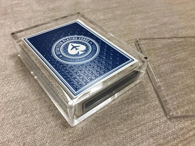
The lucky winner of the Premier Edition in Altitude Blue Prototype enclosed in an X1 Carat Card Case is Backer number 265, Joshua Miller!


Congratulations to Josh and a big Thank You to Paul Ruccio and Jetsetter Playing Cards for letting us be a part of his project and campaign.

If your interested in any of the Jetsetter products be sure to visit there website!

Deck View: Red Wheel Playing Cards


Red. Bicycle. Modern.

This gorgeous deck was created by Art of Play in partnership with California-based creative studio, DKNG. The Red Wheel Playing Cards takes inspiration from the classic Bicycle Rider Back and was given an all new updated look - clean design meets creative personality on each card.

The deck is fully custom, from the bold eye-catching backs to the gorgeous courts, Ace of Spades and beautiful pips. Each card is printed with two metallic inks and housed inside a foil-stamped and embossed thick red paper tuck.

Printed by the US Playing Card Co. with an air-cushion finish, Red Wheel is popular with cardists and definitely one for your collection. Available from JP Games.

School of Cardistry: Scissor cut Extension Tutorial


On this week's Cardistry tutorial from our friends at School of Cardistry, we will learn the Scissor cut Extension. According to Jaspas:
Scissor cut extension is a cut that I designed for the purpose of having a slightly more elaborate one handed cut. It can easily be used in some of the other School of Cardistry tutorials (such as Zoey and Candice) to create more complex 2 handed cuts.
If you missed earlier episodes, check it out here!

Also, the New Deck Order in collaboration with 2011 world champion Cardist, Rama Dimasatria, has just released a 4 tutorial Cardistry pack called, Kutilang.  If NDO's tutorials have piqued your interest for more difficult Cardistry check it out at thenewdeckorder.com


To learn more about Cardistry, check out and subscribe to NDO's School of Cardistry channel on YouTube for more high-quality tutorials.

Exclusive First Look: Dedalo Playing Cards by Thirdway Industries Part I

Here's an exclusive first look of the Dedalo Playing Cards series from designer Giovanni Meroni of Thirdway Industries. Last month, Giovanni posted a teaser on Thirdway's website and provided a few clues about Dedalo. This has generated quite a lot of interest within the playing card community.


For the next 3 weeks, we will be going through the details of each deck in the Dedalo series. To kick things off, we have Giovanni to tell us about Dedalo Alpha:
Dedalo Alpha is the first deck in the Dedalo Series- the main theme is the Labyrinth. The symbology is very complicated. Just for a challenge, I will not spoil the complete story and prefer that people try to guess who the characters represent. For this reason, I've used "King of Taurus" instead of "King Minos" for the King of Diamonds as an example. 
There are two main stories in this deck. Hint... the gods involved in the story will be represented by the Spades courts. 
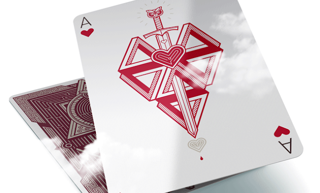
The above images are Jack of Hearts and the Queen of Diamonds. If you're wondering why those animals, the Owl was the symbol of Athens, and the bull was the symbol of Crete. Finally, the above are images of pips and an Ace of Clubs. Everything, as always, will be 100% custom :)

Join us next week when we look at the second deck in the Dedalo series, the Dedalo Omega! The provisional launch date for the campaign will be 10 June 2016. Stay tuned! 


To find out more about Dedalo and anything Thirdway Industries, visit them at thirdway.it or follow them on Facebook.

Kickstarter: 7 Questions with Nicolai Aaroe of Dominus Playing Cards


Already funded on Kickstarter, Dominus is a deck of playing cards featuring two stunning limited edition decks. This is the second volume in the ‘Light vs Darkness’ series by designer Nicolai Aaroe. Dominus illustrates the damaging physical and psychological effects of political ambition on those who seek to gain power through activities related to the underworld and magic. Dominus seek to represent light and darkness with a mirrored 2-deck theme, Divinus and Obscura.

Fully custom, the card backs represent the European monarchs moral codex and reign and are decorated with royal, divine, religious and occult symbolism. The meticulously illustrated courts tell a unique story of fate, destiny, choice and consequence. The rulers in the elegant Divinus deck represents the moral right path while the darker-coloured Obscura deck features the same rulers in their darker versions. Both decks are housed in an eye-catching matte deluxe tuck designed with hot stamped gold foil and embossing effects.


We had a quick chat with Nicolai, and asked him about being a designer, inspiration and design evolution of Dominus Playing Cards and his takeaway lessons from previous Kickstarter projects.

What do you most love about being a designer? and what are some favorite projects you’ve worked on?

I like to express myself and communicate with visuals, form and shape. Design is a language and the colors, fonts, and shapes are the words you use to create a certain mood or a specific message. Often the perfection of the communication lies in the detail, and certain words can ruin what you are trying to say or express. Like a symbol that is misinterpreted or doesn’t fit well with the rest of your story. My favorite projects are those where I get a chance to create a concept from the ground up. I’ve been doing that for retailers, video games, movies and tv shows. And I tend to have a personal preference for the more gloomy concepts.

What is your inspiration behind the Dominus?  How did you come up with the idea?
Both Indictus and Dominus are inspired by historical dramas such as The Tragedy of Macbeth by William Shakespeare, and The Wars of The Roses. I also find much inspiration in historic writings and ancient paintings and portraits. The Indictus tuck cases were directly inspired by an antique, french and golden cabinet held at the Versailles Palace in France. The Dominus theme is visually inspired by occult artwork and a scarf I found in Germany. Ancient European monarchies have so much historical drama to draw upon. So noble and elegant to the eye, and so backstabbing to gain power. Display is important, but simplicity must rule our hearts. 
Doing good and doing bad is a tough balancing act, and monarchs of ancient times must have had quite a struggle choosing between them. 


How much time did you spend working on the deck?

About six months. I had a lot of fun working with Eugen Poe (Dead Inside Ink) to illustrate the court cards. He liked the idea and concept so much that he was willing to work on it even during nights and weekends, out of devoted and passionate interest. We started working on the first sketches in October last year and I did dozens of drafts for the tuck designs in several months after.
 In total, I would estimate that more than 300 hours of work went into this project before I even got to the design of the Kickstarter pitch.

Can you briefly go through the design evolution of one of your unique card design?
Queen Rumyna was one of the first courts we did. Eugen made a rough sketch based on my briefing and concept for the character. When approved he inked the character in hand and more detail. Then I edited his illustration technically, made golden parts and formed it into a two-way court design with all that follows in a detailed card such as this, with symbolism and more.


What was your most brilliant breakthrough when designing the deck?
Originally the Divinus tuck case was designed with a Kings Crown on the front to represent a regents power and potency, but I felt that it didn’t match the face of Obscura in some way.
 My wife and I did some sketches with a Fleur De Lis instead and we the very ornate version was an immediate breakthrough in regards to the matching of style and visual power between the two decks. I am so pleased that I didn’t just settle with the crown design as it kept haunting me style wise for reasons that I couldn’t really point out or explain.

With so many playing card projects competing for funding, why should potential backers choose your deck?

Backers should scan and pick the theme that they find the most interesting and appealing. My designs are not more valuable or above any other theme on the market. There are so many themes covered and we all have different tastes and preferences for our playing cards and collectibles. But hopefully, the amount of effort, work and background depth of the court cards that went into the Dominus theme shines through in the pitch. That is my only hope really.


Finally, you have previously launched 2 successful playing cards projects on Kickstarter. Are there any takeaway lessons from your previous projects you would like to share?
Be transparent, be honest, and be responsive to your backers. Be a backer yourself so you have insight and hands on experience from both sides of the table. Never promise more than what you are able to deliver. Do your homework prior to launch. Be in contact with your manufacturers to avoid surprises as much as possible. And finally, make sure that you don’t compromise on product quality to avoid delays on fulfillment. These are my personal priorities at least.

Once again, thank you for your time, Nicolai! At the time of writing, the project is already 163% funded with 21 days to go. If you want to support the Dominus Playing Cards, you can find it on Kickstarter here! 


Pledge starts from ~$12 and the deck will be printed by the NPCC. Dealer chip, uncut sheets and satin pouches are available as an add-on. There are also multiple rewards that are waiting to be unlocked once the project hits its various stretch goals.

Kickstarter: 7 Questions with Zach Wahls of the Woman Card[s]


When Donald Trump said the only card Hillary Clinton had to play in the US presidential race was the "woman's card", a brother-sister duo decided to make a whole pack of "woman cards". Zach and Zebby Wahls were so appalled by Mr Trump's comments, the pair launched a Kickstarter campaign to get The Woman Cards off the ground. The project, with a target of $5k, was funded in just over three hours. The deck features pioneering American women, from the Ace card (featuring Mrs Clinton) to the Queen of (featuring Beyonce).

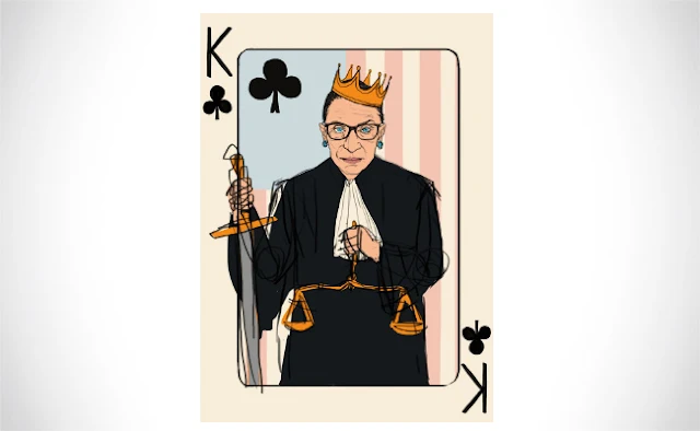
Choosing just 13 influential American women for the first edition of the deck wasn't an easy task as there are so many extraordinary American women who have contributed so much to society throughout history. After choosing Mrs Clinton and Beyonce, the Wahls' crowned Supreme Court Justice Ruth Bader Ginsburg the King of the pack. Also, the founder of American Red Cross Clara Barton was selected as the Jack card, with Amelia Earhart, Rosa Parks and Dr Sally Ride just a few of the others chosen to make up the inspirational pack.


Between his busy schedule, we were able to catch-up with Zach for a quick Q&A on the Woman Card[s].

For those of us who don’t know, can you tell us about yourself and what is your design background?
My little sister is actually doing all of the illustration work for the deck, not me. She's 100% focused on the illustrations and design work, and I'm handling everything else, including running our Kickstarter, identifying our manufacturer, working on our fulfilment, etc. She is currently finishing her BFA in painting at the University of Iowa with an emphasis on illustration. She's also a staff illustrator for The Daily Iowan, Iowa City's independent student newspaper. I'm three years older than her, but she's been drawing for about as long as I can remember.

Can you describe the Women Card[s] and why you’re passionate about it?
The Woman Card[s] is a full 54-card deck of playing cards featuring fifteen original, hand-drawn portraits of American women who changed the world. Thirteen of the women appear in all four suits, and there are two jokers. We've settled on our lineup for the thirteen cards who comprise the 2 through the Ace, but we haven't yet settled on the Jokers. Each woman has a mnemonic corresponding to her rank. They're explained more in depth on our website.


Walk us through the process you took to design the deck. How did you approach this project and get to this finished product?
We haven't finished designing the deck just yet. After Mr. Trump's comments on April 26, we knew that we had to move quickly to capitalize on the momentum of the news cycle and get a minimum viable product online. Based on the overwhelmingly positive response we've received, we're not expecting to change the style of the illustrations or pattern at this time.

What was your most brilliant breakthrough when designing the deck?
Deciding that we would only stick with American women made the selection process much easier. At first, we were contemplating women throughout history, and it was just so overwhelming. And then my sister pointed out that we should just stick with American women, which would make the selection easier. Not that much easier, but easier enough that we were able to settle on a lineup fairly quickly after that. In terms of actual look-and-feel of the cards, I think my sister really found her stride on the third mockup she did, which is of Ruth Bader Ginsburg as the King of Clubs. It was received incredibly well online.

From the project page, what are a few of your favorite reward levels and why?
Our most popular reward so far has been Reward Level 2, which is two decks and a signed thank you note from the illustrator. Zebby is going to have to sign a lot of thank you notes! Another popular reward is Reward Level 3, which is five decks and a full-size, 18"x24" print of any of the 54 cards. That's probably the level I would have picked if I'd stumbled onto this online.


You've received a lot of attention from the mainstream media recently. Can you tell us about your experiences with this?
We've received a ton of media coverage, ranging from our local newspaper all the way to the Australian Broadcasting Corporation. It's been surreal. Most of our pledges, however, have come from Facebook, and people sharing by whatever the social media equivalent of "word of mouth" is.

Finally, what are your favorite playing cards?
I love the feel of Theory11 cards if I'm feeling luxurious. I have a deck of Citizens and of Union. But when my family is playing Euchre, we're usually using a standard deck of Bicycle cards.

Thanks Zach, all the best! At the time of writing, the project is 2213% funded with 21 days to go. If want to support the Woman Card[s], you can find it on Kickstarter here!


Currently, over 2,800 people have backed the project have raised $110k. The decks will be hand-drawn and pledge starts from $15.


Card Radar: Odd Bods Playing Cards


A brilliant deck commissioned by publisher The Folio Society. Illustrator Jonathan Burton has designed these custom playing cards in a beautifully nostalgic style. The Odd Bods Playing Cards feature amusing characters, quirky illustrations and playful imagery.

The deck has been designed to have the look of ‘aged’ Victorian lithographs with limited colour and slight printing errors. A brilliant mix of surrealism, twists on the traditional icons and chucklesome juxtapositions in this deck.


Jonathan’s work has gone on to win a silver medal at the Society of Illustration in New York, an award of excellence from Communication Arts and overall professional winner at the AOI illustration awards 2013. The judges commended this commission for its delightfully inventive imagery and highly skilled draftsmanship. The drawings are sophisticated and indicative of an illustrator who is working at the top of his game.

Jonathan is based in Bordeaux, France and you can see more of his work at jonathanburton.net
© all rights reserved
Kardify 2013