Responsive Ad Slot

News: Chris Ramsay and Ellusionist Release Carpe Noctem Playing Cards. Only Available for 7 Days.


Chris Ramsay has released his new deck of playing cards, Carpe Noctem on Ellusionist. The intriguing deck is inspired by 'The Night Blooming Cereus'; one of the strangest and most beautiful plants of the desert, the Carpe Noctem deck unveils it's true beauty only after dark.


The bold deck features custom Ace of Spades, jokers and card back in deep black ink. The tuck box is subtle, but embossed, to emphasise 'The Queen Of The Night' forcing itself to be noticed.


Ellusionist will only sell Carpe Noctem once per year for a seven-day time period. Available now for $10 at ellusionist.com

News: Patrick Kun Releases New Mirage Playing Cards Dawn Edition


Magician Patrick Kun’s Mirage Playing Cards deck is back, and arguably looking better than ever! The new Dawn Edition features with the new crimson color, which compliments the Dusk edition perfectly.


The court cards are now fully custom. Magicians such as Laura London, Calen Morelli, Eric Jones, and of course, Patrick are featured.


The eye-catching tuck case was printed with stunning gold foil on a brand new premium pearlescent paper and gold champagne ink covers the interior of the box, and closed-off with a matching gold perforated seal. Also, the deck includes a subtle marking system.

Originally available exclusively on his Asia lecture tour last month, the deck is printed by Legends Playing Card Co and are now available on patrickkun.com for $9.95.


First Look: Apothecary by Seasons Playing Cards


Seasons Playing Cards and Alex Chin never disappoint. Always looking beyond the norm Seasons always brings something deep in its creation and cultivation.

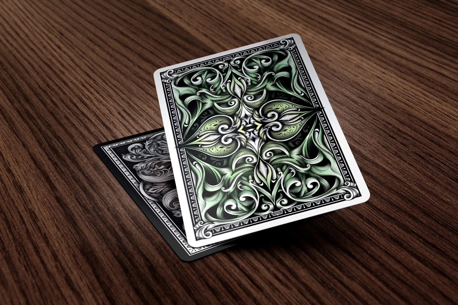
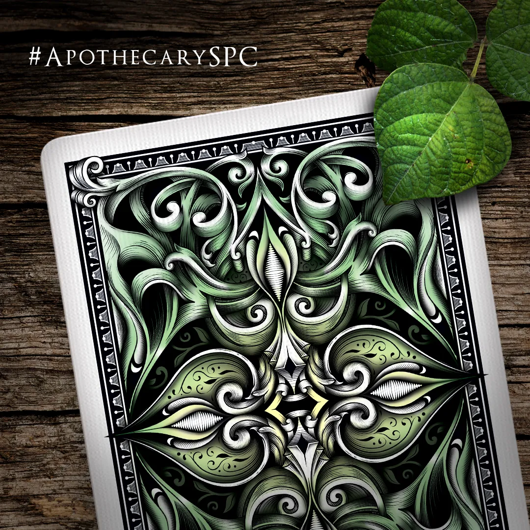
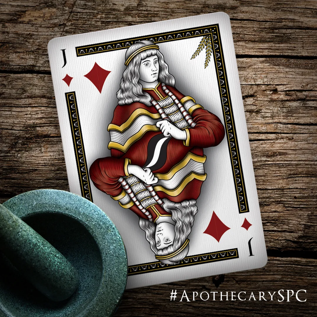
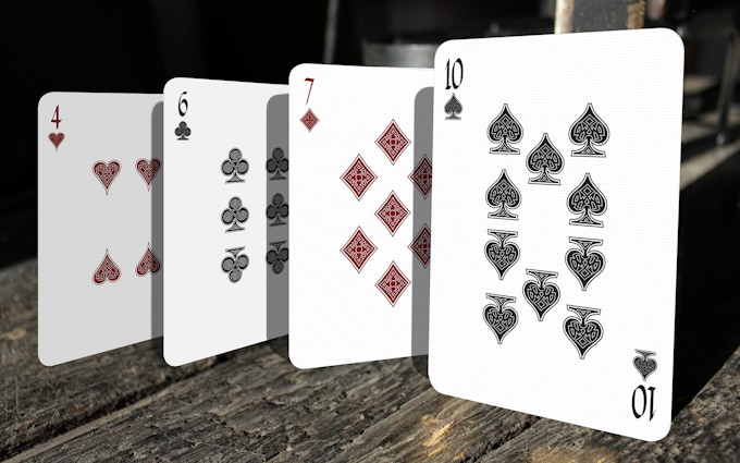
Apothecary is the latest project coming from Seasons Playing Cards. Already shrouded in a bit of mystery, Apothecary is already showing the tell tale signs of the attention to detail and brilliant talent of Alex Chin.
The few things we do know is that Apothecary will be launching as a 2 deck set on Kickstarter some time in September and Alex Chin is hoping to bring something a little different to this campaign. According to Alex,

This campaign will have a bit more engagement than a typical KS and I'm hoping to really expand the collector experience with this one.


 As the release date and more details become available we'll do our very best to keep our readers informed of the progress that Apothecary is making.In the mean time, you can "Join the Journey" here and start to be a part of this "experience".

We're very excited about this project and looking forward to traveling the journey with the project and our readers. We leave you with one more little mystery in the form of a teaser trailer... what do YOU make of it?


We would like to thank Alex Chin and Seasons Playing cards for the opportunity to bring this new journey to you all. Here's looking forward to an interesting and exciting project!


You can visit Seasons Playing Cards on their official website and also follow them on Facebook to stay up to date on all the Seasons news and products.


Deck View: Never Forgotten Playing Cards


Remember. Beautiful. Love.

The Never Forgotten Playing Cards is a collaboration between Robert Wright and Randy Butterfield and it pays tribute to all loved ones we have lost to cancer. Self-funded by Robert, this beautiful and classy deck was created as a tribute to his mom.

The striking blue sapphire on the tuck box, backs, and spade/club suits are Robert’s mothers' birthstone. The symbolism of the ribbon becoming the butterfly. The lavender ribbon on the Tuck, back and Ace of Spades is for all cancers. The different cancer ribbon colors represented in the court cards. Plum is the color that honors caregivers represented by the angels.

This deck is an amazing reminder of Life and Love. Never Forgotten was printed by the Expert Playing Card Co. Only 2000 decks were printed, with 1800 being released for sale. Single decks will be $10.00 plus Shipping. Available now from Never Forgotten Storenvy Shop.

For more cool playing cards, check out JP Games.

Cardistry: Cardistry Apparel Release Exclusive BLOOM Tee


The team at Cardistry Apparel released their new tee design, BLOOM earlier this week. Co-founded by Anthony Whitford (@notaninstagram) and Anna DeGuzman (@annadeguzman), Cardistry Apparel (CA) is exactly what the name entails - apparel for cardists.


According to Anthony, who runs the business aspect of CA,
All of our designs relate to cardistry in some manner - whether it be a parody of something else, a photograph of playing cards, a simplistic take on a card flourish, etc...

Anna, who is also a popular cardist, help designed the apparel artwork and graphics that are commonly featured in cardistry, with a focus on tailoring for both men's and women's tee. With BLOOM, the design is a simplistic take on the popular card flourish Bloom.


With the inspiration of the tee designs, Anna said,
We draw inspiration from all aspects of our community, as well from companies like HBX. That being said, we want our designs to appeal to everyone, not just cardists.

BLOOM comes in 5 different colors and only will be available until Monday, August 29th. This design will never be available again. Check it out!


To find out more about Cardistry Apparel and keep up-to-date with their latest offerents, follow them on Instagram (@cardistryapparel)

Kickstarter: 7 Questions with Marianne Larsen of Midgard Playing Cards


From the team at Design Imperator based in Denmark, the Midgard Playing Cards are inspired by the Norse mythology. Having already hit it’s funding goal of kr85k (~USD$10.1K) on Kickstarter, there are two decks on offer in the campaign: the Danegeld (Black) and the Yggdrasil (Dark Red) Editions.

Both decks are fully custom, from the pips, fonts, values, courts and aces. The card backs are designed in the traditional 2-way layout and inspired by the classic Bicycle backs. The court cards feature legendary Viking leaders of Scandinavia and deities of Norse mythology. Illustrations are hand-drawn by professional illustrator Patrick Leis and lead artist Nicolai Aarøe.


Both editions feature deluxe sturdy tuck boxes with hot-stamped metal foil (silver foil on black tuck for the Danegeld Edition and gold foil on dark red tuck for the Yggdrasil Edition) and richly embossed artwork on all sides. Both with a numbered tuck seal applied.

We were able to catch-up with Marianne Larsen from Design Imperator for a quick chat about the team at Design Imperator, designing the Midgard Playing Cards and experience from their previous Kickstarter projects.


For those of us who don't know, tell us a little about yourself and Design Imperator?
Design Imperator is a group of Scandinavian based creatives and freelance artists. While the team is supervised by me, Marianne Larsen, the responsibilities of each task and job is handled and administrated by the best man for each job in any project. We have been engaged in the development of numerous independent projects since our team was founded in late 2011. With a passion and genuine interest in playing cards, we seek to consolidate ourselves as developers of unique and rare custom decks. Our flexible cooperation with talented artists forms a solid basis that helps us raise the bar with every deck we make. While Design Imperator is just a small team we aim high and have very ambitious projects in the pipeline.


Can you describe the Midgard Playing Cards and why you're passionate about it?
Midgard Playing Cards form a bridge between historic legends of Scandinavia and iconic deities of Norse mythology. Thor, Frejya, Odin and Loki are all represented in the deck in a hand drawn format and style that really strikes a good nerve. As Scandinavians ourselves we always had a passion for this culture and the sagas. This theme has been on the drawing board for a long time, but we needed to gain insight, a following and hands-on experience before pitching it on Kickstarter. This is our most ambitious project to date and we are proud to look back on the huge amount of work that went into, before showing it off on Kickstarter.


Walk us through the process you took to design this unique deck. How did you come out with the idea and how did you get to this finished product?
Presenting deluxe features in the base package is a rare approach for playing cards on Kickstarter. But we needed the decks to be very ambitious and impressive even in their basic form. We made numerous sketches and drawings and left them in a pot for some time before re-approaching the full design a few months after. This is a great way to approach a solid design with fresh eyes and spot all the weaknesses for a chance to improve the artwork. The courts, drawn by professional artist Patrick Leis in a coop with Nicolai Aaroe, really was our breakthrough because of their unique style, perfectly reflecting our vision of the Norse legends.

We have presented several deluxe features of both decks right from the start, but thanks to the amazing support we are witnessing the decks are now loaded with even more special features, such as interior artwork and added cards!

What was your most brilliant breakthrough when designing the deck?
While the custom courts really did take the decks to the next level for us we felt like the 'story-telling approach' to the tuck backs was a great way to present something new and creative to the industry of playing cards. Few decks does this, and the tucks of Midgard have so much thought worked into their design, with no details left on random or without a good reason to have them there. The two decks are unique and very different in appearance, but the story telling tuck back designs are our main breakthrough, presented in metal foil and with rich embossing.


You have successfully funded numerous Kickstarter campaigns. What are a few key elements and principles you incorporated into your project that you think future Kickstarter creators could benefit from knowing?
It is important to show that you care. Let it shine through that you are passionate about your project and not just hoping to earn a few bucks on a new platform. Our first two deck project, Noble and Chivalry, were both well funded and convincing in their own form. Our backers witnessed how we are just as passionate about fulfilment as we are about designing, and this is an important factor. For a chance to succeed with a great idea you need to convince that you are able to deliver when the time comes.

We have been open and transparent from the start and our backers have seen this from the start. To fund well you must earn the trust of backers, and on that note, it helps you if you are a backer yourself, and not just a project creator.

What's next? Can we expect to see more card designs in the future?
Absolutely! We have about five solid ideas for other projects, but they will be kept hidden and secret for now. Some of our projects take years to bring from a to b so we need to plan and strategize well before revealing anything about the these. We also have some ideas about the creation of a web shop at some point, but things take time, and we don't want to rush anything. In terms of playing cards project, we have some designs and themes that have been brought to an almost complete state.

These may be pitching on Kickstarter in the future, so stay tuned for more creative ideas coming your way. And on a closing note, Midgard Playing Cards may not be the last Viking themed deck you've seen from us, with Midgard hitting so many stretch goals already!


Finally, what are your favourite playing cards?
There are so many great designs out there. We could mention a favorite deck for every category out there, elegance, fantasy, historic, modern, etc. But if we have to pick just one out that really stands out from the rest we would probably go with the Arcanas by Chris Ovdiyenko. The amount of work that went into their design is extreme and obvious. Hand drawn illustrations are unique and personal in their own way.

Thank you for your time and congratulations on hitting the funding goal! The project is already 204% funded with 18 days to go. If you want to support the Midgard Playing Cards, you can find it on Kickstarter here!


Pledge starts from kr89 (~USD$13) and the deck will be printed by the NPCC. Dealer coin, booklet, and deck pouch are available as an add-on.


Exclusive: First Look at the New Products from Carat Card Cases


The Carat Card Case line-up has been one of my favorites since they first showed up in the market not that long ago. Sherman Tsao, continues to improve and create new and exciting ways to display your collection.

We had the opportunity to get a first look at some of the prototypes of some of the new products coming soon to the Carat line. All the new products continue to shine in the quality and craftsmanship that we've come to expect and the innovation and functionality continue to flourish.

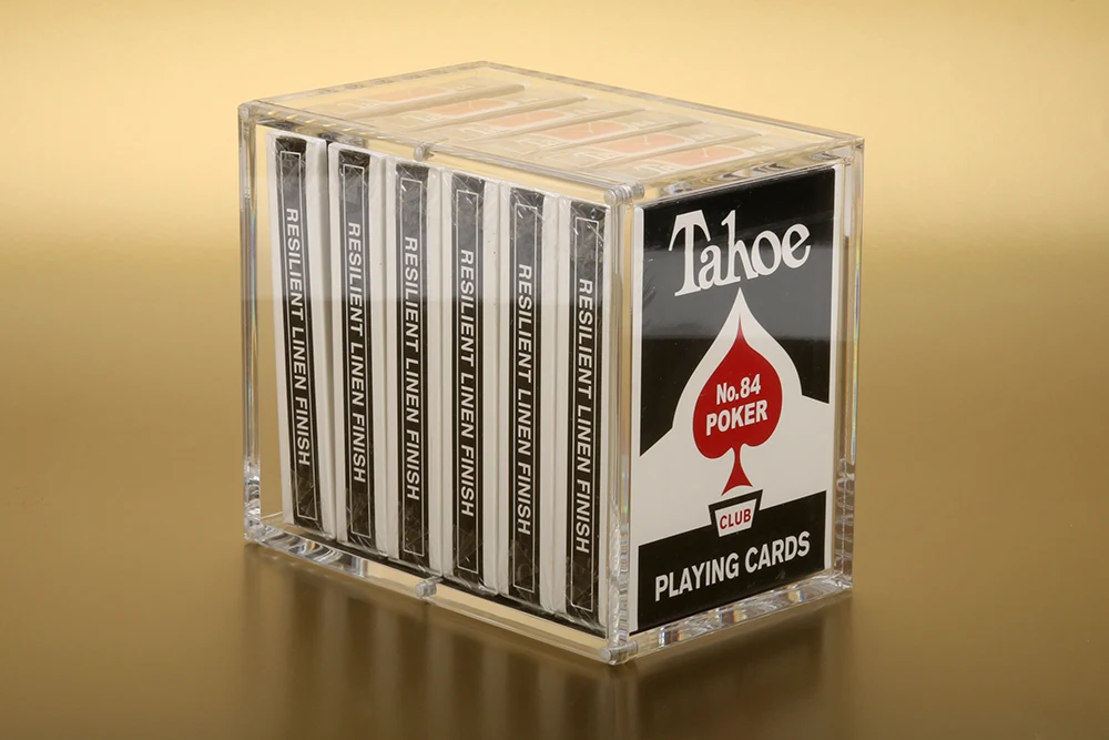
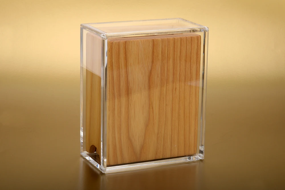
Earlier this year Sherman introduced the first Carat Brick Box, debuting exclusively on the Jetsetter Playing Cards: Premier Edition campaign. Coming soon to the Carat line will be an all new half brick box. The same beautiful crystal clear acrylic with a magnetized lid and included rubber feet. (Pictured above)


Earlier this year also brought the V2 (version two) deck cases featuring the new rounded corners. In the not so distant future, you'll see the addition of a Coin lid single and double deck case. The lid will be able to hold a 2" coin and seal seamlessly, just as the standard cases. The coin compartment is on the inner face of the lid leaving the clean lines of the case undisturbed.

The other deck display coming this year is the custom fitted Legacy display, made to display the Limited Edition Legacy line from Kings Wild Projects and Jackson Robinson. An excellent touch to an already stunning display.


I've always been one to try and display as much of my collection as I can, the Carat product line continues to give collectors the ability to showcase part of their collections in a clean design that can be placed in any setting. 

We have no release dates or price points as of yet, but be assured once we have any information we'll be sure to share it with our readers. Please keep in mind these are prototypes still undergoing tweaks and updates, but I'm sure the final versions will be just as appealing as these early incarnations. There are a few more unique products coming from Carat that we're not at liberty to discuss just yet, but when the time comes, we'll be bringing those to you first hand as well. 

We want to thank Sherman for giving Kardify the opportunity to bring this exciting first look at his new products and as always to our readers.  


News: Mark Stutzmans' Gorgeous New Flying Machines Playing Cards


It's always great to see a detailed, well-designed deck under $10.00, even better when it's designed by the amazing Mark Stutzman.

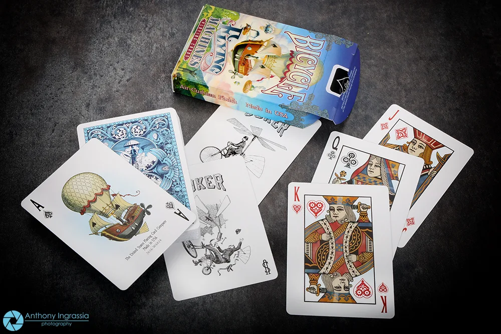
Produced by The United States Playing Card Co. Flying Machines "....celebrates the spark of imagination and creativity that lives in all of us through unique and imaginative illustrations of flight"

Completely hand-illustrated, Flying Machines is a fully custom deck with familiar courts. The brilliant and whimsical back design are matched by the beautifully colorful tuck case.

Available now on Collectableplayingcards.com. Enter "Kardify" as your coupon code for a special discount.

Deck View: The US Army Playing Cards


Respect. Honor. Country.

Designed by Jackson Robinson, in respect and appreciation for those in the US Military and in honour of the rich history of the US Army. The US Army Playing Cards deck is a fully custom playing card deck celebrating the United States Army.

The deck design emphasises on the evolution of the Army uniform throughout the major conflicts of it's history. From the Revolutionary War, Civil War, WWI & WWII, Korean War, Vietnam War and the modern conflicts in the middle east. 

In a departure from Jackson's usual art style, this deck is more fluid and raw while maintaining some of the line work of his previous decks. The tuck will be printed with 4 color process, inside and out, on premium vellum stock.  Each face card will depict a servicemen or servicewoman in a period correct uniform, a way to chronicle the evolution of the US Army uniform and dress. The Aces feature commonly used military helicopters. Printed by the USPCC.


For more cool playing cards, check out JP Games.

Cardistry: What is Cardistry? Watch this Short Documentary


For those of you who are into the mesmerizing art of card flourishing (cardistry), you probably have watched this short documentary numerous times by now. Directed by Erudite Pictures and produced by Dan and Dave, this documentary tells the story of how Cardistry-Con came to be and the amazing community that is pushing the limits of possibility with a simple deck of cards.

Cardistry-Con 2016 took place in Berlin, Germany on July 8, 9 and 10. About 150 cardists from all over the world gathered in an old chocolate factory to share their passion for cardistry, learn about the art, and connect with one another.

Filmed on location during this year's Cardistry-Con, the documentary begins with Zach Mueller sharing why Cardistry is important to him and followed by Dan and Dave describing what Cardistry-Con is. The video also features lots of cool shots of incredible card flourishes by attendees and interviews with cardistry personalities such as Andrei Jikh, Anna DeGuzman, Kevin Ho and more!

Check it out!

Art of Play: The Odd Bods Playing Cards by Jonathan Burton is Available Right Now


Art of Play is brightening up it's already extensive offering of playing cards today. The company is releasing the Odd Bods Playing Cards. Up until now, this charming deck was only made available exclusively to the members of the prestigious Folio Society, the design world fell in love and the decks were sold out. Check out our Card Radar feature for more.

The fresh new Odd Bods features an all-new back design and gold-foil embossed tuck box. Each playing card, hand illustrated by Jonathan Burton, in a beautifully nostalgic style with amusing characters, quirky illustrations and playful imagery. Odd Bods are the epitome of refined indulgence.

Available now from Art of Play for $15.


Image from Instagram (@artofplay).

Kickstarter: 7 Questions with Stewart West and Bob Case of Moirai Playing Cards


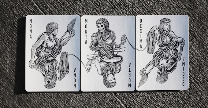
The Moirai Playing Cards deck is headed by Stewart West and illustrator Bob Case. The guys have taken the life/death theme to their creation. Inspired by the Greek mythology, the Moirai were the three goddesses of fate who personified the inescapable destiny of man.

This intriguing deck features fully custom artwork. From the illustration of intertwined vines- alive and dead on the intricate card backs to the unique court cards which depict the control Moirai have over their lives and ultimate death, and the Ace of spades decorated with the majestic double-headed eagle.

We reached out to the team and had a chance to talk to Stewart and Bob (who has just been selected to be included in Lürzer's Archive “200 Best Illustrators 2016/2017”) about their design background & inspiration behind the deck and their plans for the future.

Can you tell us about yourselves and what are your design background?
Bob: I'm Bob Case - illustrator, animator, art director and CCO of LAVIDGE (an advertising Agency in Phoenix, AZ). I graduated with a BFA in studio art with an emphasis in Illustration from the University of Arizona - ironically around the same time that Stewart was attending although we didn't really know each other (he was a cool designer and I was a weird illustrator). I started out as a designer working for a small firm in Tucson, then moving up to Phoenix to work in-house for an airline. I moved to the advertising world, then into interactive in the mid 90's doing v.1 websites - hilarious stuff to look back at. Went full-time as an illustrator when my kids were little, then went back to advertising and have been with LAVIDGE for about 16 years. Still do freelance illustration, but I'm slow, so I try to be picky about what I take on.


Stewart: I'm Stewart West – graphic designer, art director, and currently a creative director for an in-house agency in Utah. I also graduated with a BFA from the University of Arizona, with an emphasis in graphic design. After graduation I worked as a production artist for a year or so and then moved to New Orleans when I got my first design job. After a few years I moved back to AZ and worked for a small design firm. Out of the blue Bob Case invites me to lunch to discuss going to work for an advertising agency - not his but a competitor. So that's how I got into advertising. After working for Cramer-Krasselt for 9 yrs. Another art director and I opened our own boutique branding firm. 10 years later one of our clients asked us to come to work for them, it was an exciting opportunity so we left the warmth of AZ for the chill of Utah.

What is the inspiration behind Moirai Playing Cards? How did you come up with the idea?
Bob: As I remember it, it started just as a conversation with Stewart and I wanting to collaborate on something. He suggested a card deck, then we started throwing around themes and landed on life/death pretty quickly. From there I started doing some sketches and shared those back with him. The "Moirai" theme came a little later as he was doing more research - the idea that fate plays a hand in life/death as well as card games was just a natural so we expanded the deck to include 3 jokers instead of two.


Stewart: I have always wanted to work on a project with Bob. We'd been friends a long time and I've always admired his talent. I had recently finished a Kickstarter playing card deck - Fanangled - and thought another deck with Bob would be incredible. We met for lunch and discussed several things we could do but came back to the playing card deck idea. As Bob says, we knew it was going to be based on life and death - I knew I wanted Bob to draw skeletons and the face cards in a deck lend themselves perfectly to having one side be life and the other death.


How much time did you spend working on the deck?
Bob: This is embarrassing. It took me two years to do all the illustrations. Like I said, I'm slow, but I also have a day job and illustration commissions so I ended up with nights and weekends to work. Stewart was awesome at subtly reminding me on occasion when I was a little too quiet and we kept up a decent pace. Without question the longest single project I've ever done and one that was a lesson in self-discipline and consistency.
Stewart: Ha. This is my longest project to date. While Bob did take a lot of time I wasn't Sir Speedy. We started this project just as I was closing my design studio and moving my family to Utah to start a new job. On top of that I knew Bob's illustrations were going to be incredible so I felt more pressure than normal when designing all the pips, the tuck case, choosing the right fonts, etc. I designed four of five versions of everything before choosing a final direction.


Talk to us about going from the first draft to the final version. How did you get to this finished product? How did you get feedback?
Bob: First draft to final version wasn't a huge shift - we both agreed quickly on the concept and the first sketch nailed the overall idea - where we had some great back and forth was in figuring out how the illustrations would sit on the card: Should they be framed, should they be cropped, etc. He would take the sketches, drop them in layout and we would just make decisions quickly. He was in the process of moving to Utah at the time we started so we did almost all of this through email - might seem like a cold way to work, but we were so decisive this way it made for a really efficient process.

Feedback loops were pretty funny - we'd both just show things to the people we work with and see what they had to say then tweak if we needed to. Probably the biggest challenge for me was solving the jokers - they weren't going to be done the same way as the cards (traditional card looking elements), they were going to be more flowing, so I had to figure out how to keep the life/death aspect of that while trying to have a more flowing style. Also had to figure out how best to break the illustration over the three cards so they could read as a single element, but function as individual cards as well.
Stewart: What Bob said. ;-)

What was your most brilliant breakthrough when designing the deck?
Bob: For me, it was the card back. I knew how cool and intricate card backs could be so I went right away to the intertwined vines. Having the quadrants break from living vines to dead was a breakthrough for me - loved having them mirrored, but different.


Stewart: My biggest break thru was the discovery of the Fates. I liked the life/death direction but I wanted a stronger concept for the deck. So I spent a lot of time doing research and thinking, and one day I found a website talking about the three sisters - The Moirai. Perfect.

What’s next? Can we expect to see more card designs in the future from you guys?
Bob: I'd do it again - just need a worthy theme (critical since the projects are so time-consuming) and maybe a moment to breathe and enjoy seeing this one come to fruition (hopefully).
Stewart: I certainly hope so. I loved working with Bob and I personally feel we've made an incredible deck. I hope our KS project funds. If it doesn't I feel my chances of talking Bob into another project are pretty slim.

Finally, what are your favorite playing cards?
Bob: When I was doing research on these, I came across so many decks that I thought were cool. I always return to the classic style of deck though - and it was why I made sure my faces and styles paid homage to them. But seriously, when you look at the old English/German/French decks, there was some magic in those cards. Can't imagine what it took to get them produced.


Stewart: So funny that Bob should pick the old European decks. Those are my favorite as well. I lived in Germany for a short spell and I loved the decks I played with over there. But I also have to say that the Federal 52 deck by Jackson Robinson is what inspired me to want to try to design a deck. Love his artwork!

Thank you for your time, guys. The artwork is incredible! At the time of writing, the project is only 55% funded with 21 days to go. If you want to support Moirai Playing Cards, you can find it on Kickstarter here!


Pledge starts from $12 and the deck will be printed by the USPCC on Bicycle playing card stock with an Air Cushion (linen finish). Dealer chip and t-shirts are available as an add-on.

News: Art of Play is Bringing the Brilliant Odd Bods Playing Cards Back, Teaser Images Released


Art of Play is bringing this brilliant deck of playing cards back to life, spotting a stunning new tuck case and a gorgeous redesigned two-way card back.


Illustrator Jonathan Burton has originally designed these fully custom playing cards in a beautifully nostalgic style. The Odd Bods Playing Cards feature amusing characters, quirky illustrations and playful imagery.


The deck has been meticulously crafted to have the look of ‘aged’ Victorian lithographs with limited colour and slight printing errors. A brilliant mix of surrealism, twists on the traditional icons and chucklesome juxtapositions in this delightful deck.

You don't want to miss this one! Available this Friday from Art of Play. For more cool designer playing cards and accessories, check out Art of Play or follow them on Instagram (@artofplay).

Kickstarter: CALAVERAS DE AZÚCAR Playing Cards by Natalia Silva


From the creative mind of designer Natalia Silva comes CALAVERAS DE AZÚCAR, a custom deck of playing cards inspired by the Day of the Dead - a traditional Meso-American holiday dedicated to the ancestors; it honors both death and the cycle of life.


Consistent with Natalia’s other decks, the CALAVERAS DE AZÚCAR Playing Cards are charming, colourful and vibrant. On the design inspiration, Natalia said,
“Calavera De Azúcar” is a skull made out of sugar, which is used to decorate Day of the Dead altars. These sugar skulls are very colorful and whimsical, not scary at all. I absolutely love the Sugar Skull style used for the Day of the Dead.


The symbolism of a sugar skull is rooted in the decoration around the eyes. Flowers are meant to symbolize life, while cobwebs symbolize death. The skulls are designed to be bright and cheerful, being a celebration of the life that once was. Natalia continued,
Sugar Skulls are a traditional folk art from Southern Mexico used to celebrate Day of the Dead. I really love Folk Art. I designed 2 Russian Folk Art decks and now I think it's time for me to explore some new different cultures and traditions.

The first time I ever saw Sugar Skulls was about 8 years ago, when I came to USA (to language school in Los Angeles) to study. As a foreign student, I stayed with a host family. They were a very nice and traditional Mexican family. I was very inspired by their culture and colorful sugar skulls. I think that sugar skulls are very similar to my design style (colorful and simple). So, I want to show my appreciation for the vibrancy of Mexican culture.

The skulls are prominently featured on the tuck box and the card backs are adorned with colourful flowers, leaves, and grapes. These nature elements are also found on the aces and the custom court cards. The well thought out vibrant colours gives the deck a dynamic look.


There will be two standard editions available, the Black and the Blue Edition. Both will be printed by the USPCC and pledge starts from $14. Also on offer are the limited edition: Purple, Green and Red decks printed by MPC. Check out the project page for more info.


Card Gear: Addicted to Creativity


Card Gear is our monthly feature dedicated to discovering new inventory, setup and accessories used every day by card designers, cardists, magicians and collectors. The concept originated from the popular social media site, Instagram: #passthepockets. Whenever one of these hashtags come up on the social news feed, there's always something new to discover, no matter who that person is.

For this month, we have the EDC of Nick Vlow, a 21-year old card magician and graphic designer based in central Russia. Nick is the designer behind Onida, Shin Lim playing cards, Longitude & Latitude and Philtre Playing Cards. You can see some of his other work here or follow him on Instagram: (@nickvlow)

Nick is addicted to creativity, so he always carries a sketchbook to write down ideas for card magic or sketch something new for tattoos or design that comes into his mind. Nick is also an economics student which takes a lot of his time through fall and winter.

Nicks's gear:
+ 68' Omega watch
+ Moleskine sketchbook
+ BarneysNY sunglasses
+ Sharpie marker
+ Micron liners x3
+ Philtre playing cards
+ Apple EarPods
+ iPhone 6S
+ Mulberry Wallet
+ Joe Porper's classic metal clip
Swiss knife & flashlight

What’s yours? If you would like your card gears to be featured on Kardify, contact us.

Deck View: Killer Bee Playing Cards


Bold. Modern. Bees.

Designed by Oban Jones for Ellusionist, the Killer Bee Playing Cards is a combination of modern aesthetic and bold elegance.

The deck features fully custom pip, striking hexagon-styled courts, Ace of Spades and the mesmerising card backs. The minimalist matte black tuck box with gold foil accent is elegant and modern.

Available from JP Games.

Kickstarter: 7 Questions with Sergio Roca of the Odyssey Playing Cards


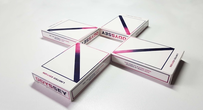
Designed by Sergio Roca, Odyssey Playing Cards is an eye-catching deck inspired by the Orion's Nebula. The deck has been designed with cardists in mind. The vibrant nebula color palette accentuates card flourishes and displays, fanning, spins and cascades will look incredible!

Odyssey consists of 54 cards and features custom suits, aces, courts, 2 custom Jokers and a minimalistic tuck. The vibrant colour palette is consistent across the deck and the diagonal white stripe is prominently featured on the cards. This classy stripe will allow cardists to create and discover new shapes and enhancing displays for their card flourishes.

We caught up with Sergio and had a quick chat about his design background, inspiration and idea behind the Odyssey Playing Cards, design evolution of the deck and his thoughts about the support he has been getting from the cardistry community.


Can you tell us about yourself and what is your design background?
My name is Sergio Roca, I am 21, a student of Telecommunication Engineering. I live in Valencia, Spain and I am a magic and cardistry enthusiast. I have been doing Magic and Cardistry for almost 6 years now and I hope it lasts for much more to come. I am not a graphic designer but I have always loved drawing, photography and image editing. Because of this, I have been able to acquire and learn basic design techniques with which to carry out my deck designs.

What is your inspiration behind Odyssey Playing Cards?How did you come up with the idea?
I have always loved everything related to cosmology and astronomy. So when I decided to design my own deck, I started to investigate more in depth about the universe in which we live in, nebulas, galaxies, cosmic formations and everything in-between. I visited many astronomy websites as NASA, SEDS, Cybersky in order to make the best decisions according to color, thematic, shapes, and figures from the deck. And that's when I realized Orion’s nebula was the key.


How much time did you spend working on the deck?
This is a good question. I came up with the idea of making my own deck two years ago. However, my studies have not allowed me to dedicate myself entirely to this deck, which has caused many delays and living in Spain was another one of the major problems because of the high shipping fee, high customs taxes and the necessity of giving legal features to this project. Nevertheless, three months ago, I made the decision to speed up the project thanks to the help of great professionals like Hanson Chien or my aunt Nuria Martinez who have helped me a lot.

Talk to us a bit about going from the first draft to the final version. How did you get to this finished product?
I started working on the back which has gone through many colour and shape changes. Finally, I gave it a white diagonal stripe, which gives the cards symmetry, and that in my opinion is perfect to create displays. After I finished with the back, I started with the design for every cards face. It took some time but it is what you need if you want to create a very special deck. The first whole designed card was the queen, and from there I kept on with the rest of royalty following the thematic. At the same time, I was working on the first tuck box prototype which was horizontal like NOC v3, however, my intention was to find the best card case design so I set out to examine all possible alternatives and I realized that the classical vertical tuck box fits better.


I tried to show elegance and minimalism with some futuristic touches in every element of this deck and I think that the card case is the perfect example. Moreover, the hardest card to find the perfect design for was the “club”. But after countless math classes designing instead of trying to make out something my teacher said I came up with the ideal Club for the deck.

What was your most brilliant breakthrough when designing the deck? 
Well to be honest, I provided this deck with a lot of minor details, the jokers being really futuristic, the cards case which contrasts nicely with the card's back or the typography or the number “10” which is replaced by an “X”. Any of these details makes this deck really unique. Although, for me the most brilliant breakthrough was the Queen's design. I think that this card shows really well what I wanted to transmit, elegance and minimalism.

We first noticed Odyssey on Instagram. What do you think of the playing card community in terms of the feedback and support that you’ve been getting so far? 
Well, the magic and cardistry community is one of the best, no doubt about that. All of these wouldn't have happened if not for them and I've been receiving feedback from the first picture of the Odyssey Cards I posted. Every comment, new idea, advice or opinion I took it into account to improve my deck according to what cardists and magicians want. I have also received tons of support from the Spanish community on YouTube and Instagram and I am also very grateful for it.


Finally, what are your favourite playing cards?
I have been doing magic and cardistry for 6 years and my favourite deck of cards remains unchanged: Bee Wynn. It may be its finish, or maybe the paper stock, I don’t know what it is, but this deck has something special for me. Blue, purple or red, all sound good to me. I should get more of these. They are perfect!

Thank you for your time, Sergio and Congratulations on hitting the funding goal! At the time of writing, the project is already 117% funded with 19 days to go. If want to support the Odyssey Playing Cards, you can find it on Kickstarter here! 


Pledge starts from €12 (USD$13.50) and the deck will be printed by the Hanson Chien Production Co (HCPC).

© all rights reserved
Kardify 2013