Responsive Ad Slot

Deck View: The Bicycle Flying Machines Playing Cards


Flight. Whimsical. Vibrant.

The Bicycle Flying Machines playing cards celebrate the spark of imagination and creativity that lives in all of us through fanciful illustrations of flight. This whimsical deck features elaborate and creative artwork hand-illustrated by acclaimed artist Mark Stutzman.

Produced by The United States Playing Card Co, Bicycle Flying Machines includes a variety of unique illustrations from the colorful tuck case to the gorgeous aces and the beautiful card backs. Also, the two fun jokers are custom illustrated and the vibrant courts are standard, maintaining a familiar look.

The suits are uniquely designed with mechanical gears and cranks. Giving the deck depth and personality. Brilliantly printed by USPCC on premium Bicycle brand cardstock with a classic Air-Cushion Finish.  For cool playing cards, check out JP Playing Cards.

Cardistry: 3 Questions with Bryan Fang of the Tessellatus Deck


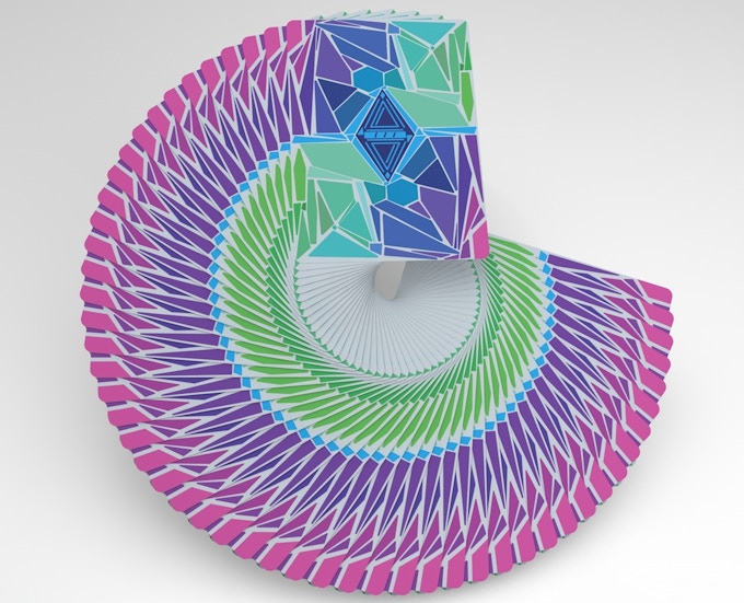
Currently funding on Kickstarter, the Tessellatus deck features a mosaic-themed back design, paired with a vivid and vibrant color palette. The deck is fully custom and the face cards are designed with the similar vibrant colourway and mosaic theme. Designed by specifically for cardistry by Bryan Fang of Hunkydory cards, whose main goal is to contribute to the growing art of cardistry and community that he loves. Bryan said,
I first thought of the name when listening to David Bowies album "Hunkydory", when listening to his songs, it made me feel happy and free of trouble, which is what the word itself means. I want to translate this emotion into my cardistry and the cards we produce, to promote a positive environment.
We asked Bryan three questions about the Tessellatus deck, the cardistry community, and his favorite flourishes.


What is your inspiration behind the Tessellatus deck? How did you come up with the idea?
My creative process is purely spontaneous, ideas I think of are often completely unplanned. The Tessellatus design was spontaneous as well, which is kind of cool in a sense, where it represents my creative process. Tessellatus started out as a very different design, it also wasn't too well received from the community, so I took that response and played around with Photoshop a bit more. I found out how cool different geometric shapes looked when placed next to each other, so then the main design was made. The original design was only grey and a dark tone of blue, taking inspiration from Absolut vodkas, but I didn't like that either. I changed the colors around a bit, and the designed turned into the present day Tessellatus.

Funded in less than 2 days! What do you think of the cardistry community in terms of the feedback and support that you’ve been getting so far?
Haha ya. We were able to reach our goal of $5,000 in only 12 hours! I honestly did not expect this at all, thanks everyone! The biggest difference between Cardistry and all of the other art forms, is the community. The Cardistry community truly is amazing, everyone is out there to grow the art and help each other out. I'm a big reddit user and I'm also pretty active on the Cardistry discord, so to see them support the campaign means a lot to me.


Finally, what are your favourite flourish and playing card decks? 
My favorite flourish hmm, i'd have to say its either the riffle fan by Dimitri Arleri, or Pandora by Dan and Dave Buck. My favorite deck of cards are probably Tally-Hos (gotta love em), but I'm also a big fan of Cardistry Con 2016s, Smoke and Mirrors and Playrights.

Thanks Bryan and congratulations for hitting the funding goal! The Tessellatus deck is available now on Kickstarter for $12.

News: Learn More About the EDGE Playing Cards by TCC Playing Cards Co.


The eye-catching EDGE Playing Cards are designed by Creative Mints and produced by TCC Playing Cards Co. Headed by Danny Wong and Joe Yang, TCC Playing Card Co was established in 2008 in China. Over six years, the company has released the T-Series Playing Cards and recently the Dead Soul deck.


With the latest release EDGE, Danny explained,
In 2008, my sophomore year, I started a business on playing cards, which made me become one of the biggest playing card dealer for a year and a half. After graduating in 2010, I had made my first fortune — about 150 thousand US Dollars and began preparing for designing a deck of playing card of my own brand, which would be as good as it could. To fulfill this dream, I have spent six years working since then and got the first satisfying product in 2016, the EDGE playing card, which is about to be released.
EDGE Playing Cards features geometric patterned courts and vibrant colors throughout which will brighten your poker nights or cardistry.


TCC has just announced that they will offer USD$20k as a reward for an official trailer of EDGE. Visit their Instagram (@tccplayingcards) for details. EDGE will be available on Art of Play Friday, 28th April.

7 Questions with Dimitri Arleri of Cardistry Touch


One of the most anticipated cardistry deck this year, the ORIGIN Cardistry deck by Cardistry Touch is the first deck crafted from scratch specifically for cardistry. The deck features a unique geometric design that accentuates spins, flourishes, and large, multi-card displays. Also, a single design is repeated on each card for an enhanced cardistry experience.

Printed by Cartumundi on a premium quality paper with a softer stock and coated in brand new "cardistry finish", which feels broken in right out of the box. All 51 cards are housed in a very unique swivel box.

We caught up with Dimitri Arleri and had a quick chat about Cardistry Touch, the inspiration and idea behind the ORIGIN deck, and his thoughts about the support from the cardistry community.

First off, for anyone who might not be familiar, tell us about yourselves and Cardistry Touch. How did you guys end up collaborating together?
I was doing cardistry for a few years already when I decided to move from Paris to Brussels for my studies: I ended up going to the same school as Ladislas, which was a total coincidence. We quickly became friends and shared this amazing passion. We then realized that we also shared a certain vision of cardistry, we were both reaching for the same goals, and we had a pretty clear idea of what we wanted the future of cardistry to look like. We also knew that, even though we were still students back then, cardistry had to be a part of our professional lives. I remember long conversations, discussing how we could improve ourselves by improving the whole community. Tons of ideas about what we could accomplish and what we could change if we put our minds and skills together. Inevitably, all those ideas had to be done under one entity, and that’s why we created “Touch”.


You guys are amazing cardists! What motivated you to create your own deck of cards?
Thanks! The motivation was really basic: we felt like something was missing, so we decided to create it. We didn’t really have an object that was 100% ours as cardists. We used playing cards, but those were made to play games, not to manipulate. We cannot deny that traditional playing cards are a great tool for our art, but we knew we could do better. So we started to rethink everything from the ground up. Not only the design, but the paper, the weight, the size, the number of cards… everything: we wanted to create a new object. We had no idea how to do it yet, but we knew that if we were going to create that new object, we couldn’t compromise on anything. We also knew that most playing card manufacturer would never take the time to create a new deck from scratch. Still, we kept brainstorming for years about this project, without even knowing if it could be possible one day.

We noticed that you will be printing the Origin deck with Cartamundi. How did you end up collaborating together?
Well, like I said, we already had the whole project figured out before we even had a supplier, and we wouldn’t settle for anything less than what we had in mind. We were in luck when Cartamundi contacted Ladislas out of nowhere to collaborate on a deck of cards. We immediately pitched our project, and a few days later, we started working together. It was pretty amazing to see such a huge company taking the time to work with us two and our crazy idea. They believed in our project, and they actually took action. We didn’t think it would take that long though. I think both Cartamundi and us didn’t realize how ambitious this project was: for two years, we worked back and forth, rethinking everything from scratch, to create a real cardistry deck that would fit our needs. And we finally did :-)


What is your inspiration behind the Origin deck? And that awesome tuck box, how did you guys come up with the idea?
When we designed the deck, we had two things in mind: practicality and aesthetics. It had to be a “cardistry” oriented design, so that really defined the main feature of the design: all cards had to be the same, and had to work together. Rhythms and connections for fans, two colorways, thin borders on one side for cuts, a spinning effect in the center, and so on. But we also wanted one single card to be a piece of art itself. We both had a design-oriented education, so we had a pretty good idea of what we wanted the final product to look like, so after months of work, we finally agreed on this design and we’re super proud of it!

We also wanted to do something different for the tuck box. We didn’t have a clear idea, but we wanted something new, just like our deck: something that would push the possibilities of cardistry. We had a few meetings about it with the Cartamundi designer team to discuss it and explain what we had in mind, and after a few back and forth, they came up with this great mechanism: the swivel box, Simple and effective. We tweaked it a little too perfectly fit our needs, that’s it, we had the cards, we had the box, and we were good to go.


After Cardistry-Con Berlin, the Origin deck is one of the most sought-after Cardistry deck. What do you think of the cardistry community in terms of the response, feedback and support that you’ve been getting so far?
The response that we had at cardistry-con was incredible. Before that, people were already saying great things about the design, and that was great, but like I said, the design is only a small part of the project. We’ve been working on this “cardistry finish” for more than two years, so we were really stressed out when we release the Cardistry-Con edition. It turned out great though; we had a lot of amazing feedbacks from cardists all over the world. We really can’t wait for everyone to try out the final product!


What’s next? Can we expect to see more card designs in the future?
Of course! We already have some good ideas for future designs, very different from Origin. This is only the beginning, with Cartamundi we also want to keep pushing the quality of our decks: we will constantly make our product evolve with the feedbacks of our customers. The cards aren’t the only thing we’ll do, by the way, we’re a cardistry brand and we have many projects in our mind and in the works already. We want to make more apps like MyShuffles, more collaboration with other artists, tutorials, and many other stuff we can’t talk about right now :P

Finally, what are your favorite playing card decks?
Origin of course! I might be biased on this one…

Thank you for your time, Dimitri, and congratulations on an incredible product! 


Kickstarter: Alexandre Dumas Classics Playing Cards by Bona fide Playing Cards


Designed by Karin Yan of Bona fide Playing Cards, the Alexandre Dumas Classics' Playing Cards are a tribute to two of the most popular masterpieces by the French Writer: The Count of Monte Cristo and The Three Musketeers.

Fully custom, both decks portray a simple yet detailed image of characters and the stories of each book. Each deck features illustrations of the main characters from the respective book, paying great attention to every single detail.


The Count of Monte Cristo Playing Cards portrays a story of revenge, jealousy, pride, greed and justice.


The court cards represent the main characters of the book, while the back and tuck feature the most characteristic elements of the story with a design inspired by book bindings of the 19th century.


Meanwhile, the Three Musketeers Playing Cards depicts a story of courage, honor, ambition, friendship and treason.


The court cards represent the most meaningful characters of the story and the back and tuck are inspired by book bindings of the 17th century, featuring characteristic and meaningful elements of the story.

Both decks will be printed by the Expert Playing Card Co, on it's Master Finish. Available now on Kickstarter, pledge starts from €13 (~USD$14) and the uncut sheets are available as an add-on.

Deck View: Red Gemini Playing Cards


Nostalgic. Vintage. Casino.

The Red Gemini Playing Cards deck is the second edition to the popular Gemini Casino line up. Conceptualized by Estonian playing card designer Toomas Pintson, Gemini is a fictional casino deck inspired by treasured classics like Jerry's Nugget and Dunes Casino playing cards.

Gemini was made to look like a vintage deck you might find in an old Las Vegas warehouse from the ’70s. The deck features a nostalgic ’70s tuck, ace and back design. The face cards are standard and include two jokers.

Printed by the United States Playing Card Company on high-quality Bee stock, Gemini definitely appeals to those who love and collect vintage casino playing cards.

Red Gemini Casino deck now available at geminidecks.com. For other cool playing cards, check out JP Playing Cards.

Cardistry Touch Releases My Shuffles App


The team at Cardistry Touch has just released, "My Shuffles", a smartphone app to capture your cardistry ideas, wherever and whenever inspiration may strike. The simple but useful app allows you to record your cardistry idea/moves and organize it within pre-defined categories. Gone are the days of excel files, notebooks, and scrappy pieces of paper. With the app, the goal is to put all your ideas in the same place.

You can also rate your own videos, add a note and even add variations to s specific move. Feel like practicing a particular move? Add the video to the “focus” feature. With one tap, add your moves to the focus category to manage your practice time, and make the best out of it!

The app has a lot of potential and is an essential tool for cardists of all levels. I wish there is a sharing feature where cardists can share their own ideas with the community and/or friends. Also, a backup to cloud feature to store data. If I ever drop my phone and need to start over, I can easily restore it from a cloud backup for my android or iOS device. Hope these features will be considered in future updates.

Get it for iOS here or Android here.

Deck Development: The Hearts of Hidden Leaves by Mahdi Gilbert


On our new series, Deck Development, we follow the progression of a deck of playing cards starting with the design inspiration to the final product you will hold in your hands. The designer will explain development decisions and may show the development process as well as the result itself.

We are honored to have the incredible and inspirational magician Mahdi Gilbert (@mahdigilbert) with us to step is though his upcoming deck of playing cards, Hidden Leaves. The aim is to blend Japanese and French aesthetics to create the style of this gorgeous deck, which is a spiritual homage to Le Samouraï, the 1967 French masterpiece by Jean-Pierre Melville. According to Mahdi,
This is my first deck of cards and I have been dreaming about creating this deck for years. A deck of cards is very personal for a magician, they are a reflection of his inner world and I wanted to have a deck that tells my audience and the world something about my world.

Mahdi was very inspired by the old style of playing cards and how they were printed over a century ago. Mahdi explains,
Every color was printed on separately and there were natural imperfections and bleeding that occurred because of the printing method. This resulted in every deck being completely unique in very subtle ways. I found that the beauty of the imperfections was something that was very attractive and I knew I wanted my deck to be imperfect so that when people saw them and handled them they could notice the subtle details. 

The images previewed here shows the Heart Court cards. Stay tuned as we continue with deck development and reveal more of the Hidden Leaves Playing Cards. Let us know what you think in our comment section below.

News: Caroline Ravn and Stockholm17 to Release Purple Edition of RAVN Playing Cards on Kickstarter TODAY!


RAVN is back with a purple touch! A collaboration between Swedish magician, Caroline Ravn and Stockholm17, RAVN Playing Cards is a custom designed deck of poker size playing cards.


On the new version, Lorenzo Gaggiotti said,
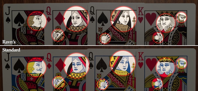
Caroline Ravn and myself teamed up to deliver an elegant and classic looking deck of playing cards, with improved courts and standard faces. Perfect to perform magic tricks, cardistry, and of course to play at the green table.  

The look of all 12 courts have been improved. The faces of the Jacks, Queens and Kings look better, and their hands have been redrawn.


The deck will be printed by Cartamundi on a special paper stock, 310gr Black Core paper with 9C² varnish designed for better handling and durability.


The RAVN Playing Cards - Purple Haze are available NOW on Kickstarter!

Deck View: Hornet Playing Cards


Reprint. Ingenius. Floral.

The Hornet deck was beautifully remastered by Circle City Cards in 2012. The design is a reprint from nearly 100 years ago pays homage to the original while updated slightly to include a couple of unique bonus cards. The cards are printed on premium-Aristocrat stock with Cambric finish and feature recoloured pips, Ace of Spads and standard courts, a classic floral back design, two jokers with a subtle reveal, an ingenious substitute card and an ad card.

For other cool playing cards, check out JP Playing Cards.

Cardistry: Check Out the NEW School of Cardistry v3 Playing Cards


The School of Cardistry Playing Cards is back this year with an all new colourway! The School of Cardistry v3 features a “Beyond Borders” back design, with circles that continue off the cards making your cardistry moves look more substantial, powerful, and deliver impact with every single motion.


Designed by Edo Huang, the iconic dynamic face design gives the deck a seamless and continuous flow, while the indices give separation to each individual card.


A centre indicator was designed specifically on both sides of the card to naturally guide you to the perfect position for card spins and isolation routines.


According to Jaspas, the new School of Cardistry v3 comes with an improved stock.

We’ve chosen a stock that is softer, with the perfect finish and varnishing that makes fans a breeze. This deck readily fans when you want it to, and stays in packets when it needs to.


The School of Cardistry v3s will be available on the 15th of April on thenewdeckorder.com. Also, prepare yourself for the craziest cardistry launch video you’ve ever seen.


Subscribe School of Cardistry on YouTube and turn on post notifications to be informed once this deck is available.

Card Radar: The Brooklyn 101 Back Playing Cards


The Brooklyn 101 Back Playing Cards are brought to you by the Brookyln Playing Card Co. The company's vision was to create a functional deck of cards for the working magician, performing direct and impossible magic.


The result is a timeless blend of tradition and innovation. The deck features a custom vintage design, reimagined Jokers, custom Ace of Spades bearing the silhouette of the Brooklyn bridge and standard faces to maintain familiarity for the performer and audience.


Printed by the Expert Playing Card Company on their improved Classic Finish stock, the deck feels incredibly smooth and durable. Only 700 of 1000 printed will be initially sold to keep the secrets of a select few. Early access currently available to subscribers at brookylnplayingcardcompany.com.

7 Questions with Harold Apples, Designer of National Playing Cards


Theory11's National Playing Cards were inspired by the mystery and the pursuit of power. Designed by Harold Apples, every aspect of the deck was designed from scratch. From the gorgeous Aces, Jokers, to the court cards that are filled with vibrant, colorful illustrations in a flat, retro and textured style artwork. The tuck box is beautifully embossed and detailed with striking gold and black foil, inside and out.

Just prior to the release of the deck last week, we were able to catch-up with Harold Apples for a quick chat about his design background, the collaboration with Theory11, designing the National deck and his advice to aspiring designers and artists.


Could you introduce yourself to our readers? What is your design background?
Hey there, I’m Adam M. from Kentucky and I currently make art under the name Harold Apples (@haroldapples). I’ve been involved in the arts all of my life, I even went to an art magnet high school that got me thinking of a career in the arts at an early age. College found me taking the traditional design/art student route, while at the same time pursuing music with friends. If you’ve ever been in a band you know how much traveling and performing can teach you. I think everything about being in a band directly affected and immensely helped my design career— You have to learn to work well with others and compromise on an outcome that you want to remain proud of; you learn that if you’re not pouring yourself into everything you do and letting that shine through then no one will give a crap about your work, and you learn above all how stinking hard you have to work to make good things happen and to get noticed. Almost all of my favorite designers have been in bands and I don’t think it’s a coincidence.


Fast forward and after 10 years of doing the band thing semi-full time I settled down, got married, and took my first proper job at an agency out west in Denver. Most designers out there know that small (but serious) design agencies can be immensely taxing, all consuming and just plain tough. The agency world helped me to become a faster and more focused designer because you’re always working to get home at a decent hour and being slow doesn’t do you any favors. This type of agency also forces you to figure out what you really want for your career, because:

> you start to think after your first month of not having a day off that there must be more to life
> you start considering leaving design altogether
> working at a coffee shop again starts to sound more appealing
> and you find yourself coming up with elaborate schemes to live life to its fullest without the need for money
> becoming a freegan and hitchhiking across Europe… that sort of thing.

Sadly I didn’t do this… man… really should’ve done this— instead, my wife and I moved back to the south to take a job on the client side with the parent company of Lonely Planet, the world's largest guidebook and travel information provider. This proved to be the absolute best career decision for me as I was allowed a lot of creative freedom without pressures from external clients. My nights became less consumed with my day job, which allowed me to pursue my passion for illustration… that pretty much gets me up to today.


We love your art style and have been following your work for quite awhile on social media. What are some of the most memorable work you have done?
A lot of my favorite work hasn’t really found its way to Instagram. I started working under Harold Apples a little under a year ago as a way to separate my illustration work from my work as a creative and art director. Honestly, the National Deck represents the first larger project that ‘Harold Apples’ has really completed. Most of the year for me has been about experimenting and just ‘doing’. I started lots of projects and have a pretty bad track record at finishing… definitely trying to work on that in 2017.

Projects that I hope to complete this year include: A children’s book my wife and I are working on about a certain writer from the 1800’s, a book of photos I’ve taken of my favorite dead blues musicians headstones (I have lots more miles to put on the odometer before this one is finished up) and a line of merchandise that I’m going to sell on my soon to launch storefront: applesaucesupplyco.com


The National Playing Cards will be your first playing card deck. How did you and Theory11 end up collaborating together?
Originally I was planning on producing a deck all on my own. I started approaching letterpress studios who were making decks that I loved, even talked to Dan and Dave about doing something with the deck (super lovely guys btw, stinking love the work they do) and I stumbled upon Studio on Fire in Chicago who produces all of the tuck cases for Theory11.


Their work is just phenomenal. I connected with SoF and they pointed me to Theory11 and Jonathan Bayme the CEO of Theory 11 helped me cost everything out and got me on my way to producing a deck. A couple months went by and he approached me about collaborating on the deck; he was following the development on Instagram and thought it might be a good addition to the Theory11 deck lineup. To me it was a no-brainer — Theory11 has such an extensive reach and their work is so respected and utterly gorgeous that making the deck with them seemed like the best way to take the deck to the next level.

Can you describe the National Playing Cards and why you’re passionate about it?
The deck for me has almost been more about an illustration process than one original concept. I had been playing around with this flat, sort of retro, very textured illustration style that was feeling very natural to me.

On a whim one night I illustrated a King of Hearts, posted it to Instagram and got a lot of positive reaction and encouragement to keep going. So I did. Over time the deck sort of morphed into this sort of secret society tribute thing. I got obsessed with working in a ridiculous amount of symbology to basically make the Illuminati's official deck of cards… kinda silly, but lots of fun.

About halfway through the process, we decided to name the deck National as a tribute to the long gone National Playing Card Company that produced beautiful decks until the late 1800’s. I’d like to think we’re bringing the brand back to life.


What was your most brilliant breakthrough when designing the deck?
Honestly, the defining moment was the decision to team up with Jonathan Bayme at Theory 11. Jonathan is crazy motivated, high energy has excellent standards and he’s willing to go through round after round of revisions until things are perfect. He really played a big hand in pushing the box design to a great place that I think we are all happy with. Without Theory11, the deck would have wound up in a wildly different place, or possibly not even produced at all. For the quality that I wanted, the cost was going to be pretty large, and I was nervous about printing with no distribution in place and basically going it on my own. Jonathan definitely made it happen.

What are your favorite playing card decks?
All growing up I had the same trashed and worn blue Bicycle deck, which I think will always have a special place in my heart. As far as modern decks go, I love Citizens by Theory 11 (shameless plug). It is a feat of design and printing (I have no idea how printing that ultra fine line work is even physically possible on a letterpress… Studio on Fire has registration skills to pay the bills!), Dan and Dave’s Maker’s deck from last year is also gorgeous and mono-width line work is just right up my alley.

Also hailing from my hometown of Louisville Ky, Tyler Deeb’s Misc Goods deck is a modern classic, everything about it is just absolutely unique and original and it has a timeless quality that I’m totally in love with. I’ll be hanging on to that one for years.

Thank you so much for indulging my questions. Do you have any other words of wisdom for other aspiring artists and designers?
If you’re getting started in design, I would encourage you to just ‘make’ and experiment. As a young designer, it’s really easy to get overwhelmed with feelings of inadequacy while striving to make your work live up to your favorite designers and artists. What you don’t see from your idols’ work online is the years and decades of refining and learning that went into a particular style or a finished piece.

Every great designer and artist have to put their time in to find the style, tone and subject matter that’s right for them, it doesn’t come over night. It did for Prince…. But we all can’t be Prince. I had a ceramics professor in college that would always tell freshmen that "it’s not about quality, it's about quantity”. Because real learning, breakthroughs, and discoveries come from the doing of things. And the more you do, the more refined your work becomes and the more purposeful and thoughtful it becomes.

Awesome! Thank you for your time, Adam!


National Playing Cards are Made in the USA using FSC-certified paper derived from sustainable forests, vegetable-based inks, and starch-based laminates. Available NOW from Theory11.

Images courtesy of Adam Moore (@haroldapples) and taken from theory11.com

Deck View: The Magna Carta (SILVER Gilded King John Limited Edition) Playing Cards


Liberty. Silver. Stunning.

The Limited Edition SILVER Gilded King John Deck is part of the stunning Magna Carta Set by Seasons Playing Cards commemorating the foundation of liberty. Beautifully illustrated by Alex Chin, symbolism and story are thoughtfully located throughout this luxurious deck.

The deck features luxurious foiled etchings on each suit, intricate linework on custom courts and aces. The tuck case is foiled with eye-catching gold and embossed on premium stock. The tuck interior reveals an interior replica of the actual 1215 Magna Carta itself. These limited edition decks feature breathtaking mirror-like gilding across the sides of the deck.

The Limited Edition SILVER Gilded King John decks were only made available during the initial Kickstarter campaign. Printed by the United States Playing Cards on the durable Aristocrat stock and coated with premium magic finish. Check out the Magna Carta Set on seasonplayingcards.com

For other cool playing cards, check out JP Playing Cards.

Cardistry Touch Releases The ORIGIN Cardistry Playing Cards for Pre-Order


On Friday the 7th April, the team at Cardistry Touch will release for pre-order one of the most anticipated cardistry deck this year, the ORIGIN Cardistry Playing Cards. The deck first debuted in Berlin, Germany, at the 2016 Cardistry Con in July. Sample decks were given out during Cardistry Con and the feedback has been overwhelmingly positive.


A post shared by Cardistry Touch (@cardistrytouch) on

Printed by Cartumundi, the deck features a very unique swivel box, eye-catching back design, modern-looking repeated face cards designed to accentuate spins, flourishes, and large, multi-card displays.

Also, to see what the guys from Cardistry Touch have been up to for the past two years, check out the video below:

News: Theory11's New National Playing Cards: Here’s What We Know So Far


Earlier this week, Theory11 released a few teasers of their upcoming deck, the National Playing Cards. At first glance, it doesn't appear to be a departure from the style we've come to know and love; they teased the deck with visuals that look like their previous few offerings.

The feedback so far has been overwhelmingly positive. Though Theory11 tends to project mystery, we already know a decent amount about National Playing Cards ahead of its release. Here's what we know so far about the deck:

1. Release Date

When it comes to the release date, the official word straight from Theory11 is Friday, 7th April at 11am ET.


2. Designer

Although not mention in any of the teasers thus far, the designer of the deck is Adam Moore. You can see some of Adam’s beautiful flat-style line work on his social media (@haroldapples) and dribbble account.

3. Face Cards

The deck will be fully custom. From the Aces, backs and the gorgeous courts. Here are some a few court cards Adam teased on his account last year. Note that this are early versions and final artwork may differ.


A post shared by Harold Apples (@haroldapples) on

4. Suits

Suits are fully custom. It would appear that each suit has a theme and colored accordingly. The all-seeing spades are black, the sacred hearts are red, lucky clubs are green and blue for the diamonds. From the teasers, the final version looks like it will be in the traditional red and black.


5. Tuck Box

Theory11 teased the side of the tuck and with no surprise, it features stunning gold foil on black paper with embossing. Here’s a full image of the tuck image from Adam’s instagram.


Deck Watch: March 2017


While we'll be the first to say that Playing Cards as an investment is not the wisest of choices, the value of certain decks is an interesting thing to take note of. With anything deemed to be a "Collectible" value comes into play for various reasons, from just knowing to gambling on the possible return on your investment.

Deck Watch is just a look at what some items are actually selling for in the market. Over time it should be interesting to see how values hold and or fluctuate month to month and what trends develop. Each month Deck Watch will feature the top 5 Playing Card decks, in terms of selling price*,  in both the Modern, as well as Vintage categories.

Guide:
David Blaine Create Magic (3) - $450.00 / 300.00
(3) = Indicates the number of this deck that sold
$450.00 / 300.00 = Indicates what the highest selling price was for the 3 (450) and the lowest of the 3 (300.00)
Average High End Selling Price= Indicated with a ▼/▲  and red or blue, depending on if the total has gone up or down from last month. 

Top 5 Modern Playing Cards


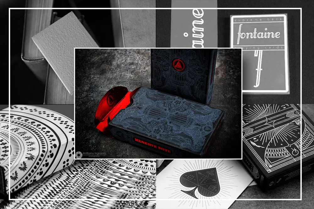
5. Rarebit First Edition - $165.00
4. Zenith Playing Cards - $170.00
3. Red Fontaine Playing Cards (2) - $191.00 / 175.00
2. Mail Chimp Summer Edition - $200.00
1. Black Un-Branded Reserve Note - $240.00

Average high-end sale price for March Modern Decks:  $190.00 for a single deck.


Top 5 Vintage Playing Cards


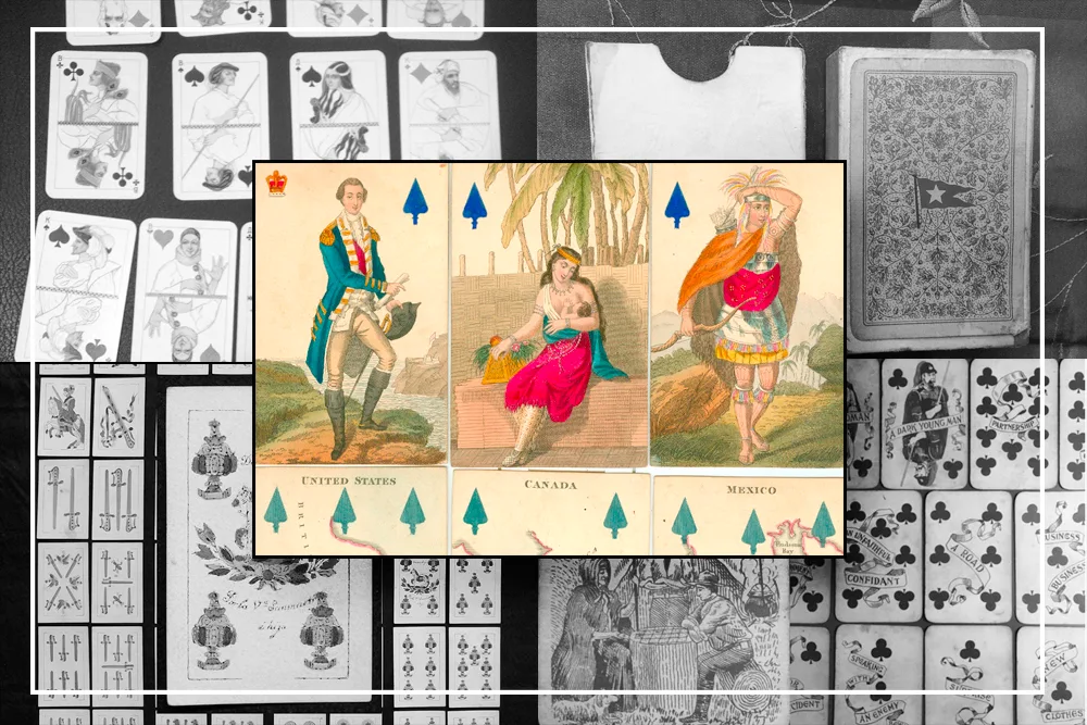
5. Century Fortune Telling Soothsayer Playing Cards c1900 - $450.00
4. Spanish National Playing Cards c1900 - $450.00
3. White Star Line Maritime Playing Cards - $460.00
2. Russian Playing Cards c1930.  - $1,725.00
1. England Geographical Playing Cards c1827 - $1,805.00

Average high-end sale price for March Vintage Decks:  $978.00 for a single deck.


* Methodology: Items are filtered from ebay under the heading of  "Playing Cards" for the prior month and only include actual Sold Items and not "Offer Excepted" listings. Selling price rank is based on a single deck listing unless the per deck price on multiple items ranks appropriately. Items that would normally occupy multiple slots will be consolidated into one listing which will include the number of times it sold and its highest/lowest selling price.

Deck Watch is intended to be purely informational entertainment. Kardify by no means is setting or guaranteeing posted values to specific items. The value of anything is based on your own personal opinion. 
© all rights reserved
Kardify 2013