Responsive Ad Slot

Kickstarter: 5 Things You Didn't Know About Cabinet of Curiosities Playing Cards by Cellar Window


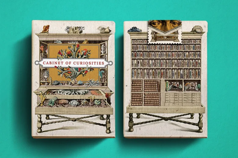
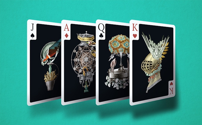
The Cabinet of Curiosities is one of the most intriguing deck of playing cards we've featured on Kardify. Designed by the team at Cellar Window, Cabinet of Curiosities is an art deck featuring a juxtaposition of elements such as mechanisms coupled with an organic look that inexplicably forms a truly unique and obscure object.


The 54 fully illustrated and imagined objects are inspired by the works and personal collections of naturalists and explorers. Here are 5 things you didn't know about Cabinet of Curiosities Playing Cards:

1. A Small Cabinet
Design and theme is always at the heart of what co-founder Nam Tibon do for Cellar Window. Creating a small cabinet design on the tuck box fits perfecly with the theme. "The idea is for people to carry this tiny cabinet around and to be able share the strange wonders found inside with friends easily."


2. Curiouser and Curiouser
Historically the Cabinets of Curiosities are predecessors of modern Museums we see today. It's a collection of a variety of things found all over the world. "The beauty I found with this theme is not its accuracy in exactly depicting nature but rather its notoriety for some of the objects to be manipulated in order to create a sense of mystery for the viewer on what other crazy things might be found out there."


3. Opening the Lock
Inside this cabinet is 56 illustrated objects each having their own personality. Anyone can interpret these objects as whatever they like and each one is a mix of organic and mechanical things that can leave you staring at it for a long time. "Rather than just focusing on court card design I wanted to create a vast collection reminiscent to a real cabinet of curiosities."


4. Inspired by Giants
Not literal giants but giants in the fields of naturalist art and scientific discoveries through the years. "As a child I was always inspired by famous old paintings about flora and fauna and always wondered what other things they might have missed and working around that thought I decided to create these strange objects. I don't have a clear idea on how an object will look before illustrating it but I am guided with a sort of stream of consciousness. That way I am always surprised on how it turns out, and so every card is born of my own personal exploration and collection."


5. Stream of Consciousness.
"I instantly fell in love with creating this art deck so I decided to make this the first of a series of art decks of different themes and all cards will be fully illustrated. I still don't know what my next playing card art deck's theme will be but I trust in that 'stream of consciousness' to guide me in creating some really unique stuff out there. This will by my first art deck and I invite you to watch out for more in the future."

The cards will be housed in an embossed matte finished tuck box with interior print and capped with a perforated tax stamp seal. Cabinet of Curiosities Playing Cards will be printed by NPCC on premium German card stock. Available now on Kickstarter and pledge starts at $14.

Kickstarter: Essentia Playing Cards Relaunched!


Mankin Chan has just relaunch Essentia Playing Cards on Kickstarter. The original project was launched late last year and unfortunately did not reach the funding goal. Shortly after Mankin went straight to work and decided to take a critical look at the artwork to see what could be done to improve to improve the deck. Mankin told Kardify,
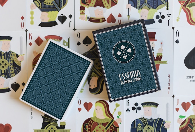
I collected feedback from friends and forums and used this as a starting point for the improvements. I received some mixed reactions about the overall simplistic style of the cards, some people liked it and some people thought it was not interesting enough. I understand both points of view, so I decided to keep the simplistic flat design style, but enhancing it with much more details. The most important and noticeable change is the style of the eyes. By giving them more definition a more mature look is achieved.

On the tuck box and back design, Mankin continued,
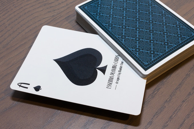
The second big change is the tuck box. Compared to other custom decks, it was not detailed and distinctive enough. So I started back from scratch, with only the argyle pattern as a starting point. After trying out several designs I came up with the current design which I was pretty satisfied with. Most people like the old back design, but it did not really match with the updated deck anymore. So I created a new back design that is based on the new.

Finally, Mankin made some minor tweaks to the colors. He explained,
Each set of courts have their own main color to make them more consistent, and the colors are a bit more saturated than before to make them pop.

We definitely love the enhancement done to the deck and with Mankin's unique flat design style, Essentia will hopefully find a place in your collection or on the table for casual card games with friends and family.


The deck now on Kickstarter and limited Early Bird reward tier is available for €11 with FREE U.S Shipping included.


Kickstarter: Kings & Crooks Just Released Outlaw Hell Riders Limited Edition Playing Cards


With 17 days to go, Kings & Crooks have just released the Outlaw 'HELL RIDERS' Limited Edition Playing Cards on Kickstarter. According to founder Lee Mckenzie on the latest backer update,
We're well over halfway to our goal now at 60% with 17 days to go! But we're not there yet... So to give us the best shot at reaching the goal, I've decided to take a gamble and switch up my plans. Instead of waiting until we reach the funding goal, I'm going to release the Limited Edition Outlaw deck now!

The deck prominently features a distressed look, creating a realistic weathering and vintage cracking effect. The burned-out red Outlaw back design will be marked - hidden, but easy-to-read to reveal the identity of every card at a single glance.


The Outlaw Hell Riders Limited Edition will be printed by USPCC on a premium, crushed card stock and cased in a matte, embossed tuck with a custom aged seal design and inner print. Available as an add-on for AUD$15 (~USD$12), and limited to 6 decks per backer on Kickstarter.

News: Ellusionist Reveals There IS A Secret Menu. Here's What Is Currently On It


For weeks, the rumor that Ellusionist has a secret menu created quite a buzz amongst fans. Guess what? It’s true. The news was revealed late last week on Instagram by our good friend Jeremy Griffith (Instagram: @lost_angelus) on a special announcement to celebrate the upcoming birth of his son.

So.. what is a secret menu? Basically, it means you can go in and buy decks that aren’t listed on the main Ellusionist menu. Meh! That sounds boring until you KNOW what you CAN buy…

Here’s what’s currently on the secret menu:


Saturn Hyperspace - Follow-up to the popular cardistry deck- Red Saturns. Two years ago, Ellusionist bought the rights to the design and it is finally available on the Secret Menu for $10.

Black Royal Reserve - Originally included when you purchase a brick of Royal Reserve. Now, available for $20.

We're not entirely sure how long the decks will be available on the Secret Menu or if the decks will be released to the public on the main menu at a higher price... so get yours now while you can!


More decks will be added to the Secret Menu throughout the year. Here's what you can expect:

Pink Rounders - Ellusionist mentioned on Instagram (@ellusionist) that this will be added in the next few week.

Silver D******* - Not much is known about this deck but like the Pink Rounders, scheduled to be released in a few weeks.

There are a few ways to get to the secret menu. Firstly, explore Ellusionist website, or if all else fail... get in touch with us on email or on social media with the hashtag #EllusionistSecretMenu.


7 Questions with Yassine Boudraa of 5 of Spades (Dark Edition) Playing Cards


Conceptualized by Yassine Boudraa, the 5 of Spades Playing Cards is an intriguing deck featuring the artwork of UK designer Sam Hayles. The centerpiece of the artwork focuses on Yassine's brand, 5 of Spades. The iconic logo has been prominently featured on the tuck, card backs and the custom 5 of Spades card (instead of the Ace of Spades).

The meticulously crafted deck features 56 cards with Cartamundi standard faces updated with faded pips, indices and scratched out court cards giving it an intriguing visual that captures the imagination. Also for the curious, secrets, reveals, and codes are woven throughout the deck to be discovered.

Before the launch of the Kickstarter campaign, we had a quick chat with Yassine about the collaboration with Sam Hayles, inspiration and design process behind the 5 of Spades deck.
 
Can you tell us about yourself and how did you end up collaborating with Sam Hayles?
My name is Yassine Boudraa. I was born and raised in France and currently living in Brussels, Belgium. I am a big fan of card magic and also love cardistry even though I don't really practice it. I love collecting cards and I discovered the Karnival series by Big Blind Media, designed by Sam Hayles (aka DOSEprod). I bought my first DOSEprod deck and quickly discovered all his decks. I became a fan of his artworks and got in contact with Sam as I wanted to get a signed copy of his deck. I felt happy and pretty honored when he replied me as he is an extremely busy man. He sent me few signed decks and the collectible DOSE goodies. The logo DOSE has always been part of my life.


Months later, I became very active on Social Media and started posting on Facebook and Instagram. I posted several times, DOSEprod's decks and artworks and I was tagging him. He liked most of my posts, he began to follow me. One day, I sent him a message to thank him for reacting to my posts, he thanked me too, he felt glad and proud! He confessed he didn't have much time for advertising, broadcasting and posting on social networks. I told him that I could do it for him. He took the time to think and finally he accepted. We discussed goals, objectives, and how it was going to work. We understood each other quickly as we have the same way of thinking and working. The DOSEprod dealer was born. I currently do advertising for Sam, I promote his artworks, find new collaborations, and I sell his private goodies (teeshirts, stickers, decks, etc).

This is your first crowdfunded deck. When did you first start thinking about using Kickstarter? What made you decide to take the plunge?
I noticed that crowdfunding is an incredible way to fulfill dreams and bring a product to live! As I am currently unemployed and without funds or savings, it is the obvious way to launch my project. The Cards community is a very industry with magicians, cardists, collectors, artists, and businessmen. So Hopefully we can raise funds enough funds. I have worked on my project for 3-4 years. The design evolved due to fashion trends and even XCM became Cardistry! Many cardists designed and launched their own decks. Few succeeded, while many are still trying. I feel that I am ready to launch my deck.


Can you describe the 5 of Spades Playing Cards? and why are you passionate about it?
I imagined many different concepts and imagined a deck which will attract magicians, cardists and collectors. So after a while, I realized that I couldn't create only one design. After several deck designs, I collaborated with Sam Hayles aka DOSEprod, to create a third design for me. That was unexpected. Sam had at this moment a lot of projects but he accepted. I wanted a dark and creepy deck but not excessively. So I ended with one concept but 3 different designs. I wanted to launch them all in the same Kickstarter campaign, but I realize that it will be complicated and difficult.

I also can tell you that the 5 of Spades Deck Dark Edition are full of secrets, reveals, and codes. I will launch a contest. Backers will be able to participate and discover and decrypt the secrets. There will be several selected winners and they will win incredible gifts (decks, t-shirts, and stickers). I am very proud of my concept. With it, I managed to meet very nice people and some of them became bro's, I have many great opportunities and developed my network. Thanks to God, I am living a wonderful adventure which gives me strength, hope and positive vibes every day.


What role did you play in the art direction and how much time did you spend working on the deck?
I thought about the concept for many years. When I have an idea, I developed them and built on my concept. For months, I explained my concept and project to DOSEprod. DOSEprod is very talented and professional. He designed more than 40 different decks (36 colors, 28 different designs). After several brainstorming session, DOSEprod started work on the deck. He's a machine! He started with the back design, then the tuck-case and the 5 of Spades card, the court-cards and the faces. Finally the Jokers and THE secret Card. We tweaked some of the details, but he spent around 3 months because he was working on several projects and holidays.


Could you walk us through your “Creative” process, do you DOSEprod have a routine when designing the deck or individual card?
As I answered you for the previous questions, I wanted to imagine a different concept. I wanted to create an original deck. I gave DOSEprod details, my ideas with examples and clues I didn't want to manage him with a draw and just ask him to work it on photoshop. He's an artist. I obviously let him work freely on my concept. DOSEprod's universe is very wide and he has many ideas and reactions. To be honest, even if I am the DOSEprod dealer, I don't really know how he works, he has his own secrets. I just know that he loves to walk in parks to contemplate nature, to visit museums and historical monuments. He also finds ideas and has inspiration listening to music, watching movies etc etc..

We initially noticed the 5 of Spades deck on Instagram (@5.of.spades). What do you think of the playing card community on Social Media particularly Instagram?
At first, I was more active on Facebook. I didn't know that the Playing Card community was, in fact, more active on Instagram and Snapchat. I don't really use Snapchat and I had to create an Instagram account. Finally, it was there that my network expanded. The playing card community is a huge community! Very passionate, talented and helpful.


Finally, what are your favorite playing card decks?
Ohoho!!!! That's a difficult question! My favorite decks are mainly DOSEprod decks, obviously, but I also love most of Daniel Madison's decks (I am also fan), Dan and Dave Bucks's decks, David Blaine's decks with the awesome Mark Stutzman's artwork, The Blue Crown/House of Playing card Decks, Jimmy K's Decks (Mechanic Industries), the Bicycle Dreamcatcher by Handy Altan who also is a bro and the old vintage decks (Arrco, Steamboat, Tahoe, Stud, Aviator, etc).

Thank you for your time, Yassine! At the time of writing, the project is only 27% funded with 38 days to go. If want to support 5 of Spades Playing Cards, you can find it on Kickstarter here!


The deck will be printed by our friends at Cartamundi on the super smooth B09 true linen finish. Pledge starts at €10 and there are multiple add-ons available such as Uncut Sheet, stickers, and t-shirts.

Deck View: KNIGHTS Playing Cards


Chess. Elegance. Checkmate.

Released during the 2016 holiday season by Ellusionist, Magician Daniel Madison and Chris Ramsay have teamed up to bring this elegant deck to life. KNIGHTS Playing Cards is a semi-custom designed deck by Oban Jones. As an avid chess player, I love how this deck looks! Everything from the iconic Ace of Spades, the eye-catching Jokers to the card backs and semi-custom faces of the court cards exudes elegance and class.

There are a few surprises on the minimalistic matte white and stunning gold foil tuck. These hidden features on the tuck exterior and interior embody the aesthetics and practicality which appeal to magicians, gamblers, and chess players alike. KNIGHTS are printed by the United States Playing Card Company with a smooth finish and traditional cut, making this deck feel as good as it looks.

Available now from JP Games.

Cardistry: LGMobile Korea Launches New Smartphone With Sleek Cardistry Ad


Earlier this week, LG Mobile Korea released an ad for their brand new smartphone, the LG V30 Raspberry Rose, which was originally showcased at CES. The stylish Korean ad features cool card flourishes with CGI incorporated to make this ad look really sleek. The 30-second ad has already generated more than 1.2m views on YouTube! Check it out below:

Anyone knows who the featured cardist is?

News: Ellusionist Quietly Released Sea Shepherd Playing Cards


Late last week, our friends at Ellusionist quietly released the Sea Shepherd Playing Cards based on an international non-profit, marine wildlife conservation organization- Sea Shepherd Conservation Society (SSCS).


The semi-custom deck features custom Ace of Spades, Jokers and standard recolored court cards and pips. Also, the Sea Shepherd logo is prominently featured on the front of the custom tuck box and on the mirrored two-way card backs.


Following Ellusionist previous fundraising decks- Bumble Bees and Killer Bees Playing Cards, 10% of the proceed from the deck will go to Sea Shepherd to support the important work done by the organization in protecting the ocean and marine life.


The deck is printed by the US Playing Card Co. on crushed stock and traditionally cut. Available NOW for $8.88 from Ellusionist.com.

Card Gear: Adam Borderline


Card Gear is our monthly feature dedicated to discovering new inventory, setup, and accessories used every day by card designers, cardists, magicians and collectors. The concept originated from the popular social media site, Instagram: #passthepockets. Whenever one of these hashtags come up on the social news feed, there's always something new to discover, no matter who that person is.

This month, we have the EDC of Adam Borderline from the UK. If you are on the popular social media platform Instagram, you've probably seen Adam's incredible photography (Instagram: @adamborderline). Adam has been gaining attention through his mind-boggling #fluidcards photography series.

Adam has been doing magic for close to 6 years, and photography about 5 years. Choosing liquid for his card photography is Adam's way of showcasing how he believe good magic and cardistry should be. It should be fluid, effortless and create a sense of wonder. Adam told kardify, "I’m very grateful everyone is enjoying something I love doing." Adam's gear (Italics are Adam's comments):

+ National Geographic backpack (the best backpack I’ve ever owned, carries everything)
+ Apple MacBook pro (My workhorse, I’d be lost without it)
+ Joby Tripod (Perfect for on the go)
+ Air blower (Blow the dust off your lens before cleaning it, otherwise you’ll scratch the coating,  This handy item is invaluable)
+ DSLR cleaning brushes (Lens, body, filter )
+ Variable ND filter (When shooting long exposures or video in mid day sun)
+ Canon 85mm 1.2L USM Lens (My portrait warrior, the bokeh and feel this lens can produce is only something this is able too do)
+ Canon 35mm 2.8 Macro Lens (All my card photography is done with this little beast)
+ Black edition Cherries by Pure Imagination (The stock, cut and finish is perfect)
+ Gold Monarchs from Theory11 (Use your cards, don’t let them gather dust, plus they’re awesome!)
+ 3 sided mirror/mat from Vanishing Inc (When i’m not shooting, it’s practice, practice, practice)
+ Various stickers from Papercuts, Supreme, Hocus Pocus, Theory11 and Gamblers Warehouse. (Who doesn’t like stickers!)

If you would like your card gears to be featured on Kardify, feel free to contact us.

[post_ad]

News: JPGames Unleashes COBRA Playing Cards!


COBRA Playing Cards is JPGames' first release outside of their popular LUXX series. COBRA is illustrated by the talented Rick Davidson and is inspired by some of JPGames owner, Paul Middleton's favorite decks - DMC's Elites and the industry changing Monarchs deck from theory11.


COBRA features easily recognizable face cards standard traditional faces, and indices. Stunning gold metallic inks were used on the courts and backs, making COBRA a premium deck made for everyday use.


For the working magician, 2 gaffs have been included in the deck- a blank face card and a double backer. The deck is neatly packaged in a gorgeous soft touch burgundy 330gsm tuck box complete with gold foil COBRA logo and detailing. Simple and effective!


The deck has been printed using Cartamundi's durable B9 Cardistry stock which has a lovely soft feel and finish. Available now from JP Games for £9.99.

Card Flash: Bicycle Dragonlord (White Edition) Playing Cards


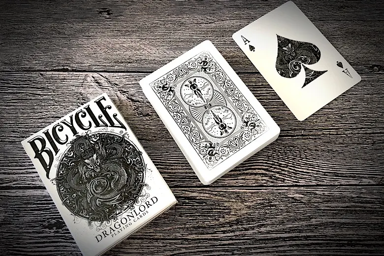
Currently being fulfilled by TCC Playing Cards, Dragonlord Playing Cards is a fully custom deck designed by UK designer Sam Hayles. The base design consists of Chinese style design elements with the Dragon being the core. The Dragonlord deck is presented in a black and white colorway, a reminisce of the White Ghost deck by Ellusionist.


The deck features custom intricate hand-illustrated dragon Ace of Spades and Jokers. The card backs are the familiar bicycle rider back and face cards are standard with updated color palette with somewhat of a dated look to fit the overall theme. Beautifully done!


The team at TCC Playing Cards did an incredible job with Dragonlord. The design, color and the use of Dragon as the theme are well balanced... and they look AND feel awesome! Kudos to the team!

Available now from TCC Playing Cards.


Deck View: Malibu Playing Cards


Malibu. California. Surf.

After 7 individual release in 2017, Estonian playing card designer Toomas Pintson is back with the first release of the year, Malibu Playing Cards. The deck is inspired by Malibu, a beach city in Los Angeles County, California known for being the home of Hollywood movie stars.


The Malibu deck features a pink-turquoise-blue colorway with custom mirrored back design, Ace of Spades and Jokers with the word 'Surf's Up' incorporated into the design. The colors of the standard courts and pips have been updated to match the color palette of the deck. The colors remind me of the beautiful pink sky sunset and the blue-green colors of the Pacific ocean.

Printed by The United States Playing Card Company on high quality crushed Bee stock, the deck is not only durable but handles amazing! Available NOW from geminidecks.com

Cardistry: Cubeline Playing Cards by Bas John


We've been a fan of Bas John's (Instagram: @basjohn) mesmerizing Cardistry cinemagraph for quite some time. So when we heard that Bas is releasing Cubeline Playing Cards, we got in contact with Bas to find out more. Here's what Bas told us about the back design,
I find the idea of an optical illusion on a back design very interesting. The first time I saw this was with Stripe by Dealersgrip. Cubeline is inspired by this concept.

Crafted for cardistry, the deck features black/white/muted red colorway with an optical illusion 2-way pattern back design, standard pips and recolored semi-custom courts with cute smiley faces.


The deck is presented in a black tuck box with the Cubeline icon prominently featured on the front.


On the cardistry community, Bas told Kardify,
I have been playing with cards for over 10 years now and it’s been amazing to see the community grow from a small group of people, to a community of thousands from all over the world. Working on my own deck of cards has been so much fun, and I honestly can not wait to see these in the hands of our community. I love this art. It has allowed me to make friends from all over the world and I can not wait to see cardistry grow further in the coming years.

The decks will be printed by our friends at Cartamundi on their famous B09 finish. The pre-sale will end on 21st January and the deck will be shipped in April.
I hope to contribute to that by making my flourishes available, and releasing my very own deck of cards. So, with every brick comes 3 of my favorite flourishes that I’ve created: Trapdoorpuzzle, Triqo, and Turning Pages. 
You can find more about these flourishes and the deck on basjohn.com.

News: Apothecary 2 by Seasons Playing Cards Now LIVE on Kickstarter!


The beautiful Apothecary 2 Playing Cards are now LIVE on Kickstarter. Meticulously designed by Alex Chin of Seasons Playing Cards, both Verana Virtues, and Seronda Sentiment playing cards are based on the idea of capturing these invisible concepts like a feeling, or an idea, and then transforming them into very real items [First Look]. According to Alex,
There's nothing like holding a physical, tangible item of some concept like an Insight, or a Virtue and then giving it to someone just to see their reactions. It's probably one of my favorite decks because of this. People are caught off guard because they just don't know what it is, but the packaging makes it look so real.

Because of the subject matter and the design prompt of making something quite literally out of nothing, Alex needed to explore new venues of printmaking to create a product that really stands out as an out of this world item. The results of upgrading and adding all these print techniques into these art packs truly elevated the level of design on these decks.


We asked Alex about the design process for Verana Virtues and Seronda Sentiments,
In terms of the design process sometimes it's easier to follow up a collection because you have a basic framework of design. In this case, however (at least in terms of the back design) it ended up being more difficult than I had expected. The Verana Virtues was a pretty straightforward back design composition given that I had to implement the diamond shape into it, but because of the theme of summer, I ended up having to incorporate some sort of item that displayed a full bloom. This central flower arrangement on paper seemed easy at first, but once I realized that it needed to be a 2-way back design, it took several iterations to get it to look natural while still being legible both ways.

On the consistency of the design across all the packs, Alex said,
The Seronda Sentiments back is probably my favorite of the Apothecary line and literally took me the longest to design. Trying to come up with a unique composition that would compliment the other 3 packs in the collection was a nightmare using the heart since it resembles too much like a spade.

The iterations ended up looking too close to the other designs. Alex continued,
It was only until maybe my 100th go around that I discovered that I could split the heart to either end to get something new. I had to add a central element to it to really bind the two halves together but it worked out well. I call the design the Broken Heart.
If you like what you’ve read here and want to support the Apothecary 2 playing cards, you can find it on Kickstarter here. Pledge starts at $14 and both decks will be printed by the US Playing Card Co.

© all rights reserved
Kardify 2013