Responsive Ad Slot

Deck View: Into the Wierd Playing Cards


Curiosity. Strange. Odd.

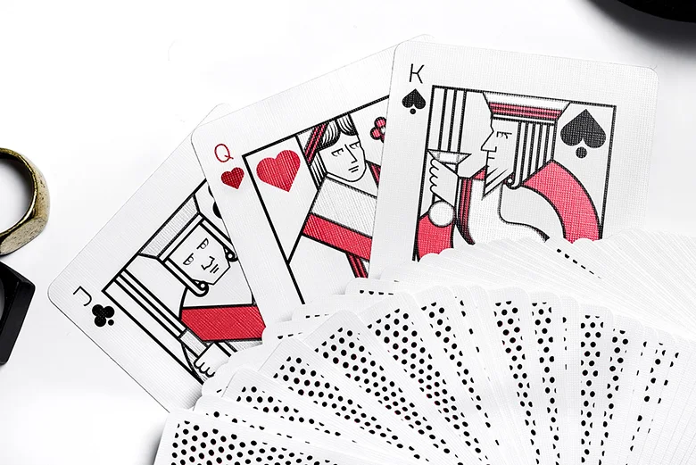
Into the Wierd Playing Cards are inspired by Art of Play's fascination with the strange and unusual. Designed in collaboration with Jenny Gebhardt this fully custom deck features an exciting and strangely odd story.

The psychedelic artwork and dark color palette might not be to everyone liking but the 54 unique illustrations tell a story. The face cards tell about curiosity and a journey full of ambient adventures. Each of the four suits shows a section of the story. It unfolds itself starting with the Ace following the ranks upwards. The court cards show the main characters.

Printed by the U.S. Playing Card Co, the deck is packaged inside a matching letterpress-printed tuck box. Available from artofplay.com. For more cool playing cards, check out JP Playing Cards.

[post_ad]

Cardistry: Peelers V2 Released!


Peelers V2 is the follow-up to the surprise hit of 2018! This time in striking red colorway. From the mind of Cameron Toner and Nate Lex, Peelers is a simplistic deck with a vibrant design crafted for the cardists and magicians in mind.


The deck inspiration came from a speech that Cam heard about bananas going extinct. He then created a mock design and collaborated with Nate to make the back design what it has come to be.


The deck features a minimalist card back in red, custom Ace of Spades and Jokers. Oh... instead of the standard courts, the team has added some more bananas to the court cards.


The deck is packaged in a cool custom tuck box that looks like a crate! Printed by the USPCC on Bee stock. Limited to 2,500 decks. Available from riffleshuffle.com for $10. Get your Peelers before they “slip” away!

Originally published on cardistrybeast.com.

[post_ad]

Kickstarter: 7 Questions with Chris Hage of Phronesis Playing Cards


Creating a new routine and need some ideas? or looking for a fun way to engage the audience? Maybe to give an old routine a fresh start? Phronesis Playing Cards can help you generate ideas and create new magic.

Just launched on Kickstarter, Phronesis is the result of several years of brainstorming and collaboration with some of the finest magicians, artists, and creators in magic. The result is a deck that’s both unique and functional. The deck is designed to help magicians generate ideas, create cool original magic, and have fun while doing it.


Also available during the Kickstarter campaign is the Classic Edition of Phronesis, designed specifically for the workers. The deck comes with custom marked back and standard faces for everyday use. Included are a custom Ace of Spades, Custom Joker, and a Double Backer.

Before the launch of the campaign, we had a quick chat with Chris about his design background, inspiration, and design process behind Phronesis playing cards.

For those of us who don’t know, tell us a little about yourself?
In my free time I’m a designer, builder and magic creator. That means when I get home from work, I spend a couple of hours at night designing decks, practicing magic and tinkering with new magic props. I really got into designing and writing following an eight-year run as a restaurant magician. After that run ended, I took a step back to reassess what I was giving back to the magic community. Since then, I’ve published a few magic effects (it's so easy these days so I don’t hang my hat on that), written three booklets on magic, and produced one deck of cards to date- TRICS Paisley.

I’m also a member of Sleight Club in Charlotte, NC. We like to say that we’re the Carolinas premier group of magic thinkers, performers, and creators in our region (we’re a modest bunch.). With this group of great people, I help run the TRICS magic convention, which just celebrated its ten-year anniversary. Also, with the help of Sleight Club, I’ve produced two magic shows benefiting local children in need, the last show being in 2017. Kardify readers can keep up to date on our next charity show. We hope to have our next show in the coming year.


Can you describe Phronesis Cards? and why you passionate about it? 
The Phronesis project is the result of several years of brainstorming and collaboration to design a deck that’s both functional and beautiful. The result is a set of cards designed to help magicians generate ideas, create cool original magic, and have fun while doing it. The idea started several years ago after leaving a Sleight Club gathering where we had just finished working on a routine for a new member and I couldn’t help but think how awesome it was to go from a half-baked idea, to something original and strong. This is not an unusual experience at Sleight Club either. There’s a method that is often used that combines both philosophical questions about the performer’s style, or the motivation of the performer, with a brainstorming session on methods, props, and the structure of a routine. The result after several iterations are strong routines that fit the magician. So, I’m passionate about the Phronesis project because it captures the essence of that experience and makes it accessible to anyone.


Talk to us a bit about going from the first draft to the final version. How did you get to this finished product?
Let’s just say the first draft was rough. I shared the first iteration with some good friends in Orlando. I call them the Orlando Trio (Josh Arroyo, Christian Magill, and Ryan Schlutz). This is as much their deck as it is mine. They really provided excellent insights, recommendations, and ideas to make this deck what it is. Those three guys saw the first deck design and really helped take this to the next level.

The original concept centered around the quotes and the aesthetics of the deck. Then I think it was Ryan who suggested the Fitzkee categories of magic and designing tricks around those. That was the first breakthrough. So, I went through several iterations of extra cards that included various categories of effects, but it just didn’t feel complete. Then in the Fall of 2018 it dawned on me that I could have illustrations on each card that depict the categories (plot, style, effect, prop). EUREKA!


The Ideation Edition has all the cool artwork and quotes, but that’s only one version of the deck. Everyone who has seen the prototypes has asked for a worker’s deck. One they can use every day. So, the Classic Edition is also part of the project and includes what you’d expect in a worker’s deck. It includes two matching Jokers, custom Ace of Spades, a double backer, and a double backer with a missing center circle. That’s so you can magically remove the circle if you want.

What was your most brilliant breakthrough when designing the deck?
I have to say the marking system is pretty ingenious. Both the Ideation Edition and the Classic Edition are marked. You can instantly know suit, value, color, Aronson stack number, Mnemonica stack number, and the orientation of the deck because of the subtle one-way design.

Another cool thing built into the deck, and one I haven’t talked about publicly, is a secret scavenger hunt built into the Ideation deck. There are clues built into the deck that lead you to the solution of a puzzle. It’s like an escape room built into the deck. I’ve only told one other person how it works. But I’ve told no one the final puzzle outcome. That’ll remain a mystery for now. The plan is to reveal portions of the scavenger hunt and the various puzzles that need to be solved later this year. But in order to solve the puzzles, you must have an Ideation deck.


We first noticed Phronesis on Instagram. What do you think of the playing card community in terms of the feedback and support that you’ve been getting so far on the social media platform?
Instagram has been great! There have been so many positive comments and support from magicians and artists around the world. I’ve reached out to several people individually through social media to get advice on Kickstarter and deck artwork and everyone has been willing to share and support the project. It’s been amazing! The one person who has really given a ton of his time and talents to the project is Kevin Reylek. Kevin has been engaged in the custom deck world for over a decade and has been involved with the production of over 50 different designs and sales of over 1 million decks! He’s offered so much sound advice about Instagram, Kickstarter, and deck manufacturing it’s really been incredible. But in general, social media has unquestionably given me the best opportunity to share the project more widely.


With so many playing card projects competing for funding, why should potential backers choose your deck?
You’re right, there are so many new decks out on Kickstarter, why this one? I debated that very question and concluded that this project (the two decks together) offer something that’s not on the market in any of the other decks. You’ve got some decks that are produced for the amazing artwork, some produced especially for cardistry with very modern back designs, but there’s nothing on the market built specifically for magicians to help them create new and original routines. The Ideation Edition is that unique product. Combine that with the Classic Edition marked deck, and you’ve got a killer arsenal for creativity and strong magic.

Finally, what are your favorite playing cards? 
My all-time favorite deck is the Tally-Ho Circle Back. You can see a lot of that influence in the Phronesis deck. But lately, I’ve really been collecting decks that have great tucks. Most of the time I don’t even open the tucks to see the cards anymore. Because I know how much work it takes to design and produce a deck of cards, I try to support as many new Kickstarter decks as I can and especially ones with great tucks and clean/classic back designs.

Thank you for your time, Chris and all the best! 


At the time of writing, Phronesis is only 36% funded with 28 days to go. If you like what you've read here and want to support Chris, you can find it on Kickstarter Here! Pledge starts at $10, the deck will be printed by Cartamundi and tuck box letter-pressed by Clove St Press.

[post_ad]

Check Out Art of Play's Stunning New Release, Standards Playing Cards


Produced by Art of Play in collaboration with Kevin Cantrell Studio, Standards playing cards are crafted with meticulous attention to detail.


Standards are inspired by nineteenth-century British opulence, an era of elegance unsurpassed. The deck redefines luxury at the card table with fully custom artwork from the bold Ace of Spades, intricate card backs, to the gorgeous courts and ornate jokers.


Two decks- the black edition and one red edition are available for purchase right now at $15. The third limited gold edition deck is only available exclusively with the box set.


The highlight of the Signature series is the bespoke box set inlaid with gilded accents and finished in high-gloss piano-black. It's metal lid features intricate sculptural details and a robust magnetic locking mechanism.


Inside are six tailored compartments lined with leather. Included are three decks - the black and red edition, as well as the limited gold edition available exclusively with the set. According to the product page on Art of Play, three more editions will be released prospectively.


Standards are printed by The United States Playing Card Co. on Dan and Dave's proprietary crushed-stock preferred by professionals. Hand-assembled in San Diego, CA. Available now from artofplay.com.

[post_ad]

Jetsetter Playing Cards: Premier Edition in Jetsetter Green

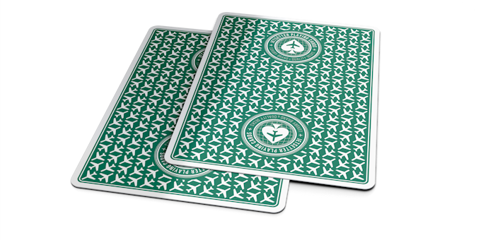
Wow! Green is BACK but this time it has a name. Jetsetter Playing Cards has launched their Premier Edition in an all-new colorway on Kickstarter. A follow-up to the BlueRestricted Red, and Jet Black Editions, the Jetsetter Green is a subtle nod to the original Luxury Edition deck. The green colorway is inspired by the roadside signs that guide travelers and plane spotters to their destination airports around the globe.


What makes Jetsetter Premier Edition series so special is the vintage and classy feel of the deck but with modern appeal. Since the release, Jetsetter Playing Cards has transitioned to become a notable luxury brand among aviation and playing car communities.

The card backs will now showcase the Jetsetter Green colorway, with the same airplane pattern and the Jetsetter logo in the traditional two-way casino-style design. The Ace of Spades, once again exhibit the Jetsetter logo with green accents and the spades logo in the center.

The court cards have been re-colored to match the overall theme of the deck. The club and spades courts will showcase green, black and silver while the diamonds and clubs in deeper casino red, black, and gold. Additionally, the round trip boarding passes which have become the trademark Jokers for Jetsetter Playing Cards will be included.

The deck is packaged in a tuck box featuring the standard synthetic stock with UV spot accents and silver foil. Once again, the deck will be printed by the Expert Playing Card Company. Pledge starts at $11 on Kickstarter.

[post_ad]

AXIAL Playing Cards Now Available!


Last month, we had Paris-based Nicolas Nargeot, founder & CEO of NOT A _ (Instagram: @nota_company) taking over Kardify Stories on Instagram (@kardify) for a sneak peek of AXIAL Playing Cards. The deck is now available for pre-order on notasite.fr.


Illustrated by Clemence Lerondeau (Instagram: @linestory), AXIAL is NOT A DECK but a piece of Art. Here's the description from the pre-order page:
With Axial, we want to share with you a vision of infinite possibility. We feel that there's need to connect deeper, to break all the codes. And you have a place in this axe. You are the ones who will make it alive. And we will go together further to find this beauty.

The deck sports a dark blue design element made out of multiple lines converging in the center. This design element is prominently featured on the tuck box and the full bleed card backs. Anchoring the deck is the diagonal line band design on both the card backs and the face cards.


Going through each card on the deck, it would seem the artwork has been designed around the diagonal line bands. The pips of the number cards are located inside the band, which is rather unique as we haven't seen this done before on any deck.


The court cards are simplistic with just the outline of each royal. The unique design element of the deck is the placement of the indices- on the top and bottom center. Not a bad thing, but it will take a while to get used to on game nights.


The deck is kept secure in a beautiful textured paper that feels like an art canvas. Printed by Cartamundi their famous B9 finish.


AXIAL Playing Cards is one of the most unique deck in our collection. It is an art deck with many unique design elements that will open up ideas for aspiring deck designers. Definitely a step in the right direction for NOT A _, whose mission statement is to democratize access to Art:
Art shouldn’t be only one piece costing €30k and only one person is going to enjoy it. Eventually. We want to share ideas, thoughts, feelings, to denounce, emotions through Art with our Artists. And sharing this on new supports.

... and what better way to promote art than a deck of cards?
Starting with a deck of card. Cards are NOT just some pieces of paper. It is NOT about the visual only. NOT only about magic & Cardistry. Cards, can be a new artistic support. Holding a real story. A new way to share Art, to denounce, to discuss all, together. What a better way to discuss with people from this support ? We need Art in our lives.
AXIAL Playing Cards are available NOW on notasite.fr for €15, shipping in April.

[post_ad]

Deck View: Red Bomber Playing cards


Matrix. Limited. Magic.

The Limited Edition Red Bomber Playing cards by Bomb Magic are inspired by the green code effect in the popular movie "The Matrix“. The idea was to print a simple deck which is suitable for daily magic performance. The high-tech style back design cleverly conceals the marking system, which is very well done and not obvious for the spectators. We had a hard time trying to figure out the system.

Like the blue version of the deck,  the face cards are standard with the exception of the Aces and jokers. The custom Aces and jokers include the same matrix-code design element featured throughout the deck. The tuck box sorts a dark blue colorway with silver foiling to give the deck a touch of elegance.

Check out Bomb Magic's other offering at bombmagic.tw. For other cool decks head to JP Games.

[post_ad]

The Evolution of Odyssey Playing Cards, from First Edition to NOVA


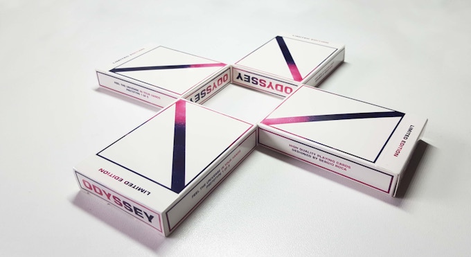
It all started when Sergio Roca decided to design a deck just for his personal use. A deck that not only feels good but looks good as well! The first time he showed the card backs of Odyssey First Edition on YouTube, everybody loved it. Sergio told Kardify,
This was really unexpected and something incredible to me because I knew that this decks was really different to the other deck in the market, 5 years ago.

Encouraged by numerous messages and feedback, Sergio decided to design every card of this deck. He continued,
Not just for me, but also for my followers. I designed the royals, jokers, suits and aces. The card backs and tuck were redesigned to ensure consistency with the theme. 
The idea was to create a minimal, futuristic and elegant deck of cards. Everything followed the same essence and main idea... to feel the universe.


The limited edition Odyssey First Edition became a reality.
Thanks to 232 backers who supported me on Kickstarter, this was one of the best moments in my life!

 Fast forward to a year after that, Sergio decided to contribute to the cardistry community once again.
This time, it had to be special. I needed to make something different but keep the essence of the new brand. Why not create a deck inspired by the most beautiful phenomenon in this planet- The Aurora Borealis.

The result- Odyssey Boreal Edition! A new impressive card back, new tonalities... and a different way to feel the universe.


Aether Edition was the third. In this case Sergio wanted to contrast the second edition (Boreal) as much as possible. From the light to darkness.
I think we got it right. We evolved in some ways: the quality of the tuck box increased a lot! We used one of the best black matt paper stock, embossed and metallic foil. Also, the card paper stock was one of the thinnest ever made. In conclusion, a different feelings in all aspects.

Last year, Sergio decided to make something new, but not just a new edition. Sergio explained,
I wanted to reach all communities, especially the magic community, by making the most complete Odyssey deck.

In collaboration with the incredible Antno Creative who helped a lot with the design process, the Odyssey Nova playing cards were born.
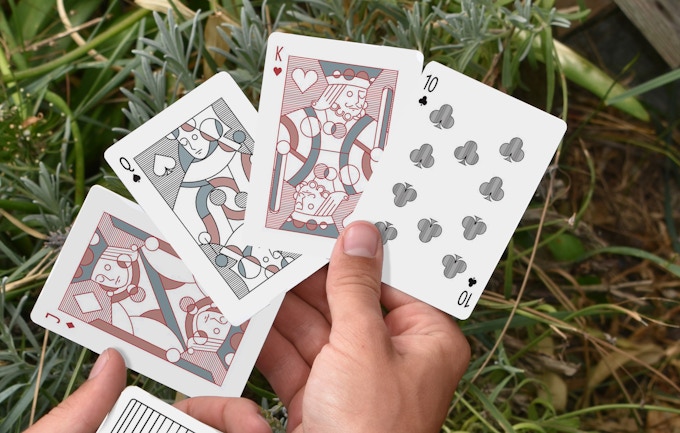
We enhanced the card suits by giving them a more mature shape but keeping the essence of Feel The Universe from the previous editions. The new suits have been inspired by our logo and the new color palette is closer to red and black.
Also, Sergio and Antno designed a new back that is a reminiscence of the first edition but with more detail, depth and different color palette.


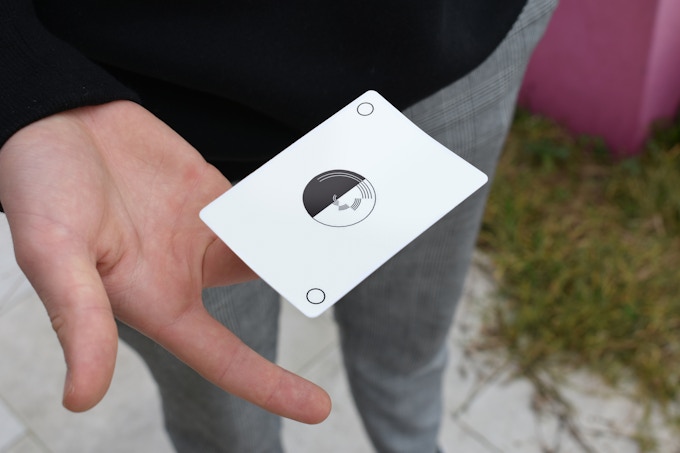
The courts have been updated with the magic community in mind, hence, they are standard and easily recognizable for magic routines. In addition, the Odyssey Nova comes with a blank card, new jokers and a great tuck box with the same quality as Aether Edition. Sergio concludes,
Some elements have changed, other evolved, but our essence will stay forever. Feel the universe in your hands.
Available NOW on Kickstarter. The project hit its funding goal within 24 hours of launch. Pledge starts at €9.

Originally published on CardistryBeast.com

[post_ad]

Cardistry: 3 Questions with Melaine Piton of Azote Playing Cards


Azote Playing Cards is the brainchild of 18-year old Melaine Piton, currently seeking funds on Kickstarter. The fully custom deck is inspired by modern art emphasizing on motion. As a self-thought designer, Melaine really enjoys discovering and creating works from different styles of art.


The deck features an optical illusion back design with a minimal black and white color palette. Crafted for cardistry, the faces will give a visual edge to your card flourishes. I personally love how seamlessly different design styles and element came together in this neat little package. A few days ago, we sat down with Melaine for a quick Q&A on the Azote deck.

What is your inspiration behind the Azote Playing Cards? How did you come up with the idea?
It all started with a graffiti I made for Diva playing cards. At the time, I had never thought of creating a deck myself. Finally, talking with Alex, I realized that it was possible, even if it's complicated: it just takes a lot of time! An unreachable dream had become a feasible project.


I was inspired by many artists: Vasarely, Tyler Spangler, Sarah Morris. Art in general as street art, or modern art! I wanted to create a visual design, pure, that would highlight the movements of the one who uses them! About the faces, they have been completely revisited so as to give a brand new aspect to these "classics", without being unrecognizable!


We first noticed the deck on Instagram. What do you think of the community in terms of the feedback and support that you’ve been getting so far?
Instagram is not very representative; the number of people interested in the project is radically different from the actual number of backers. However, it is important to highlight (and thank) the role of those who share the page, who help a lot to make the project gain notoriety in the community; which is not obvious when you started from scratch. The community, let's talk about it: Few haters, only encouraging and positive comments! Nothing to say, the middle of the cardistry (and magic) is really nice!


Finally, what are your favorite playing card decks?
I like a lot of decks, but my favorites are Diva's from Alex Matencio, Red Stripes from Omar Renfro, and Cubeline from Bas John; These decks are real pieces of Art!

At the time of writing, Azote Playing Cards is only 85% funded with only 3 days to go! Head on to Kickstarter if you want to support Melaine. Pledge starts at €12 (USD$14).

[post_ad]

Views X Ellusionist Playing Cards by Ellusionist


Ellusionist started the custom deck market with the Black Tiger playing cards, that spawned an entire product category for designers to express their art. The Views X Ellusionist Playing Cards is a collaboration between Ellusionist and Nicholas Earl of Got Magic?


Luxurious and unique in design, Views is an illusion-themed deck with artwork by Yves Krähenbühl. The original Views deck was included in our Top 12 Playing Cards of 2018 list.


The cards are fully custom with a motion-like bending dots with an undertone on the card backs to create the illusion of motion. The face cards have custom pips, and the modern clean-looking courts have metallic inks.


The trippy deck is packaged in a tuck case surrounded by the same mind-bending illusion as the card back design, foiled and embossed! VIEWS is a celebration of unique perspectives. Only 5,000 were printed with United States Playing Card Co. and they won't ever be diluted with a re-run.

Available now for $12 from Ellusionist.

[post_ad]
© all rights reserved
Kardify 2013