Responsive Ad Slot

Detailed Look at DIVA French Edition Playing Cards


DIVA French Edition is the follow-up to the vibrant DIVA playing cards designed by Alex Matencio. The deck is inspired by the Bauhaus art style. Design in collaboration with Fabien Defaucheux, the French Edition DIVA sports a patriotic Blue, White, Red colorway with a touch of Silver pantone. The color palette is used consistently throughout the deck including the card backs, Ace of Spades, Jokers, and the court cards. The contrasting colors balance really well with the design, making it aesthetically pleasing. The cards themselves are smooth and buttery with the Cartamundi’s 9C2 Touch finish. Available now from diva.cards for $16.75.


[post_ad]

Six Strings Playing Cards Nominated for Deck of the Year!


We want to thank the members of 52 Plus Joker (52+J) for nominating Six Strings Playing Cards for the Deck of the Year in the 2019 Diamond Awards, given out annually by 52+J, the premier playing card collectors society in North America - and soon, the world!


The Diamond Awards will be presented to the winners at the Gala Dinner which concludes the 52 Plus Joker Annual Convention, to be held this year at the Hilton University Place Hotel in Charlotte, North Carolina from Wednesday, October 9 through Saturday, October 12.


Six Strings is a collaboration between Kardify and Murphy's Magic inspired by the most majestic and fascinating musical instrument- the guitar. This limited edition deck is designed by Ade Suryana. You will love the fully custom design featuring gorgeous reimagined courts, visually appealing pips and suits, bold Ace of Spades, and an intricate card back design. All packaged in a beautifully crafted letter-pressed tuck case by Clove St Press.

Six Strings playing cards is available NOW from your favorite Murphy's Magic retailer. Images by Akmal Luthfi (Instagram: @cardcollections09)

[post_ad]

Geminidecks Drops Cheetah Playing Cards


Constantly expanding its family of unique decks, Geminidecks have just released Cheetah Playing Cards. Designed by Toomas Pintson, the deck features a yellow/black colorway with a modern take on the Cheetah spots, adding on a mix of fun and energy. The Cheetah design element has been featured throughout the deck from the bordered card backs to the recolored traditional court cards and jokers. Cheetah will sure to turn heads and accentuate card flourishes and displays, making fans, spins, and cascades look incredible! Printed by the United States Playing Card Company on soft crushed premium stock. Get it now on geminidecks.com. Limited to 1200 decks.


[post_ad]

Wow! Kings Wild's Verum Videre Black Edition Playing Cards!


Jackson Robinson released the Verum Videre Black Edition Playing Cards to the Kings Wild Shorts Subscribers last week. "Verum Videre" means "See the truth" in Latin and this new addition is probably the most stunning deck yet in the series.


Two editions were made available: Standard and Gilded. The decks comes in completely black playing cards with eye-catching red and white pips!


The custom Kings Wild Standard coloured courts pops and the custom Ace of Spades exceptionally bold against the dark background.


The die-cut tuck box prominently showcases the iconic Eye of Providence from the Ace of Spades. Also the tuck is adorned with gold foil and capped with a custom seal. The stunning deck is a combination of modern aesthetic and bold elegance.


Verum Videre Black Edition is printed by the United States Playing Card Co. on Bee Casino Stock with embossed Finish. These deck should be released to the public soon.

[post_ad]

These Are the Five Design Updates to Orbit V7


The new Orbits are going 80's! The seventh edition Orbit deck was released last weekend and there are a few noticeable changes and enhancement done to the deck.

1. The iconic card back now features a pink dominant center along with the mountain range from the V5 Orbits that are now inverted so they are a window to whats behind the card rather than the original mountains.


2. Pips and indices are based on a retro Arrco deck in Chris Brown's private collection- they are a bit thinner than previous Orbit pip packages (that are also Arrco) and look a little wavy. This was not an accident as the team wanted to capture the essence of a 70's deck that would have been used in the 80's, imperfections and all. The red has been replaced with pink on the V7's for an extra eye-catching aesthetic.


3. New custom court faces have been added, the Queen of Clubs, the King of Clubs and the king of Spades. The courts in the Orbit deck have played an important part in Chris' life and have guided him through some tough times.


4. The rainbow at the bottom of the tuck box inside the Orbit logo is a direct tribute to the lives lost in the 1986 space shuttle Challenger on their mission STS-51-L. The last names of the crew can be found on the inside of the V7 tuck because those who gave their lives for space exploration should never be forgotten.


5. The V7 Parallel Edition. During the V7 design process, designer Daniel Schneider showed Chris the final render of the inside of the V7 box and was blown away by how 80's it looked. Chris desided to make the design it's own deck and introduve the parral iniverse concept and hence, the Parallel Edition. Throughout the deck of the V7p's you'll find some things have been changed/flipped from the V7 to further highlight the fact that you're now in a parallel universe.

The Orbit V7 and V7 Parallel Edition are available NOW from theorbitbrown.com for $13 and $15, respectively. The decks are printed by the USPCC on premium Crushed Stock with Air cushion finish, made on the Web press.

[post_ad]

Deck View: Black Roses Altrosa Playing Cards


Vintage. Trendy. Custom.

Black Roses Altrosa Playing Cards is the fifth deck in the Black Roses series designed by Daniel Schnieder. Daniel is a huge fan of vintage playing cards from the last century and it is obvious from his designs.

The seasonal colorway features fully custom artwork from the personalized court cards to the intricate back design composed of clean and smooth lines. The dusky pink contrasts perfectly against the grey color of the line work, making it aesthetically pleasing. The Black Roses Altrosa Playing Cards is an elegant yet deck that links vintage design with modern elements. A familiar yet trendy deck for performances or game nights.

The Black Roses Altrosa deck is printed by the US Playing Card Co on crushed paper stock and tradition cut. Available now from your favourite Murphy's Magic retailers.

[post_ad]

Guess Sport Fontaines to Release at Pop-Event in Los Angeles Today!


Zach Mueller teased the GUESS Jeans U.S.A. collab just prior to Cardistry-Con, Portland. The brand new Fontaine decks are set to be release at the Guess Farmers Market today (24th August) in downtown Los Angeles.


The new Fontaines comes in two editions, Cycling Edition and Sticker Edition. Both decks takes cue from Guess’ 80s and 90s archives, with an emphasis vintage Guess graphics.


Like the previous Fontaines, the card backs are custom with GUESS design elements scattered throughout. With the exception of the Ace of Spades and Joker, the court cards and face cards are most likely custom.


The two-day pop-up experience in LOT 5 at the GUESS?, Inc. HQ in Downtown L.A. will offer a marketplace of fashion and an exhibition of professional and local athletes competing in their sports on various ramps, courts and fields set up in LOT 5.


The unique, outdoor activation, complete with food, live performances, entertainment and sporting events, will celebrate the renewed energy of Downtown L.A., where parent company GUESS?, Inc. launched the Los Angeles denim industry almost 40 years ago.

Originally published on cardistrybeast.com

[post_ad]

Betrayers Red Invictus Playing Cards


Betrayers Red Invictus is the super-limited, gilded edition of Betrayers Invictus by Thirdway Industries. The Betrayers playing cards series was originally funded on Kickstarter late last year. Betrayers Invictus is the Limited Edition deck of the campaign and is inspired by the traitors who sacrificed everything to realize their dream.


In early 2019 Cartamundi told Giovanni that they produced around 270 Invictus without the box and offered Giovanni the option to buy them out. According Giovanni,
As I usually do on those occasions, I accepted. However, I was very busy managing Monolith, so I kept those there, thinking about what to do. After some months I’ve decided to invest a little on those and gild them and use a different box. Those overproduction problems happen often, and my philosophy is always try to optimize issues and turn them into something good – those decks are not an “intentional” betrayal since they weren’t planned at all.

The Red Invictus deck comes with metallic ink on face cards, cold foil on the backs, and gold gilding on the cards. They are kept secured in a stunning foiled foil metallic ink dark red tuck box. Printed by Cartamundi. Limited to 265 decks, sealed and numbered at thirdwayindustries.com.

[post_ad]

Kickstarter: White Sensory Playing Cards


White Sensory Playing Cards by Lunzi is the latest offering by TCC Playing Cards on Kickstarter. Lunzi, a popular cardist from China, is well known for his smooth, aesthetically pleasing style of flourish.


The White Sensory deck visually comnpliment his smooth moves with contrasting white/black colorway. Unlike the first edition Black Sensory, this deck has more white space and emphasized more on the bold linework.


For the faces, the suits and the pips have been redesigned and rearranged. The linework design element are used on the card backs, courts and tuck box.


Lunzi crafted the deck with lines and extensions in all directions, giving it personality yet keeping it simple and powerful. Hence, different movements and displays such as fans or spreads will create different combinations of lines- changeable but unified!


Produced by TCC Playing Cards and printed by USPCC on high-quality paper with Crushed stock, which gives the decks a thin, light, and smooth handling. Limited to 2500 decks.

Find it now on Kickstarter.

[post_ad]

5 Things You Didn't Know About Stanley's Impossible Bottles


An impossible bottle is a type of mechanical puzzle. The term refers to any bottle containing an object that does not appear to fit through the bottle's mouth, particularly, a sealed deck of playing cards. Impossible bottles have been around for many years. Nowadays a small group of people worldwide are learning the art of impossible bottle making. It is a difficult and frustrating process and much secrecy surrounds the methods used.


These bottles are pieces of art that can inspire many ideas right and are a reminder that the impossible is in fact possible. Here are 5 things you didn't know about Stanley's Impossible Bottles:

1. Stanley’s Impossible Bottles are non-tampered with. 
There is no glass blowing or heating used on the bottles.


2. Stanley’s Impossible Bottles fit a deck of cards perfectly. 
They don’t move inside of the circular glass milk bottles.

3. All bottles come with a cork that has Stanley's logo burned into it to ensure authenticity.


4. Stanley’s Impossible Bottles have a factory sealed deck inside with the original cellophane and seal on every deck.

5. It takes me 30 min to make a bottle! 
In terms of complexity, Art of Play decks are the easiest, because their decks are all boxed up and cellophaned with a different company, not USPCC. USPCC and Cartamundi are also staight forward, while other companies have completely different methods like EPCC, Hanson Chien, and Legends all have a different method to make them from USPCC but difficulty wise isn’t that hard compared.


These bottles are definitely a great gift for anyone and can lift up all spirits and cause a sense of wonder in their heads! The sole meaning behind this art is what makes it worth every penny. Check it out on stanleyimpossiblebottles.com

[post_ad]

Sponsored Post: Bicycle Rainbow V2 Playing Cards


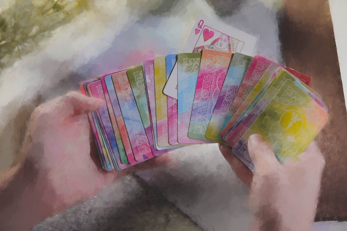
The Bicycle Rainbow V2 Playing Cards is the follow-up to 2017's Bicycle TCC Rainbow, a vibrant deck featuring a full spectrum of colors on both the standard card face and backs.


V2 sports a softer color palette with dispersed watercolor as decoration for the back design. The fluidity and ungoverned nature of watercolor make the deck aesthetically pleasing.


Besides the colors, we love beautiful card backs. They are familiar yet different with flowers, floral scrolls, butterflies, peacock feathers, and angels holding mandolin (809). Combined results in a beautiful deck for game nights, and even card flourishes.


Currently funding on Kickstarter with less than 7 days remaining. Pledge starts at $6 and the Bicycle Rainbow V2 will be printed by the USPCC with Air Cushion finish.


Also, add-ons such as Impossible Bottle, collector's box set and, album are available during the campaign.

[post_ad]

7 Questions with Jack Brutus Penny of the Culturae Animalis Art Deck


The Culturae Animalis art playing cards is a deck of highly detailed, hand-drawn, luxury art playing cards with a beautiful message of cultural respect and environmental and animal protection currently funding on Kickstarter. This unique illustrated deck by Jack Brutus Penny took over six months, with every card, including all pip cards, having its own unique design bleeding to the edge.

Lots of creativity has gone into the deck and the artwork employs the imagery of animals, delivering a powerful and thought-provoking narrative. The theme is consistent across all cards, sticking to the black, white and red colors. Last week, we caught up with Jack to talk about his design background, the inspiration behind the Culturae Animalis art deck, the design evolution of the deck and future plans.


For those of us who don’t know, can you tell us about yourself and what is your design background?
I am a nonsense writer and illustrator, meaning I use spoken and visual language to play with our interpretation of its meaning. I consider all my work to be in the same universe, from my In Truth Stories publications on how animals came to be the way they are, and Riddle Me This original conundrum collections, to my illustrated animal series, Japanese clay mugs, men’s accessories and more.

I have years of experience as a freelance artist, and before that various internships and placements in design studios. But I decided to open my own studio/publishing house called JBPPublishing and focus my attention on the creative worlds swimming through a gateway whimsical place, I call Clocktown.


Can you describe the Calturae Animalis Art Playing Cards and why you’re passionate about it?
Culturae Animalis is a deck of art playing cards in which every single card has a detailed illustration, each telling its own story. The suits provide windows into four different realms inspired by four different historical cultures and animals.

It’s as illogical to say why I’m passionate about my work as is to say why I’m passionate about myself - because it’s an extension of me. It shows the curious world of words and images that pass through our minds as we let them wander. But I can say that I’m passionate about my causes. I feel strongly about cultural acceptance, about the environment, and about animal welfare. Culturae Animalis, in its design, its production, and its application, exemplifies these passions.


Walk us through the process you took to design this unique deck. How did you come out with the idea and how did you get to this finished product? 
Well my cats themed in Japanese Edo period ukiyoe (woodblock prints) was a series I’d worked on for years before starting the deck. The series had expanded into different civilisations and I decided to collect them into a deck of gorgeous playing cards with details never seen before in the genre, partly because I’m a keen social card player, and partly because suits epitomise the hierarchy of a classic culture.

Each card was designed from scratch to reference the culture, the animal, the number (for instance the 8 of diamonds includes an octopus - though other number connections are more obtuse), and even relate between the suits. The planning and research, composing and illustrating of the deck took me over 6 months.


How did you get feedback? 
Because I have a community of followers on Instagram (@jack_brutus_penny) based on my animal illustrations - I am constantly getting feedback on design preferences and more popular themes. But I come from an artistic/creative background over a commercial/product design background - meaning I try to balance what feedback I gather with my visual inspirations and the message I want to tell.

As the campaign began I set out to involved my community in the whole process, constantly asking what they wanted to see and creating pieces based on their ideas but that still managed to surprise and enchant. So, in the end, Culturae Animalis art playing cards have a significant sense of the community within them.


What was your most brilliant breakthrough when designing the deck?
As with all my work, there is a lot to ‘discover’. I always hide details, some that can be found with a second or third look, some that will take hundreds until you glance while daydreaming and notice a message concealed across the background waves. I like how the aces subtly incorporate the suit marks into their compositional shapes. But perhaps the design feature I’m most proud of is the court cards.

Because each card had its own intricate detail I needed something to make the court cards more unique and impressive. In deciding to make the court cards a seamless panorama divided into a triptych, it allowed them to stand alone as a powerful set and added the impact I wanted to collect a court run as you see them line up in your hand.

What’s next? Can we expect more deck designs in the future?
I’m working on a full nonsense novel about a Japanese girl and English boy lost in their own ‘Wonderland’, in which a game is also heavily featured and I intend to make into a physical tabletop itself. What’s more, the book itself is written intently to be converted to video game media (think Alice and Oliver Twist in the world of The Witcher), so there are lots of projects on the go. But yes, I intend to continue my work in the playing cards field, to hone what I’ve learned, become stronger with my community, and bring more projects that excite the eyes in ways playing card designers without my eclectic, linguistically artistic approach may never have considered.


Finally, what are your favorite playing cards? 
So I am no cardist, no magician, not even a collector. I’m a professional creative of sorts, who also grew up playing kings, rummy, whist and betting pennies with his grandmother. I love playing cards but my favorite deck is any that is sumptuous to the eyes as I hold them with a cup of tea and a person I care about across the table.

That is why I created this deck to be luscious, to be art in itself, and collectible for that reason, but also for the casual player. I want to bring printing to a top tier printer (EPCC), using environmental processes (some they specially sourced for this deck), and the highest quality card stock - so that the (second) deck you get to open and use, can be enjoyed for a long time.

Thank you for your time Jack and congratulations on hitting the funding goal! 


The Culturae Animalis art Playing Cards just hit one of its stretched goals and the deck will be printed by Expert Playing Card Co. Pledge starts from $19 on Kickstarter.

[post_ad]
© all rights reserved
Kardify 2013