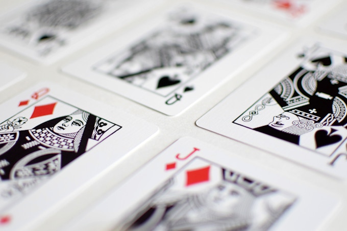
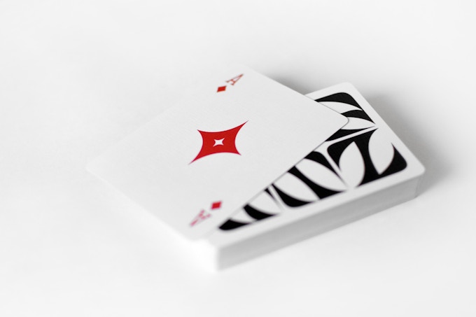
Fresh off the success of Paperwave Playing Cards, New York-based graphic designer, Lorenzo Cobo has just launched the Paperwave Glypth Edition deck. The overarching idea for this deck design was a direct comparison between all the different permutations of glyphs, and the infinite amount of possibilities a deck of cards is presented with.
This design was born from Lorenzo's deep interest in typography and the search for unconventional typefaces that pushes the boundaries of form, with the goal of creating a deck design that challenges the preconceptions of what a deck of cards can look like. On the design,
The typeface used as building blocks for this design was designed by my friend, and talented French type designer, Charles Quirouard. From there, I adjusted its curves, proportions, and specific dimension to properly fit my vision for this design.
This quite abstract typeface has many beautiful moments that I wanted to highlight, but I couldn't include all 26 letters of the alphabet in one back without it feeling cluttered and chaotic.That's when the fitting decision of making a deck with 56 different back designs surfaced. Every single back design has been carefully crafted to create a harmonious interaction between letters. This being a very abstract typeface allows for the letters to act more like shapes, taking legibility out of the equation and allowing the viewer to focus on the forms and negative space this partnering of letters creates.
There will be 1000-2500 decks printed by the United States Playing Card Company on premium crushed stock. Now on Kickstarter!
[post_ad]


 Kardify is the leading online destination for playing cards news, reviews, and cardistry culture. Enjoy the best editorial content daily.


No comments
Post a Comment