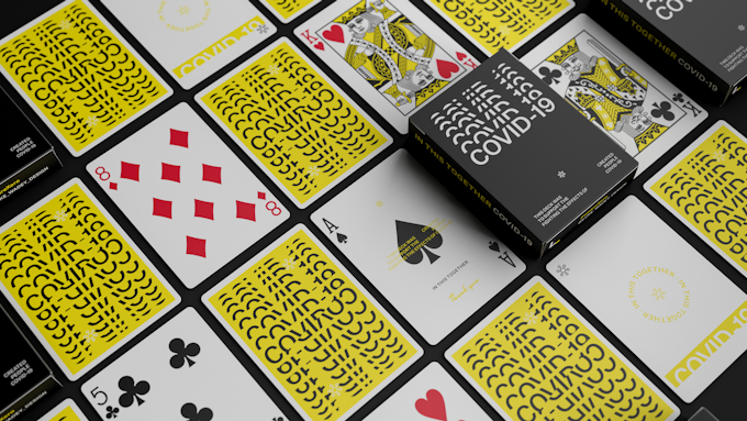
The COVID-19 deck is designed to raise funds for charity and awareness for a fund run by the World Health Organisation, for helping people all over the world deal with the effects of the virus. Currently live on Kickstarter and has already reached its funding goal, designer Luke Wadey has taken his recognizable approach to tuck and card back, combined with traditional faces, custom courts and extra cards included too. According to Luke,
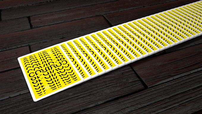
Like all my designs, I wanted to create something a little different. Combining typography with patterns, the back design aims to create real punch for use during all routines and flourishes. The yellow is used to catch attention, the black to contrast.
The card faces remain traditional, with some adaptations being made to the courts so as not to raise suspicion in routines; the yellow and black color scheme flows through.
This is the first time I have done this with a deck with the aim to widen the appeal not only to the usual collectors, cardists and magicians, but layman as well.
I have made this to almost look 3D, like a slit in paper to create this illusion and depth. The other optical illusion is the sides of the card where the curvature of the repeated letters makes it feel like the sides of the typographic block are curved too.
Combining my usual approach to Swiss design with traditional playing card aspects has somewhat become my go-to style. This wording flows around the thumb opening slot and on to the top of the tuck to keep the design going. Usually, my logo has a set location on each of my decks, found on the sides top and top-bottom of the tuck, often on the front and back too in some case. However, I have minimized the amount of my own branding on this deck as it is not about me at all, I simply put it on the bottom of the tuck so people know where to contact if they wanted to support or get a deck. The repetition of the word is to symbolize how we can help to make this virus fade away to nothing; it starts large and shrinks to being gone, just like what we are trying to achieve.
To be printed by Cartamundi on a limited run just to cover the Kickstarter backers, this deck is just trying to help those in need and bring a symbol of hope in the card community. To help back this deck, find it on Kickstarter here! The campaign ends Sunday 19th April.
All profits made from the sales of these cards of off Kickstarter will be going to the World Health Organization's, with association with the United Nations, COVID-19 Solidarity Response Fund, who are already working with some huge companies such as Facebook and Google already to name just a couple.
[post_ad]


 Kardify is the leading online destination for playing cards news, reviews, and cardistry culture. Enjoy the best editorial content daily.


No comments
Post a Comment