Pixel Kingdom playing cards is a meticulously designed deck by Artur Fast and produced Plan52 Playing Cards by Marco Dyziek and André Preller. The deck is currently seeking funds on Kickstarter and handcrafted pixel by pixel specifically for collectors, dreamers, retro gamers and card enthusiasts in mind.
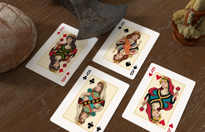
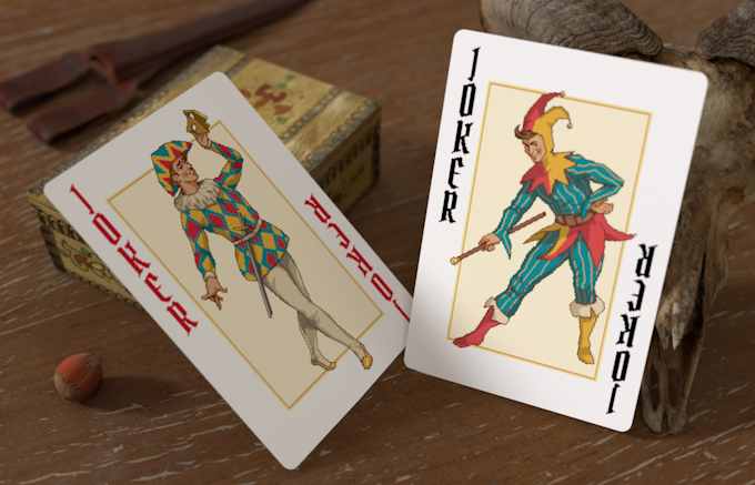
The FULLY custom deck is inspired by 16-bit graphics in a modernized way and a romantic representation of the Middle Ages and how retro PC games looked. The court cards in particular are inspired by fairy tales, ballads, and retro games like King's Quest. All designs are influenced by the traditional court cards and are easily recongnizable.
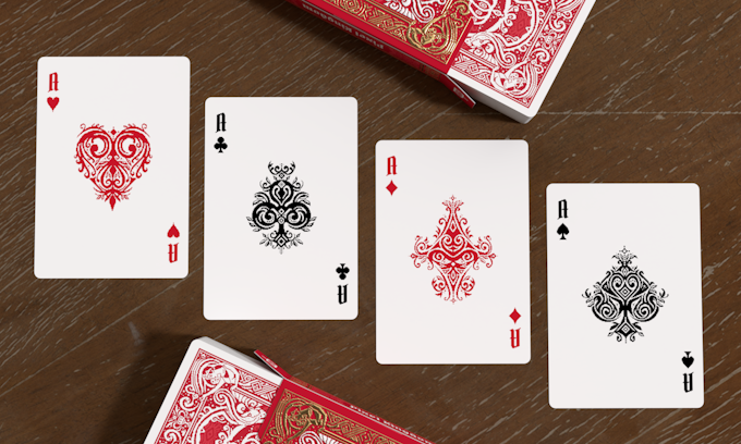
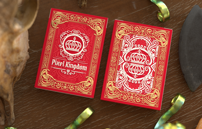
The custom pips are smaller than traditional to emphasise the delicate pixel art and the aces are highly ornamented and intricately designed. The card backs are coloured in a rich red and designed to be elegant, intricate, and full of little details. The deck is pacakged in an elegant tuck box featuring embossing and gold foil.
We had a quick chat with Marco and André last week about the design, inspiration, and design process behind Pixel Kingdom Playing Cards.
For those of us who don’t know, can you tell us about yourself and what is your design background?
Hey, we are André and Marco. Together we have more than 15 years of experience in the game industry working on different projects in different positions. We enjoy all kinds of games and love to bring fun to everyone. We also have experience working with various artists and we have a lot of connections to bring to the world of playing cards. Stay tuned for that.
Can you describe the Pixel Kingdom Playing Cards and why you’re passionate about them?
They are beautiful 16-bit pixel art game cards designed by Artur Fast, with a medieval setting and a very classic video game background story. We love 16-bit pixel art, and we were very careful to make sure that you could still see the individual pixels on the printed card, even if they are very small.
It was very important to us to give each court card some sort of character, but we also wanted to make sure you could find similarities to the traditional courts. We are passionate about the deck because it brings back for us the feeling of the good old adventures of Sierra, especially King's Quest, from which it is largely inspired, making it a personally satisfying mix of old school games and playing cards.
We love all kinds of art and also the design process behind it. We really tried to put all our passion and experience into this deck.
Walk us through the process you took to design the deck. How did you come out with the idea?
To answer that question, let's take a step back and also talk about how this deck came to be:
As we mentioned, we come from a game design background, so we originally brainstormed with Artur because we wanted to work on a pixel art game. His initial concepts for the game reminded us a bit of a playing card and it inspired us more than any other game project at the time. He then created a card design just for fun and we were hooked on his take on the subject. Based on that, we started building everything around it. One of the first things was to move from 8-bit to 16-bit because we wanted to do more than the decks that already existed. After that, we started coming up with ideas for the story of the deck to give more depth to the court cards and get more and more in tune with the setting. We drafted the back design early in development, but we revised it after we had the theme and court cards set.
We really wanted to involve the community in the design and find out what people thought about our vision, so we started posting on United Cardists. We gathered feedback and played around with the little details that we all love in playing cards.
What was your most brilliant breakthrough when designing the deck?
The biggest challenge was finding a way to get the 16-bit pixel style on paper and make it pixel perfect. We tried several things, even vectorizing the artwork, but in the end we just went for the maximum quality that uspcc allows, and it worked. Sometimes it's the simplest solutions that work best.
The other thing was to find the final style, we redesigned the back based on the final courts to make everything fit together. We'll write an update on that soon and reveal different drafts of the back design.
With so many playing card projects competing for funding, why should potential backers choose your deck?
It's the first deck with 16-bit rather than 8-bit pixel graphics that we know of, which means it's a nice new addition to your collection. As we said, we made sure to pack some retro game design storytelling into each court card to give them more personality. You get a free pixel kingdom solitaire game, which might be nice if you're into that.
Finally, what are your favorite playing cards?
The Name of the Wind Art Deck by Elodin Enterprises is our all time favorite. The artwork is phenomenal and we always enjoy looking at it from time to time. Last year’s favorite was without a doubt The Tale of the Tempest Playing Cards by The Gentleman Wake. We love the elegance of the deck. In general, we love decks with a great theme that is well executed and carried throughout the design.
It's the first deck with 16-bit rather than 8-bit pixel graphics that we know of, which means it's a nice new addition to your collection. As we said, we made sure to pack some retro game design storytelling into each court card to give them more personality. You get a free pixel kingdom solitaire game, which might be nice if you're into that.
Beyond that, this is the start of something bigger, think of it as the start of a series of art decks with different artists and styles. We want to bring different famous and unknown game artists into the amazing world of playing cards to create beautiful designs for everyone. To make this happen we are using our connections and network to reach out to many artists we have worked with before. It will be fun to collaborate on something completely different.
What’s next? Can we expect more deck designs in the future?
Absolutely!
We already have at least two more decks planned with two different amazing artists and we are thinking about more for the future. One of the artists is responsible for a critically acclaimed game with international success in its genre. That's all we're giving away for now.
We're cooking it low and slow, letting the artists set their own pace to comfortably bring their vision to life and deliver the best quality.
Finally, what are your favorite playing cards?
The Name of the Wind Art Deck by Elodin Enterprises is our all time favorite. The artwork is phenomenal and we always enjoy looking at it from time to time. Last year’s favorite was without a doubt The Tale of the Tempest Playing Cards by The Gentleman Wake. We love the elegance of the deck. In general, we love decks with a great theme that is well executed and carried throughout the design.
Thank you for your time Marco and André! If you like what you've read here and want to support Pixel Kingdom Playing Cards, you can find it on Kickstarter Here!
Pixel Kingdom Playing Cards will be printed by the USPCC with Air-Cushion Finish. Pledge starts at $14 for a single deck on Kickstarter.
[post_ad]


 Kardify is the leading online destination for playing cards news, reviews, and cardistry culture. Enjoy the best editorial content daily.


No comments
Post a Comment