Responsive Ad Slot

Blake Vogt’s ABRACADABRA Playing Cards


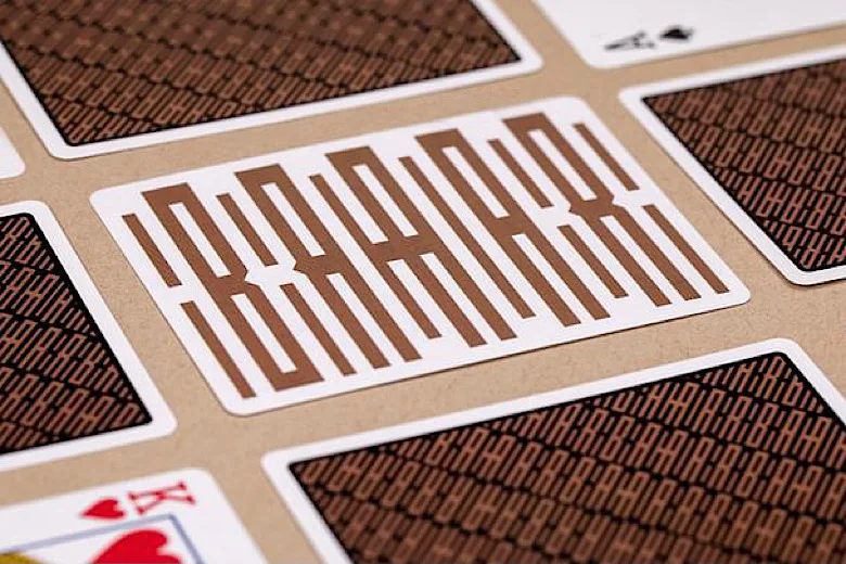
New from Vanishing Inc Playing Cards! Inspired by magician Blake Vogt’s best-selling ABRACADABRA artwork, this limited edition deck is one of the most unique ways to infuse your love for magic into every card trick and card flourish.


The one-of-kind ABRACADABRA design allows you to celebrate the art of magic in a stylish and subtle way. From a distance, it simply looks like modern geometric art. However, as you get closer, magic’s most famous word slowly starts to reveal itself in a truly magical way. 


This remarkable imagery has been carefully infused into the stunning two-way back design of the exclusive ABRACADABRA Playing Cards. The standard faces are complemented by an amazing custom Ace of Spades, matching Jokers with a bold inverted version of the artwork and a double-backer. Each deck also comes with an exclusive miniature ABRACADABRA print with Blake’s signature on the back.


Packaged into a gorgeous matching tuck box crafted with a custom kraft stock and embossing, the ABRACADABRA deck is like a mini work of art for any deck collection.

Printed by Cartamundi on slimline stock with a beloved B9 finish. Available NOW from vanishingincmagic.com for $14.95.

Check Out the Bubble Tea-Inspire Boba Playing Cards


BaoBao Restaurant has just expanded its menu with the release of Boba Playing Cards on Kickstarter. Illustrated by Angga Tantama and Meko Deng, a lot of thought has gone into the beautiful design and packaging of the bubble tea-inspired design. 


As it is a true staple in most Asian cultures, producer Bao Hoang has decided to create this deck as a way to celebrate a uniting aspect of Asian culture. The symmetrical back design showcase the popular boba milk tea. The color scheme and shape perfectly represent brown sugar bubble tea. Also, the white borders represent the “container” that holds the milk tea! 


The pips for each suit are custom carrying the milk tea theme from the back design over to the pips. The traditionally red pips now follow a light brown milk tea-inspired theme, and the traditionally black pips follow a dark brown tapioca-inspired theme. Each pip also features the same “wave” of milk tea on top. 


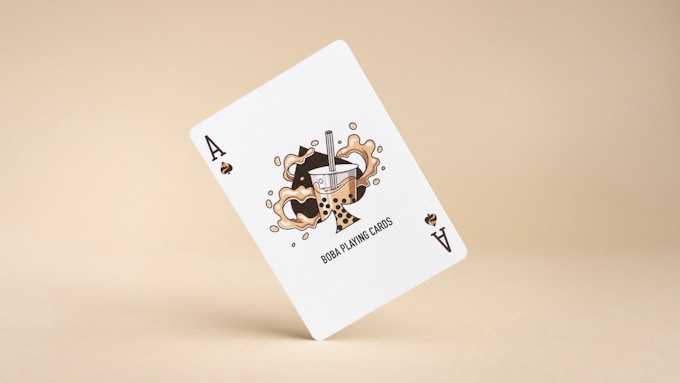
One of our favorite cards is the ace of spades. The cool artwork features an actual cup of boba that emerges from the spade with splashes of milk tea in the surrounding areas. Definitely a unique design that helps tie together the entire boba theme! 


The courts are pretty much standard but updated with the Boba theme. If you look closely, each and every court card has a different and unique face, while performing a different and unique action! 


The deck is packaged in a minimalist design tuck box resembling a cup of boba to actually look like: brown sugar with the tapioca (bubbles) at the bottom, and milk tea on top. This pairs perfectly with the transparent plastic casing to really give you the experience of holding a cup of boba! 


The deck is printed by the United States Playing Card Company with Air-Cushion Finish on Bee Casino Grade Paper. Limited to 3500 decks. Pledge starts at $12 on Kickstarter.

[post_ad]

Slime Edition Fontaines SOLD OUT in 3 Minutes!


Fontaine Cards dropped the Slime Edition Fontaines yesterday for members only and they were sold out in 3 minutes. This is the first time Zach Mueller has printed a solid color Fontaine with Neon Inks. 

These are the “wet” cards that have been teased on @fontainecards Instagram stories. It took nearly 5 months for USPCC to produce. 


For this drop, Zach is only limiting to a max of 6 decks per person. That would mean, six-pack OR up to 2 single decks per person. The 6 decks will be housed inside a letter-pressed small box. According to the product page,
So now, instead of only 180 people getting a brick, we’ll have 360 people getting a six pack. Without increasing the print run, this allows for double the people to get their hands on the decks.


That would mean, more accessible Fontaines! We’re excited to see the outcome of this approach. For larger print runs of 5,000 and 10,000, Zach will still be doing 12 deck bricks.

[post_ad]

Deck View: Carbon (Graphite Edition) Playing Cards


Custom. Unique. Elements.

Carbon Graphite Edition by Elemental Playing Cards is the 3rd installment of the popular Elements series. This unique deck is designed in collaboration with Luke Wadey.

Carbon Graphite Edition features a one-way design and semi-border/full bleed. A large hexagon is the focal focus of the backs with large pencil strokes run off the upper left side corner helping to create dark areas during fans and spreads.

The face cards are completely standard except for the court cards and the ace of spades. Each of the court cards is done in black and white and has the fading and smudging effect is prominently featured.

[post_ad]

Kardify's Second Collab Deck with Murphy's Magic, Nara Playing Cards

NARA Playing Cards are available now from vanishingincmagic.com for $15..

Introducing Nara, our second deck in collaboration with Murphy's Magic. Cardistry is a mesmerizing art form, in which a cardist creates fascinating display through the movement of playing cards. To celebrate the visual art form, we have crafted this equally visually appealing deck, Nara. 


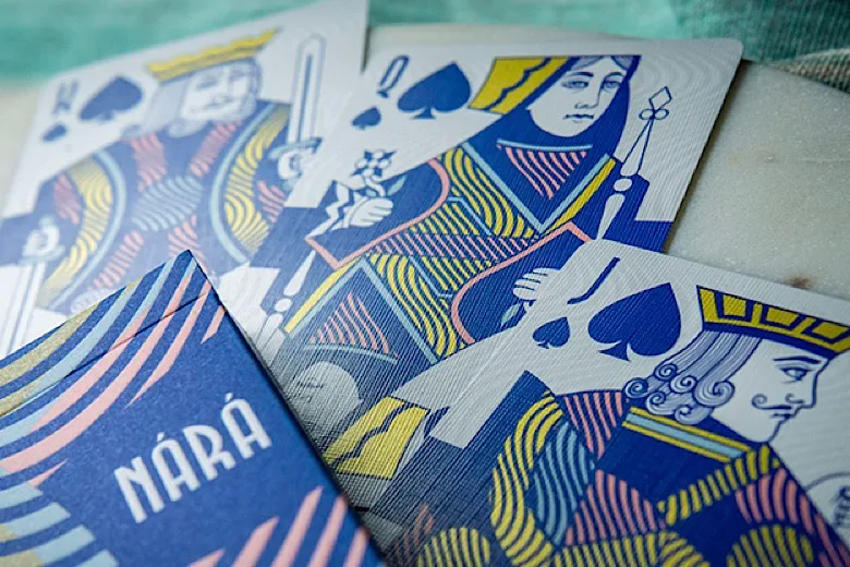
Nara's wave-like element has been specially designed for optimal cardistry performances by Ade Suryana. The vibrant blue and pink colorway will enhance any flourish and fan, while spreads will turn heads with the continuous wave design throughout. 


The Ace of Spades and Jokers are custom while the standard pips and court cards have been recolored with blue and pink color palettes. 


The wave design element of deck can be found on the wardrobe of the courts and as a subtle background of the face cards, giving a sense of continuity when fan or spread. 


Nara celebrates the mesmerizing beauty of card flourishing and will add accent to your EDC with a vibrant color palette. Printed by The United States Playing Card Company, Air-Cushion finish. Limited edition of 2500 decks.

Robin Hood Playing Cards Back in Stock!


Robin Hood Playing Cards are back in stock!
Released late last year, the highly sought-after deck is back on kingswildproject.com. The unique artistic style of Robin Hood playing cards took heavy inspiration from the Bayeux Tapestry - a French tapestry from around 1066. 

 
Look closely at each card, and you'll find that designer Jackson Robinson drew every stitch by hand to create this incredible display of artistic achievement. 

 
Each court cards are hand-drawn to make these beautiful and unique art pieces on each card. ⁣ You will definitely recognize characters from the legend, from Prince John, Prioress of the Kirklees Priory, Sheriff of Nottingham to Friar Tuck, and Robin Hood himself. The diptych jokers from the Robin Hood deck show the legendary first encounter of Robin Hood and Little John. ⁣ 

 
The striking tuck case was intricately designed to resemble an ancient book, including life-like features to resemble canvas and leather design-work, a book spine, frayed paper edges, and finished with realistic wear-n-tear details. 


Available NOW from kingswildproject.com for $16.

[post_ad]

Gemini Decks just dropped the All Star Playing Cards


Gemini Decks just dropped the All Star Playing Cards on geminidecks.com. Crafted for cardistry, the new deck sports a bold color palette of red, blue, black, and white, giving it an eye-catching look with its modern back design.


For the face cards, designer Toomas Pintson has kept things simple with standard recolored court cards but it boasts some eye-catching flair via custom pips arrangement, tip pattern on the top right and bottom left borders of each card, and triangular design element outer center of the cards. The contrasting colors along with the bold design elements will enhance any flourish and fan, while spreads will sure to turn heads. 


Akin to previously-released decks, All Star comes with silver metallic ink on face cards. The design style of the card back continues on the tuck box, with the same color palette and striking design. 


Printed by the USPCC on soft crushed stock. Available NOW for $9.95 on geminidecks.com.

[post_ad]

Kickstarter: 7 Questions with Christian Byard of Relativity Cards


Mutineer is a pirate-themed deck currently seeking funds on Kickstarter. The fully custom deck is designed by Christian Byard of Relativity Cards. According to the campaign page,
Mutineer playing cards are a souvenir-style, walrus-and-carpenter-esque look at piracy with an unhealthy helping of dehydration hallucination.
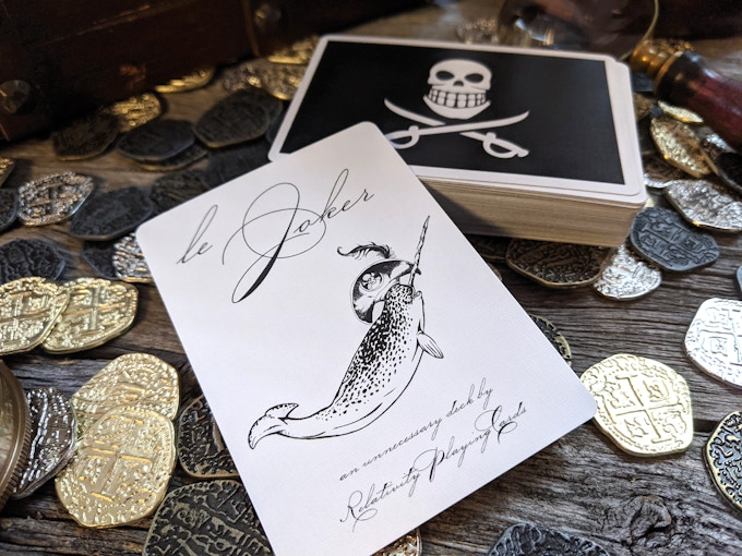
The card back prominently features the Jolly Roger and the face cards feature illustrations of all different ships and items of the Pirate Era, from the cannons, hooks to the Kraken and Man-o-War. The familiar yet strange courts feature these items on one-half of the royals. 


A few days ago, we had a chat with Christian about his design background, inspiration, and design process behind the fascinating Mutineer Playing Cards.

For those of us who don’t know, can you tell us about yourself and how did Relativity Cards came to be?
As a developer at a tiny design firm, I wear a lot of hats. Video work, copyediting, print management, production design--if there's something that needs doing, I'm probably doing it. I like the continual learning that comes with diving into the required discipline of the moment, even if it means I rarely do development! Ellusionist is to blame for my interest cards, reigniting that childhood fascination with magic and cultivating a love for custom cards. 

I was there when Jackson Robinson came onto the scene, and I ate it up! Fast forward a number of years I'd rather not think about (although I can at least take comfort that Jackson Robinson is older than me... hooray?) and a couple of decks, in a really weird way, made me decide to start designing: OPC's Peelers v2 and Tavern on the Green. Something about the simplicity of the one and the complexity of the other, plus some specifics of the design (like those half-gold pips that I still can't get over) gave me ideas for a really stupid deck project. But one that I wholeheartedly wanted to execute on! I knew that if I was going to make this effort, though, I didn't want my first deck to be a joke. So I started working in other directions. My first vector was the decision that the world needed more orange playing cards. That was the genesis of Singularity, spurred by the EHT Collaboration's First Image of a Black Hole. Galactic Paradise, a collaboration with Tanner James, followed, and now here we are. 


Can you describe the Mutineer Playing Cards and why you’re passionate about it?
Mutineer playing cards are a souvenir-style, walrus-and-carpenter-esque look at piracy with an unhealthy helping of dehydration hallucination. They are familiar and strange, unglamorous and fascinating. They are exactly what they say on the tin, and so much more... and so much less. For the expectations of some, they will be off-putting. That's not the intent of the design, though, rather there is an invitation to maybe not take things so seriously. Look at that card back! I've heard a bit of feedback that it's too goofy, it should be a real pirate flag. You may not believe me but I do value consistency in design. So goofy it must be. I don't think I could have made a serious pirate deck anyway, and there are enough of those already! The piracy theme has been begging some kitsch if you ask me.

Walk us through the process you took to design the deck. How did you come out with the idea?
It began as a joke, and that's the sorry truth! I saw certain decks out there, popular souvenir decks, with public domain flags for backs. And, well, with a setup like that, what else was I to do? A different flag, a rhyming name, pointed erosion of piracy's romanticism, and here we are. It would have ended there, but I showed it to people who saw beyond the joke. They made me make it real. 


What was your most brilliant breakthrough when designing the deck?
It was definitely tying dehydration hallucinations into the theme. I wanted to customize the courts of the deck non-traditionally and semi-haphazardly. "Really bad pirates running out of water" gave me the license to get surreal. It gave the "why" I needed and allowed me to solidify the whole design with more purpose.

With so many playing card projects competing for funding, why should potential backers choose your deck?
Back what you enjoy! If you like the look of the thing, come aboard! And maybe you just want a really good-feeling custom USPCC deck for $7 that you won't feel bad if your trash! Also, I do have some special editions involving silver design elements since silver is a lifesaver for water purification. 


What’s next? Can we expect more deck designs in the future?
New versions of Galactic Paradise are coming hopefully this summer, some typography decks I'm really excited about will be next year, and at some point, I may find the courage to release the third version of Singularity. I self-funded the second, so nobody seems to really know it exists (or they don't care, in which case I suppose its days are numbered!) I will say that I had a spark of an idea yesterday for a second edition of Mutineer, so I opened up my design folders and added the 28th deck. Will I do them all? No way! But some have promise, and maybe even that first deck that started it all will come to life someday...

Finally, what are your favorite playing cards?
Stockholm17's House of the Rising Spade: Cartomancer. I also love Art & Machine and anything done by Playing Arts. Decks that confound and delight during table games use find their way to the top of my list. 


Thank you for your time Christian. If you like what you've read here and want to support Mutineer Playing Cards, you can find it on Kickstarter Here!


The deck will be printed by the United States Playing Card Company on Premium casino stock, linen finish. Pledge starts at $7 on Kickstarter for a standard deck. 3 different editions are on offer: Standard, Thirst, and Shiny Buoy (gilded).

[post_ad]

Queen Bee Playing Cards on Ellusionist's Secret Menu


Killer Bee, Super Bee, and now... the revered monarch herself, Queen Bee Playing Cards. Ellusionist has just released the eye-catching deck on the secret menu after successfully funded on Kickstarter late last year.

Unlike the previous two deck designs which feature a faint white halo around the deck's edge - Queen Bees card backs have no border. The design is a classic of borderless decks, repeating into infinity with bees that fly in opposing directions. 


The top left and top right corner features the yellow bee. This little splash of yellow in a sea of black looks stunning in fans and spreads, allowing the minimal design to feel more 3-dimensional. 


For the face cards, each custom pip is arranged in a completely unique way, with a hidden hive represented in 1 pip of each number card.


Each court card is custom, with connecting hexagons encasing an effeminate design, like honey trapped within a single cell of the honeycomb. The lines are thin and sleek but the aura for each court card is instantly recognizable. 
 

The deck is kept secure in a custom matte yellow tuck case with all intricate details debossed to create texture. The back of the tuck is foiled in black stripes featuring the life-giving Queen, taken from the Queen of clubs within the deck. 


Printed by Cartamundi on the E7 stock and available now for $12 on the secret menu.

[post_ad]

Only 2 More Days on Kickstarter! The Heritage Series by Jocu Playing Cards


From Jocu Playing Cards, the Heritage Series is a four-deck love letter to the decks which first ignited our passion for elegant, luxury playing cards and the hands that wielded them with such finesse. These gorgeous decks are currently funding on Kickstarter, raising over $42k with only 2 days to go! 


Fully custom yet traditional, clear, and vivid, the Heritage Series celebrates playing cards themselves and traces the origins of the suits as they evolved across Europe into what we know as the 'French' suits today. According to the campaign page,
We wanted to create a classic deck which at first glance seems inconspicuous, but is packed with nods to the original suits, elements and ideas that make the history of playing cards so compelling.

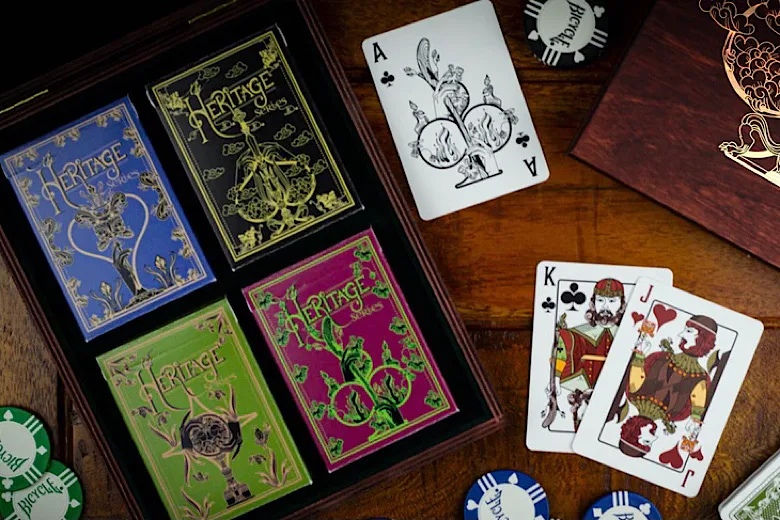
Four different editions are available during the campaign. Each deck is based on the heritage of the four suits - Spades, Hearts, Clubs, and Diamonds. 


Each with unique intricate and vintage-looking card backs, rich, vivid court cards are inspired by the attire of 16th-century paintings and eye-catching Aces. 


The decks are kept in dual foil and Pantone printed tucks on quality matte paper with embossing and interior printing. For the Spades edition- black matte card stock and gold foil, Hearts edition- blue matte card stock and silver/pink foil, Clubs edition- tuck box with red matte card stock and green foil, and Diamonds edition- tuck box with green matte card stock and copper foil! 


The decks are classy, luxurious yet remain unpretentious and accessible. Printed by Cartamundi True Linen B9 Slimline and pledge starts at $15 on Kickstarter. Add-ons such as Collector boxes, uncut sheets and gilded decks are available during the campaign.

[post_ad]

Deck View: Sin City Playing Cards


Lights. Roulette. Stunning.

A stunning deck by Riffle Shuffle in collaboration with designer Alba Zapata. Sin City Playing Cards takes inspiration from Las Vegas, a place that never sleeps, the city of thousands of lights and millions of fates, the place of endless thrill and bottomless pockets.

Inside, the card backs come with a red-and-gold pattern, made up of two adjoining roulette wheels lined by diamonds, martini glasses, and other quintessential Las Vegas elements. The court cards feature different types of characters one can encounter in Sin City. From cowboys, magicians, singers to contortionists, fortune tellers, and intoxicated bar patrons. The designer drew all of these characters in a lovely geometrical style, which surprises with many hidden details.

The tuck box is hot-stamped with gold and red foil on black paper evokes a starry evening on the famous strip. The front of the box features large red letters saying “Sin City” placed in the middle of a golden diamond, while the back and the sides are completely covered in a symmetrical design.

Printed by the United States Playing Card Company, AIR CUSHION Finish with the legendary BEE CASINO STOCK. 

[post_ad]

Less Than 24 Hours! Fluorescent (Neon Edition) Deck on Kickstarter


Another eye-catching deck by MPC funding on Kickstarter. Fluorescent (Neon Edition) Playing Cards is a fully fluorescent deck with neon ink printed on both sides which intensifies in UV light. 


The design of the deck is similar to MPC’s Impressions series featuring the tree back design and face cards. However, a special highly fluorescent ink is used on the artwork on both sides of the card. 


The eye-catching fluorescent neon yellow-lime green colorway is used on both face cards, card backs and the tuck box (exterior and interior). According to the campaign page,
We chose this color as this is the most common and popular color associated with the term “fluorescent”.

The cards are produced on MPC’s M30 linen air-light card stock with their renowned BETA finish creating a deck that is very smooth, snappy, springy as well as flexible, which is needed for all those complex card movements as used in sleight of hand card magic tricks. 

The Neon edition will be a limited run of 5000 decks and available NOW on Kickstarter for $14.

[post_ad]
© all rights reserved
Kardify 2013